6 months
ago -
Lilayah
-
Direct link

This month, we're participating in #Blocktober, highlighting the work of our talented Level Designers. This time around, Andrzej Giełzak shares a behind-the-scenes look at the Minor Quest “No Easy Way Out”.
This location was initially planned out and drafted as a Main Quest location, but we ended up adapting to the smaller location scope of a Minor Quest. Working closely with Jakub Skoneczny, our quest designer, we attempted to get the most of existing layout, allowing the experience to play out in a single open space, without compromising footprint of existing location and it's role in the district.
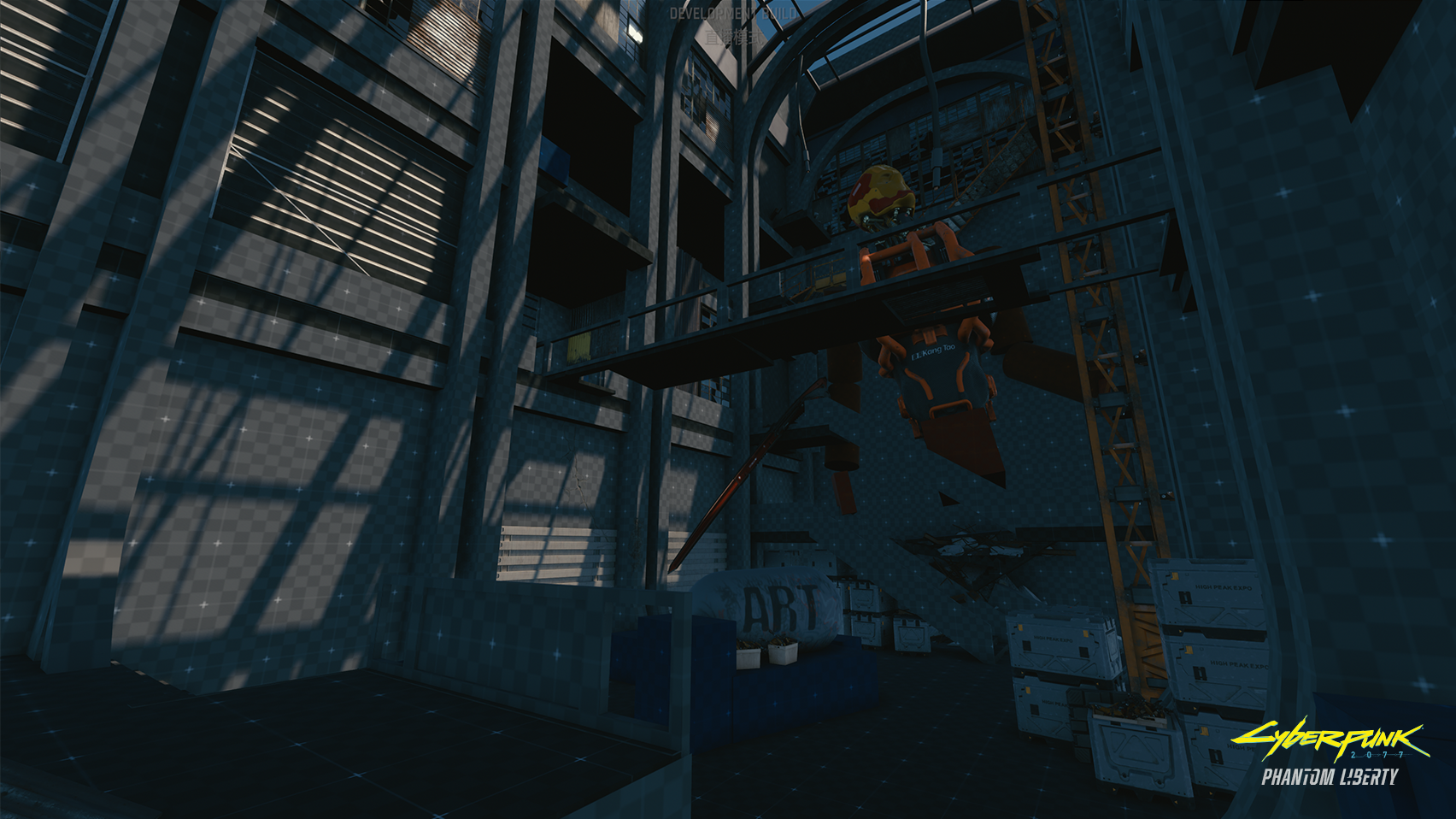
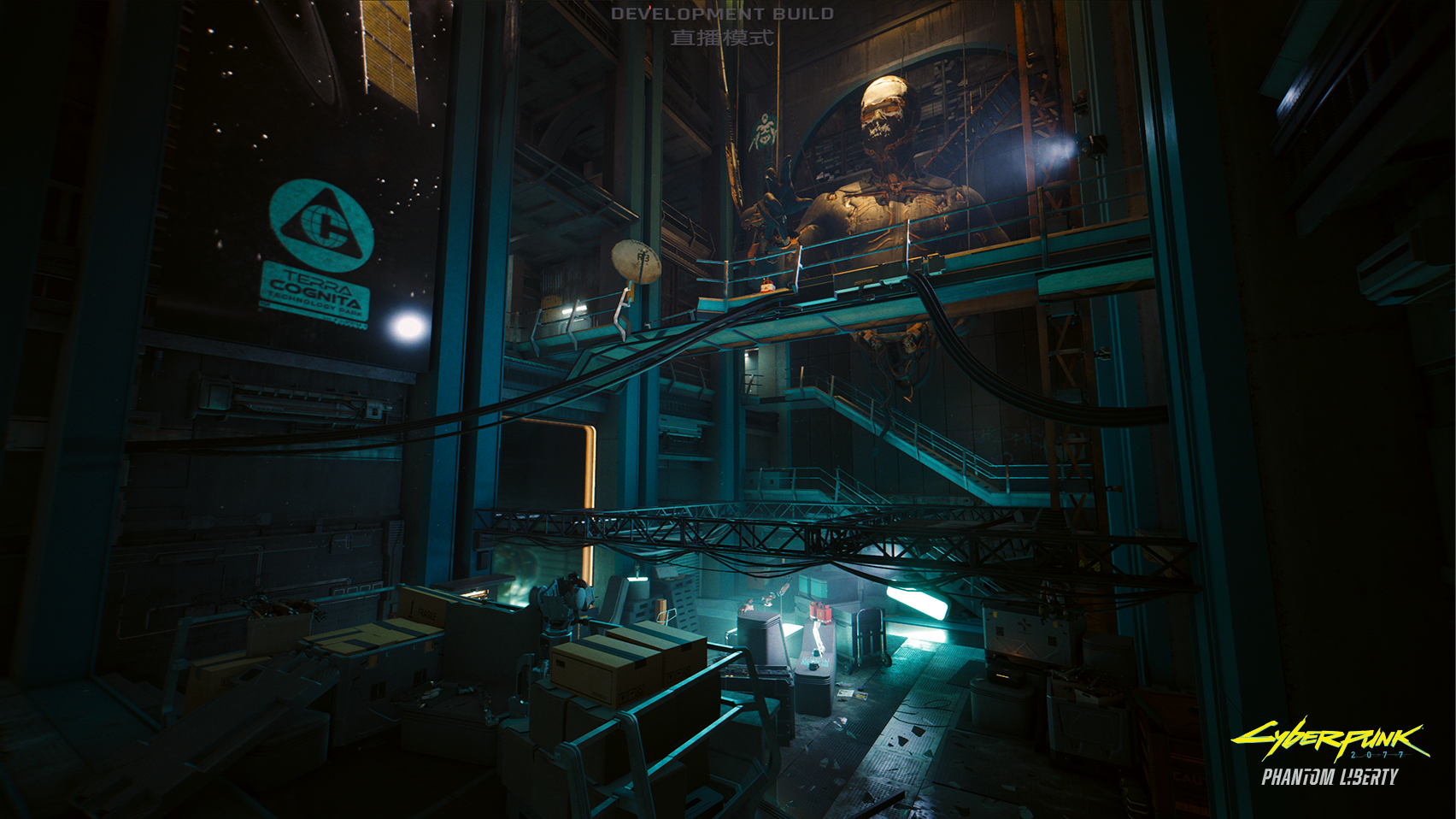
The first image shows the Main Hall Entrance, which was designed to create the feeling of progression through the galleries. Establishing an open space in the middle with a landmark — a giant robot statue — was crucial to providing the player with a strong reference point, as the act of going in a spiral around the gallery could easily have led to spatial confusion. It was important to design the gallery with a layout that would be logical in the “original” state of the building, while its derelict state of the building as well as the damage and modifications done by Scavs allowed us to break the open plan and create obstacles and challenges for the player to overcome. Senior Environment Artist Albertus Januardy did a great job of extending the few accents from the blockout into a full-fledged, disgusting Scavenger Hideout.

The paths for different playstyles were designed to convey that same upwards progression. In combat, enemies retreat upwards as their numbers dwindle, pulling you upwards in pursuit. For those using the netrunner path, the cameras were sequentially arranged by floors and always included a glimpse of the landmark as you hopped between them. For players focused on agility, we designed the location to feature opportunities to continue upwards using double or charged jumps.

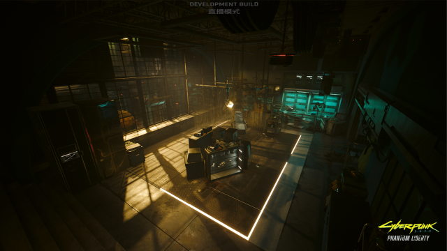
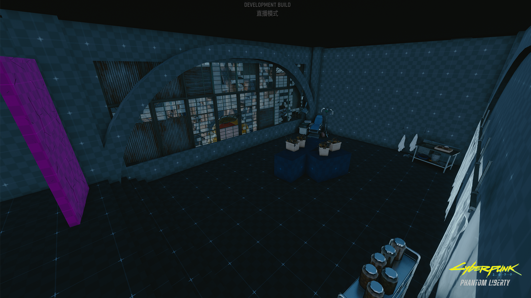
The second blockout features the ripperdoc’s office, which was blocked out in comparatively low detail as its layout was dictated later by the needs of the Cinematics team. From the perspective of tying the location together, the presence of the window to the main gallery was crucial, with the added bonus of seeing the key landmark from it. Lighting played a crucial role in tying both spaces together, which was deftly handled by Senior Lighting Artist Marcin Stępień.


Andrzej Giełzak:
https://www.artstation.com/andrzejgiezak