Introduction to Quarterly Updates
Luis Barriga, Game Director
UI Design, Controller Support, and Co-Op
Angela Del Priore, Lead UI Designer
Monster Family & Design Highlight: Cannibal Tribes
Candace Thomas, Senior Encounter Designer
Hello, and welcome to the new blog section of the Diablo IV website!
The Diablo IV development team has been hard at work since BlizzCon and we are all still incredibly energized by the response to our announcement and follow-up blog posts. We can tell you are all excited to see more info coming from the team and about how the game is coming together.
Well, we have some great news for you today. We are stoked to deliver the first of our quarterly blog updates with you, and this one happens to be a doubleheader.
First, we have a word from our Lead UI Designer, Angela Del Priore, with some super cool updates on post-BlizzCon feedback, controller support on PC, and a deep dive into couch co-op. If you’d like to jump to her update right now, click here.
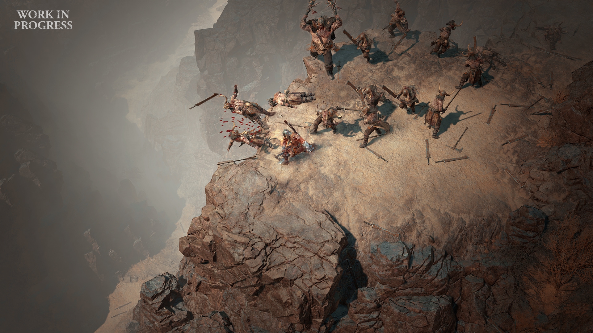
Our second update is by our Senior Encounter Designer, Candace Thomas. She shares a first look at a new set of enemies: the cannibal tribes of the Dry Steppes. You’ll see some amazing new art by Igor Sidorenko, read some of our in-world lore, and even watch video of these flesh-eaters in action. To check out Candace’s update, click here.
We hope you enjoy both of these updates. We’re looking forward to your thoughts and comments on them, and please also let us know the sorts of things you’d like to hear about next. We realize many of you are curious about different aspects of the development process—some of you love reading and re-reading lore, while others of you may geek out over item tooltips or want to hear some early music tracks. So be sure to tell us what excites you most! Our goal for these updates is to cover a wide variety of subjects and, over the course of development, share something exciting for everyone.
Once again, we want to thank you all for sharing in this journey with us.
See you in Hell.
-Luis Barriga-
Game Director, Diablo IV Team
UI Design, Controller Support, and Co-Op
Angela Del Priore, Lead UI Designer
For anyone who isn’t familiar with user interface (UI) design, our team is responsible for communicating game systems to the player and providing players with the inputs they need to engage with those systems. So while we are focused on helping the player achieve what they want to do, we also need to balance that goal against the vision for the game while maintaining the clarity of what our interface is trying to communicate.
As you might imagine, this means that we iterate on our UI regularly. As systems change, the UI changes with it, which can in turn cause player goals to change. The UI then needs to adapt while keeping our visual language consistent across the entire game. Visual polish is one of the last things we focus on for this reason. Please keep that in mind as we talk through and show some of our in-progress work, but feel free to let us know your thoughts!
BlizzCon Demo Feedback
It’s been a few months since BlizzCon, but we still wanted to take a moment to address some of the UI-specific feedback we received from the demo and announcement videos.
Inventory
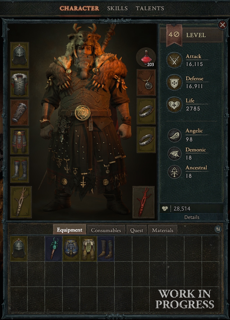
We saw a lot of feedback around the inventory, either regarding its coloring, the style/size of the item icons, or overall aesthetic. To avoid interrupting gameplay with pockets of inventory management, we’re not planning on bringing back different-sized items. However, we’ve been tackling the other points from a variety of directions.
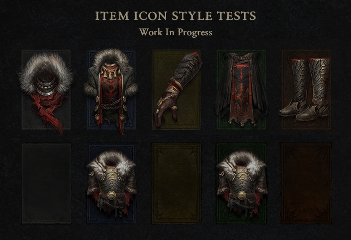
With item icons, we’d initially pursued a painterly style to stay in line with the overall art direction of the game, and we’re finding that it doesn’t come across as well when we’re talking about small elements in the UI. We’re now exploring another approach more directly based off the 3D models to give them natural texture and realism.
We’ve also toned down the brightness and saturation of the icon backgrounds, as well as added secondary visual cues for indicating rarity via the border decoration. This way, we’ve made rarity indicators visually more subtle but hopefully with a wider range in accessibility.
We received some non-specific feedback about the inventory, but we had guesses as to what people were reacting to based on our own observations. We’ve reorganized the layout of the inventory to what is hopefully a more balanced composition, and across the board we’re looking at the color spread and contrast levels of individual UI pieces.
We hope to both home in on our goal of a gritty, realistic UI, while balancing ease of use. As the inventory screen is something our players will probably interact with the most, we really appreciate your feedback in this area.
Rebinding Left-Click
A surprising number of players asked for the option to rebind their primary skill to anything but the left mouse button so that they could separate moving from attacking. Adding more flexibility to our binding options had already been on our radar for a while, and the demo feedback helped confirm that this was a customization feature that players really wanted.
In addition to giving players the freedom to assign any skill to any slot from the get-go, all skill slots can now have their keys rebound. We’re committed to supporting skill rebinding for controllers as well.
The Left-Corner Action Bar
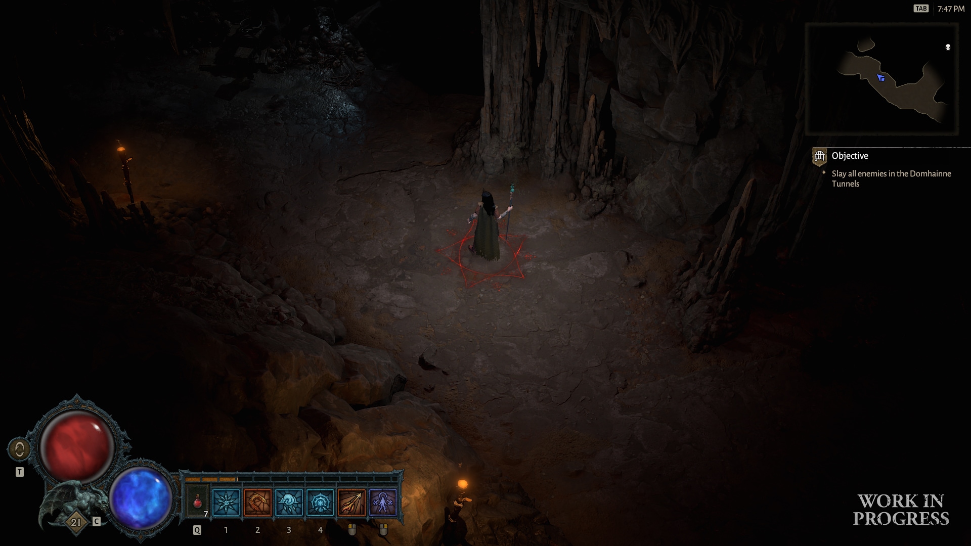
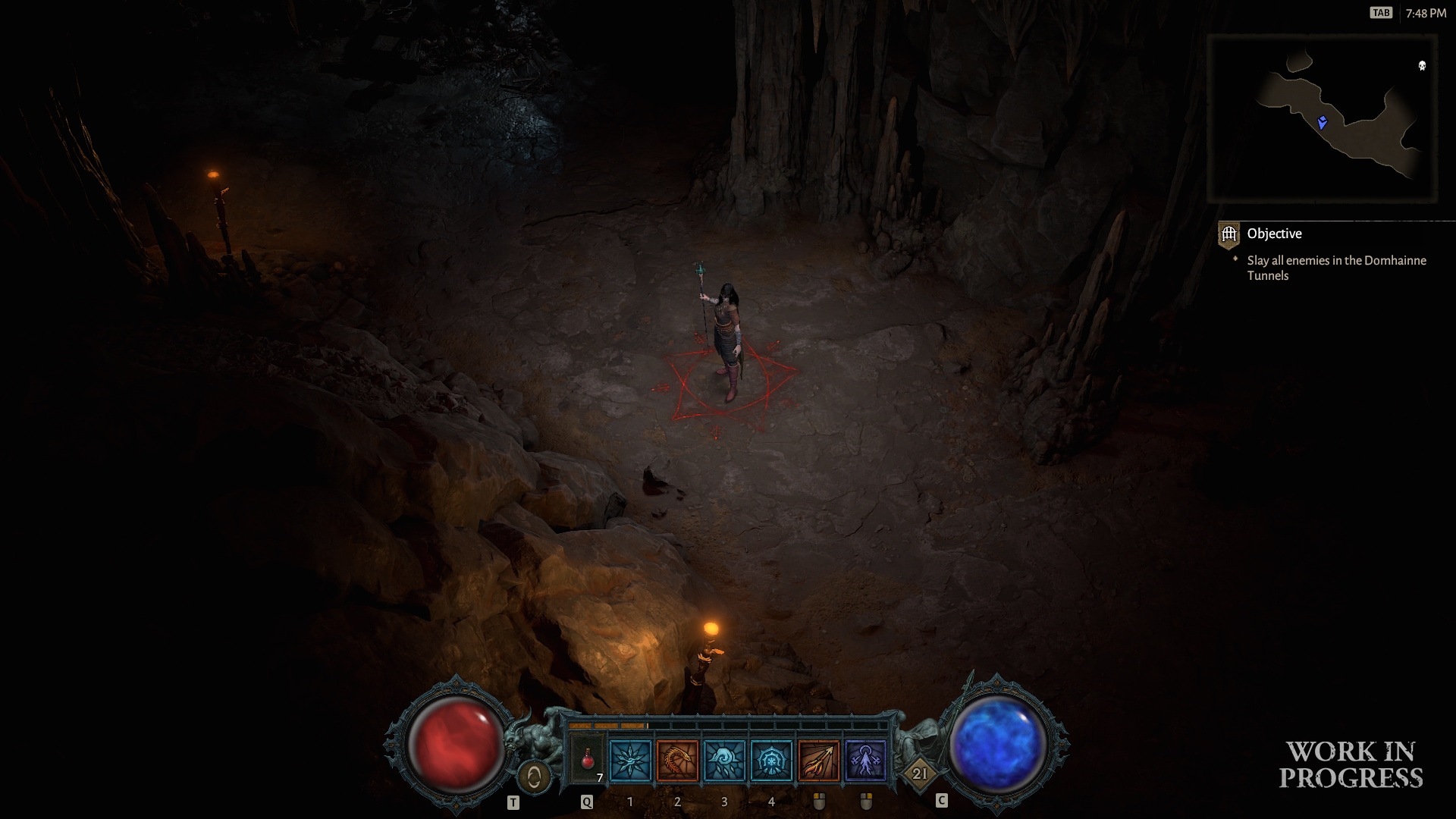
We went through a lot of iteration on this piece of UI. The left-corner configuration came about because we wanted to try clearing the central combat area and freeing up the bottom of the screen where the isometric camera already sees less. However, based on usability test results, the team’s feedback, and the feedback we received from the demo, we’re going to move the default position of the action bar back to the bottom center for PC players.
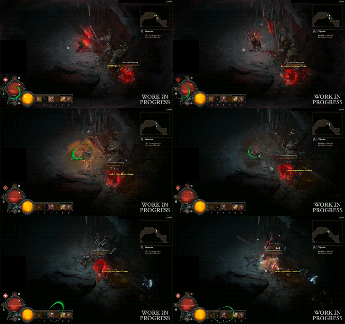
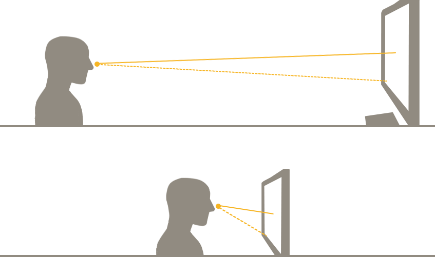
That’s not all, though! The preferred position changes to the left-corner when people play further away from the screen. This doesn’t come as a surprise given the shift in viewing angle (illustrative diagram below not to scale), but it does mean that the center configuration isn’t a majority winner on PC since we’re supporting controller input. So, while we will only stick to the corner configuration on consoles, we will offer both left and center positions as options on PC.
Supporting controllers on PC
This is the first time a Diablo game is being developed simultaneously for both PC and consoles, but the decision to support controller input on PC is what caused the greater paradigm shift for us. We wanted to give players the ability to switch between the two options freely, so our UI needed to be unified enough that swapping hardware inputs on the fly wouldn’t throw people completely off kilter. A unified UI means our layouts are more grid-based for ease of navigation, but it doesn’t necessarily mean an identical interaction flow.
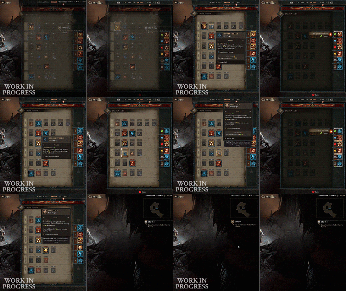
We try to maintain this sort of approach, of keeping established keyboard and mouse conventions while creating controller-friendly shortcuts or alternate flows, throughout the game. Controller support shouldn’t be a limiter on how complex our game can be; it just means we have more paths that we need to consider. It’s not a simple undertaking, but we’re really striving for a native feel for both types of inputs.
Couch Co-Op UI
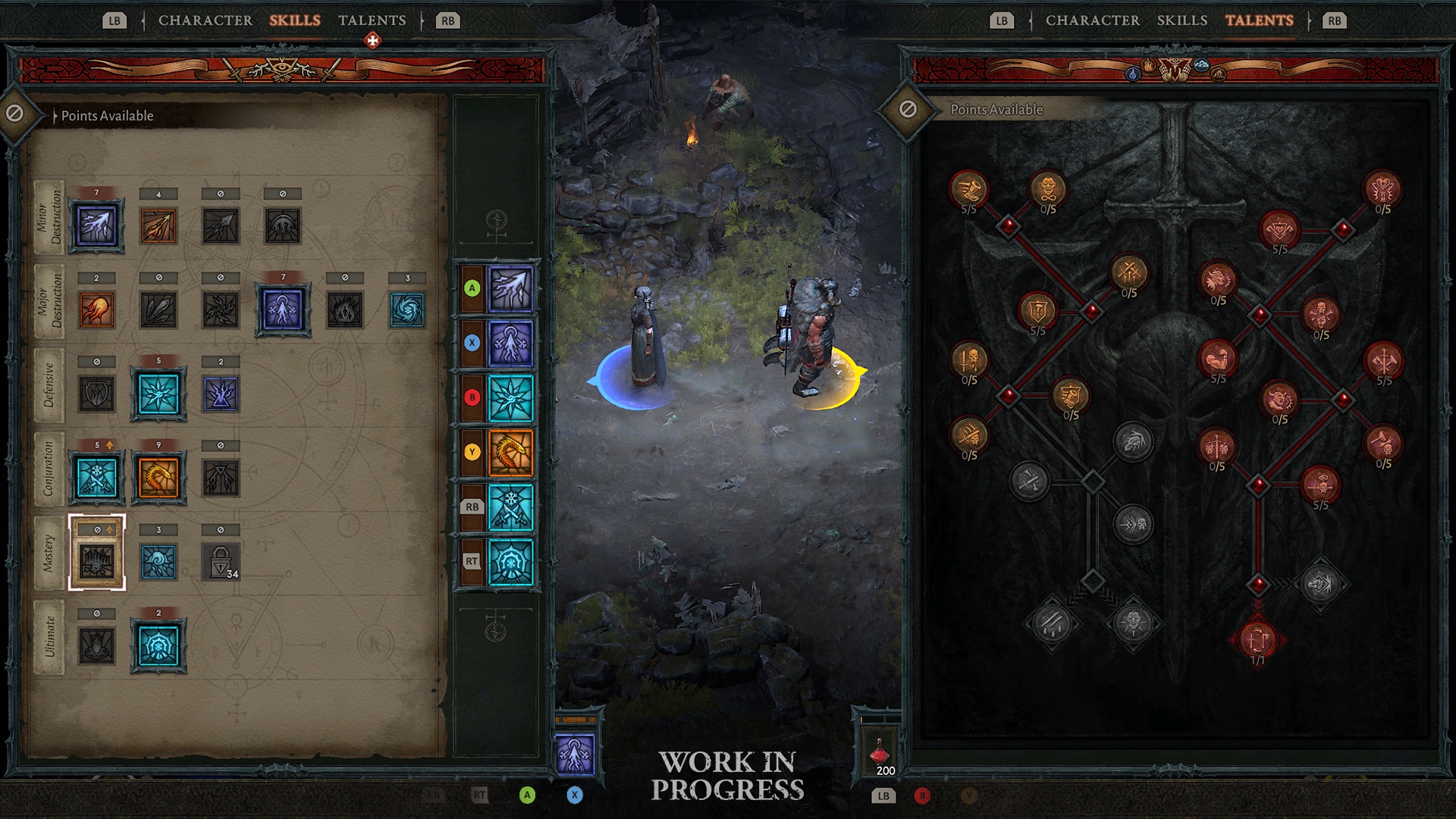
We know many players enjoyed couch co-op in Reaper of Souls, and that the biggest complaint was the inability to do anything while one local player had a UI screen open. When the topic of couch co-op came up early on in development, we looked at the number of people who utilized this feature in Diablo III and found that the 2-player setup accounted for an overwhelming majority. For Diablo IV, we decided to focus on improving the favored 2-player co-op experience and set up our core progression UI screens such that they can be opened independently or at the same time.
We iterate on this interface regularly and ease of interaction comes before visual polish, but we still welcome impressions at any stage. Everyone approaches the game with a different set of experiences and, consequently, different expectations for how things should look or work and it’s always interesting to hear these perspectives.
Thanks for reading!
Monster Family & Design Highlight: Cannibals
Candace Thomas, Senior Encounter Designer
If you had the chance to watch our World and Lore Panel during BlizzCon, you learned that monsters in Diablo IV are classified into “families.” In our various panels we covered different monster families such as the Fallen, who are returning to once again terrorize Sanctuary, and the Drowned, who are a brand new threat plaguing the shores of this world. We touched on their story, combat abilities, the regions they inhabit, and how they interact with one another in a meaningful way. Now, we would like to give you a look into another new family: The Cannibals.
What is a Monster Family and Why Does it Matter?
Before we dive into the specific mechanics of the Cannibal family, let’s take a moment to talk about our design philosophy when it comes to monsters.
In the bestiary of Diablo III, we classified monsters into broad categories like demon, unholy, undead, humanoid, or wildlife. These monsters served as an anchor to the story by adding to the overall setting and tone, which made the whole game feel complete.
In Diablo IV, the vast and seamless world we created necessitates a slightly different approach to worldbuilding and storytelling. It requires building Sanctuary as a living, breathing character—especially through its creatures. Since we have everything from serene ocean cliffsides to the gaping maw of Hell itself, what does that mean for the bestiary? Well, to fill those areas and make them feel real, we definitely needed to have more non-aggressive wildlife than in Diablo III. But never fear, we still have plenty of monsters to fight.
Every monster has been reimagined, but in a darker, more gritty art style. We have lovingly handcrafted every creature you’ll encounter from the ground up: that includes demons, NPCs, Act Bosses, and even the skittering critters you can crush underfoot. Though we still pay tribute to some hallmark gameplay—such as Fallen Shamans resurrecting other Fallen—we have completely reimagined things in other places.
To have these creatures feel more sophisticated and robust, we designed them in what we call “monster families” and archetypes. Each family has a different combat style and feel. For example, the Drowned family has five members in various archetypes: bruiser, ranged combat, melee combat, swarmer, and dungeon boss.
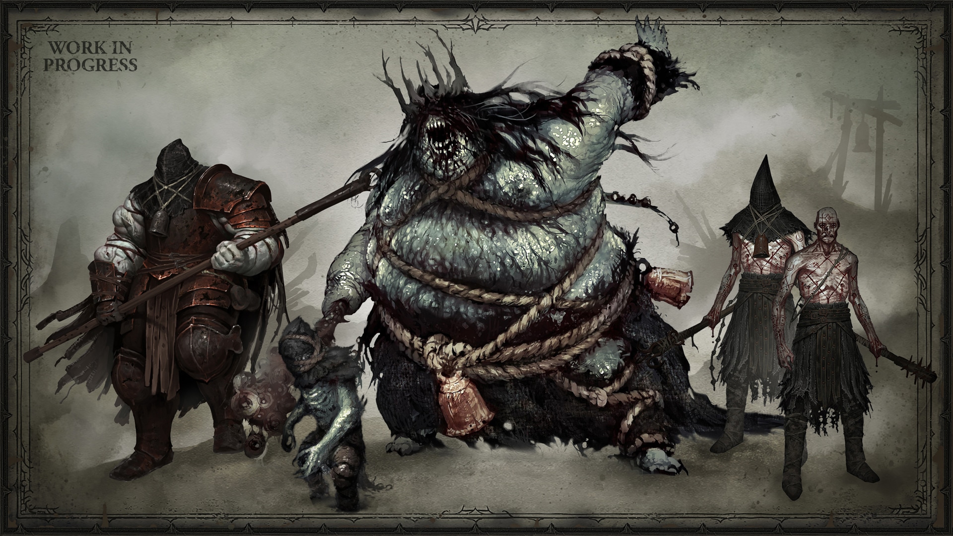
Each archetype plays a different role in combat. Swarmers strike in groups, making AoE attacks feel satisfying. Bruisers are larger monsters with high health values, which will make damage over time abilities feel good. Melee combat units act as shields by standing in the way of projectiles for their ranged counterparts. Situations like this provide the player with interesting positional dilemmas if they want to focus fire on ranged units. When adding all of this together, each encounter with the Drowned will be slightly different with regards to player positioning and choice of attack. These rich and varied combat experiences are the power of a monster family.
Who Are the Cannibals?

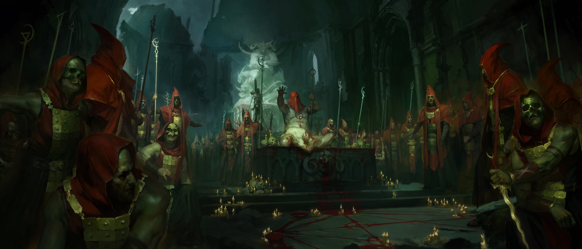
“Corpses riddled with bite marks. Splintered bones scraped clean of marrow. Tongues sawed off and eyes gouged out of their skulls. These are the bloody fingerprints the Cannibals leave behind—if they leave behind anything at all. No one is certain where they come from, but some legends claim they are a former tribe of barbarians, banished from Arreat years ago. Whether their cannibalism led to their exile or developed out of desperation afterward is unknown. The outcasts brought their endless hunger to the Dry Steppes, and from there spread to the far corners of the world to prey on lonesome caravans and unsuspecting villages.
The few who have survived encounters with these butchers share the same stories. They tell of the mad fire that burns in the eyes of all Cannibals, of how eating the flesh of their victims in battle only fuels their hunger for more. They whisper of the unlucky souls spared in the attacks, hauled off like livestock for the raiders to pick clean until their next hunt. And then, they say no more. The silence speaks for them: sometimes it is better to die than to live and remember.”
—Liya Khal’tib
Lore by Matt Burns
A Battle for Survival
Now that we’ve introduced some new lore about this family, we can dive into how we try to use them to give a cohesive experience narratively, while also providing the peaks-and-valleys of combat expected in a hack-n-slash ARPG. So what does this mean for Cannibal combat design? How do we convey their story through combat? We took a couple of approaches:
Weaponry
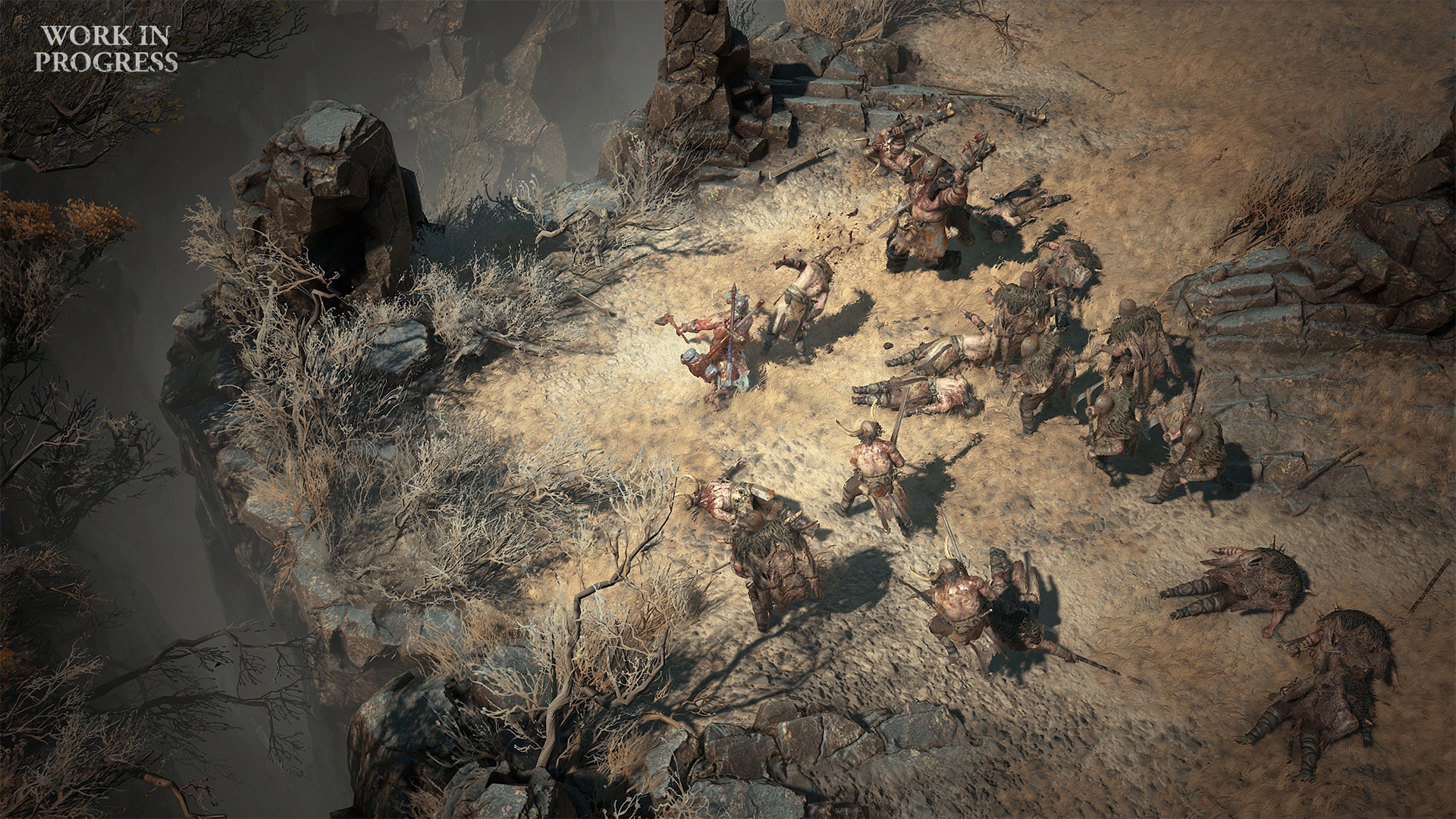
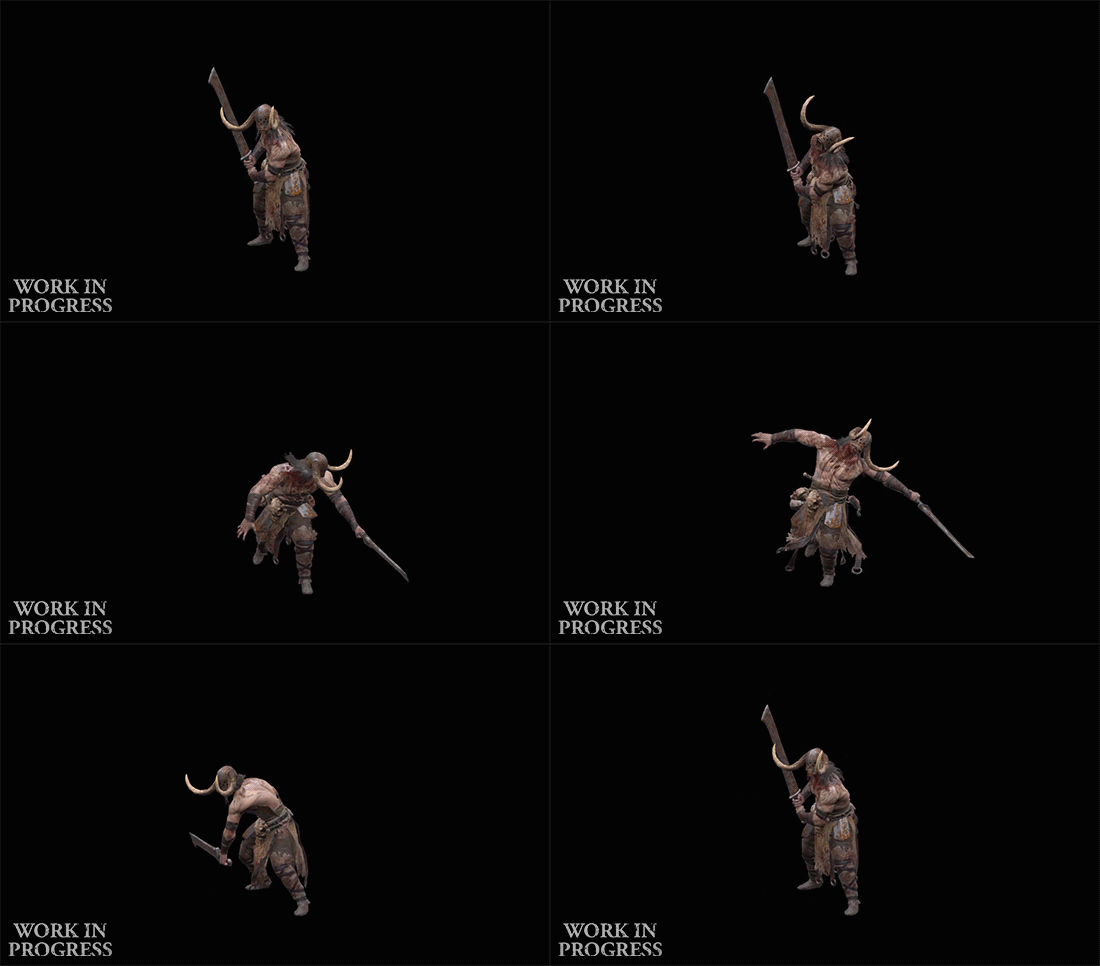
The Cannibal family has four members. They each have their own unique weapon and a significantly different silhouette or stance to help differentiate them from one another. There are two standard melee combatants: one wielding a two-handed greatsword cleaver, which delivers a slow, sweeping frontal attack; and the other using a lightweight halberd which allows them to leap at players from a great distance and crash down with a devastating attack.
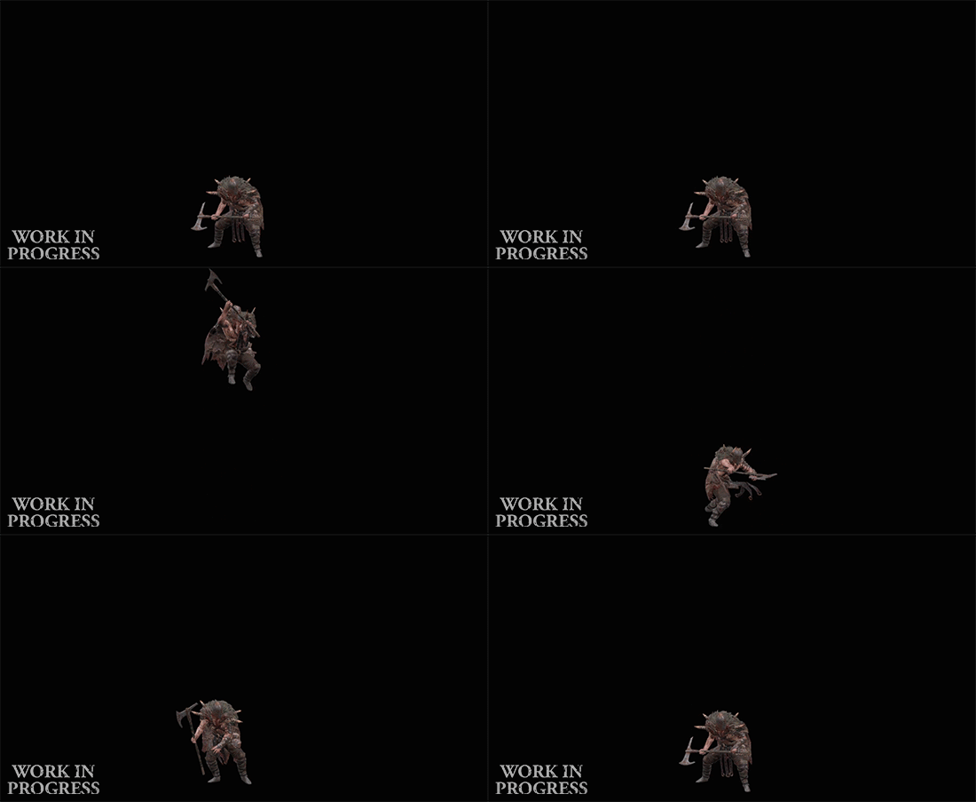
The bruiser uses a spiked club in each hand to deliver intense blows that will stun players if they aren’t paying attention. By contrast, the dual-axe-wielding swarmers can unleash a flurry of frontal attacks that will quickly kill if left unchecked. However, this is a less binary pass/fail than the bruiser’s stun attack. If the player finds themselves surrounded by flurrying swarmers, getting hit by the bruiser’s dazing blow would remove all possibility of escape. It’s combinations of attacks like these that make this family so deadly.
Archetype
Earlier, we explained how different monster archetypes play different roles in an encounter. For example, players who want to efficiently kill ranged monsters will need to learn how to reposition their accompanying melee attackers so that a cleverly dropped area of effect ability will target both clusters of enemies. This makes for interesting on-the-fly decision-making, and skilled players will be able to spot the optimal positions for these attacks very quickly.
By design, the Cannibal family has no ranged units. Instead, they spring at the player with supernatural swiftness. Some may close the gap by leaping over obstacles and would-be competitors, while others will swiftly and deftly maneuver through other monsters to get first blood. This provides a very different experience and gives the player less time to make thoughtful positioning decisions, thus making combat with these flesh-eaters feel frenetic.
That’s it for today. Thanks for staying a while and listening!
Note: Comments on all Diablo blog entries have been disabled. This is part of our website migration for GDPR compliance. We apologize for the inconvenience.
Have a question, comment, or feedback about the information we shared today? Join the conversation here on our General Forum. We can’t wait to hear from you!
