over 2 years
ago -
PDX Katten
-
Direct link
Hello, and welcome to this week's Dev Diary!
I am HOI’s 2D artist and am the one who makes the little buttons, icons, and whatever gets thrown in my way for you to look at and push on, and today I have gotten the opportunity to talk about my work!
So let’s start at the beginning, how does a project start, and how and when do artists get involved?
Being an artist on a project such as Hearts of Iron is not an easy piece of work. You need to be on your toes and ready to adapt to whatever task your colleagues want help to solve. It usually involves a bit of text and a ton of reference material. And to gather all of these things we use a tool called Miro.

It’s essentially an online whiteboard that can be used however fits you and your team best. On our Miro, we separate the features into columns that give you a quick overview of what we need to complete for the upcoming update.
The columns are usually divided into Focus trees and Features that are expected to get art during the project.
As the project starts it’s not uncommon for the Miro to be a bit empty. A lot of the research for what can be used, artwise, is a pretty heavy task to bite into with all copyrighted photos out there. Our amazing content designers spend quite a lot of time on valuable research, sorting out what is necessary for the game to make sense as well as adding flavour to your gameplay. And yes, this takes a fair amount of development time to gather all this valuable information as well as imagery that will communicate the right thing for you when you play HOI.
As time goes on, more art tasks will fill up the Miro board. So, for an artist at the beginning of a project, it can range from doing some cleanup work on older icons or portraits, starting to work on loading screens, continuing setting up the Miro board for the DLC to their taste or helping with another project that needs some extra art-hands.
But back to BBA and our work there!
We already know what kind of art we want to have for each focus tree, it's more the quantity that is a fluctuating number at this point and it's still uncertain how much we can make in-house. I always try to convince my CDs to ask for art to their heart's content because we always prioritise what needs to be done so the things that matter the most get the art it deserves first.
When all High Prio art is done, if time allows we continue with Medium and last of course the Low. We also have, for whenever we manage to wrap up art in a timely manner, a special section that is called a “wish-list” or Corner of Shame. It's essentially Low Prio art but stuff that maybe was more of an afterthought or just forgotten for a Feature or a Tree that would be extra sweet if it got some new shiny textures.
Without giving too much away, here's a heavily zoomed-out version of how a Miro board can look like that I as an artist work with. And yes, I was in charge of all the Focus trees and the Plane Designer for this DLC (granted I did not make all the art, we also outsource).

We use a colour code to communicate what's going on on the board! All of them also have a little stamp on them to mark what Prio it has as well as a text section where CDs write what they want to communicate with the icon they request. As you probably can see, there's quite a lot of information that needs to be shared between the departments before art can be worked on.
It’s our transparent way to communicate with each other, CD’s can see how much I have done and how much I have left. They can also see my schedule on what I’ll be working with each day. This means that CDs can also ask to get prioritisation over each other if their Focus tree or Feature requires art sooner rather than later and this is constantly brought up and talked about on our syncs together.
Communication 👏 is 👏 key!
Here is an example of how a request turns into an icon (that you may or may not already have seen):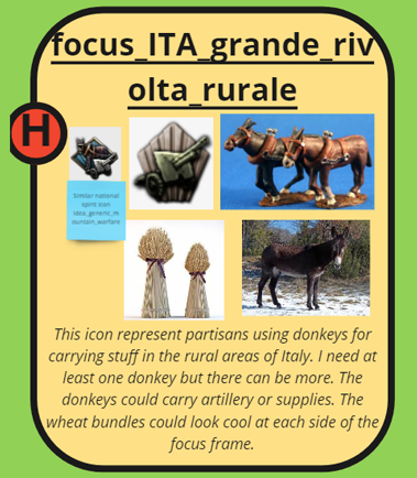
This is a typical request.
It has an in-game name displayed, reference images provided as well as a description of what my CD wants out of the icon. It is also prioritised!

And this is how it ends up looking!
Since we have quite the large art-library by now I can quickly iterate on what type of background works the best as well as reuse different layer styles to make the icon feel cohesive and on-style with the rest.
I also made sure to hit all the marks from the requests such as;
Also, one thing to keep in mind when doing these types of icons is remembering their size. All the things that a CD may want in an icon may not fit in the end or make it more or less unreadable because all the things together will just create noise.
That's when we artists step in and “take over” so to say with simplifying without losing the information that the icon should communicate.
This is also a typical request when a CD isn’t 100% sure on what would or could look the best and leaves that up for me to figure out:
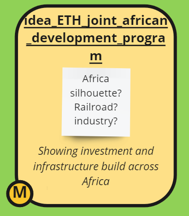
Icons are requested the same throughout the art process, so name, description, and prio are all there.
It's just that this time I didn’t get any reference material and that's perfectly normal!
And this is the result!

Example of adding coins to this icon to communicate investment:

So the TL;DR of this section is; Use good Tools for communication, whatever that may be for you and your team.
Be honest and transparent with what's going on, what you need to do your part, and when you need it to estimate the time left on the project.
CDs do research, CDs request art, Artist look at the requests/ask questions, Artist make art, Artist share art with CDs and so the circle is complete.
Now when you kind of know how artists, or at least I, do work with content and for the project I would also like to share how the loading screen got worked on for BBA!
Ahh sh*t, here we go again.
Yes, I was thinking that we could get a little re-cap on how it is to not just make icons and portraits, but also be flexible and knowledgeable enough to pull off a loading screen. We artists are a jack of many trades so to speak and we do need to be able to adapt to a lot of different types of art tasks that need to be done for a project.
So, how is a loading screen created? It usually always starts with a prompt or a vision from one of either designers or content designers that are heavily involved in the upcoming DLC.
Essentially we want the loading screen/splash screen to communicate something in relation to the DLC, this time we want to focus on Italy and planes. Mostly because Italy has been heavily requested and we want to shine a spotlight on the country as well as showcase the plane designer!
The prompt is “Italian and American fighters incoming in a dogfight over Italian landscape”
Cool. Let's go ahead and make some thumbnails then!
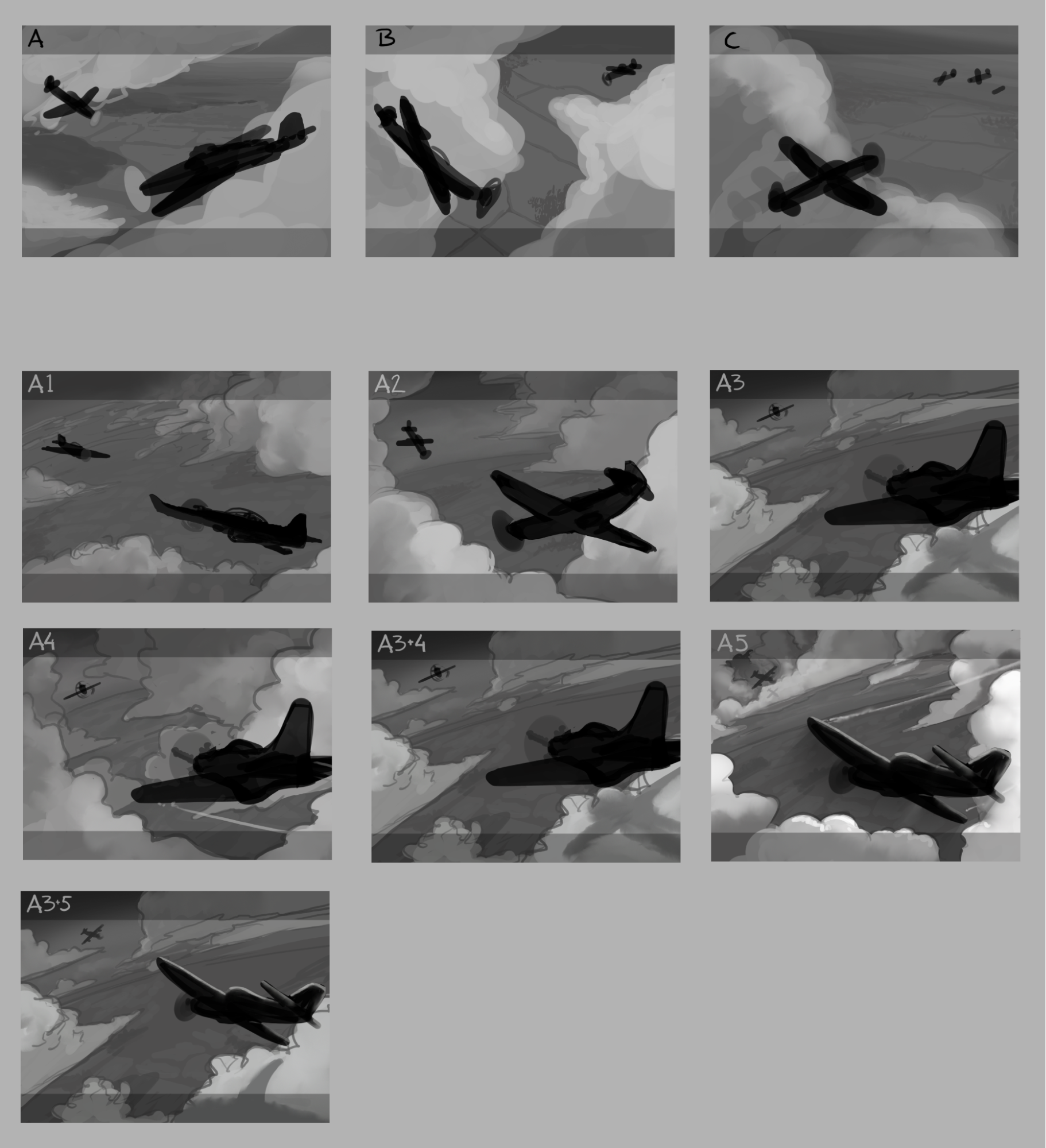
Once again several thumbnails are presented for the others to choose from. Typical hierarchy methods are used here, black = most visually interesting, grey = further away and white/light grey = low focus.
The last one, A3+5 was chosen and started to get some more details in a simple greyscale set-up. This time I quickly wanted to take it into colour and started to experiment with what kind of setting looked best.
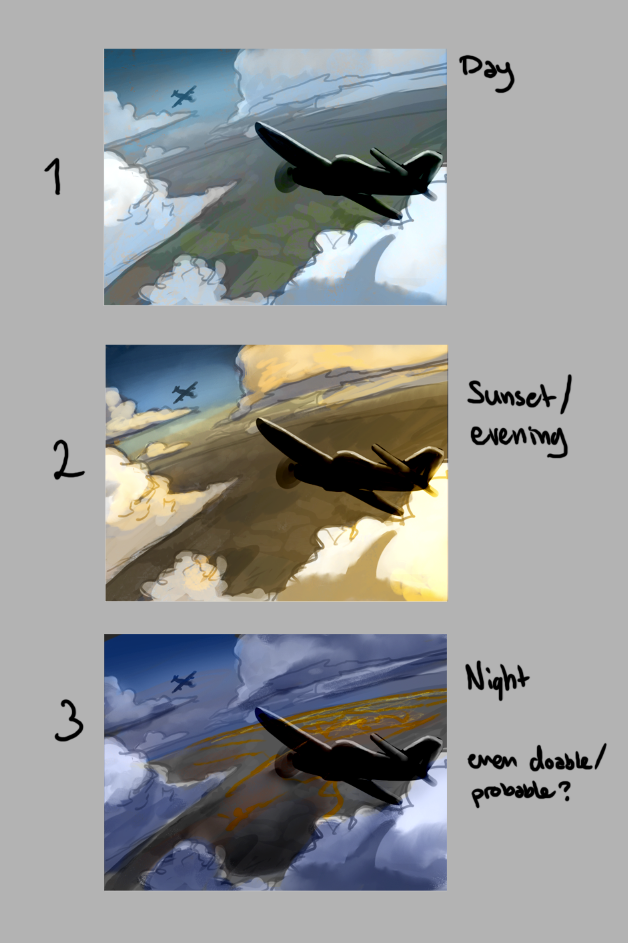
After going with a more sunset/evening vibe, because it looks more epic, I started to experiment with the range of those colour schemes as well as trying out some different styles.

Here you also can see that I had no idea I was painting the wrong plane but that doesn't matter because we are still very early in the process and just trying to find a good mood.
I also noticed that the balancing of the image was off since we need to take into consideration the different kinds of resolutions it's gonna sit on. So to solve this I pushed the whole image down and (thankfully) it was just drawing more sky this time!
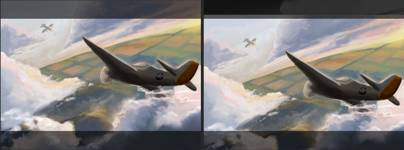
(still, the wrong plane, don't worry about it)
The render phase is coming up and I’m not gonna lie, I’m not too excited to draw hard surfaces.
But luckily we have a fantastic 3D artist on the team that needs to model some planes for the DLC anyway! He was generous enough to pose the plane for me on top of my background and now it's just painting over them a bit to make them blend into the image and look cohesive.
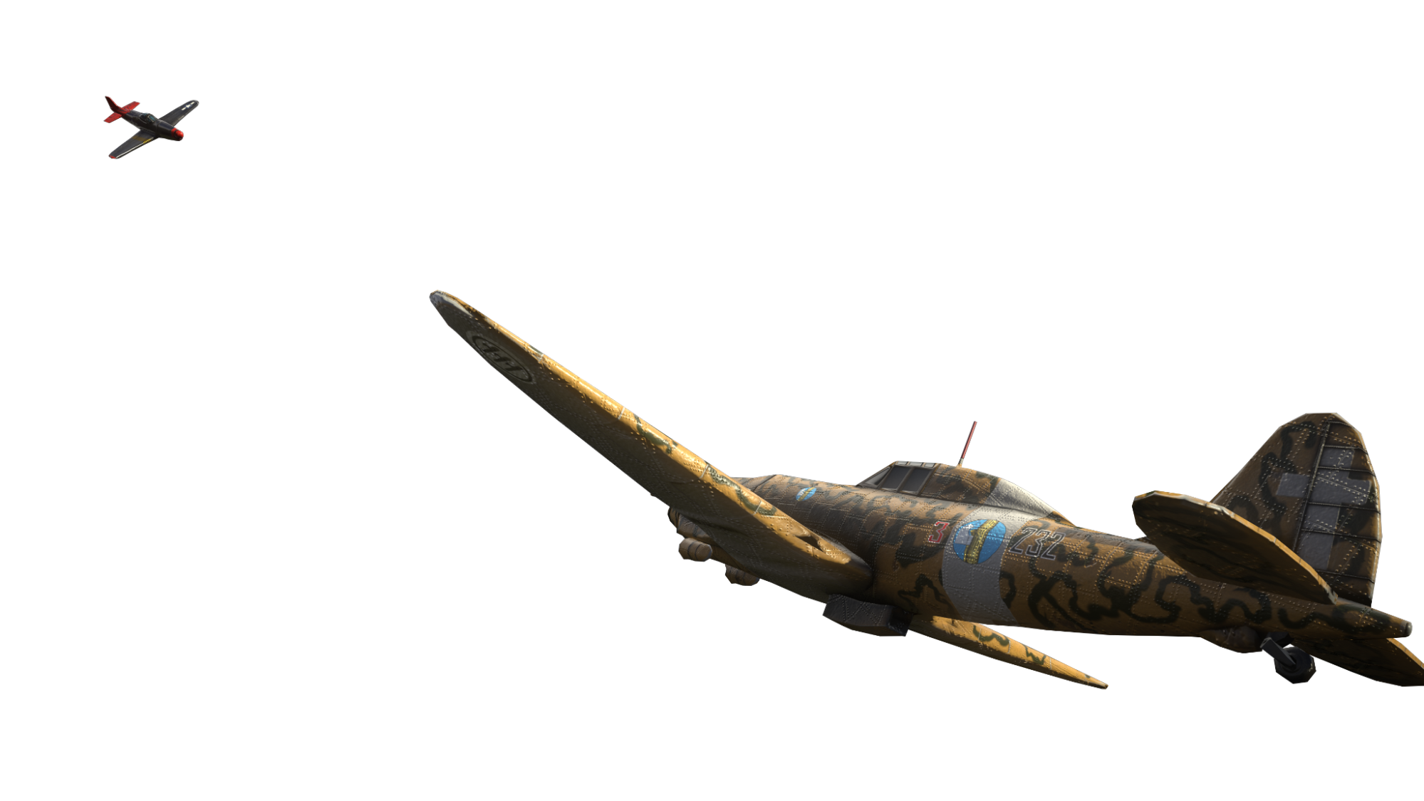
(3D render of the planes)
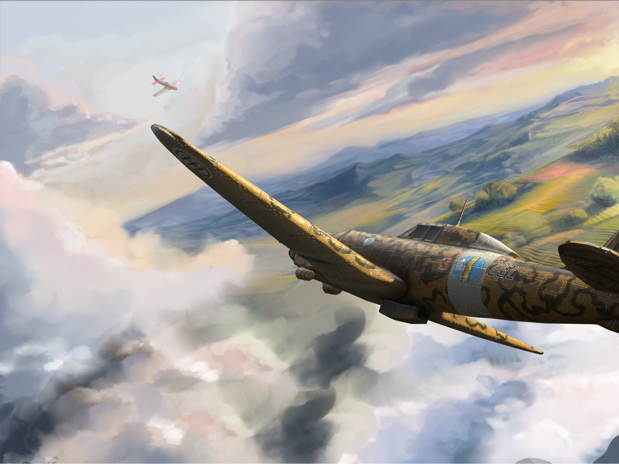
(3D render on top of WIP background)
What's needed now for the next step is to make the planes work together with the background as well as paint more details in the clouds.
I also need to add details such as motion blur to make the planes go woosh, which is a dilemma. How much do you paint before the details you put in get lost from said motion blur? Let's find out… the hard way 😌
Along the way, I also realised… what if we tilt the plane some more to have the wing cut through the cloud better.
Needless to say, I asked our 3D artist to tilt his model and render a new one which he so kindly did.
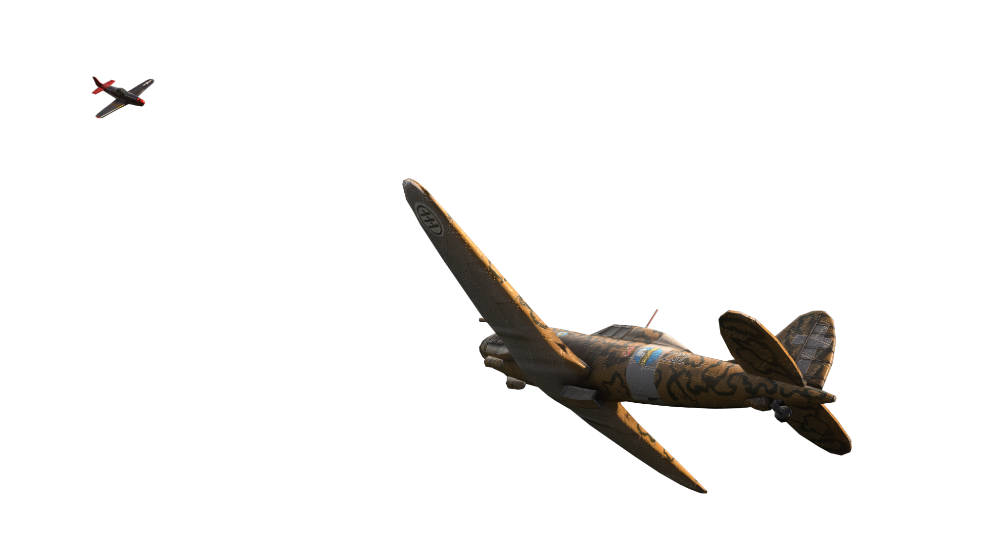
Looks nice 👌
But back to figure out the BG again.
After some back and forth with rendering in and out clouds as well as doing some touchup to the landscape I think I finally landed on something that I was happy with.
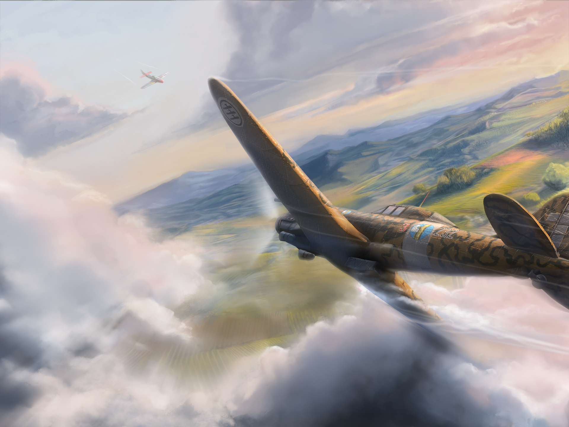
Adding motion blur, air trails, and a propeller as well as bounce-light and painting in the sky in the plane's window I think I made it work nicely together.
And the loading screen is done ✨
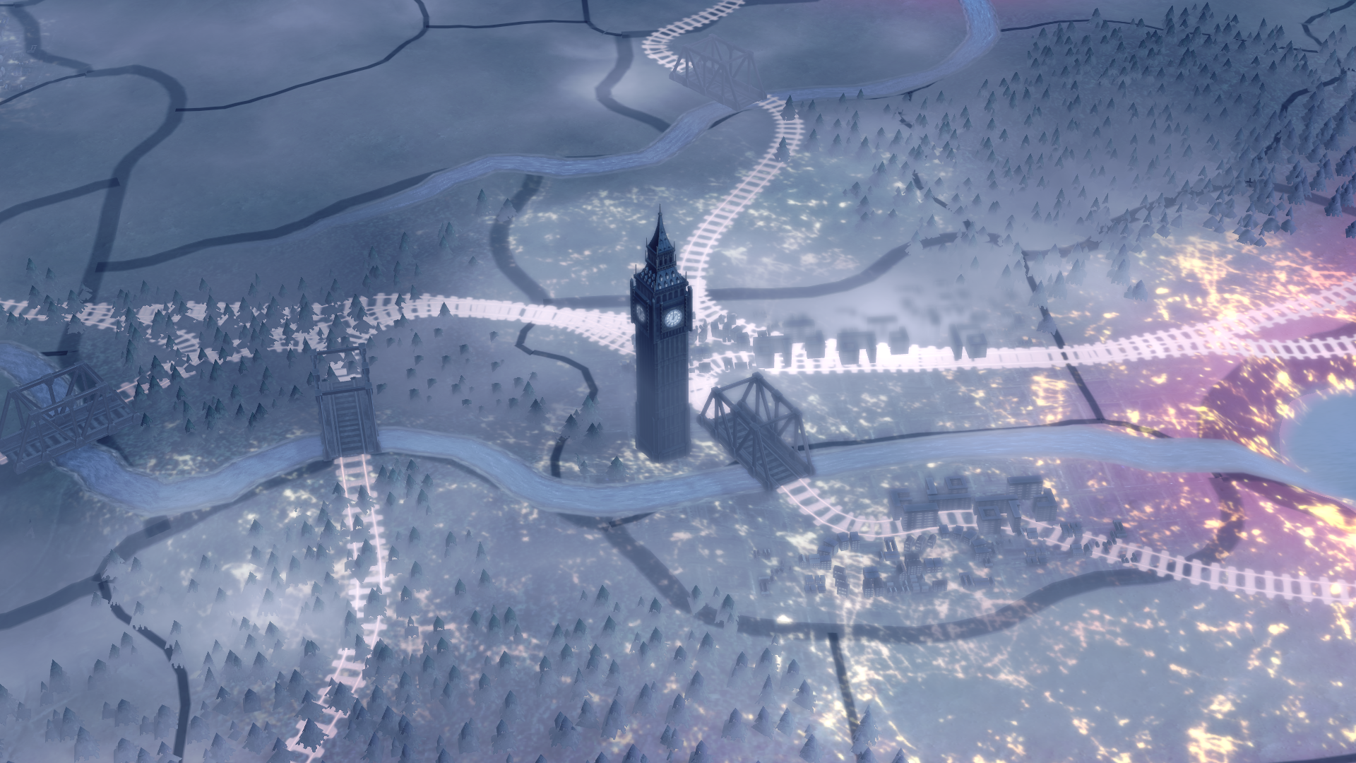
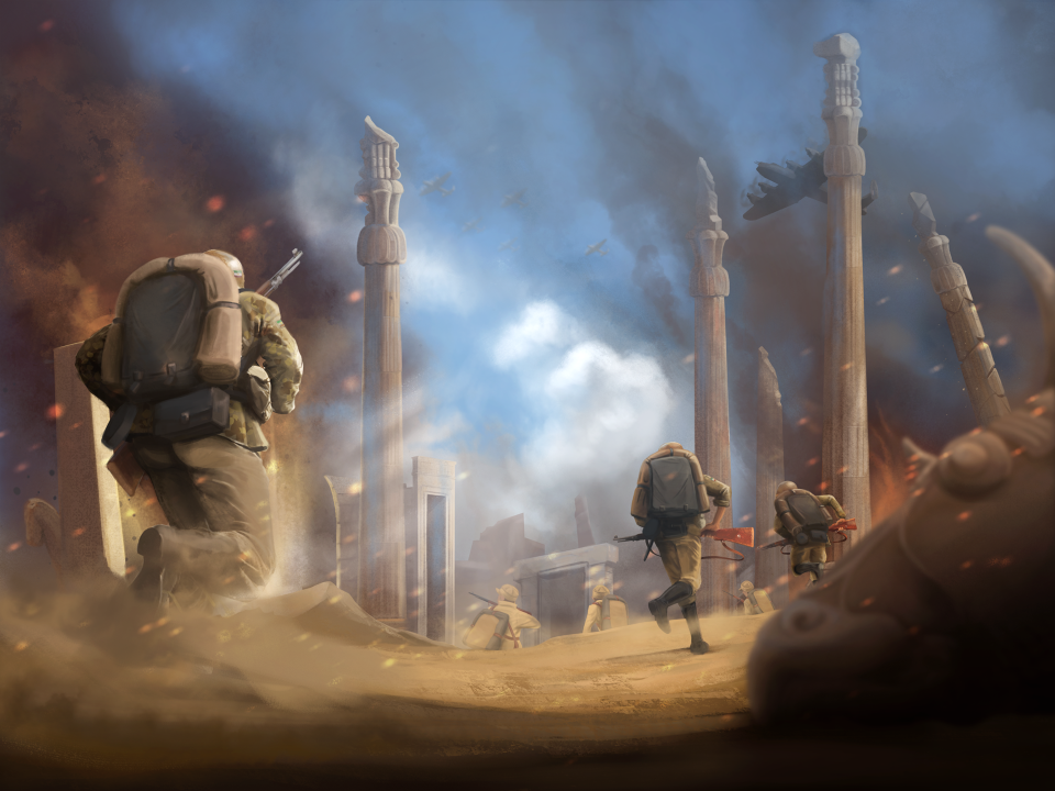
And now for something completely different! I was thinking that you guys might be tired of reading about the art process now so I’m just gonna drop a bunch of art stuff for you at this point.
Please, enjoy the small selection of what's to come for BBA!
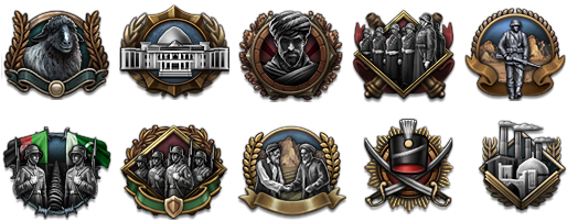
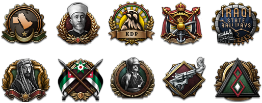
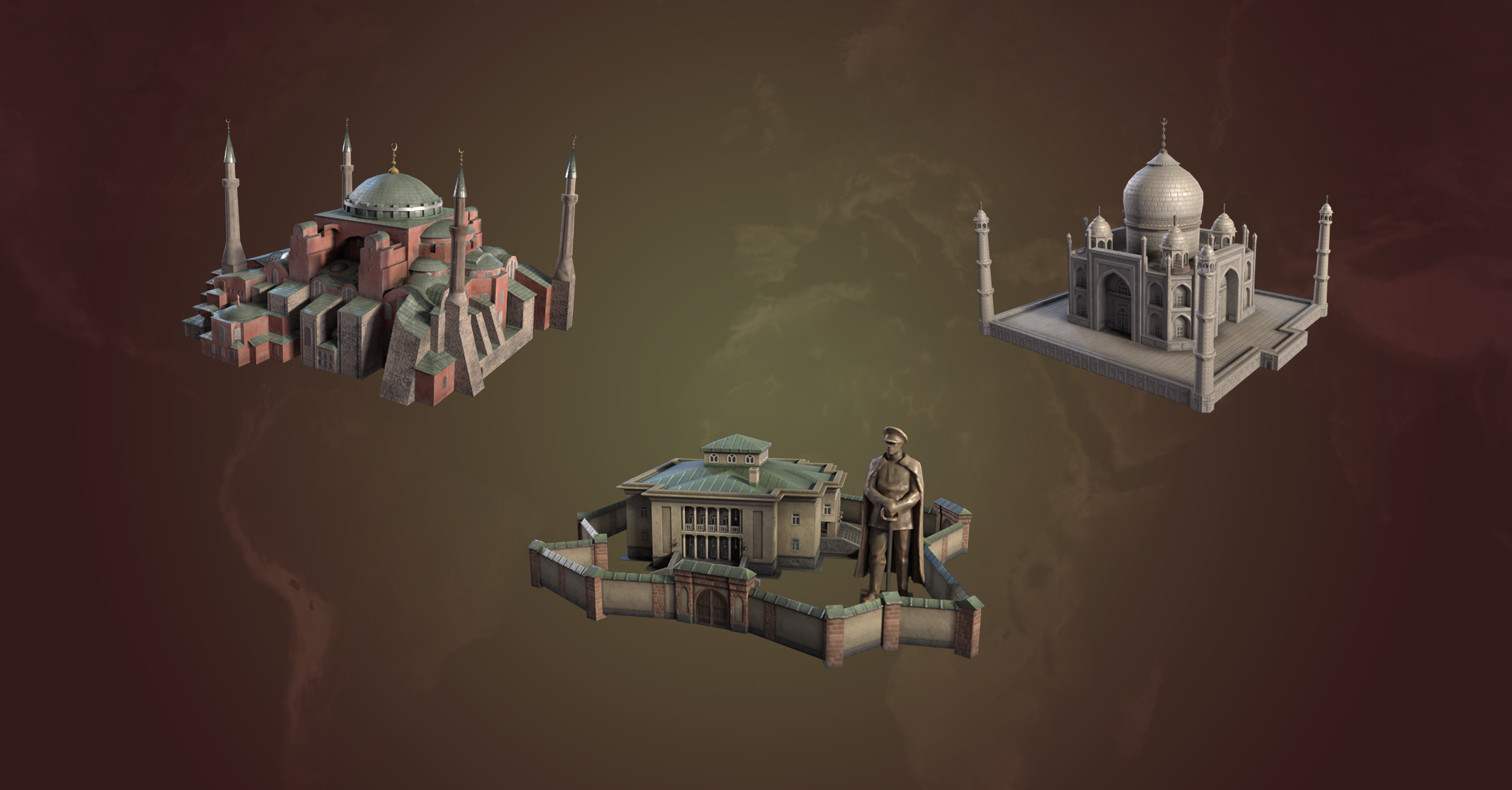
Cute misc icons:
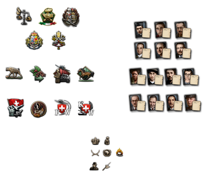
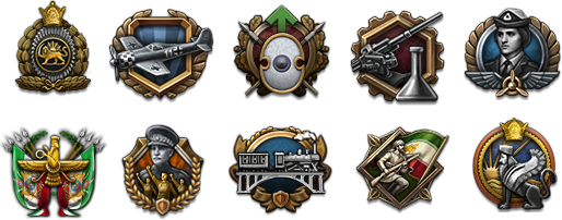
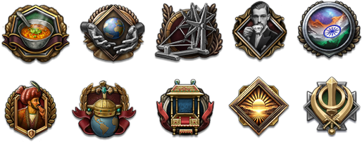
Focus icons:
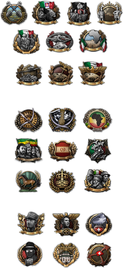
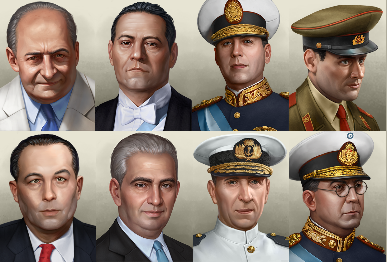
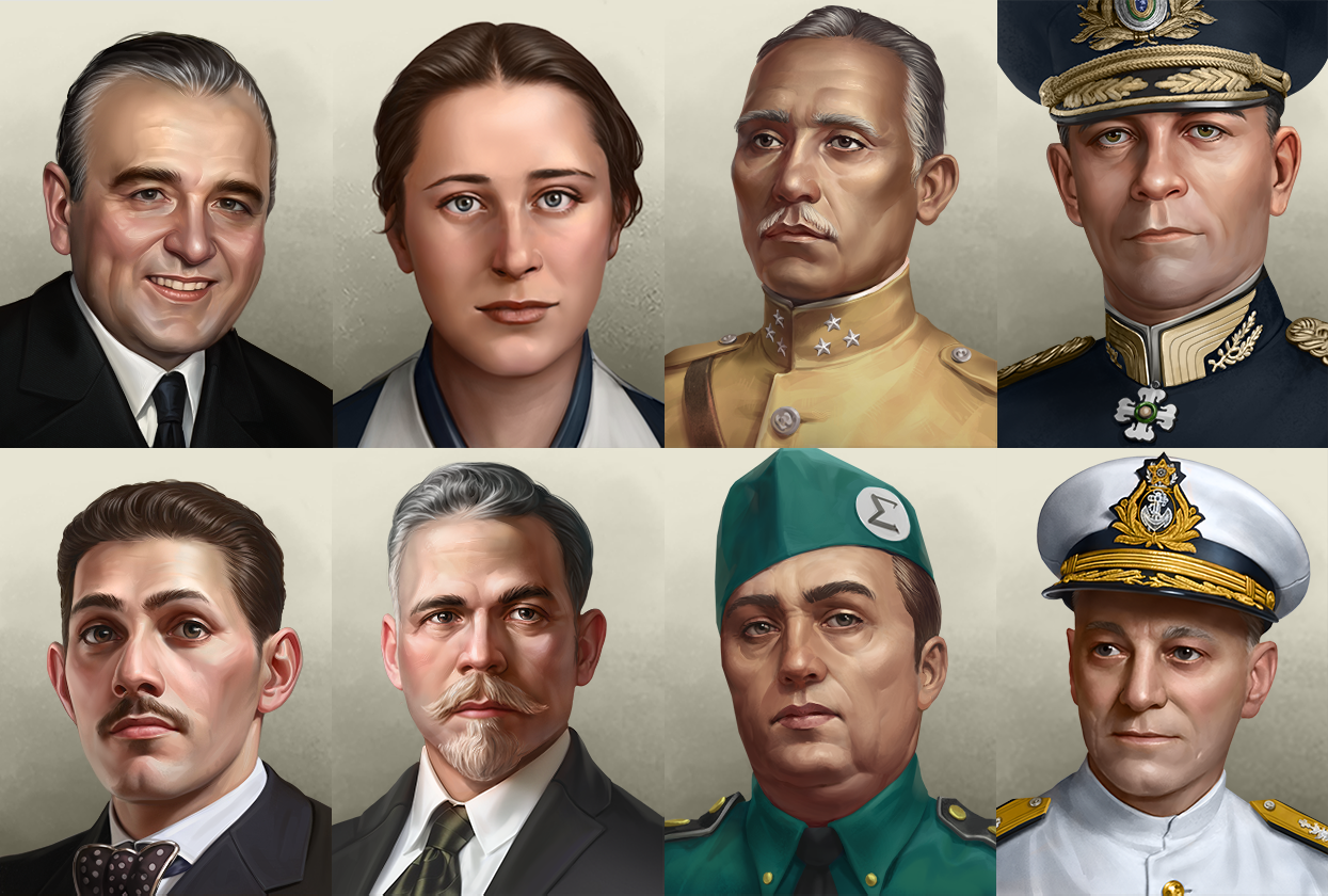
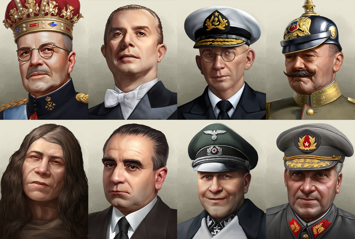
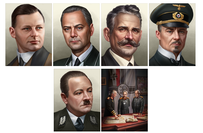
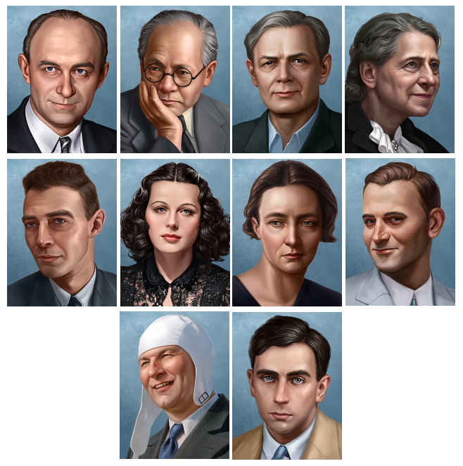
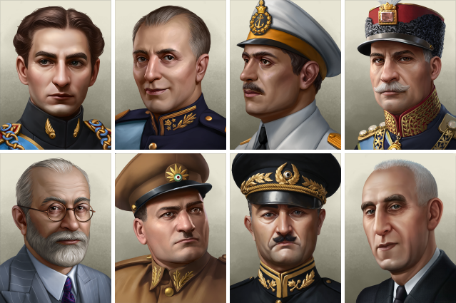
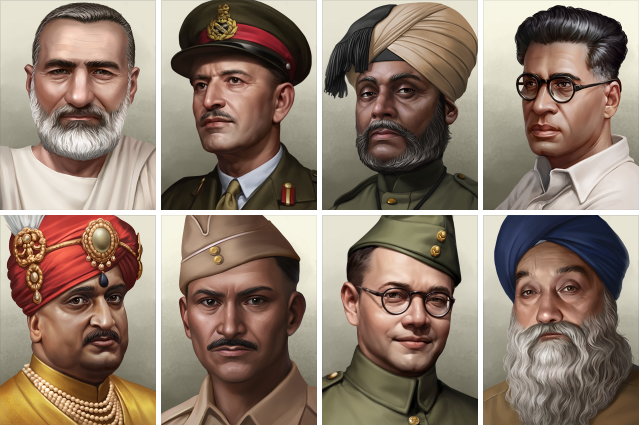
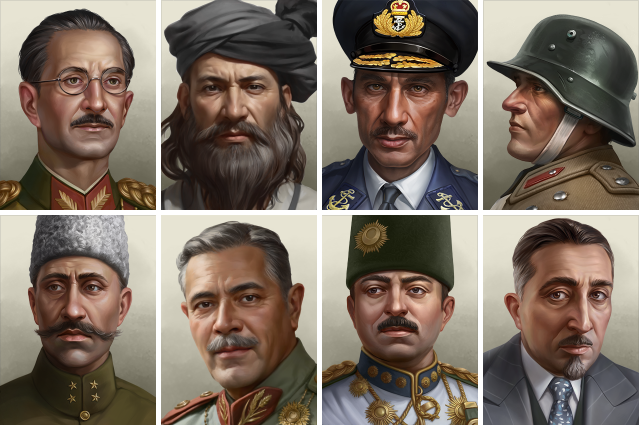
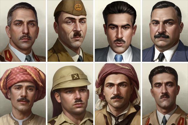
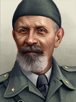
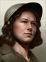
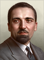
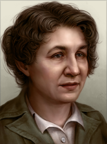
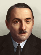
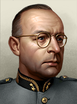
Portraits:
Italy:


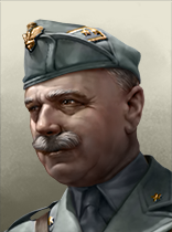
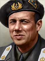


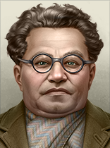
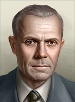
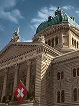
Switzerland:

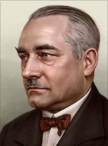
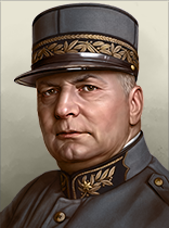
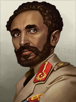
Ethiopia:
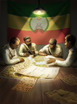
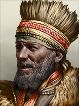

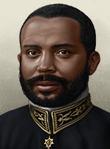
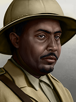
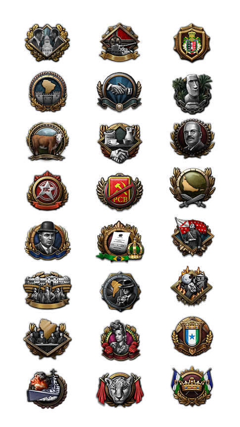
Achievements for BBA: Why yes, we can’t forget about the achievements for BBA now can we?
We always think about what type of achievement can be done for each DLC. This time around I hope you guys will have a few laughs and also maybe think “well that's easy” or “oh no… how?”
…and you get a canton, everybody gets a canton!
As Switzerland, have 24 states.

I’m not locked in here with you…
As Switzerland, declare war on Germany and win.

Swiss Cheese
As Switzerland annex 5 states that are not contiguous with each other or Switzerland.

You Shall Not Pass
As Switzerland, win a defensive war without ever losing Western Swiss Alps, Eastern Swiss Alps or Ticino.

The Lion that Roared
As Ethiopia, without being in a faction, force the Italians to make peace. Again.

The Lion King
As Haile Selassie, declare yourself “King of Kings” and control Kenya and Tanzania.

This time for Africa
As Ethiopia, found the African Union and have it encompass at least 13 different countries with capitals in Africa.

Crusader Kings IV
Take Jerusalem as Ethiopia and move the capital there.

The Red Sea
As Ethiopia, go communist and take all the states that border the Red Sea.

Holy, Roman, and an Empire
As the Pope, restore Rome.

Pizza Time!
As Italy, occupy New York, Chicago and Hawaii.

Collect all the Romes
As Italy, continue holding onto the First Rome, and gain the second and third Rome.

Nothing personal, Adolf
As Italy, take Austria before the Anschluss and never enter a faction with a fascist Germany (before 1945).

Not today
As communist Italy, save Gramsci from the brink of death, make him the leader of Italy and form the Italian National Union.

This time it will stick
As any Allied Nation (in faction with a democratic Britain), enforce a peace deal on Germany that disarms the Rhineland and makes it a demilitarized zone.

By Beer Alone
As Germany, control Budweis, Tsingtao, and Guinness directly or through a faction member.

By merit alone
Promote a Unit Commander to a general, and reach max level.

Snakes on a plane
As Brazil, capture Rome with paratroopers.

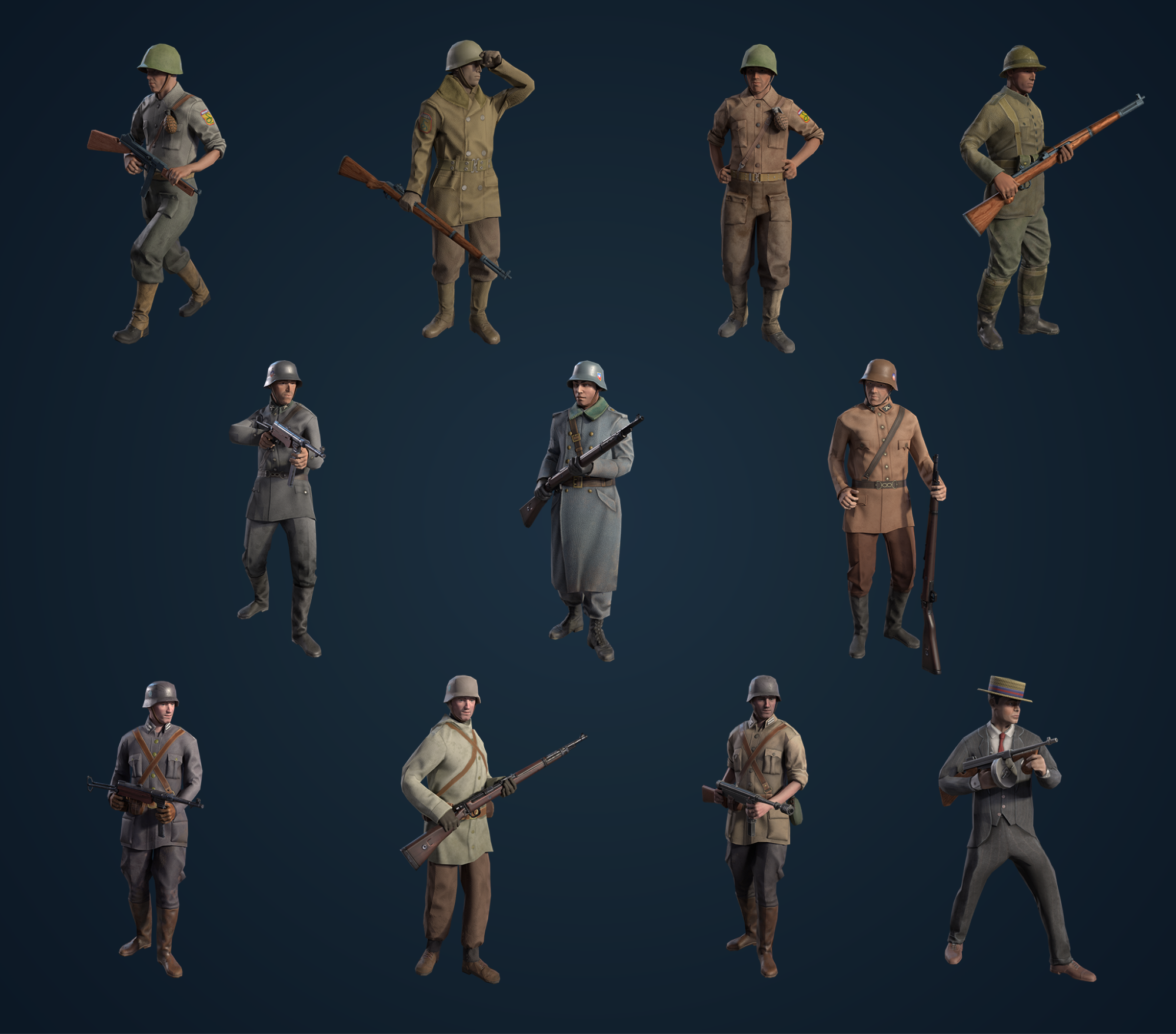
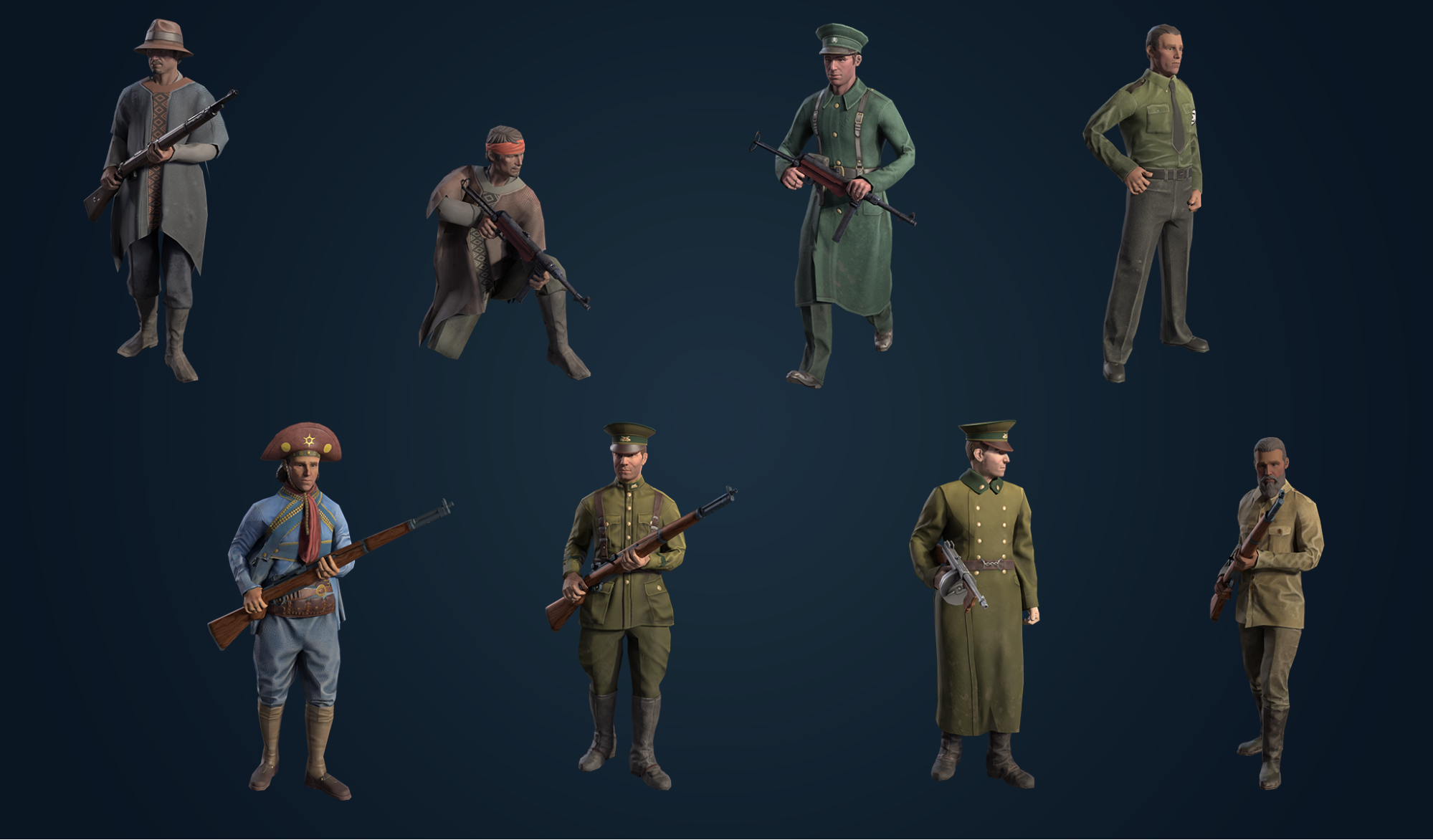
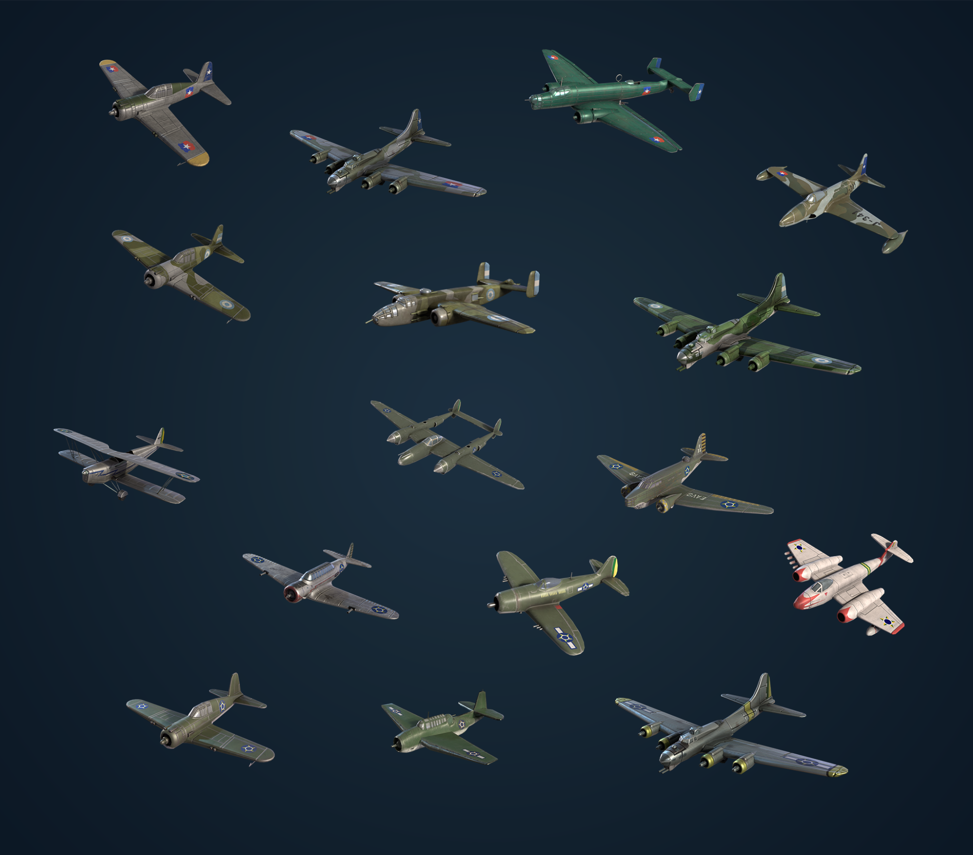
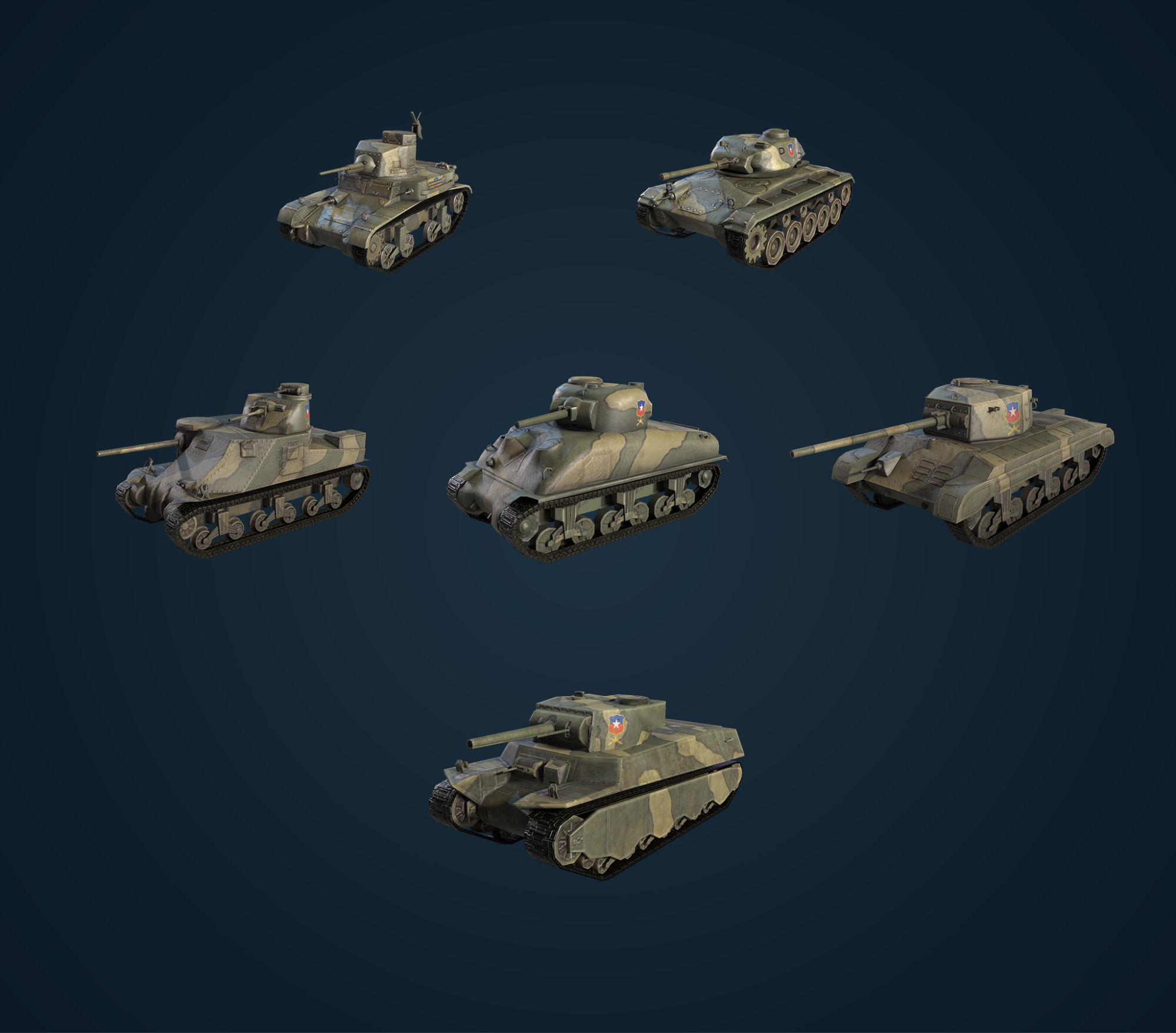
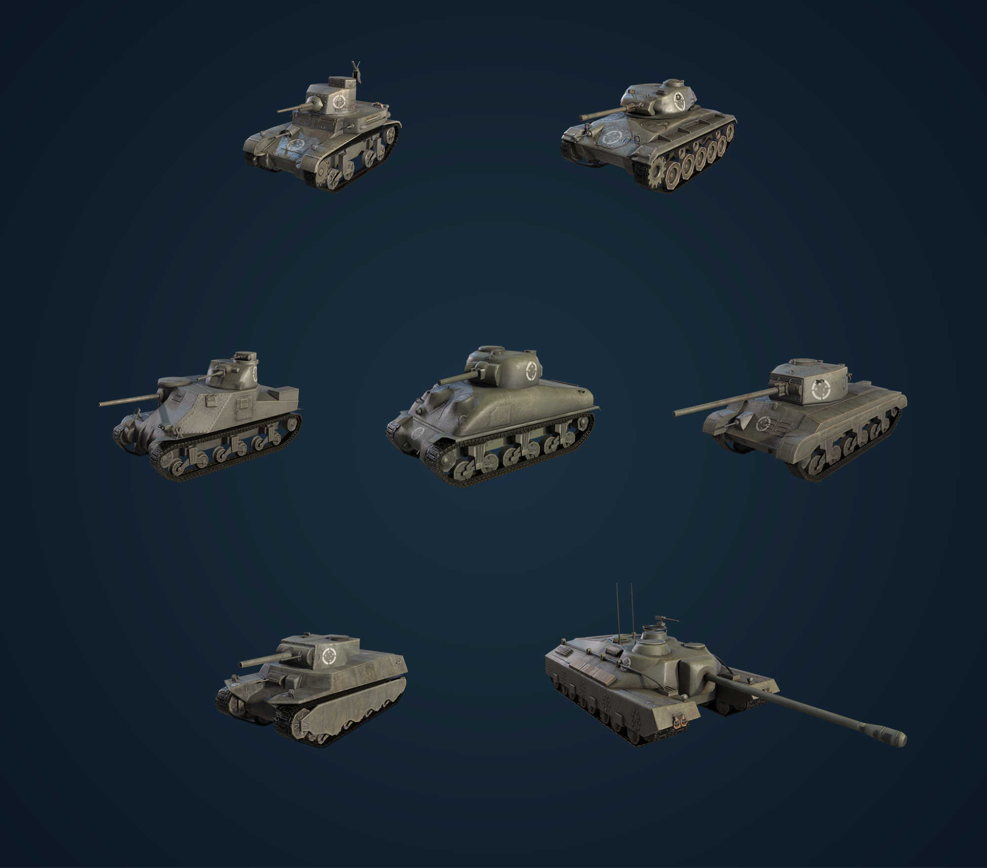
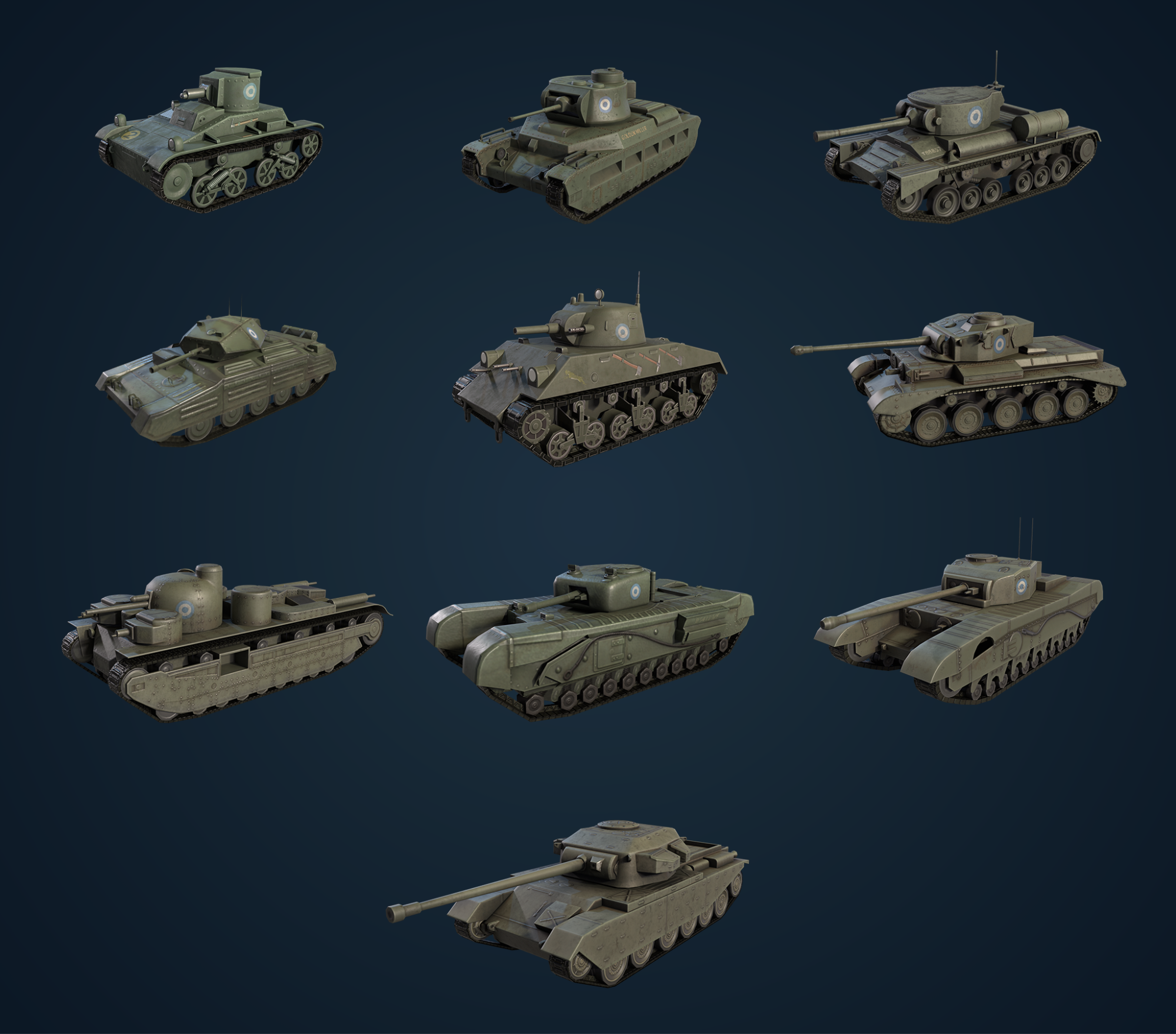
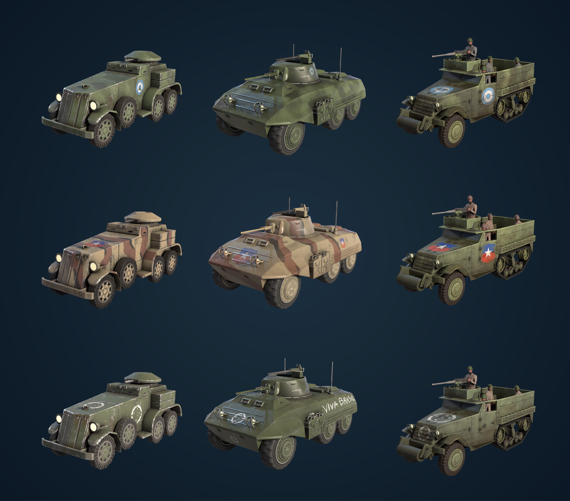
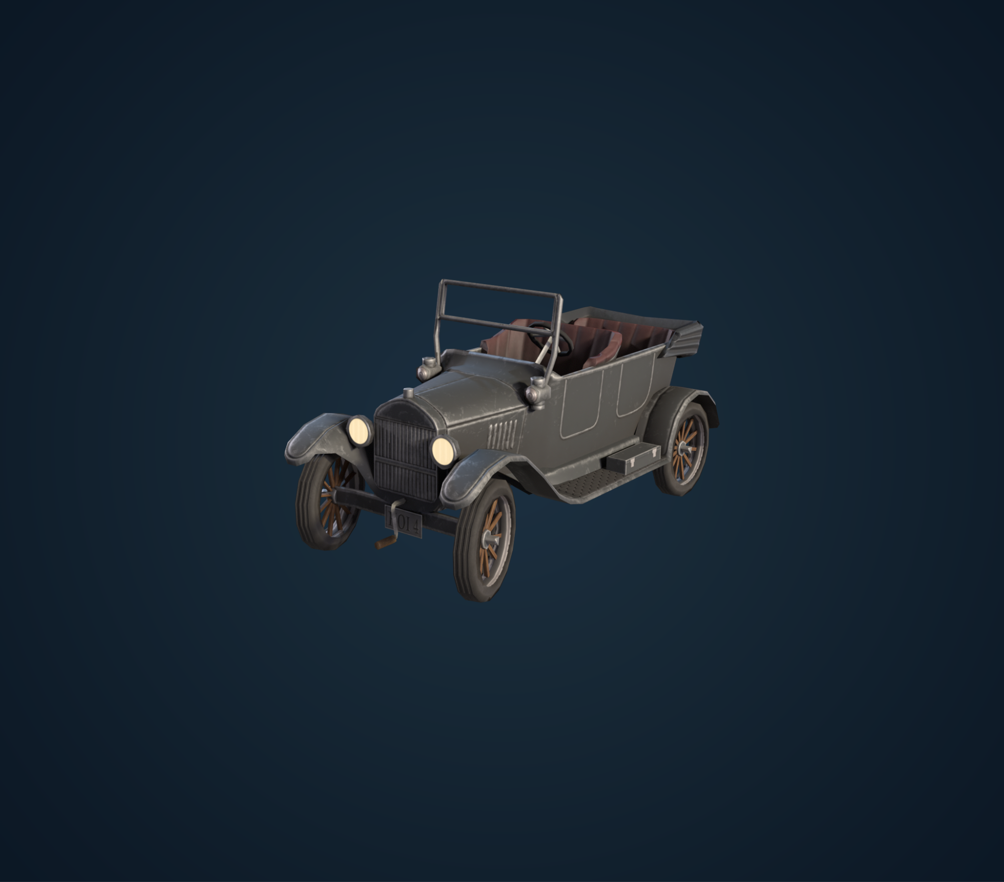
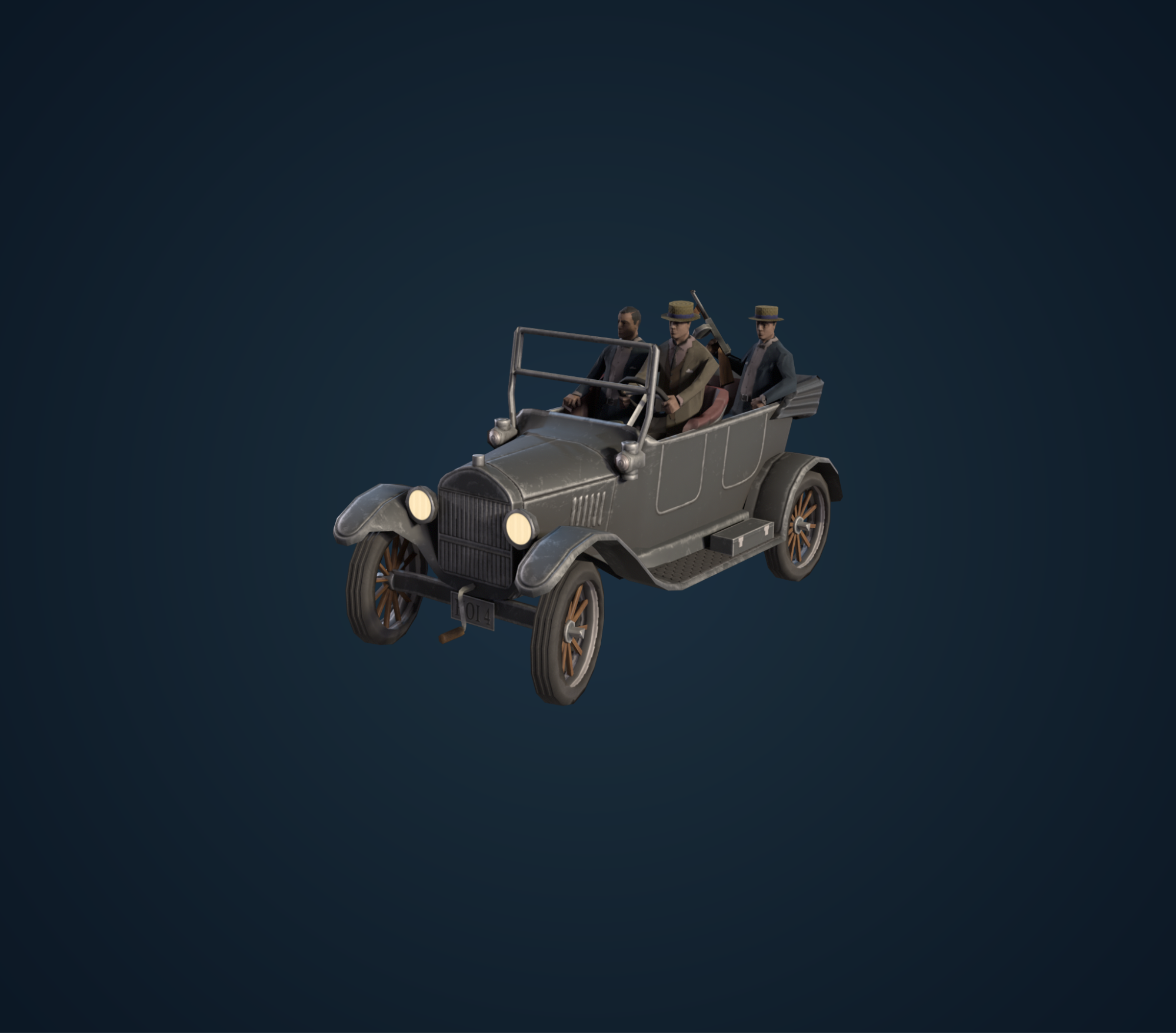
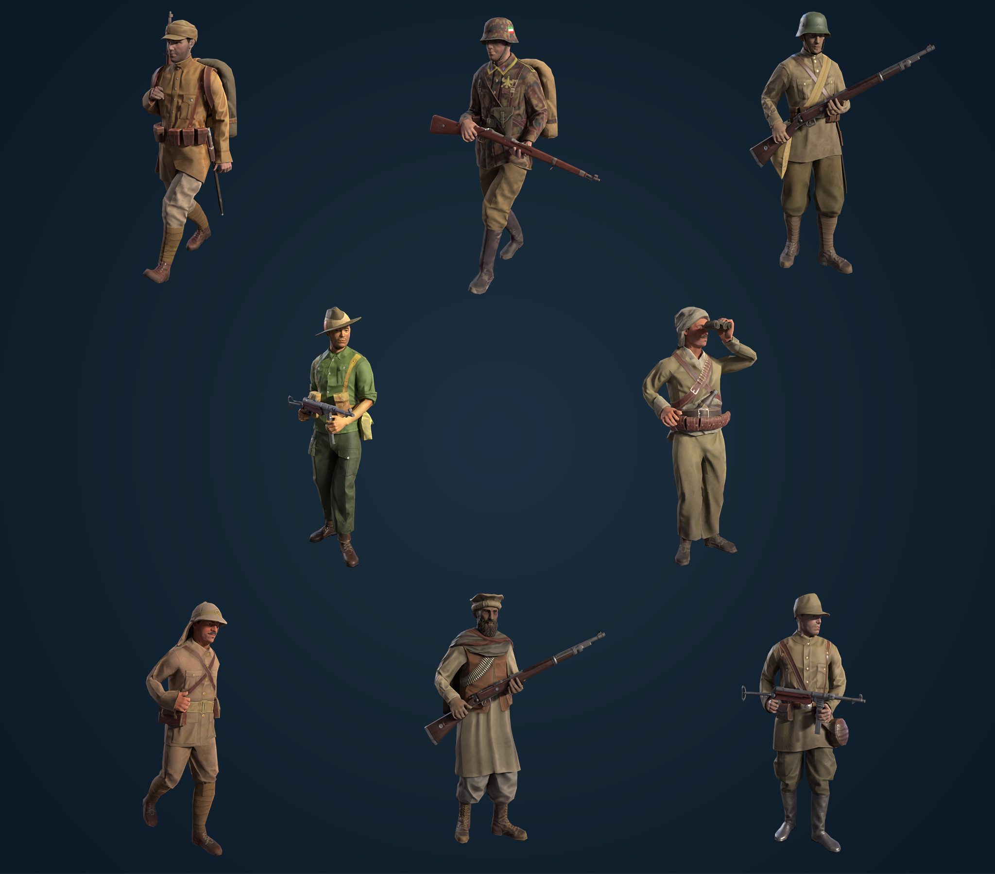
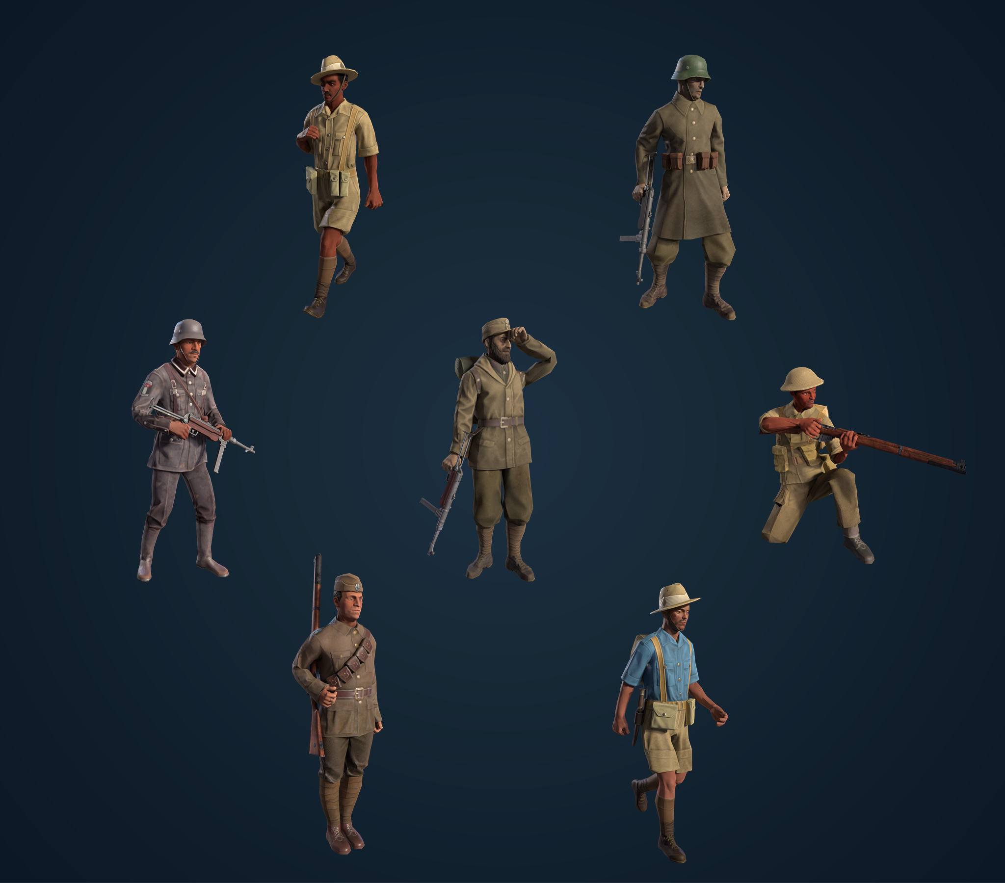
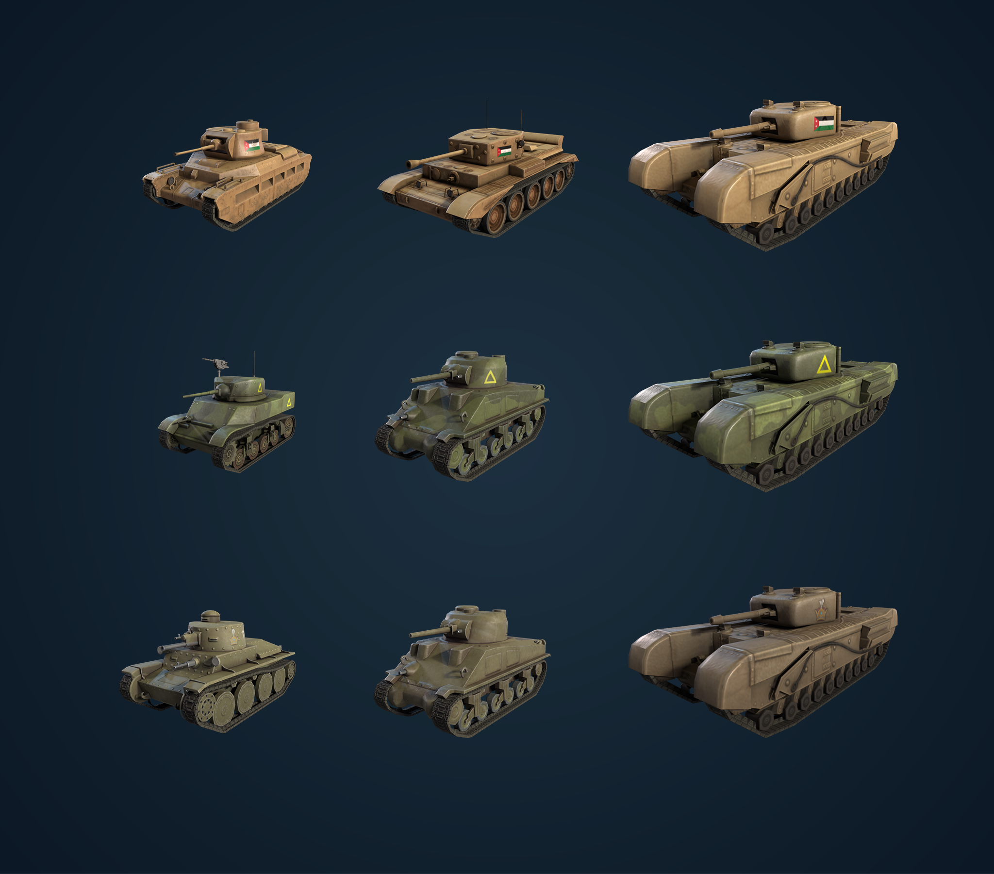
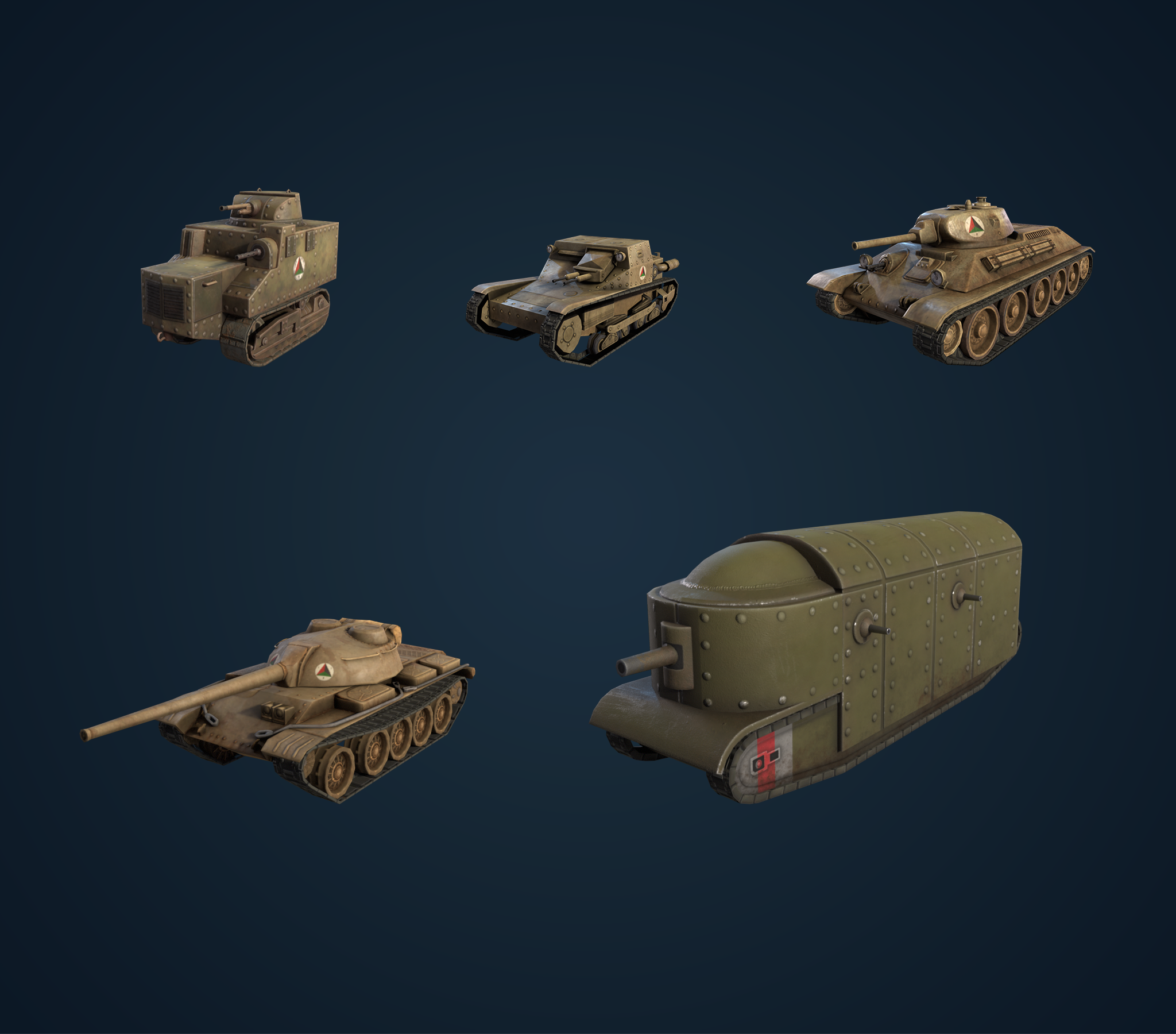
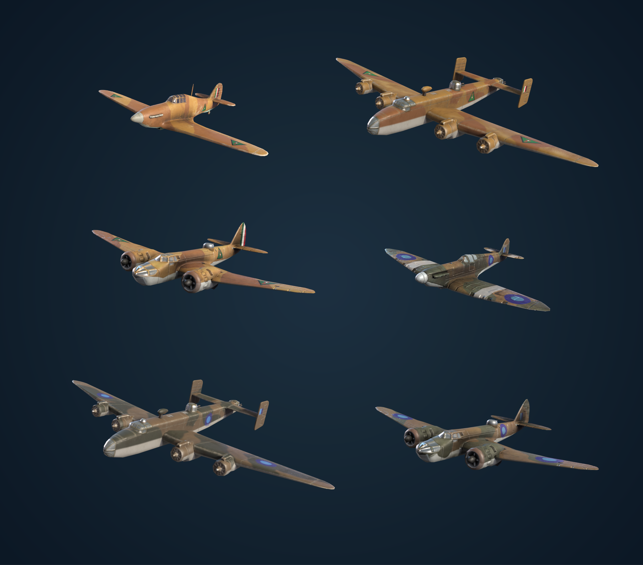
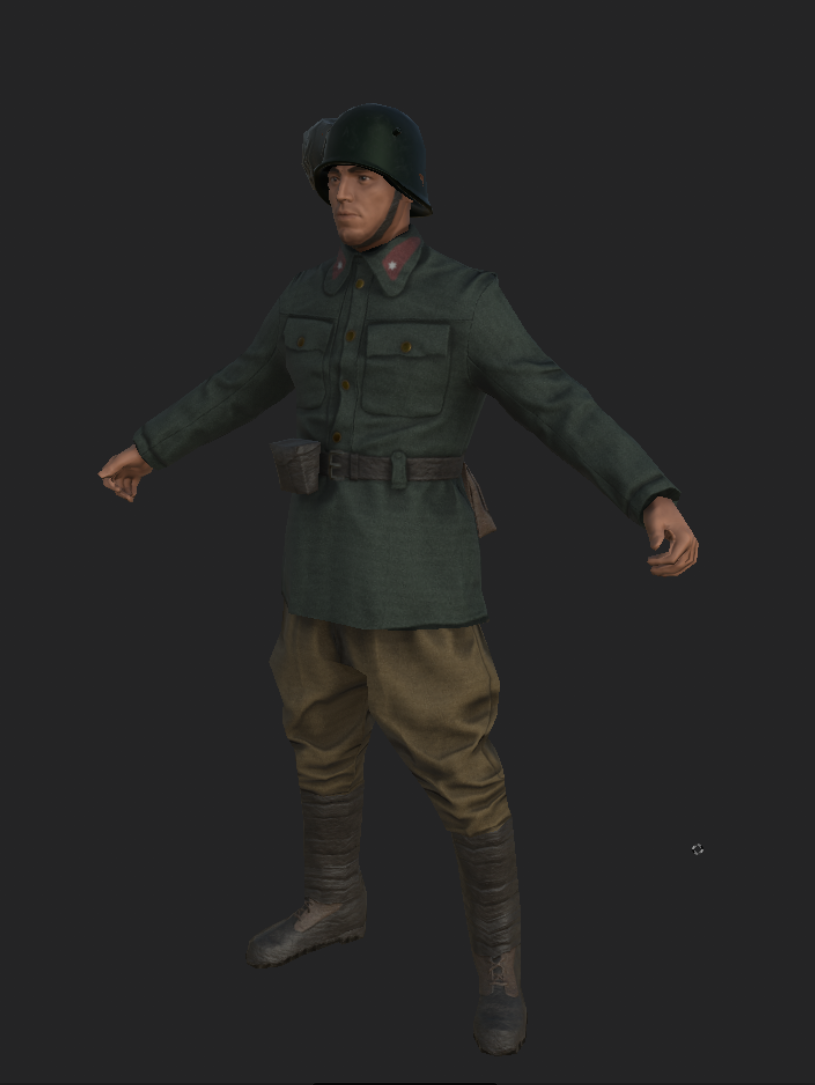
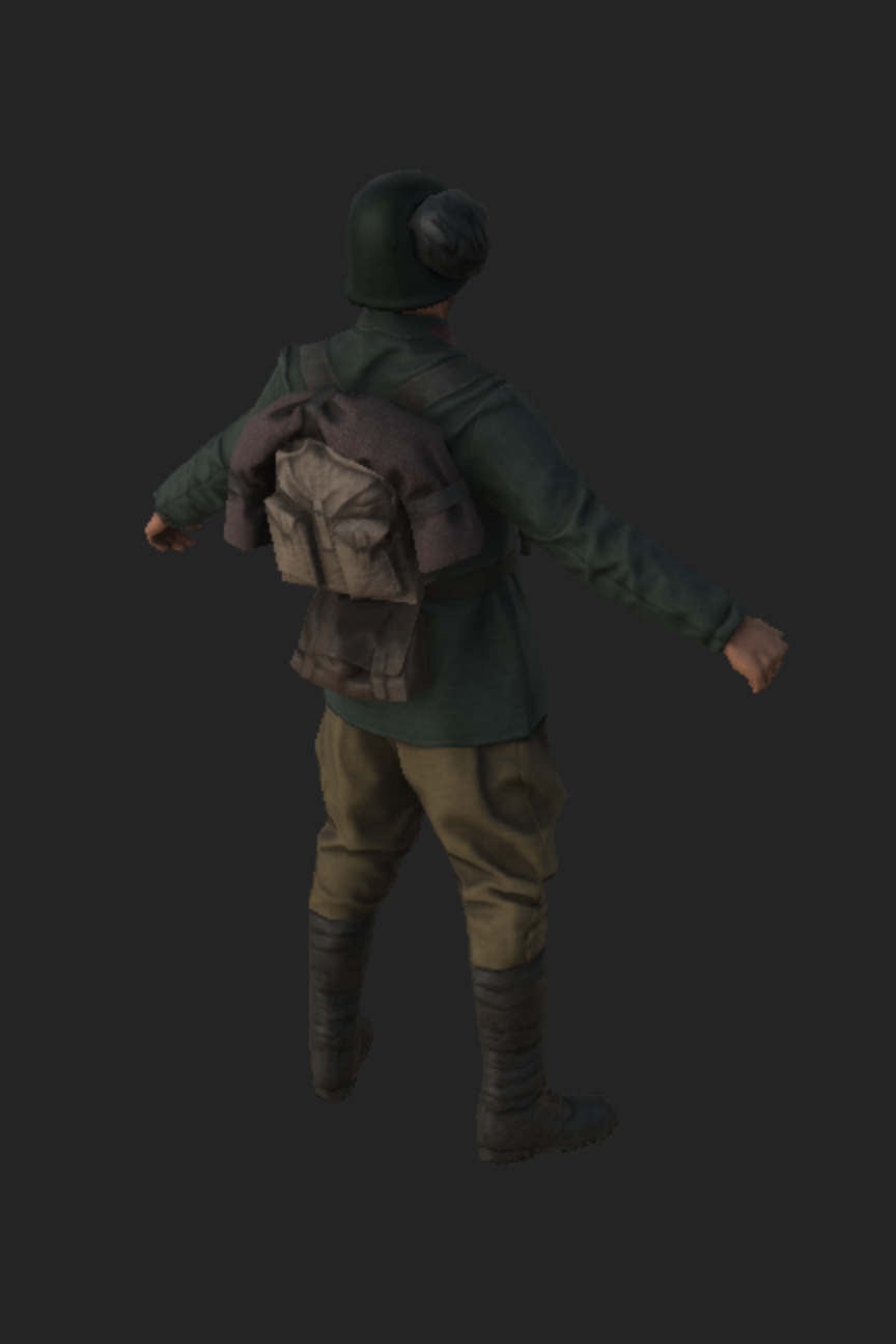
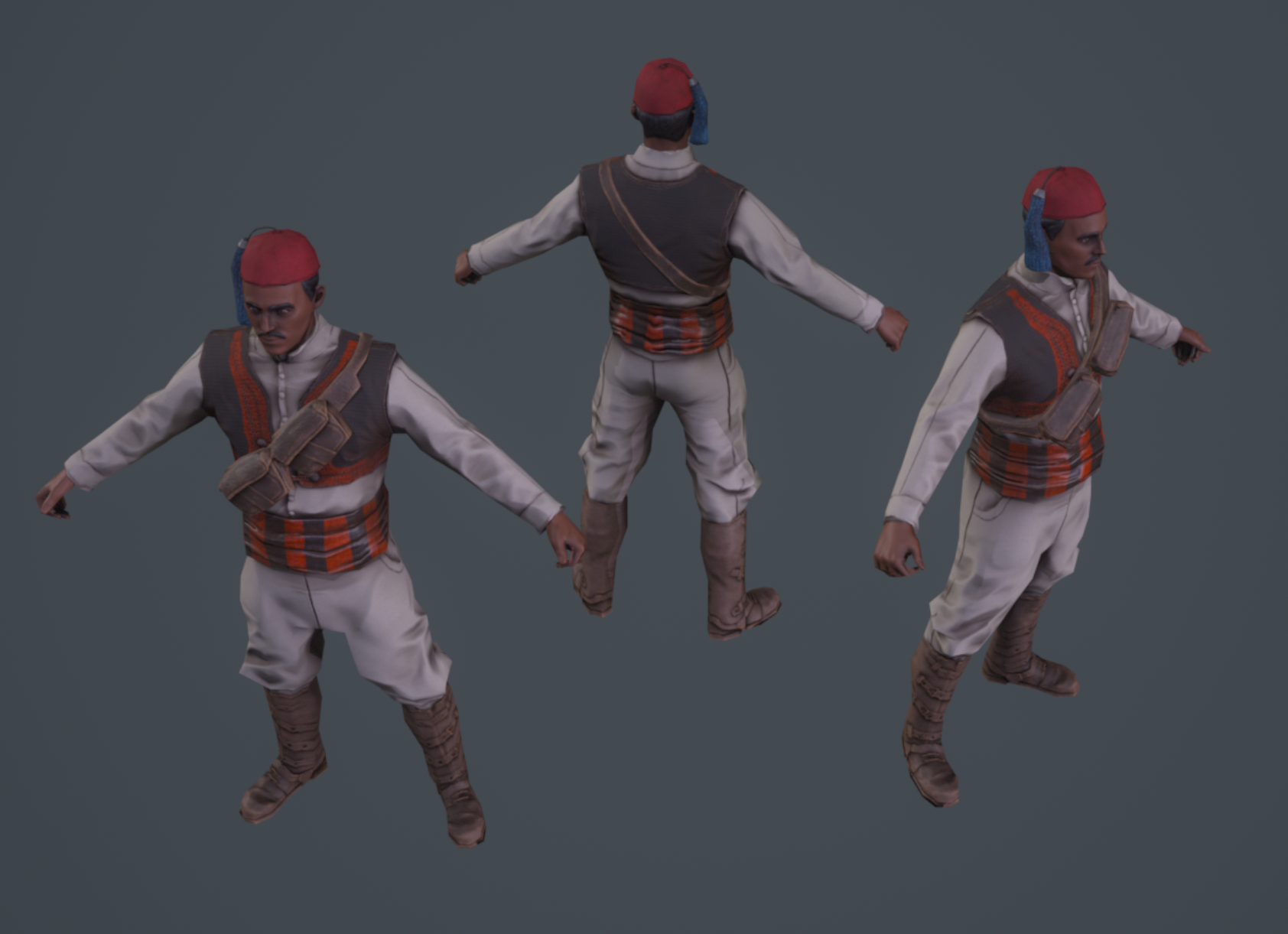
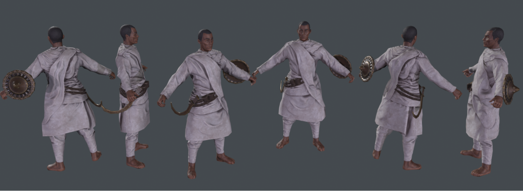
3D art for BBA: Of course, we need to show, last but definitely not least, the 3D art that was made for BBA \o/
(some are still WIP 🤫)

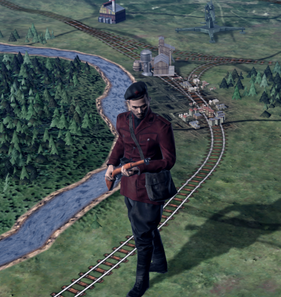
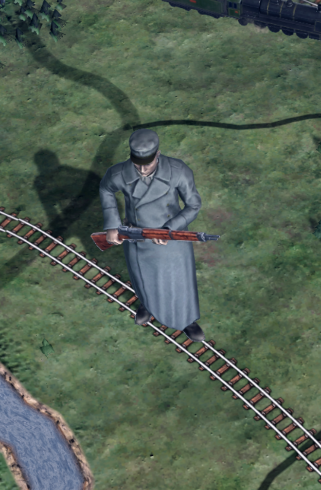
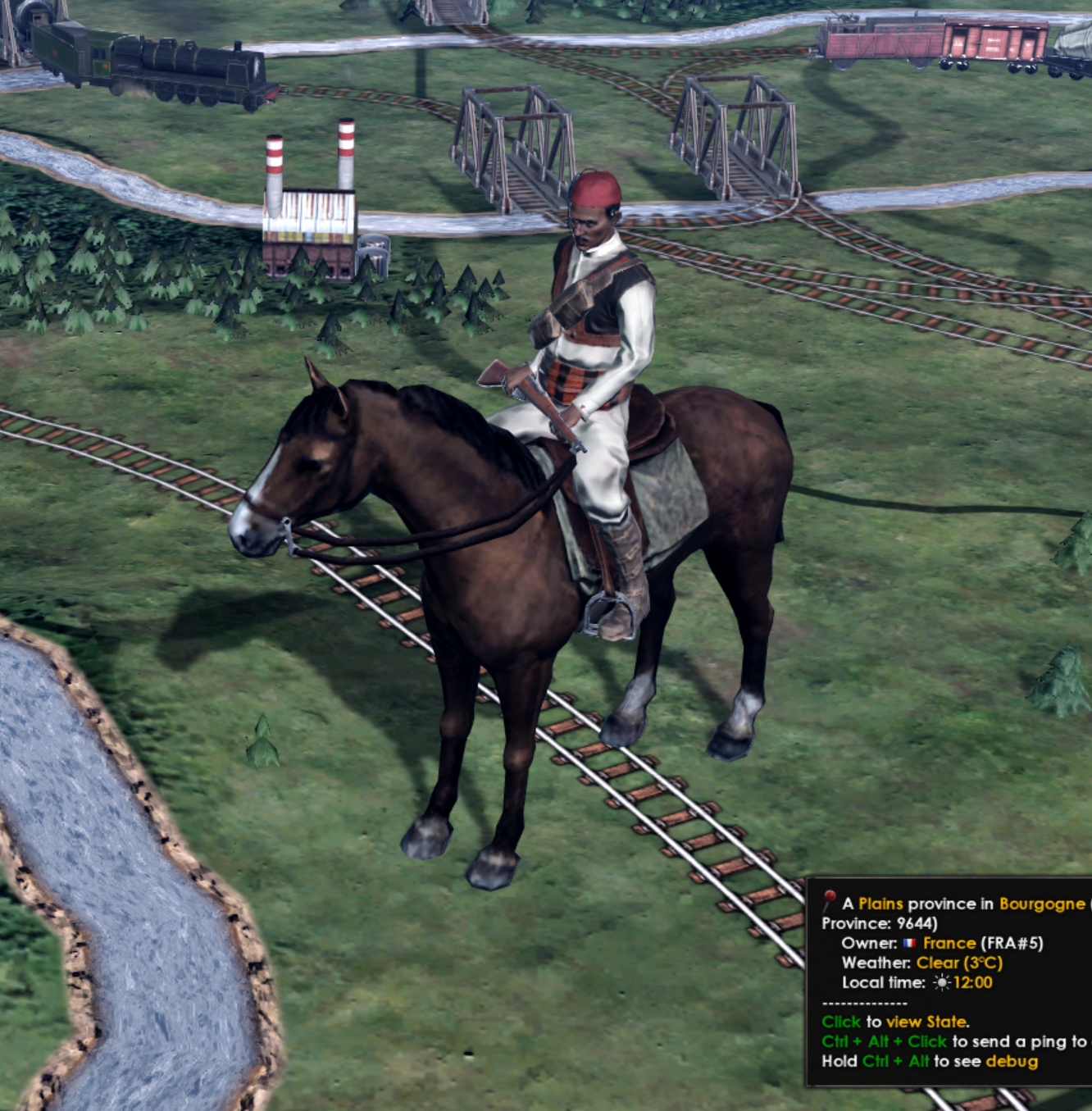
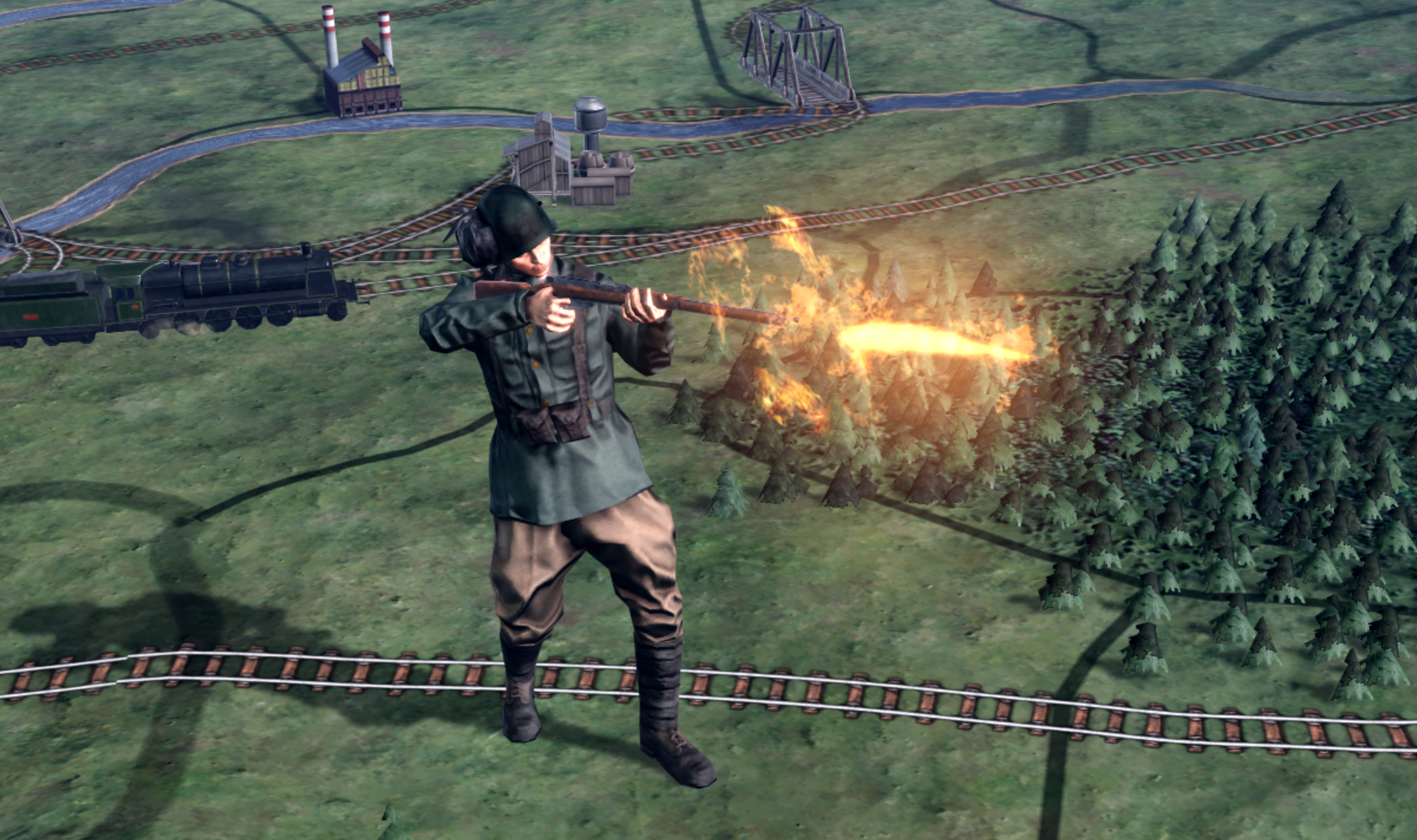
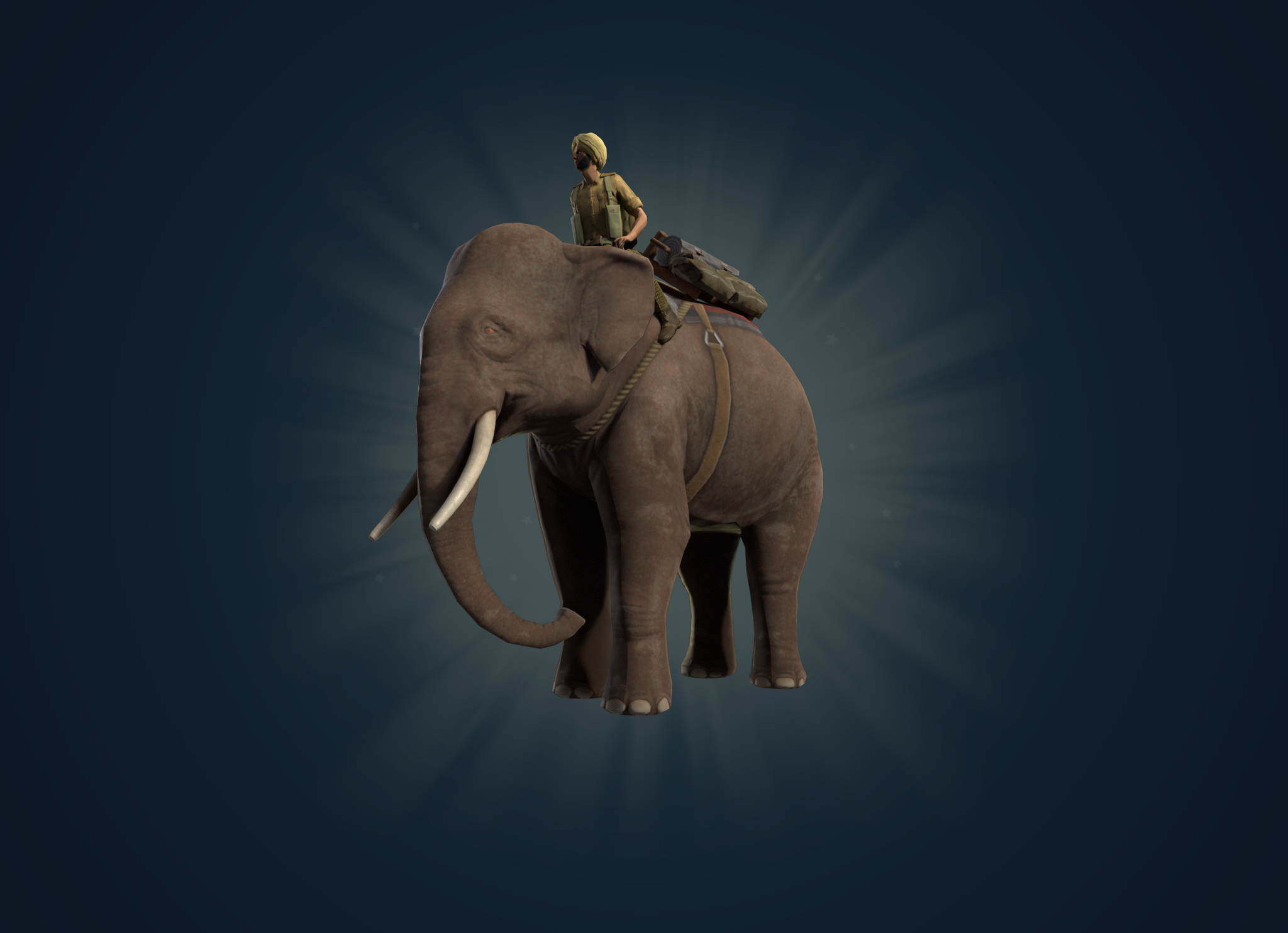
T-posing soldiers o7


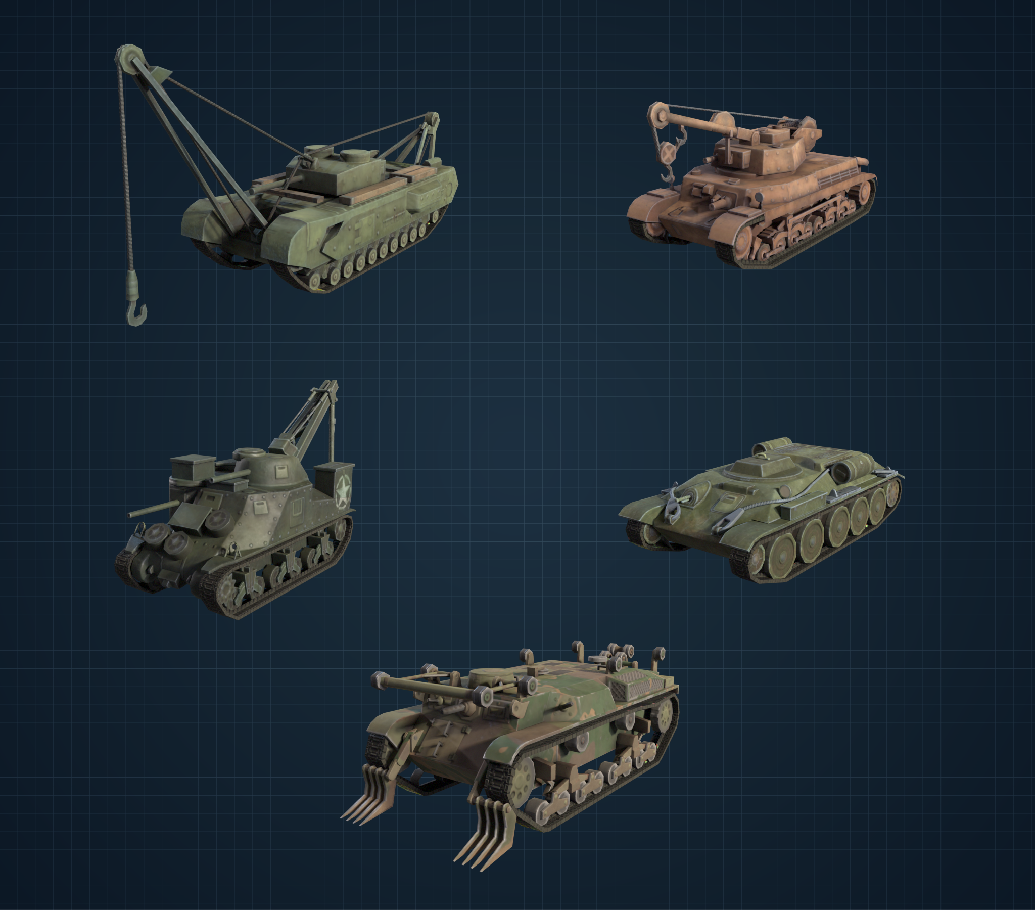
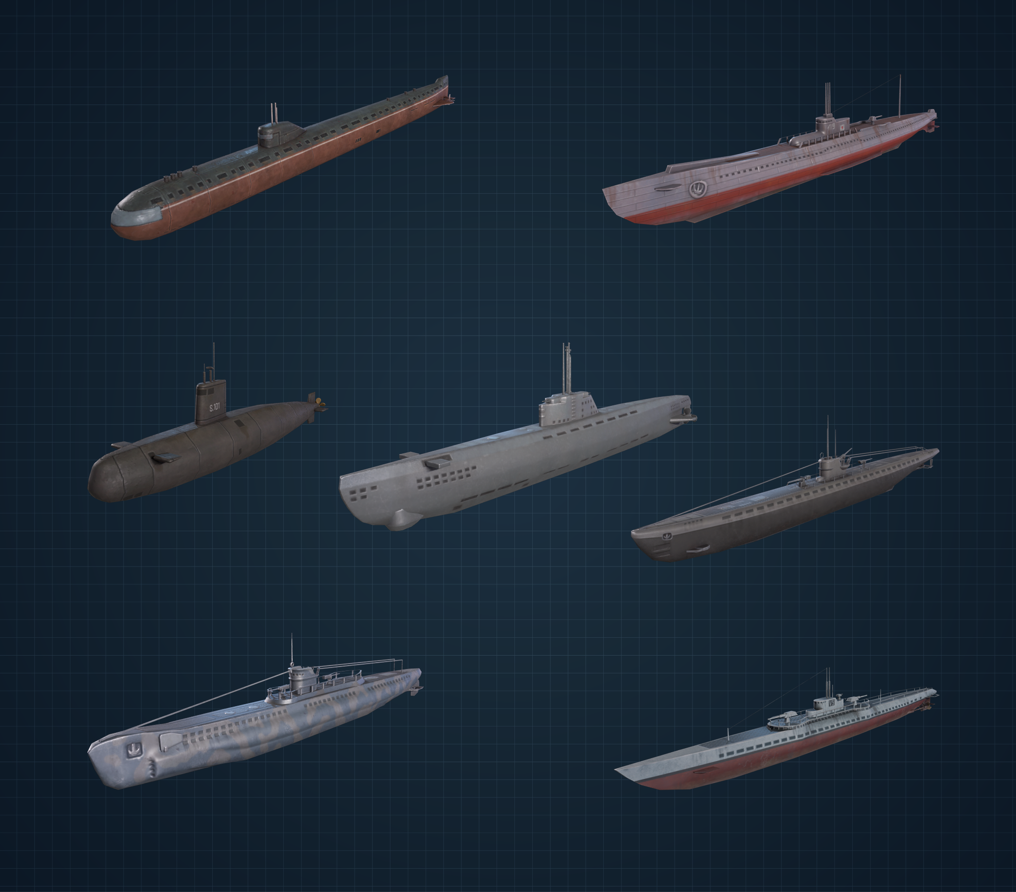
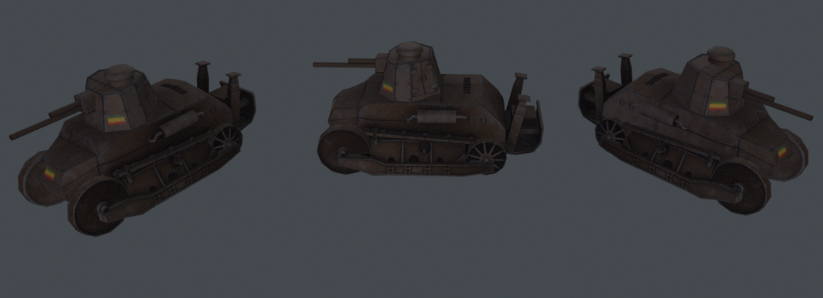
Cute tanks ❤️

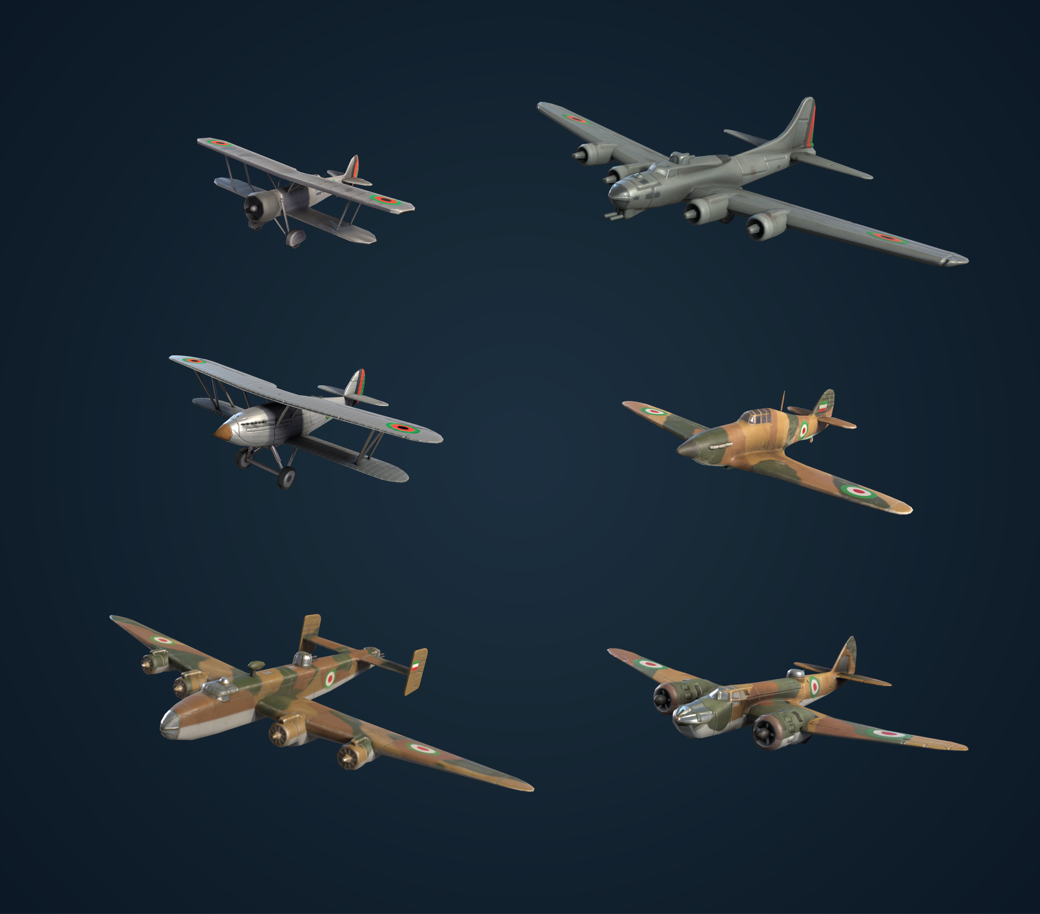
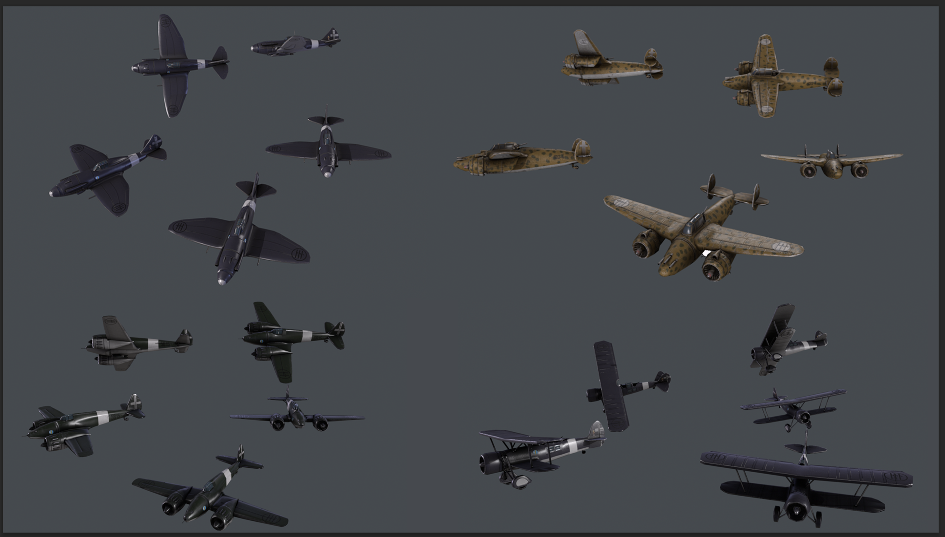
Adorable planes 🛩️
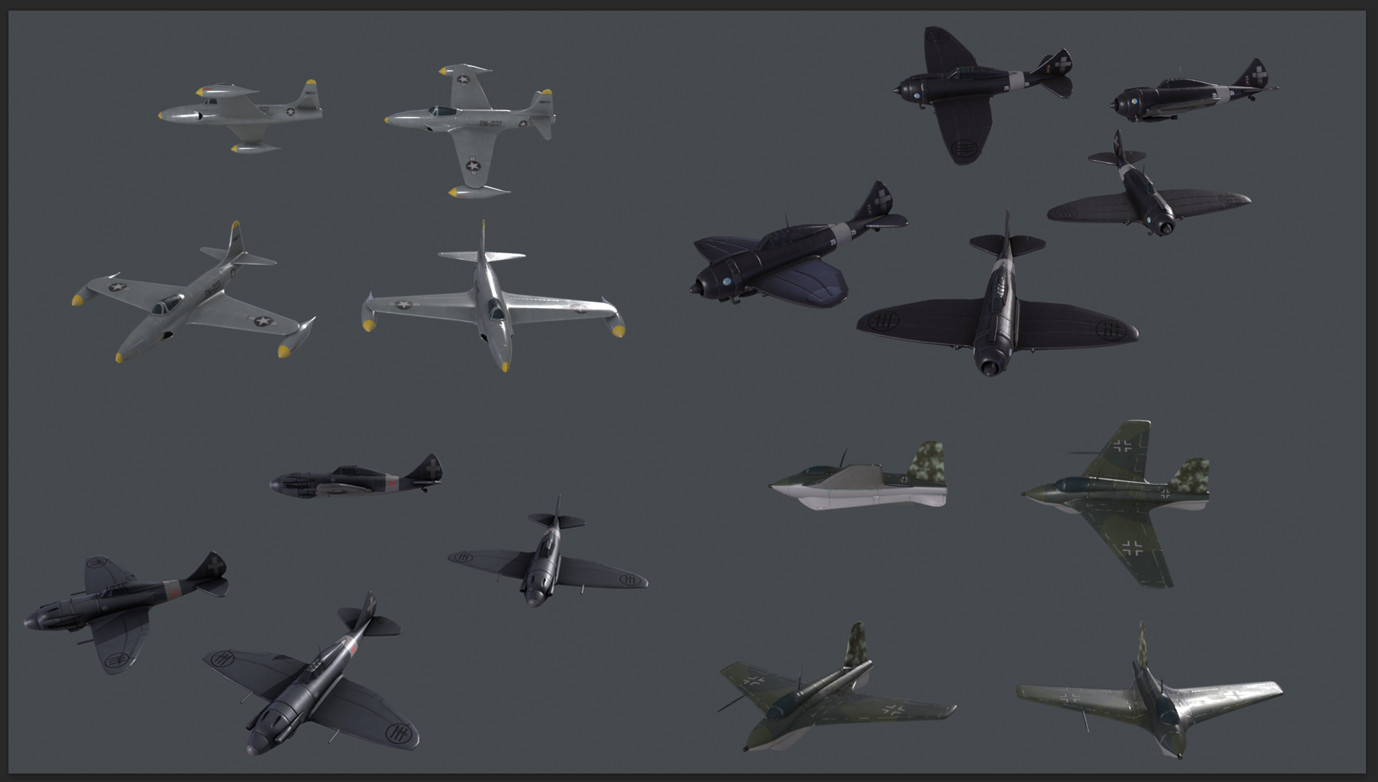
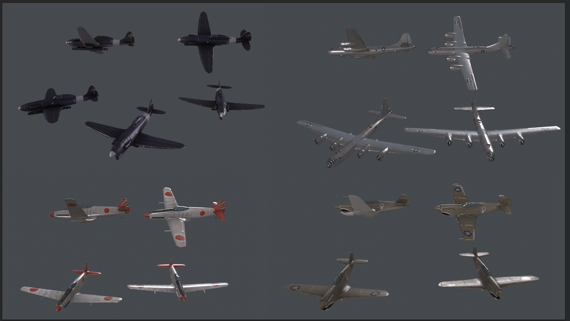
And with that, I’ll wrap up this week's, and last DD for By Blood Alone!
Thank you for hanging around for this long, I truly hope you enjoyed getting a peek behind the curtain of a HOI4 production!
/CreamGene
{LINK REMOVED}
I am HOI’s 2D artist and am the one who makes the little buttons, icons, and whatever gets thrown in my way for you to look at and push on, and today I have gotten the opportunity to talk about my work!
So let’s start at the beginning, how does a project start, and how and when do artists get involved?
Being an artist on a project such as Hearts of Iron is not an easy piece of work. You need to be on your toes and ready to adapt to whatever task your colleagues want help to solve. It usually involves a bit of text and a ton of reference material. And to gather all of these things we use a tool called Miro.

It’s essentially an online whiteboard that can be used however fits you and your team best. On our Miro, we separate the features into columns that give you a quick overview of what we need to complete for the upcoming update.
The columns are usually divided into Focus trees and Features that are expected to get art during the project.
As the project starts it’s not uncommon for the Miro to be a bit empty. A lot of the research for what can be used, artwise, is a pretty heavy task to bite into with all copyrighted photos out there. Our amazing content designers spend quite a lot of time on valuable research, sorting out what is necessary for the game to make sense as well as adding flavour to your gameplay. And yes, this takes a fair amount of development time to gather all this valuable information as well as imagery that will communicate the right thing for you when you play HOI.
As time goes on, more art tasks will fill up the Miro board. So, for an artist at the beginning of a project, it can range from doing some cleanup work on older icons or portraits, starting to work on loading screens, continuing setting up the Miro board for the DLC to their taste or helping with another project that needs some extra art-hands.
But back to BBA and our work there!
We already know what kind of art we want to have for each focus tree, it's more the quantity that is a fluctuating number at this point and it's still uncertain how much we can make in-house. I always try to convince my CDs to ask for art to their heart's content because we always prioritise what needs to be done so the things that matter the most get the art it deserves first.
When all High Prio art is done, if time allows we continue with Medium and last of course the Low. We also have, for whenever we manage to wrap up art in a timely manner, a special section that is called a “wish-list” or Corner of Shame. It's essentially Low Prio art but stuff that maybe was more of an afterthought or just forgotten for a Feature or a Tree that would be extra sweet if it got some new shiny textures.
Without giving too much away, here's a heavily zoomed-out version of how a Miro board can look like that I as an artist work with. And yes, I was in charge of all the Focus trees and the Plane Designer for this DLC (granted I did not make all the art, we also outsource).

We use a colour code to communicate what's going on on the board! All of them also have a little stamp on them to mark what Prio it has as well as a text section where CDs write what they want to communicate with the icon they request. As you probably can see, there's quite a lot of information that needs to be shared between the departments before art can be worked on.
It’s our transparent way to communicate with each other, CD’s can see how much I have done and how much I have left. They can also see my schedule on what I’ll be working with each day. This means that CDs can also ask to get prioritisation over each other if their Focus tree or Feature requires art sooner rather than later and this is constantly brought up and talked about on our syncs together.
Communication 👏 is 👏 key!
Here is an example of how a request turns into an icon (that you may or may not already have seen):

This is a typical request.
It has an in-game name displayed, reference images provided as well as a description of what my CD wants out of the icon. It is also prioritised!

And this is how it ends up looking!
Since we have quite the large art-library by now I can quickly iterate on what type of background works the best as well as reuse different layer styles to make the icon feel cohesive and on-style with the rest.
I also made sure to hit all the marks from the requests such as;
- At least one donkey
- The donkey should carry (at least) a supply
- Add wheat bundles without overcrowding the icon.
Also, one thing to keep in mind when doing these types of icons is remembering their size. All the things that a CD may want in an icon may not fit in the end or make it more or less unreadable because all the things together will just create noise.
That's when we artists step in and “take over” so to say with simplifying without losing the information that the icon should communicate.
This is also a typical request when a CD isn’t 100% sure on what would or could look the best and leaves that up for me to figure out:

Icons are requested the same throughout the art process, so name, description, and prio are all there.
It's just that this time I didn’t get any reference material and that's perfectly normal!
And this is the result!

- I have the silhouette of Africa
- Railroad
- And industry
- And of course, a background to frame it all on
Example of adding coins to this icon to communicate investment:

- Immediately crowded
- Silhouette of Africa is no longer a focus and is hidden
- The coins stealing the show
So the TL;DR of this section is; Use good Tools for communication, whatever that may be for you and your team.
Be honest and transparent with what's going on, what you need to do your part, and when you need it to estimate the time left on the project.
CDs do research, CDs request art, Artist look at the requests/ask questions, Artist make art, Artist share art with CDs and so the circle is complete.
Now when you kind of know how artists, or at least I, do work with content and for the project I would also like to share how the loading screen got worked on for BBA!
Ahh sh*t, here we go again.
Yes, I was thinking that we could get a little re-cap on how it is to not just make icons and portraits, but also be flexible and knowledgeable enough to pull off a loading screen. We artists are a jack of many trades so to speak and we do need to be able to adapt to a lot of different types of art tasks that need to be done for a project.
So, how is a loading screen created? It usually always starts with a prompt or a vision from one of either designers or content designers that are heavily involved in the upcoming DLC.
Essentially we want the loading screen/splash screen to communicate something in relation to the DLC, this time we want to focus on Italy and planes. Mostly because Italy has been heavily requested and we want to shine a spotlight on the country as well as showcase the plane designer!
The prompt is “Italian and American fighters incoming in a dogfight over Italian landscape”
Cool. Let's go ahead and make some thumbnails then!

Once again several thumbnails are presented for the others to choose from. Typical hierarchy methods are used here, black = most visually interesting, grey = further away and white/light grey = low focus.
The last one, A3+5 was chosen and started to get some more details in a simple greyscale set-up. This time I quickly wanted to take it into colour and started to experiment with what kind of setting looked best.

After going with a more sunset/evening vibe, because it looks more epic, I started to experiment with the range of those colour schemes as well as trying out some different styles.

Here you also can see that I had no idea I was painting the wrong plane but that doesn't matter because we are still very early in the process and just trying to find a good mood.
I also noticed that the balancing of the image was off since we need to take into consideration the different kinds of resolutions it's gonna sit on. So to solve this I pushed the whole image down and (thankfully) it was just drawing more sky this time!

(still, the wrong plane, don't worry about it)
The render phase is coming up and I’m not gonna lie, I’m not too excited to draw hard surfaces.
But luckily we have a fantastic 3D artist on the team that needs to model some planes for the DLC anyway! He was generous enough to pose the plane for me on top of my background and now it's just painting over them a bit to make them blend into the image and look cohesive.

(3D render of the planes)

(3D render on top of WIP background)
What's needed now for the next step is to make the planes work together with the background as well as paint more details in the clouds.
I also need to add details such as motion blur to make the planes go woosh, which is a dilemma. How much do you paint before the details you put in get lost from said motion blur? Let's find out… the hard way 😌
Along the way, I also realised… what if we tilt the plane some more to have the wing cut through the cloud better.
Needless to say, I asked our 3D artist to tilt his model and render a new one which he so kindly did.

Looks nice 👌
But back to figure out the BG again.
After some back and forth with rendering in and out clouds as well as doing some touchup to the landscape I think I finally landed on something that I was happy with.

Adding motion blur, air trails, and a propeller as well as bounce-light and painting in the sky in the plane's window I think I made it work nicely together.
And the loading screen is done ✨
And now for something completely different! I was thinking that you guys might be tired of reading about the art process now so I’m just gonna drop a bunch of art stuff for you at this point.
Please, enjoy the small selection of what's to come for BBA!
Cute misc icons:

Focus icons:

Portraits:
Italy:


Switzerland:


Ethiopia:


Achievements for BBA: Why yes, we can’t forget about the achievements for BBA now can we?
We always think about what type of achievement can be done for each DLC. This time around I hope you guys will have a few laughs and also maybe think “well that's easy” or “oh no… how?”
…and you get a canton, everybody gets a canton!
As Switzerland, have 24 states.

I’m not locked in here with you…
As Switzerland, declare war on Germany and win.

Swiss Cheese
As Switzerland annex 5 states that are not contiguous with each other or Switzerland.

You Shall Not Pass
As Switzerland, win a defensive war without ever losing Western Swiss Alps, Eastern Swiss Alps or Ticino.

The Lion that Roared
As Ethiopia, without being in a faction, force the Italians to make peace. Again.

The Lion King
As Haile Selassie, declare yourself “King of Kings” and control Kenya and Tanzania.

This time for Africa
As Ethiopia, found the African Union and have it encompass at least 13 different countries with capitals in Africa.

Crusader Kings IV
Take Jerusalem as Ethiopia and move the capital there.

The Red Sea
As Ethiopia, go communist and take all the states that border the Red Sea.

Holy, Roman, and an Empire
As the Pope, restore Rome.

Pizza Time!
As Italy, occupy New York, Chicago and Hawaii.

Collect all the Romes
As Italy, continue holding onto the First Rome, and gain the second and third Rome.

Nothing personal, Adolf
As Italy, take Austria before the Anschluss and never enter a faction with a fascist Germany (before 1945).

Not today
As communist Italy, save Gramsci from the brink of death, make him the leader of Italy and form the Italian National Union.

This time it will stick
As any Allied Nation (in faction with a democratic Britain), enforce a peace deal on Germany that disarms the Rhineland and makes it a demilitarized zone.

By Beer Alone
As Germany, control Budweis, Tsingtao, and Guinness directly or through a faction member.

By merit alone
Promote a Unit Commander to a general, and reach max level.

Snakes on a plane
As Brazil, capture Rome with paratroopers.

3D art for BBA: Of course, we need to show, last but definitely not least, the 3D art that was made for BBA \o/
(some are still WIP 🤫)


T-posing soldiers o7


Cute tanks ❤️


Adorable planes 🛩️


And with that, I’ll wrap up this week's, and last DD for By Blood Alone!
Thank you for hanging around for this long, I truly hope you enjoyed getting a peek behind the curtain of a HOI4 production!
/CreamGene
{LINK REMOVED}

