Greetings, HoI fans.
I'm not much of a forum goer, so most of you probably never heard of me, but I am the Art Lead on Hearts of Iron 4.
Today I bring you a rather special Dev Diary. This was prepared for you all by our 2D artist on HoI4 and should give you a glimpse into the work that goes into each new loading screen. We hope that you will all find this to be an interesting and enjoyable read.
Without further ado, I now hand over to the artist.
The loading screen for The Krojanty Battle - An artist's journey
So where does an artist start?
First and foremost, to have a tool to gather the most crucial thing to build an epic looking loading screen is a reference board. The tool that our artist uses is called PureRef. It keeps track of your images and is easy to organize and customize.
And of course, photoshop to draw in. Can’t forget the most important of them all now, can we?
So! The tools are in place, the artist is ready and the prompt lands on their desk, saying “Polish cavalry attacking resting German soldiers early in the morning”.
Google time!
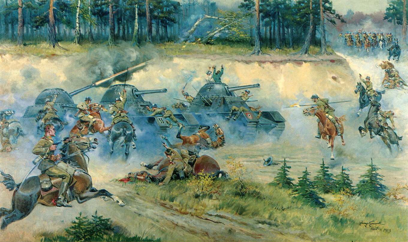
You may be familiar with the illustration by Jersy Kossak who specialized in painting military scenes. This was one of the first images that our artist found and immediately banked it in their PureRef for later use.
The myth, the legend, the Krojanty Battle:
It's epic and cool but oh so inaccurate. But it is a start!
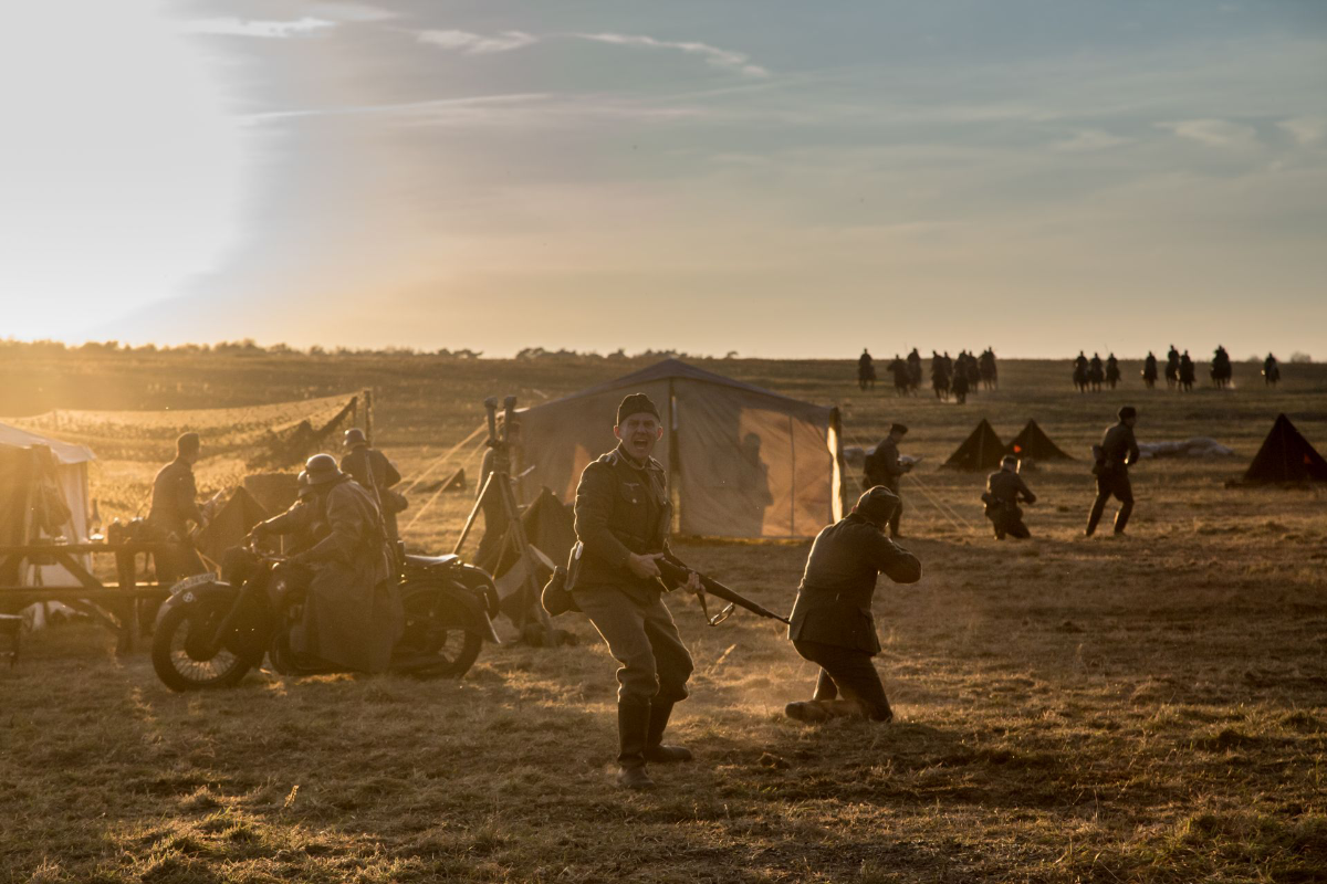
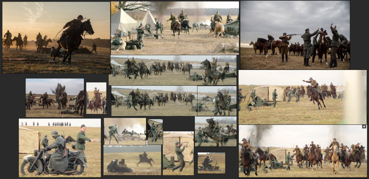
Doing some more research led our artist to a reenacting movie about the battle. Of course still not accurate but a great score for poses, mood and composition. They also only had the trailer/making of available to them but that never stops an artist.
Screen grab galore took place, no regrets.

Epic light in this one ^

Great references for poses in these^
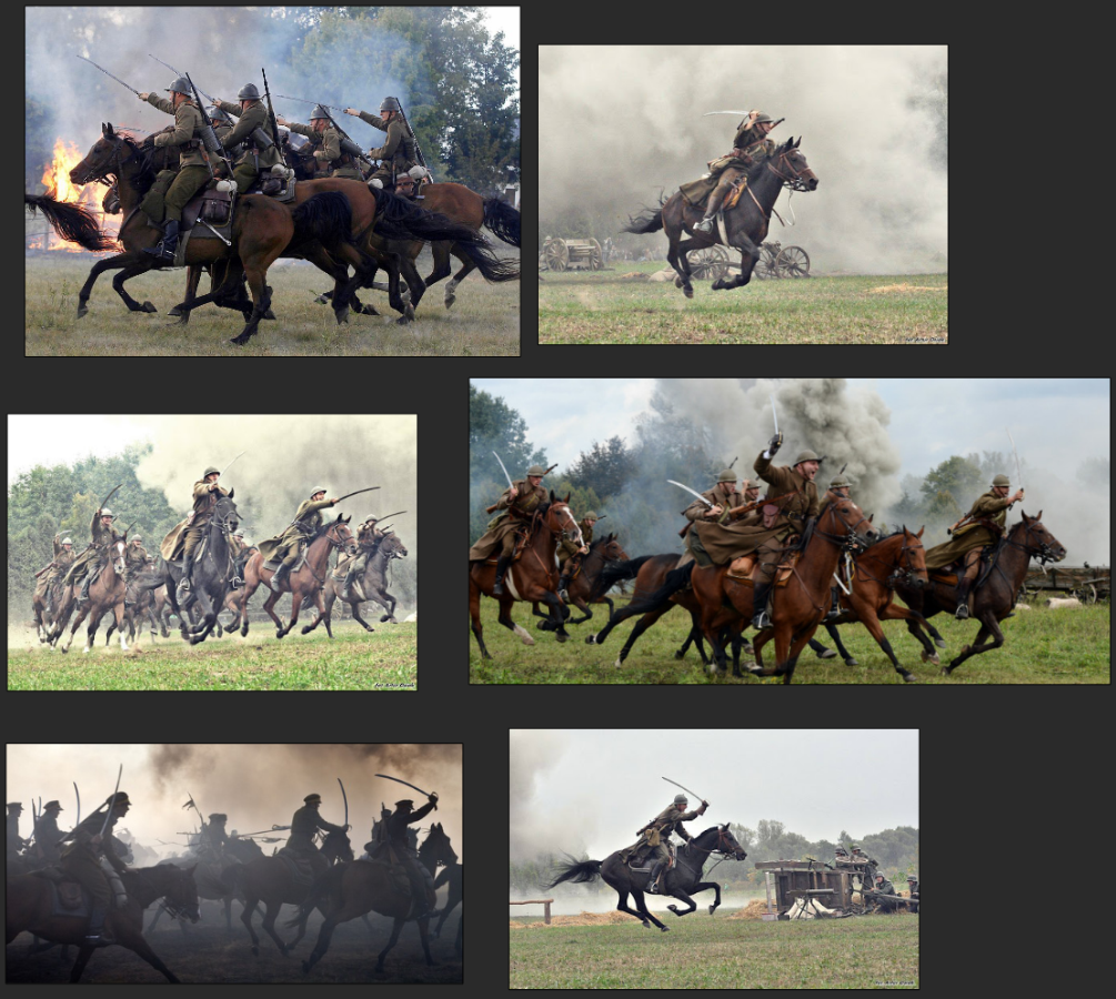
Of course our artist can’t stick to one source. Time to hit google again and this time they found some more reenacting scenes to add to their growing collection.

More poses and epic looking horses ^
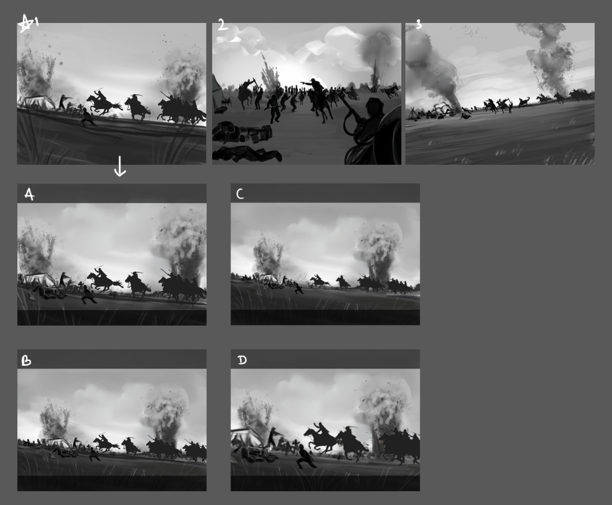
With a PureRef filled to the brim with interesting angles, poses and an interesting mood and light our artist now starts to work on something that’s called “Thumbnailing”.
It essentially means that our artist is making quick, easily viewable suggestions for the loading screen depicting a cool looking battle, sketched up with the help and guidance of the reference material they gathered.
Fun fact; the word “thumbnailing” is actually a direct reference to the human thumbnail in size and the word has been used as early as back in the 17th century for small imagery.
Kind of gross... kind of accurate, but still.
These are the thumbnails that they did for Podcat and Archangel85 to pick from!

Yes. They are that ugly. Yes they take no time to make, that’s the point. There's a bunch of ways to go about thumbnails and our artist usually use grey scale when doing these. Mostly to be able to tell hierarchy in the scene quickly. For example, the darkest parts are the most visually interesting ones where we want you to look first and the lighter ones are secondary and not as important.
Here we also see our artist giving us the A-B-C-D options for easier communication with the team. Pro tip here is always be clear on communication with the team to deliver the most accurate representation you can as well as often showing the progress to steer the illustration in the right direction.
So the Work In Progress phase begins.
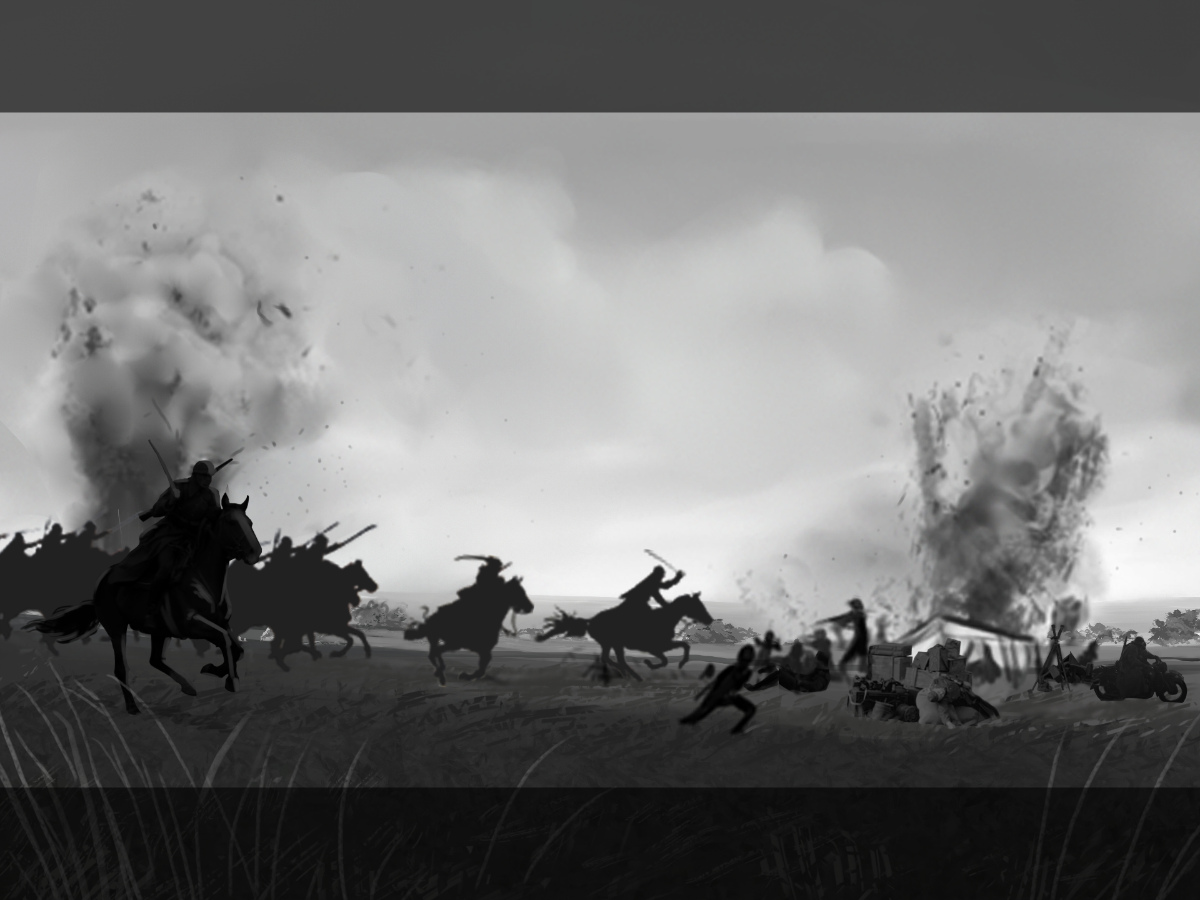
The first WIP that’ll be shared is the very first “clean” thumbnail that Podcat and Archangel85 together with our artist went for. They choose to change the direction of motion from left to right because that is the way we read as well as adding another rider in the foreground to give visual depth of the image.

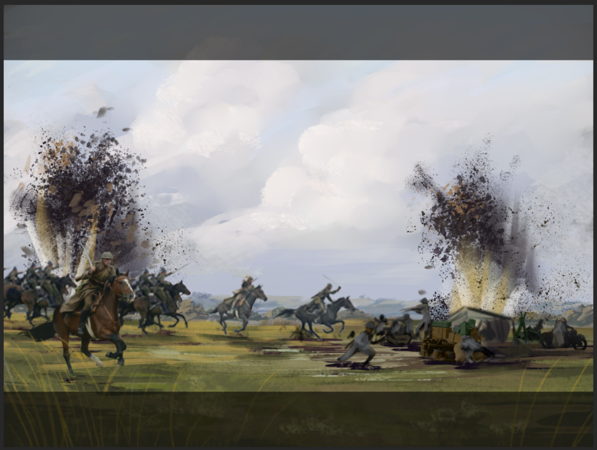
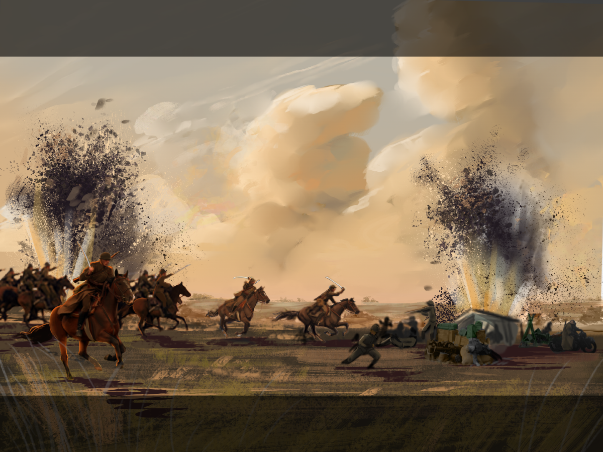
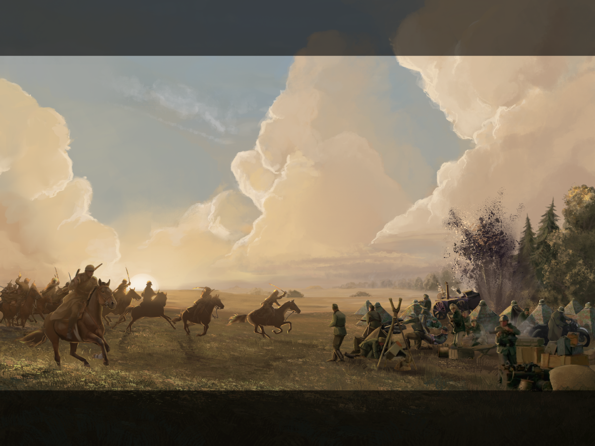
Next phase in the WIP series is colours! We wanted the illustration to be time accurate, so what do we know? We know that the cavalry attacked early as heck in the morning. We know the German soldiers were camping near a forest. We know that the cavalry came through it. But what kind of feeling was most interesting/epic?
Our artist made two colour variants to choose from:

^ More time accurate with a cooler tone of morning

^ And this one is more romantic/golden hour esque which in the end we went with. This felt more on-style with what we wanted to portray even if the time of day is wrong this feels more HOI.
After working some more with what tone and mood of the illustration should lean towards, our artist start to define some more characters. Right now they are just blurs and blobs as well as straight up photos.

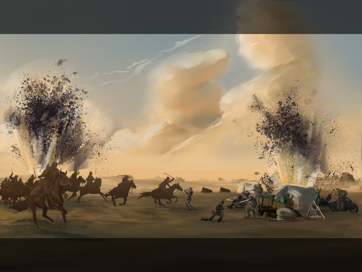
At this stage our artist went in the direction of adding more drama to the background. A new skyline was added with a helping paintover to show direction from HOI’s art lead as well as defining the landscape some more.
In this stage our artist also started to add some more definition of the soldiers who suddenly got multiplied (in the distance you could hear sad artist noises who realized they had bitten off more than they could perhaps chew). But as we say in Swedish “Skam den som ger sig!”

And yes… You saw right. Was that gear time period accurate? Were those crates truly used? What's up with those crazy large tents? Why are they even white? How strange…
So yes. Sad artist noises were once more heard as they realized the finds they had collected in their PureRef were indeed inaccurate for the time period. It dawned on them that they had to re-do some stuff.
There's a reason why artists live by “kill your darlings”. Sad, but oh so true. But also a very good thing to do! Sometimes you just have to realize that the best way to fix something is to start over. Now this was of course not the case. But still a hefty re-paint was in order.
Thanks to Jamor who so kindly rallied to our artist’s aid, gave them proper reference material and managed to steer clear of an embarrassing illustration.
So now we are heading somewhere! The noisy background elements were taken out because it was too distracting which wasn’t entirely the case up until now.
Remember the thumbnailing? Yeah those explosions had suddenly stolen the show which was a big no-no. Let the horses be the stars!
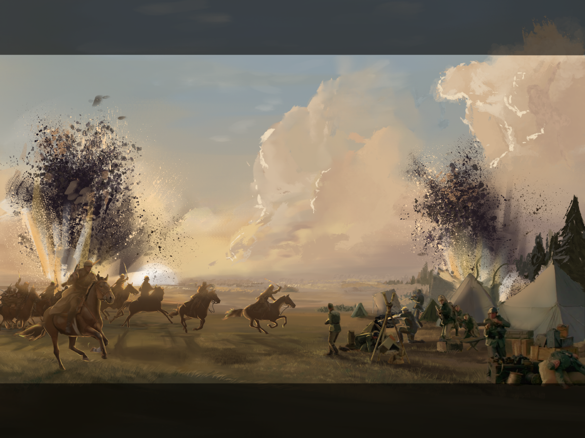
And in this stage the character got more defined as well as the background getting more painterly.

Well, we finally arrived where it really started to come together! It looks epic, the mood is heroic and you can feel the battle about to happen. This was therefore a time to go back to the beginning, to look at how the other loading screens had been made to maintain an equal feeling and style of rendering to this new piece!
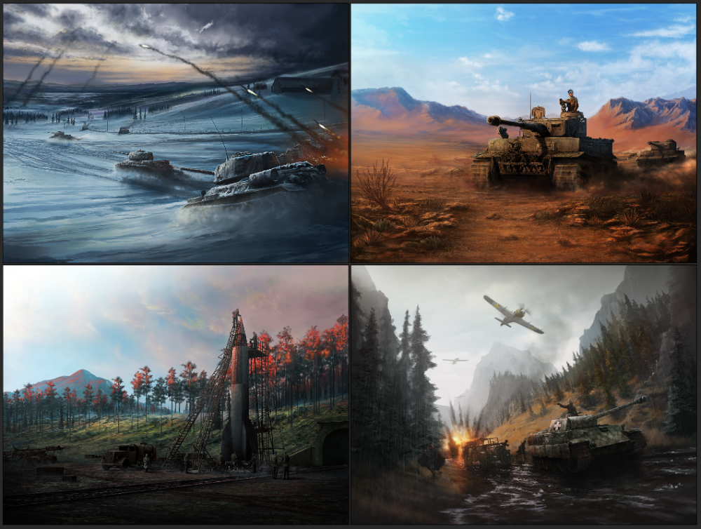
Grabbing a bunch of older loading screens our artist studied the brush strokes, textures and colours that had been used.

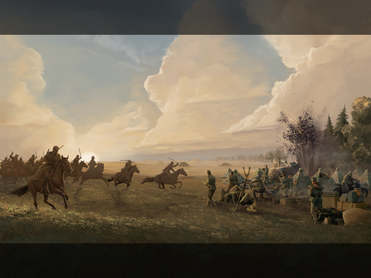
Aaaan back to the illustration! More textures are now added to mirror the old style as well as adding to the foreground and middle ground as well as details in and around the camp. Some soldiers got new jobs, instead of lying dead someone is now defending the camp and some more soldiers crawl out of the tents. Our artist wanted the feeling of “panic” to be visible in the camp.

Here the decision to actually raise the ground a good chunk to balance the whole image better was taken. And at this stage our artist, together with lead artist and art director, checked the values of the image.
Arguably this could have been done much earlier in the process but sometimes you simply forget until it bites you in the ass. Luckily tho it was at least caught!
For example, the darkest part of the field kitchen was too dark to match where it stood in the field and our artist had to make it lighter in value to push it back where it belonged in the image.
Not to get in and be TOO technical about what was happening in this stage, in short, our artist checked the contrasts to make them feel believable. The things at the foreground should be the darkest and as further back you go in the image the lighter in value it is.
The example with the field kitchen was that it didn’t look believable. The darkest part of it matched the darkest parts of the horse and rider in the foreground and therefore looked off in its position.
Flipping a adjustment layer of Black and White on and off helped with a quick overlook of the scene since sometimes colours can deceive. Being able to toggle a grey-scale filter on and off can do wonders and give a new perspective and light to the image.

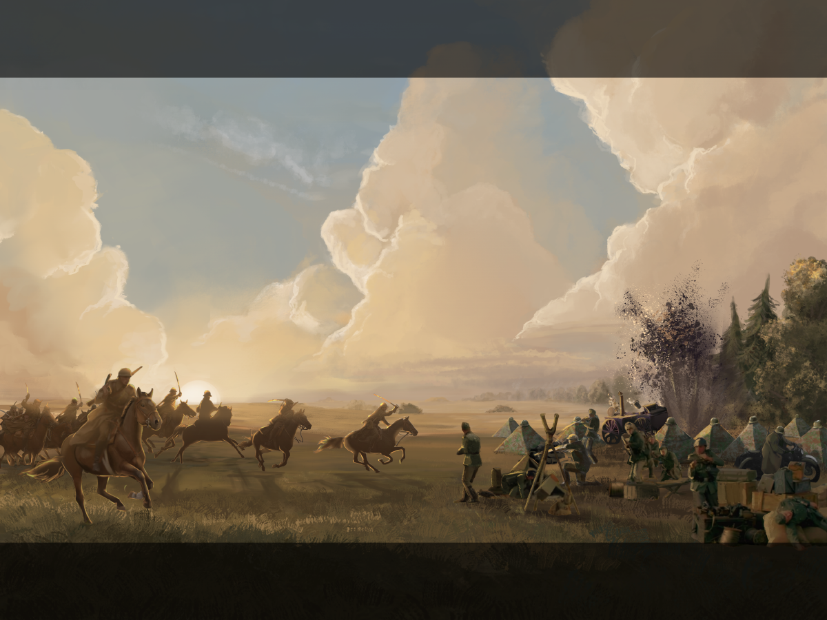
The final stretch of “last minute fixes”, here we go!!
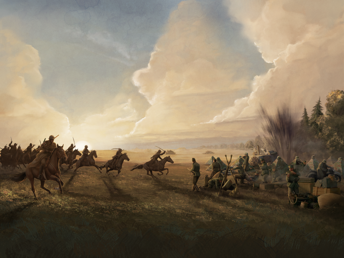
Here our artist started to do those last 10% of the image to take it over the finish line! Fun fact, usually the last 10% are referred to as the longest and most tedious part of an illustration.
Here they are adding details and more life to all the characters as well as adjusting and fine-tuning the background and the light in the illustration.

The whole illustration from gathering references to thumbnailing to finally done took approximately 3 weeks, 2 of which were dedicated to be set after each other, while the rest of the remaining days were spread out in between other work our artist had to prioritize.
Our artist sure did an amazing job here and can you believe that this was the first time they ever created such a huge piece of art?!
Their usual work on HOI is to create the icons and buttons you like to push and glance at as well as a few portraits here and there so this was indeed a challenge for them. But least to say is that they sure had fun (despite some suffering, but let's be honest… what is an artist if they're not suffering) and enjoyed the challenge and above all the experience the loading screen delivered, and hopefully you’ll agree with them that it looks pretty cool.
And perhaps we’ll see them take on another loading screen again in the future.
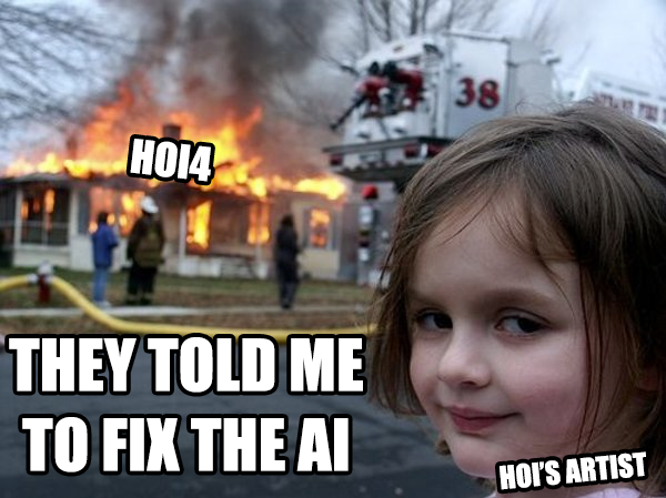
But before I let you go, I have a little meme from our artist to you.
(artists are artists, not programmers )

--------------------------------------------------------------------------------------------------------------
Now for something completely different.
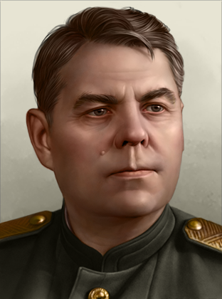
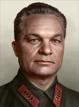
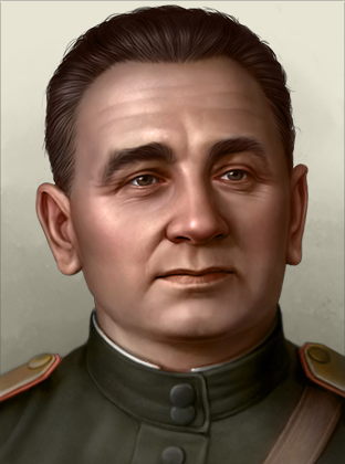
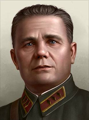
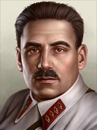
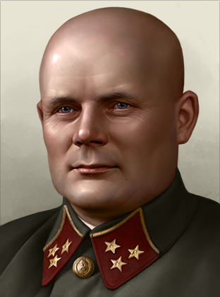
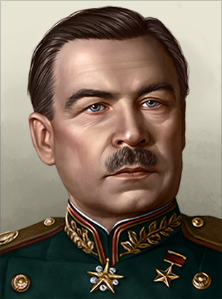
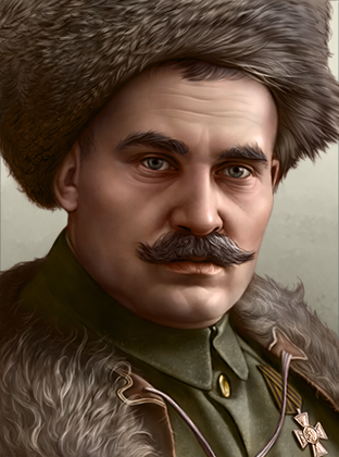
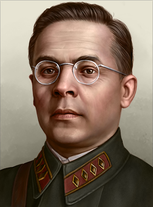
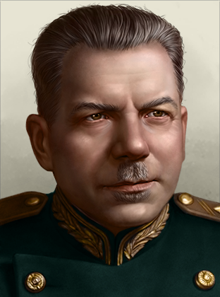
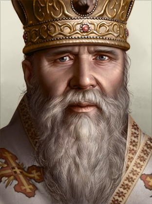
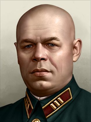
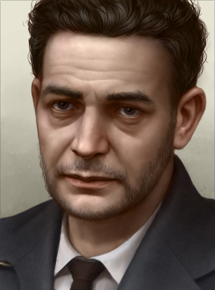
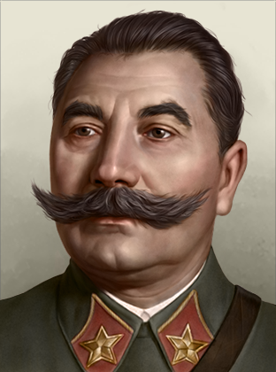
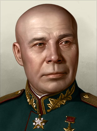
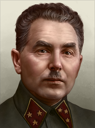
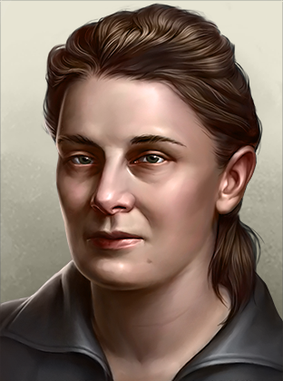
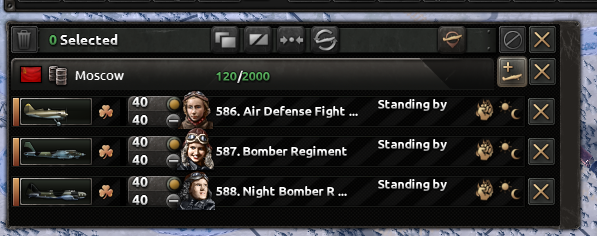
Portraits + Focuses Here are a few of the new portraits you can expect to see in No Step Back.


There are plenty more where these came from. ;)

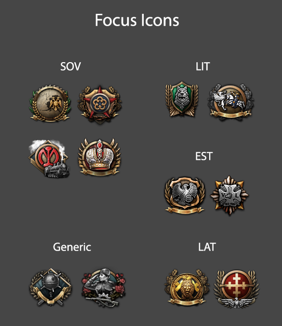
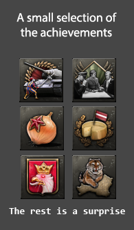
Additionally, here is a peek at some upcoming focus and achievement icons:


Well... That's all from us for now, folks.
We hope you are all as excited about playing No Step Back as we are to have you play it.
Oh and one last thing: The No Step Back feature streams are starting this week, with a first look at the new focus trees in action. The first stream is today (Wed 27th) at 16:00 CEST, during the normal HOI weekly stream slot!
 {LINK REMOVED}Read the full diary here

