almost 5 years
ago -
Sarno
-
Direct link
Thanks for bringing this to our attention!
I’ll make sure that this gets looked at; I agree in its current form it looks very bad.
Thanks for bringing this to our attention!
I’ll make sure that this gets looked at; I agree in its current form it looks very bad.
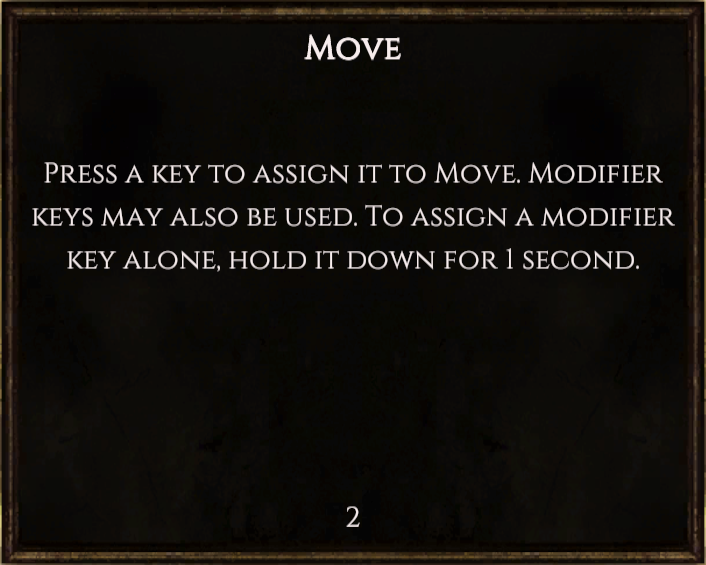
This oversight will be corrected in next week’s content release, Patch 0.7.5;
Move.png706×565 213 KB
It’s possible we’ll touch on this part of the UI again at some point in the future, but it’s quite late in the patch cycle so for now we’re just concentrating on readability and usability.
Thanks for the kind words!
We do our best. 