Welcome to the October Development Diary!

Update 12 is out now! In case you missed it, this latest release introduces 3 new species, brand new basic tutorials, a new map, building, staff training, official prefabs and more. You can find the full patch notes here along with our exciting announcement trailer below!

Update 12 Support

During the start of November, we’ll be supporting U12 (Update 12) with additional hotfixes targeting outstanding issues reported by the community, as well as feedback regarding the feel of Park Issues. At the time of writing, we’ve already released two patches and will continue to read reports as they come in. Thank you for your help!

Swapping Update 13 & Update 14

If you’re a keen follower of our Public Roadmap, you probably know what we’re cooking. However, for the sake of ensuring players get more content before Christmas, we’ve made the decision to swap the next two updates.

Update 14 will be focused on animal sociality and improving the state of animals. There is a fair bit of work to be done, especially with ontogeny on the way. Here are our technical goals for the animals in U14:

  • Socialize and communicate amongst themselves

  • Form herds or groups that follow a leader

  • Smooth out locomotion, minimizing jitter or snappy behavior

  • Polish foot IKs, making limbs less prone to breaking and ensuring footstep sounds are triggered consistently

This is going to take time and a huge amount of resources, but our programmers have actually been working on U14 on-and-off since August. Once we’ve finished supporting U12, they’ll be going back to finishing animal awareness.

We obviously don’t want to leave you hanging in the meantime, though, which is why Update 13 will be released in mid-December. Since this is primarily content-focused, it does not detract development time from U14.

Update 13 will be our final update of the year, focused on adding new animals, foliage, music and rounding out the user experience with UI changes.


Update 13

New Species

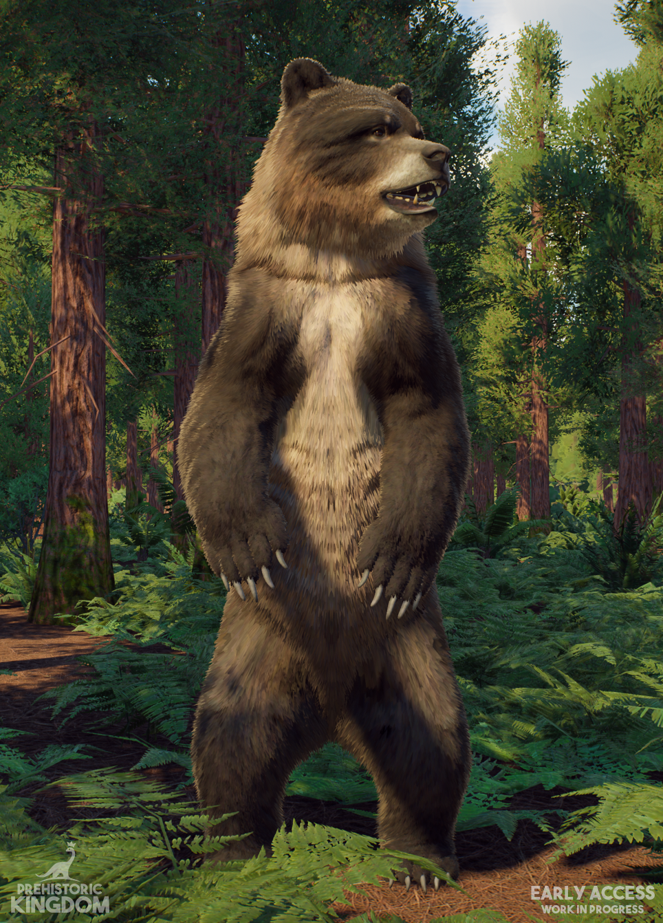
To reveal the first of two mammals arriving in Update 13, we can bearly contain our excitement. After a long hibernation, the Cave Bear (Ursus spelaeus) is finally joining the park.
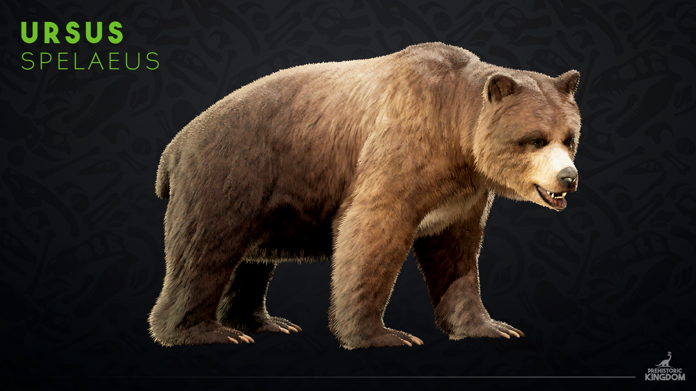
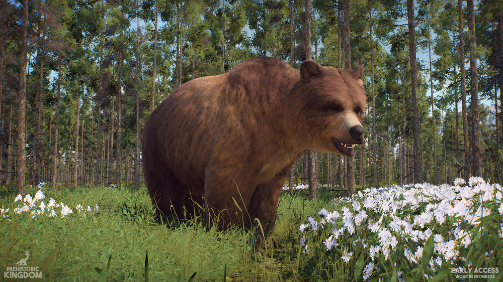
This primarily herbivorous bear is best distinguished by the massive hump between its shoulders, giving it a bulkier appearance than the modern grizzly. Some of you may be thinking it’s “just a bear,” but to that, we offer the following counterpoint:

It’s a bear!
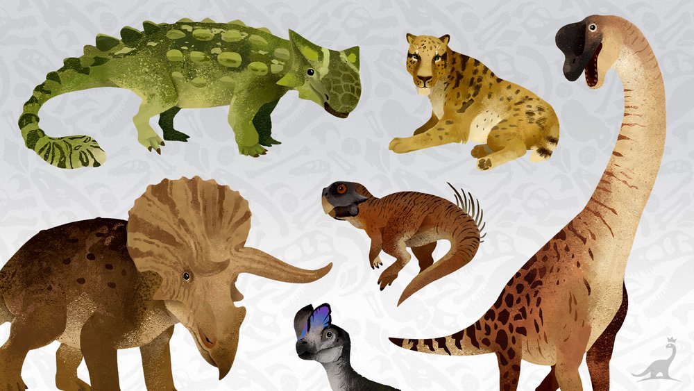
Stylized Animal Signs

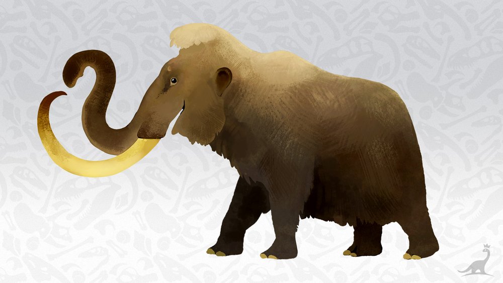
New animal signs are coming in the next update! These illustrations will be available as modular objects for a few dozen key species, adding a lovely charm around the zoo.

We love how these turned out and can’t wait for you to see them all!

Building Toolbox Updates

In Update 13, we’re going to be making changes to the building experience. We first started sketching this out internally all the way back in Update 9, but now that we have our updated official prefabs, we think it’s the right time to make the leap.

We understand that building is a huge part of why so many players fell in love with Prehistoric Kingdom, so making changes to the creative side of things needs to be handled with care. Our goal with this update is to streamline the experience and make building more approachable. We do not want to remove customization, but rather present it in a way that is more appealing.

These are just design concepts for the time being, so there’ll be lots of would’s and could’s in the discussion below. Let’s begin!

New Toolbox & Organisation Changes

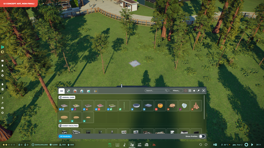
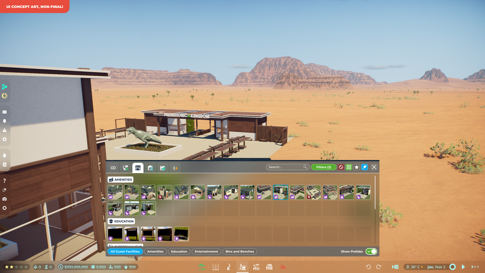
In this example, we’ll select the central building category. As you can see below, this would be home to all of the game’s modules.

By default, every item is shown in the All category, reducing the clicks needed to find common modules like feeders, enrichment, bathrooms or kiosks. Just like the current UI, players would be able to drag the toolbox up or down to adjust how much of the screen it takes up.


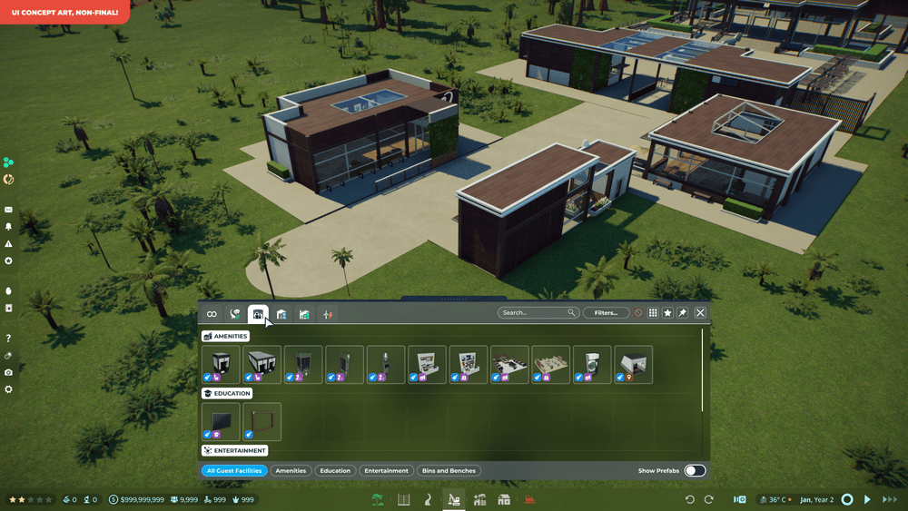
If we were to switch from All to the Guest Facilities tab, we would now only see items that belong to guests. The modules are also split into subcategories to better distinguish their use in the park.

From the bottom, players would be able to isolate a subcategory, hiding all other items. This would be especially helpful when trying to navigate something like the modular building toolbox, as there can be hundreds of pieces!

Prefabs

In this new toolbox, prefabs and items would not coexist at the same time. While this is maybe an odd choice at first glance, players can have hundreds, if not thousands of prefabs saved.

We propose that in the bottom right of the toolbox, players would swap between items or prefabs. By putting prefabs behind a switch, it’d mean we can properly organize them by subcategory without risk of cluttering the toolbox. There’s no chance that they’d drown out important modules.

For the hardcore builders, this means you could save custom beams or arches into their correct spot, rather than having them shoved to the bottom of the list like in the current game.

Side note: the new toolbox would support a small thumbnail option to show more content at once, as seen above.

Controls & Styling

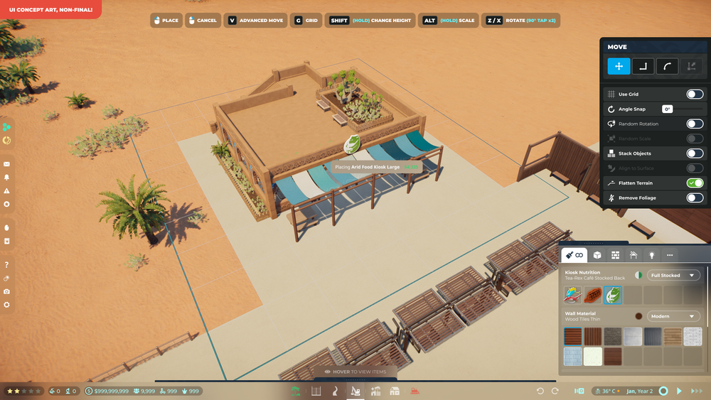
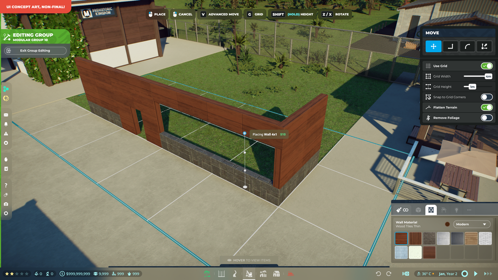
Once the player selects or edits an item, the toolbox quickly ducks out of the way, leaving the player with more screen space to see what they’re doing. On the right, panels for the modular controls and styles slide in, completely detached from the toolbox.

Hovering over the bottom of the screen or canceling your current action would make the toolbox reappear.

Here’s how these two panels would work: 

  • Modular Controls
    The control panel is contextual, depending on what settings have been enabled. Options like angle snap and align to surface would be hidden if the building grid is enabled, since they only work with free movement.

  • Styling
    The styling window can be expanded vertically, like the toolbox, to show more or less materials at a time. You can also filter for specific object types by selecting one of the style categories (all, modules, walls, roofs, lights or miscellaneous). Coloring options would be available per style.

Can the Toolbox… not?

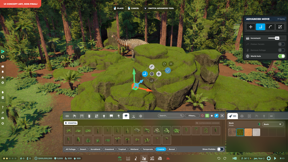
If you’re someone who wants to keep their toolbox on-screen, just like in the current game, we’ve got you covered. Enabling the “pin” toggle would prevent the toolbox from ducking away while building.

The modular controls change during advanced editing, too! Wow, increments.

And all the rest…

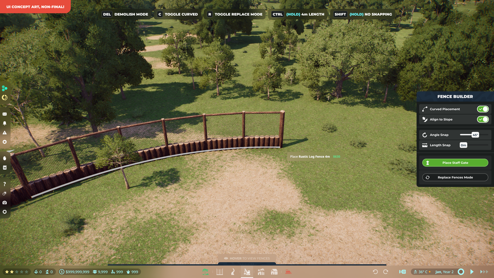
This style of contextual control would be brought over to the paths and fences, too. Even though it’s displaying the same information as the current game, we think it draws more attention to what options the player actually has.

And that’s it! We’ll be reviewing your early impressions, but we think these changes to building will be for the better. Let us know what you think!

Created by Krex

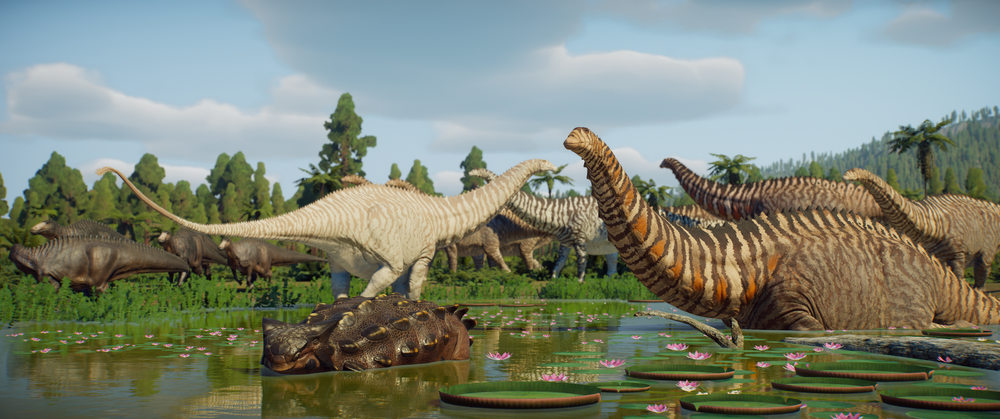
Created by W3

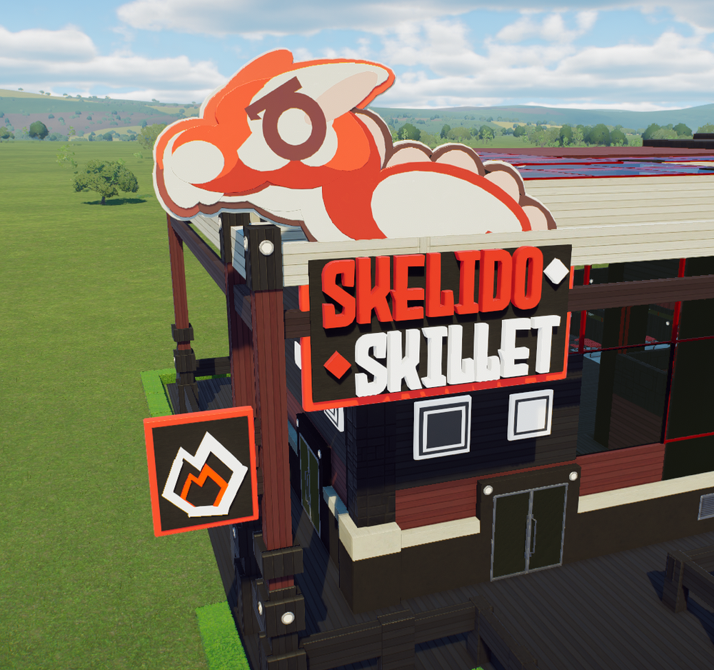
Created by DagothDagothDagothDagothDagoth


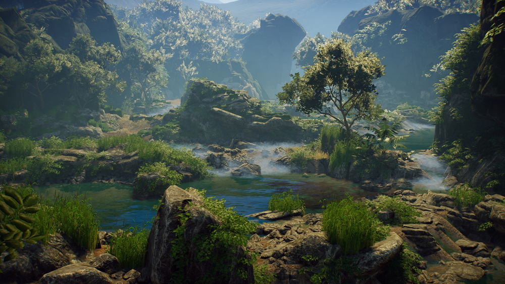
Thank you for reading October’s dev diary!

With the release of Update 12 having just happened, we hope you can forgive a shorter Dev Diary. We will be back next month to share more progress on Update 13!

Until next time,

- The PK Team

Facebook | Twitter | Discord | Reddit | YouTube

18 days ago - /u/ - Direct link
A lil somethin somethin: You can find the details for this event on the announcement page here.
18 days ago - Blue Meridian - Direct link


Welcome to the October Development Update!

Update 12 is out now! In case you missed it, this latest release introduces 3 new species, brand new basic tutorials, a new map, building, staff training, official prefabs and more. You can find the full patch notes here along with our exciting announcement trailer below!


Update 12 Support During the start of November, we’ll be supporting U12 (Update 12) with additional hotfixes targeting outstanding issues reported by the community, as well as feedback regarding the feel of Park Issues. At the time of writing, we’ve already released two patches and will continue to read reports as they come in. Thank you for your help!

Swapping Update 13 & Update 14 If you’re a keen follower of our Public Roadmap[trello.com], you probably know what we’re cooking. However, for the sake of ensuring players get more content before Christmas, we’ve made the decision to swap the next two updates.

Update 14 will be focused on animal sociality and improving the state of animals. There is a fair bit of work to be done, especially with ontogeny on the way. Here are our technical goals for the animals in U14:

  • Socialize and communicate amongst themselves
  • Form herds or groups that follow a leader
  • Smooth out locomotion, minimizing jitter or snappy behavior
  • Polish foot IKs, making limbs less prone to breaking and ensuring footstep sounds are triggered consistently
This is going to take time and a huge amount of resources, but our programmers have actually been working on U14 on-and-off since August. Once we’ve finished supporting U12, they’ll be going back to finishing animal awareness.

We obviously don’t want to leave you hanging in the meantime, though, which is why Update 13 will be released in mid-December. Since this is primarily content-focused, it does not detract development time from U14.

Update 13 will be our final update of the year, focused on adding new animals, foliage, music and rounding out the user experience with UI changes.

Update 13
New Species To reveal the first of two mammals arriving in Update 13, we can bearly contain our excitement. After a long hibernation, the Cave Bear (Ursus spelaeus) is finally joining the park.


This primarily herbivorous bear is best distinguished by the massive hump between its shoulders, giving it a bulkier appearance than the modern grizzly. Some of you may be thinking it’s “just a bear,” but to that, we offer the following counterpoint:

It’s a bear!


Stylized Animal Signs New animal signs are coming in the next update! These illustrations will be available as modular objects for a few dozen key species, adding a lovely charm around the zoo.

We love how these turned out and can’t wait for you to see them all!


Building Toolbox Updates In Update 13, we’re going to be making changes to the building experience. We first started sketching this out internally all the way back in Update 9, but now that we have our updated official prefabs, we think it’s the right time to make the leap.

We understand that building is a huge part of why so many players fell in love with Prehistoric Kingdom, so making changes to the creative side of things needs to be handled with care. Our goal with this update is to streamline the experience and make building more approachable. We do not want to remove customization, but rather present it in a way that is more appealing.

These are just design concepts for the time being, so there’ll be lots of would’s and could’s in the discussion below. Let’s begin!

New Toolbox & Organisation Changes In this example, we’ll select the central building category. As you can see below, this would be home to all of the game’s modules.


By default, every item is shown in the All category, reducing the clicks needed to find common modules like feeders, enrichment, bathrooms or kiosks. Just like the current UI, players would be able to drag the toolbox up or down to adjust how much of the screen it takes up.

If we were to switch from All to the Guest Facilities tab, we would now only see items that belong to guests. The modules are also split into subcategories to better distinguish their use in the park.


From the bottom, players would be able to isolate a subcategory, hiding all other items. This would be especially helpful when trying to navigate something like the modular building toolbox, as there can be hundreds of pieces!


Prefabs In this new toolbox, prefabs and items would not coexist at the same time. While this is maybe an odd choice at first glance, players can have hundreds, if not thousands of prefabs saved.

We propose that in the bottom right of the toolbox, players would swap between items or prefabs. By putting prefabs behind a switch, it’d mean we can properly organize them by subcategory without risk of cluttering the toolbox. There’s no chance that they’d drown out important modules.

For the hardcore builders, this means you could save custom beams or arches into their correct spot, rather than having them shoved to the bottom of the list like in the current game.

Side note: the new toolbox would support a small thumbnail option to show more content at once, as seen above.

Controls & Styling
Once the player selects or edits an item, the toolbox quickly ducks out of the way, leaving the player with more screen space to see what they’re doing. On the right, panels for the modular controls and styles slide in, completely detached from the toolbox.

Hovering over the bottom of the screen or canceling your current action would make the toolbox reappear.


Here’s how these two panels would work:

  1. Modular Controls
    The control panel is contextual, depending on what settings have been enabled. Options like angle snap and align to surface would be hidden if the building grid is enabled, since they only work with free movement.
  2. Styling
    The styling window can be expanded vertically, like the toolbox, to show more or less materials at a time. You can also filter for specific object types by selecting one of the style categories (all, modules, walls, roofs, lights or miscellaneous). Coloring options would be available per style.
Can the Toolbox… not? If you’re someone who wants to keep their toolbox on-screen, just like in the current game, we’ve got you covered. Enabling the “pin” toggle would prevent the toolbox from ducking away while building.

The modular controls change during advanced editing, too! Wow, increments.

And all the rest… This style of contextual control would be brought over to the paths and fences, too. Even though it’s displaying the same information as the current game, we think it draws more attention to what options the player actually has.


And that’s it! We’ll be reviewing your early impressions, but we think these changes to building will be for the better. Let us know what you think!


Created by Krex

Created by W3

Created by DagothDagothDagothDagothDagoth.png


Thank you for reading October's’s dev diary!

With the release of Update 12 having just happened, we hope you can forgive a shorter Dev Diary. We will be back next month to share more progress on Update 13!

- The PK Team