 Happy 13th of December!
Today we would like to talk to you about User Experience Design. One of the Frozenbyte’s UX Designers is here to tell a bit about their role and share a few snippets of the player experience in Trine 4: The Nightmare Prince.
User Experience Design (or UX Design) is an interesting facet of game design, which has fairly recently been split off as its own thing. Essentially the focus is on the player and their experience. So, for example, when making Trine 4 level designer focused on the pacing of the level, the difficulty of the puzzles, player skills, etc. Fight designer would focus on making sure fights are balanced, increase in difficulty, have enough room, etc. UX designer would focus on the fact that players should be immersed in a beautiful story world and feel like the smart and powerful hero they are controlling. Obviously all designers (all of whom are not necessarily mentioned here) think about all of the things mentioned above (and more), but those are the main things they focus on while the others are more or less at the back of their minds.
“Keep the player experience at the front of your mind” is easy to say, but what does it mean? Let’s walk through one example, shall we.
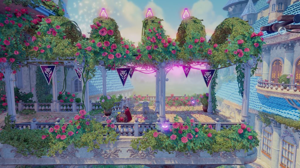
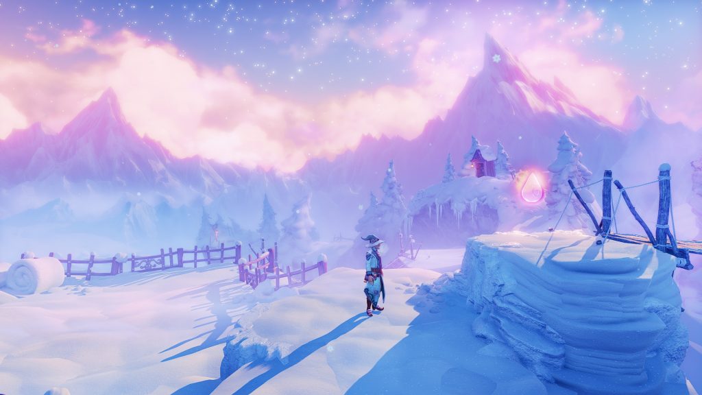
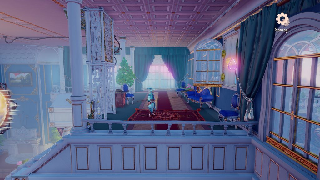
In all of the Trine games there are experience points scattered throughout the world for players to find and use to make their characters more powerful. Some of these are directly on the player’s path and some are in very hard to reach, sometimes even hidden, places. Why? Oh, so many reasons! First of all, people have an inherent need to collect things. For some it’s more intense than others, but most people feel a sense of satisfaction when they collect things. (Which is why on some platforms, all games are required to have trophies.) The harder the point is to reach, the greater the feeling of accomplishment when they get it. However, if all experience points were really hard to reach or hidden, we’d be in trouble. Some players would not realize that the points are meant to be collected by the player, so they’d never even try! And the players who didn’t want that challenge, would never get the chance to get better skills to make the game more fun. Also, the skill points are also sometimes very useful in guiding the player to the right direction in a large space.


As you can see, something as simple as experience points and their placement actually involve a lot of thinking of different kind of players and motivations.
BUT WAIT that’s not all!
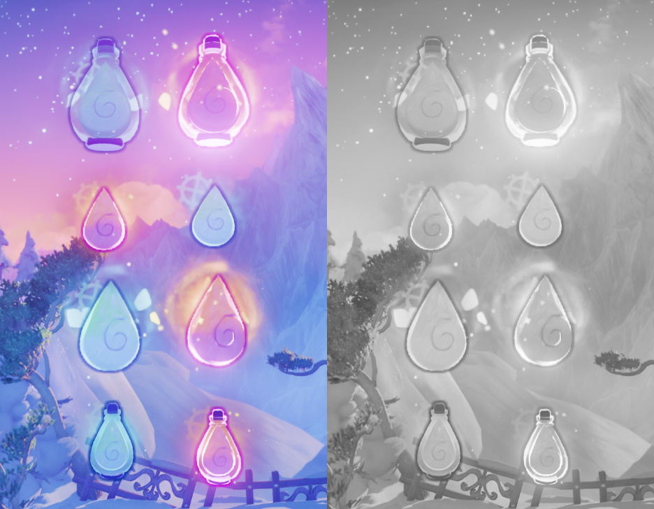
Apart from having different motivations (ex. wanting to collect ALL the things vs not really caring about collectibles), we have players of varying abilities. Going over the different kinds of accessibility barriers players might have would warrant a blog post of its own, so let’s keep it simple here: we’ll only focus on the visual aspect of things. Some players see all the colors, some see only some colors, and some don’t see any at all. There are also players who might have very poor eyesight – even legally blind people enjoy games.
What does that have to do with the experience points? While we want some of them to be easy to reach and some to be more challenging to get, we do not want them to be difficult to see. While we had different effects and colors in the experience points, we realized they were still hard to see against some backgrounds in the game, which was not what we wanted. So we tweaked them so that they were easier to spot even when they were hard to reach.

Hopefully this gives you some idea on what a UX Designer does. Their work overlaps with bunch of other disciplines – other design fields and art being the ones mentioned here, but practically UX Designers collaborate a lot with all disciplines. But that’s only natural, as all disciplines do affect the player’s experience.
If you have any questions, or would like to hear more about UX Design, please leave us a comment below!