Hey there! I’m Sammi Pedregon, art outsource supervisor on VALORANT here to talk about the inspiration and process behind the Nunca Olvidados skin.
As much as this article is about how the skin came together, I also wanted to share how this skin brought me closer to my heritage as a second generation Mexican American—far more than I expected it would! Growing up, my Mexican grandparents were always very accepting and straightforward about death, and they somehow saw a beauty behind it that I didn’t yet understand.
As you’ll read, these were themes that inspired Nunca Olvidados and through the process, helped me feel I can better understand where my grandparents were coming from. Yes, death can be scary and inevitable, but once family has passed, why not instead look back and continue to celebrate the memories? I didn’t realize just how much working on this skin would mean to me.
THE TRADITION
Nunca Olvidados is a Mexican-Spanish phrase meaning “never forgotten,” which is itself directly inspired by the Mexican holiday Día de los Muertos (Day of the Dead). In Mexico, Mexican communities, and throughout Latin America, this multi-day holiday takes place from November 1–2, and is used as a celebration of the life and death of our families and loved ones.
Families come together and set up a small altar (ofrenda) which is typically decorated with food, drinks, and pictures of departed family members. It’s believed that these offerings help spirits find their way home to visit living family members. Skull head candies, painted skull face make-up, and bright flor de muerto (marigold flowers) are common symbols for the holiday and have grown more popular in recent years.
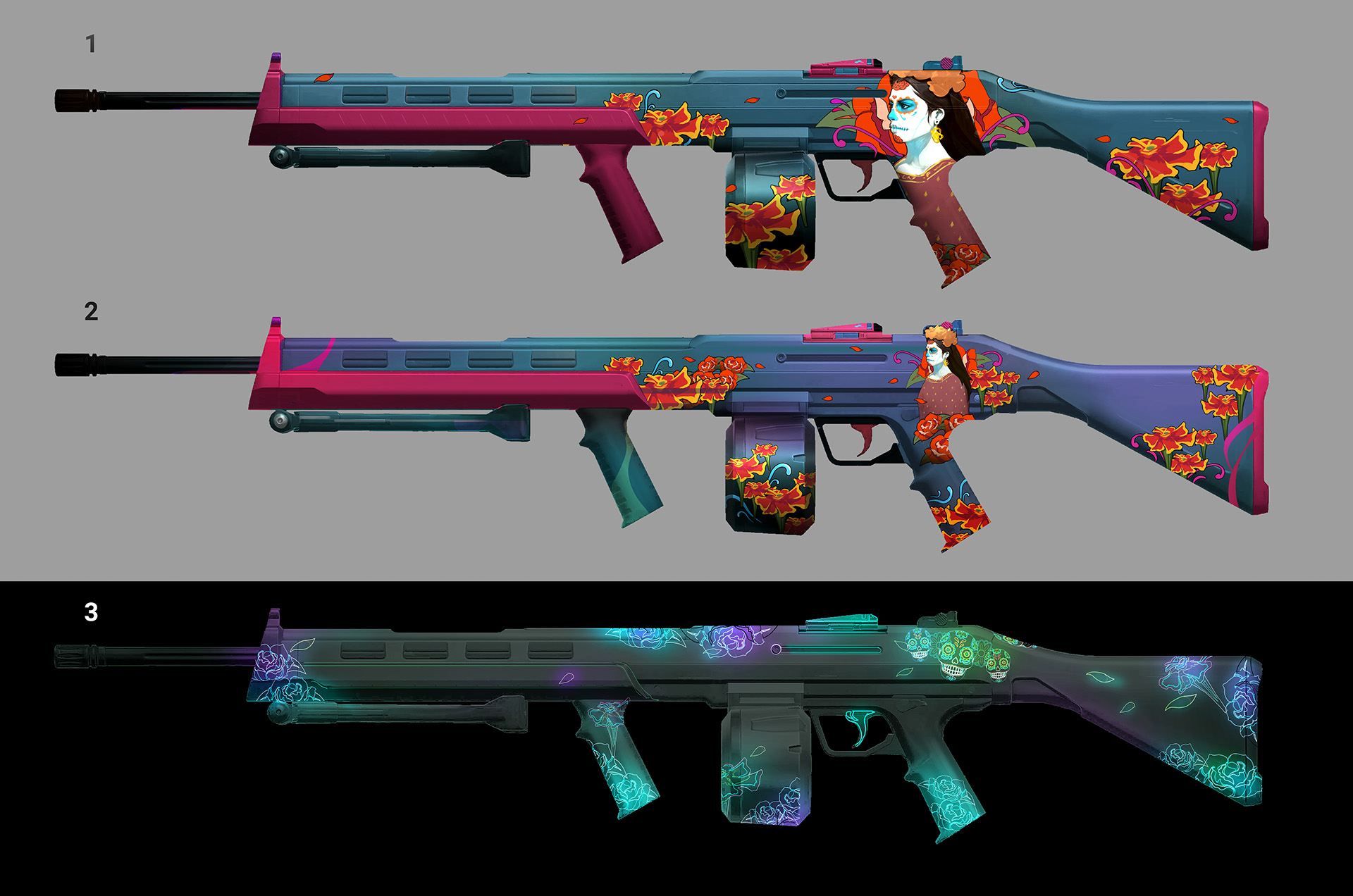
I was more than ecstatic when I saw the first Nunca Olvidados concept art by Josh Kao, our senior concept artist. The marigolds, the lady in calavera face paint with her dress, the glow-in-the-dark skull variant, even the color palette had such a special and familiar feel for me.
With no prior knowledge that this was being done, the visual connection to Día de los Muertos was clear to me.
After seeing the progression of the concept art go from first passes to final, I was privately eager to work on this skin but was hesitant to request it if I could. The final concept of the skinline looked so beautiful and I felt it matched the elegance of Mexican culture that I grew up around.
Now imagine my excitement when I got word that I was assigned to outsource the skinline! I was thrilled for the opportunity to work on a skin that I felt so culturally connected to.
THE PROCESS - CONCEPT
Josh Kao and Cathy Woo, associate producer for outsourcing, worked closely with the Riot Mexico office on the design and skin/melee name to ensure we brought authenticity and respect to the tradition—and strayed from kitsch. Coordination also helped sort the best time to release the skin that would overlap with the Día de los Muertos this year (Oct. 20–Nov. 2).
THE PROCESS - SHADER TECH
It was envisioned for this skin to feature two shader techniques:
- Transition between two textures (day/night look). Night for when going through shadows or day when out in the sun in-game. This was shader tech we had already made for the Winterwunderland skinline (shoutout to Sean Marino!)
- Project the lady+flower behind her onto the gun from the player's camera, instead of being directly textured on the weapon. This was another shader tech we had already made for the Jigsaw skinline (shoutout to Chris Stone!)
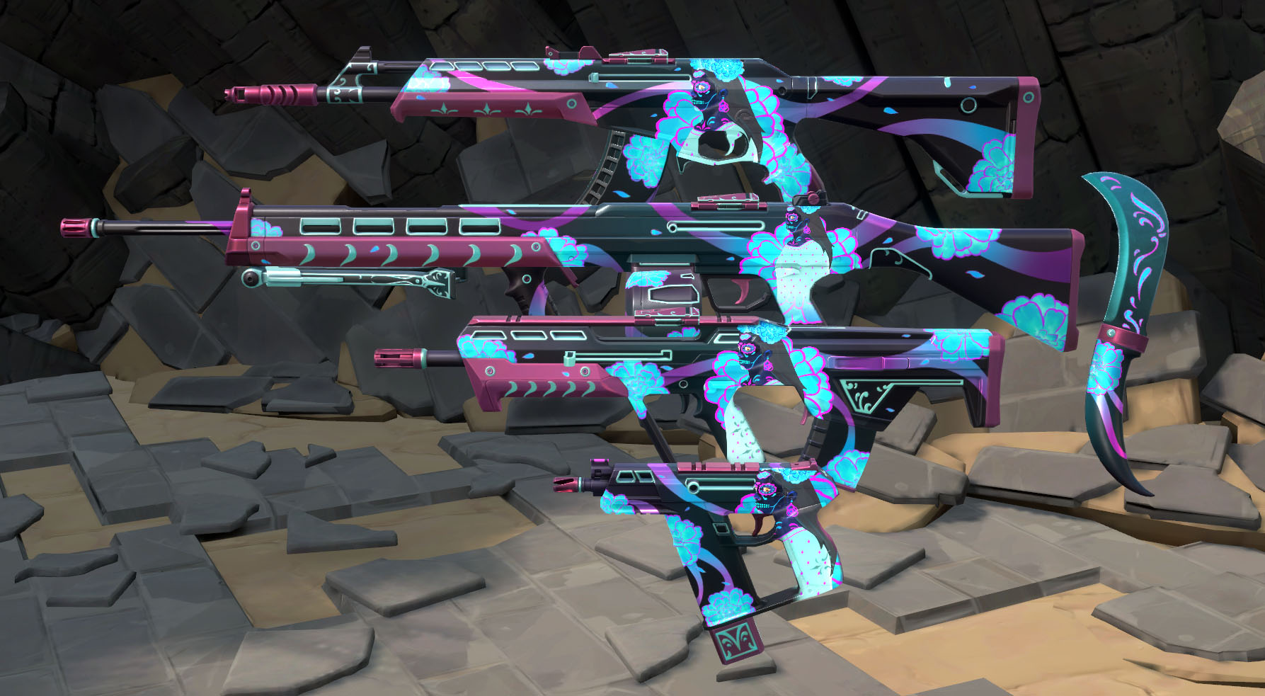
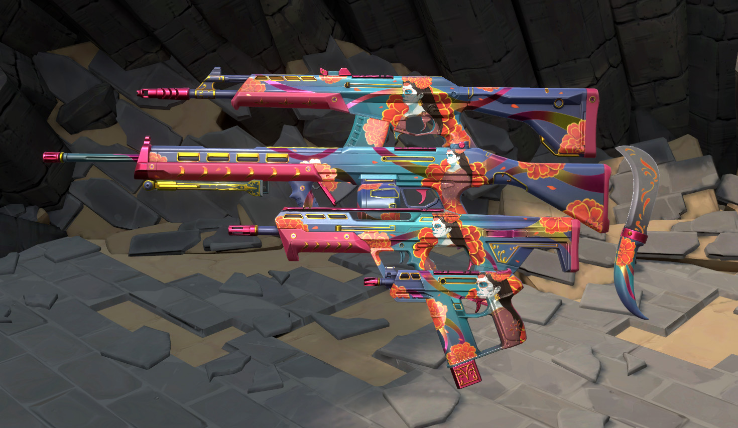
What better way to convey the Día de los Muertos celebration of life and death with a skin than to have a ‘light’ variant and a ‘dark’ variant that changes in and out of the shadows on the map?
When projecting a texture directly on the side of a weapon, things can look way different when holding it in first person view, compared to what it looks like in the Collections menu. We wanted the lady to not look distorted when a player holds the gun, so we projected it from the camera for a nice crisp look.There is an elegance to her image and we wanted to make sure to keep that same feel when playing..
Originally, the gun was just going to transition between the two variants, like Winterwunderland. As we internally reviewed this skin overtime, our 3D weapon artist mentioned how much he really loved the dark variant, and that he liked the light variant, but he REALLY loved the dark one and wished he could just have that.
I’ve read similar sentiments from players, so that was definitely something to consider. We’ve heard feedback on these transition-based skins that they would rather have one variant instead of a transition. This skin will have the transitions set as two variants so players have the option of just using one of them in the transition.
Since we’ve already released single level transition-based guns, we didn’t want to split this one into multiple levels to unlock the transition at level 3, because we wanted to make sure that things are fair for players who’ve previously bought transition-based skins.
THE PROCESS - 3D
Quick rewind: Before the team began the concept of the skin, they established important visual pillars. Nunca Olvidados should accurately represent the holiday, but also feel festive and blossom with elegance for players who may not be too familiar with the traditions.
We steered away from anything that would make the skin look childish, have a sense of grief, or misrepresent what the holiday means. This isn’t an alternative Halloween, it’s a celebration. The concept held to these values well, and I wanted to make sure these were respected in the 3D phase of the skin too.
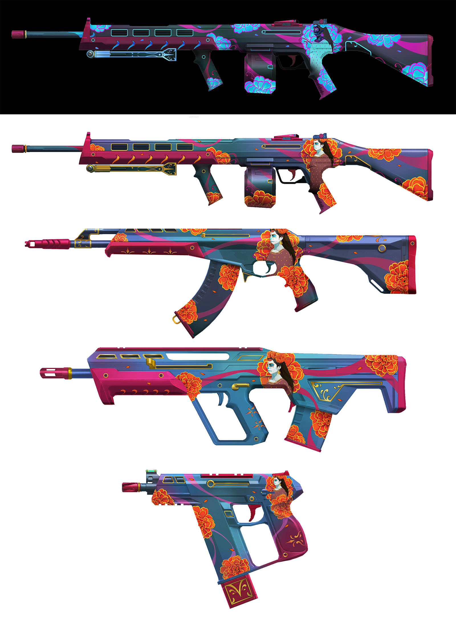
As we received first works-in-progress from vendors, we ended up adding more details to the design of both the light/dark variants. For the light variant design, we added a few gold accents so players weren’t just staring at a blob of blue from the texture.
An orange glow was added on the ribbons to help bring more of a “celebration” feel to the skin. The lady seemed to blend too much into the background of the gun, so we brightened the background to help her stand out just enough as the centerpiece.
Then, with the dark variant, we wanted the glowing elements to be easy on the eyes but also equally beautiful to complement the light variant. Again, we wanted to steer away from having the dark variant look dreary and keep a similar celebration-feel but with dark colors.
After some adjustments in the shader tech and a few more revisions done both internally and with a vendor, we finished Nunca Olvidados.
We think Nunca Olvidados is a VALORANT skin that’s gorgeous and authentically represents Día de los Muertos while capturing the festive and colorful spirit for players who may not be too familiar with the occasion.
There is beauty in both life and death and we hope this skin helps reflect that.


