Hello we are Chris Stone. Senior Weapons Artist, and Sean Bigham, Senior Concept Artist, here to tell and show you how the Glitchpop skins were born out of a misunderstanding and grew into one of VALORANT’s most loud, colorful and bold designs.
Glitchpop is heavy on the visual elements that bring out the futuristic fantasy for players. The muzzle flash, glitch equip, holographic projector, and stickers were all elements that we could clearly theme in the cyberpunk genre, while offering a great first-person visual experience.
A MEGA-MISUNDERSTANDING

While working on a completely unrelated skin line, we gave some feedback to our concept artist that was (thankfully) misunderstood and led to a very unique design we dubbed “Megapunk.” The rest of the team saw the design and raved. We knew we had something special, but it needed the right kind of push.
THE THEMATIC GOAL
Glitchpop was an opportunity to offer our fresh take on a favorite science fiction subgenre, cyberpunk.
With so many amazing representations of all things cyberpunk, we didn’t want to lean too heavily towards any one of them. We had an opportunity to take inspiration from the cyberpunk genre but offer our own fresh take on it. We pulled inspiration from Akira, Ghost in the Shell, Cowboy Bebop, Love Death and Robots, Josan Gonzalez, Altered Carbon, Deus Ex, Ruiner, and many others. Ultimately, we wanted to focus instead on how to push this skin line towards a more fun and punk aesthetic vs. the classic gloomy and grounded dystopian representation we often see. To keep ourselves oriented towards this thematic goal, we coined the term “Playful but Deadly.”
The term branched into the product pillars for this line: Bold. Colorful. Playful. Graphic. These were established before we cemented the VALORANT Brand Tones. Turns out, they line up very well (even if accidentally!).

Still, we of course did reference some classic cyberpunk themes:
- The world is a futuristic Corporatocracy. Everything appears happy through corporate imagery and advertisements but has an underlying dystopian twist.
- Corporations are specifically targeting younger audiences with fun characters, brighter colors, and are trying to be less overtly megacorp.
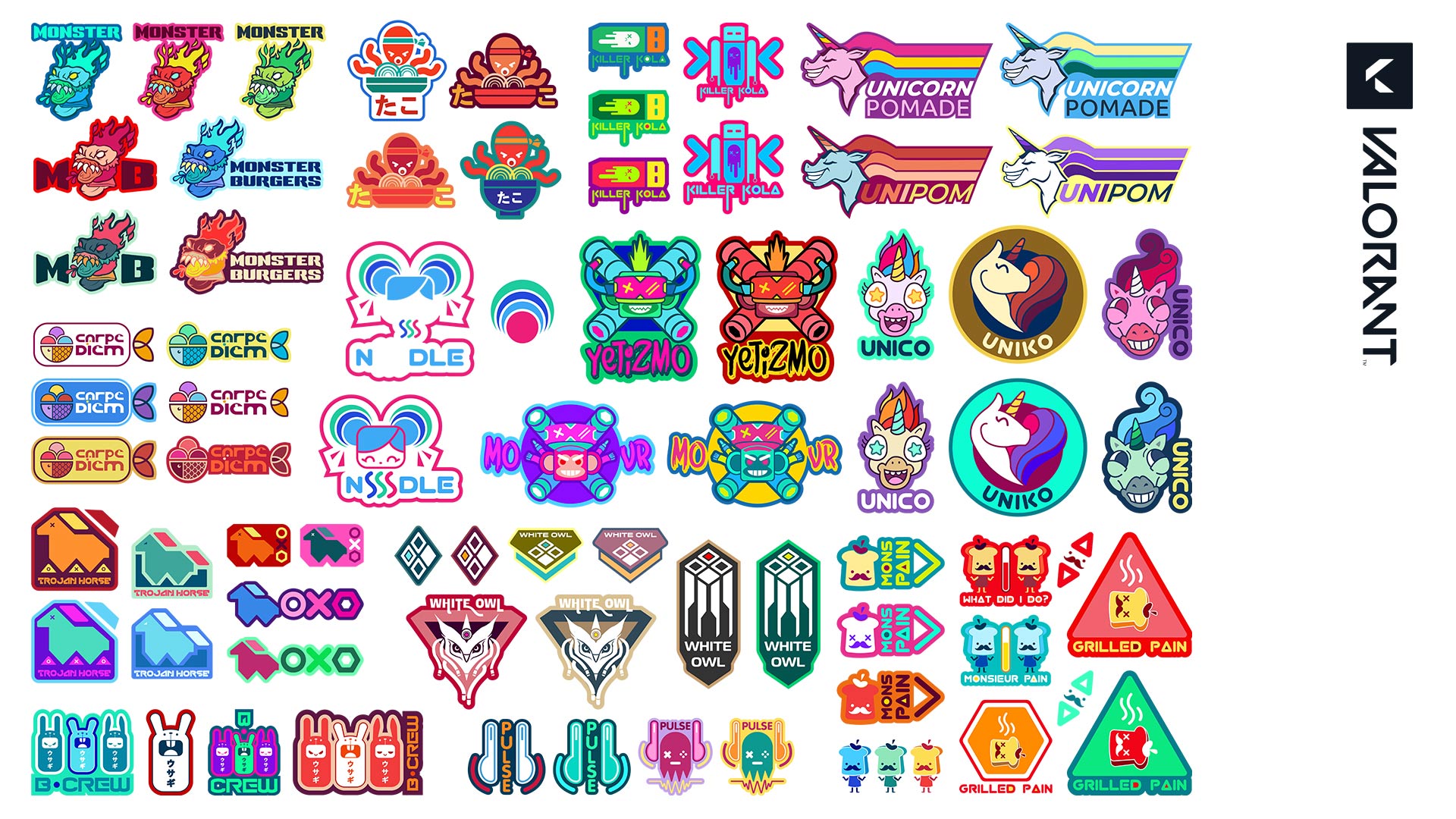
- The stickers on these guns are all corporate branding that appears counter-culture to consumers.
- Overall, we loved the juxtaposition of a lethal weapon paired with happy colors and playful stickers.
- We’re creating a lifestyle and casualness around something that’s anything but.
Weaving the narrative ties in every facet of Glitchpop were important to give it the feel as if pulled from an alt-universe. We relied on the genuine but less familiar cyberpunk themes to be the forefront of our design, with hopes to avoid cliches.
CONCEPT EVOLUTION
There’s no delusion that we all have a very North American perspective of how we view Cyberpunk. That’s why one of our other concept artists, who’s from Russia, brought a lot of elements that Western players are not typically used to seeing. His initial idea with the Bulldog set the foundation of how we would approach the design—create the stock version and add the punk attitude.
Our concept artist Sean Bigham worked with our external partner to help guide the concepts that were used to make the models you see in game today.
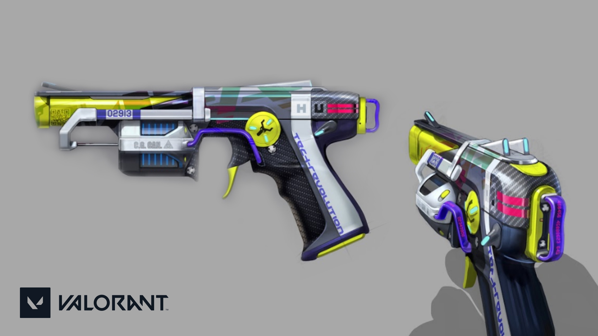
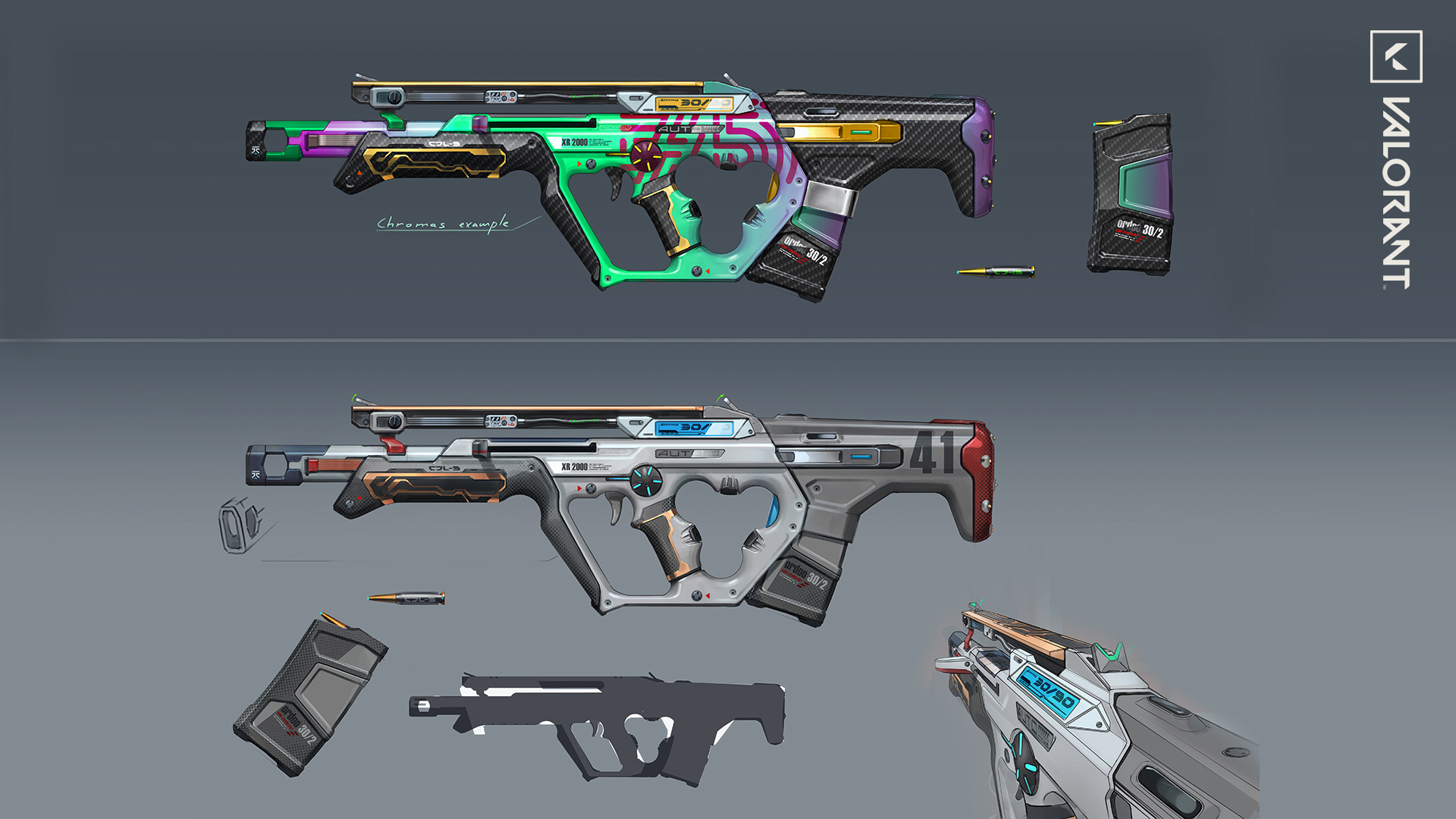
Early development of the gun focused on designing a factory fresh, stock version of the weapon which had a modular aspect to it built upon many recognizable hallmarks found in sci fi and cyberpunk: grey plastics, emissive lights and copper elements. Once the base design was resolved, we began experimenting with various ways to push the personalization of the weapons in order to have a fresher take on the genre.
Initially, we had our concept partner go very far with a bunch of different ideas. Each one felt very different from the next but hit certain cyberpunk thematics we had established. Ultimately, we wanted the partner to focus on creating guns that appeared like they could be purchased off the shelf and then upgraded with aftermarket parts to suit their needs and style.
This is where the “upgrade” with a holographic logo projector, a digital glitch muzzle flash, and a glitch equip effect came in. We didn’t want to simply slap on these elements though, we wanted to find a way to integrate them into the gun with some sort of functionality in order to solidify the design. Looking at the Bulldog, the copper cable runs from the battery on the right side to the holographic projector seen in first person, which then runs down the gun towards the barrel for the digital muzzle flash.
From a design standpoint, we thought it would be good to allow for the stickers, glitch effect, and projector to stand on their own. From a color standpoint, simplifying the gun to a color gradient that has a contrast with carbon fiber and copper trim helped the stickers pop a lot on the gun.
Our partner was able to contribute a wide variety of ideas without explicit guidance every step of the way. They were excited about working on the skin line and brought ideas to the table through their explorations, which ended up benefiting and improving the initial idea.
LOGO EVOLUTION (AKA BRING ON SEAN BIGHAM)
Memorable logos are always a challenge. Now try creating ones that someone wants to decorate their weapon with.
We knew that we wanted to deepen the fantasy by thinking about how the weapon would be personalized with stickers and holographic elements that reference “real” brands in a cyberpunk alternate universe.These needed to target a mixture of happy and serious tones that are both corporate feeling and somehow punk.
The logos should interact nicely with the company name from a design standpoint and should not feel like a company just slapped their logo onto a cool image. Also, we didn’t want any logos that were too on-the-nose cyberpunk. Remember, less cliche the better.
Finally, we wanted to have a fun mix of food, beverage, security, and other random brands. Unico Pomade ended up being one of the favorites (a hair care brand). Other favorites are NSSDLE, Mons Pain, and Monster Burger. Yummy.
Our first round of logos were way too corporate—a hand-made feel was missing. So then, we moved to the other end of the spectrum. The revisions appeared very hand crafted, but no longer evoked any corporate imagery or feelings. Eventually, we hit the sweet spot. Logos that have a corporate touch but feel very playful and fun.
NOW, THE FUTURE

With Glitchpop, we think we made a VALORANT skinline that glimpses into a dystopian future, where death has no consequence but it’s life breathes through bright, colorful skins, and a playful but deadly attitude.
We hope you enjoy them!