Hello everyone!
My name is Jens and this is my first appearance on this forum. I’ve got the opportunity to share some details with you on my probation project for CK3, which is making it all the way into the upcoming release (because that’s where I pushed my changes, lol)!
I’m happy at least
one of you[forum.paradoxplaza.com] caught on to the subtle hint in the previous DD. I was like “Wokeg, did you use my new thing to set up the screenshots?” Well yes, because all of a sudden most assets and characters have become way more accessible. So what is it I’m talking about? At this point, most of you have probably guessed it - but yes, we have upgraded our old friend the Barbershop.
►
Read more about Dev Diary #117 on our forums![pdxint.at]
I’ve scrambled through the webs looking for feedback and wishes of what you would like and expect from such a tool. Heck, no mediocre fix would do: I want only the best for you! I distilled the info down, looking for the essence of how you’d want to use the tool, set up the tasks, prioritized them, and spent the last few weeks going through them all. Well, I’ll spare you the fluff. Let’s get into some details.
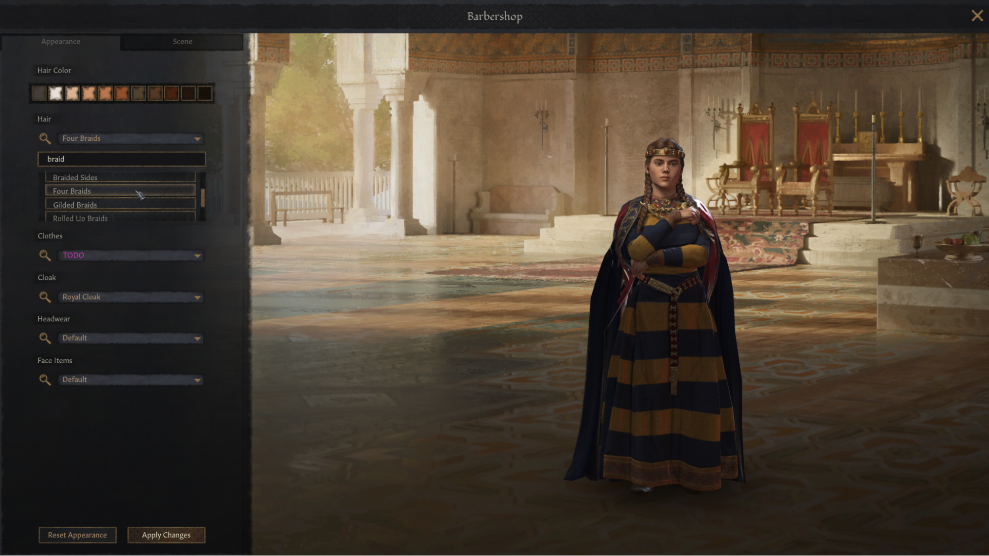
First off, we have expanded the Barbershop into two tabs. The first is focused on changing the appearance of your character. Additionally, I’ve added a fuzzy search box next to the drop downs, in case you already know the name of what you’re looking for.
 [Image: Barbershop, tab for changing appearance]
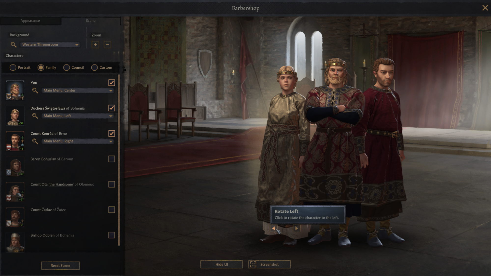
In the second tab, we’ve added drag and drop support for the portraits, so you may click, drag and place them wherever you want. You can also rotate them 360 degrees and we’ve also got 4 different zoom levels for you to play around with. Every character has their own dropdown of poses and animations and we’ve also added a wide variety of backgrounds. The only limit now is your own imagination.
 [Image: Barbershop, tab for placing characters in the scene]
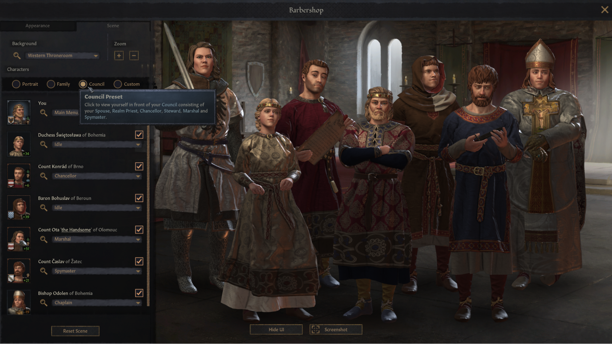
One of the big reasons we play is to create stories and make memories. I took a deep dive into the forum history and found out some of you want to use the Barbershop to relive past events between characters, dress up a serious ruler in a funny outfit or take family photos. To support this I’ve added presets. The “Custom” preset lets you import characters simply by pinning them. Another preset I really wanted in (based on a comment) was an easy way to view your entire Council, so for that end I present to you:
 [Image: Barbershop, easily view your council]
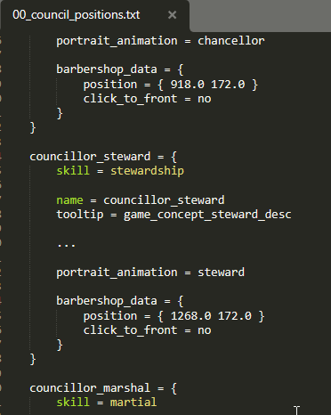
Also, note the council preset supports modding if that’s your thing.
 [Image: Barbershop script]
With only a few polish tasks left, people have already begun discovering this tool in-house and started trolling and meme-ing each other. I hope you guys will enjoy the new Barbershop as much as we do. Let me know if you have any last minute requests and I will see what I can do. Now, our Game Director also has something in store for you.
---
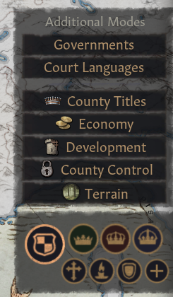
Greetings! In addition to the above we also want to show some additions to our collection of Map Modes - namely the introduction of the Control and Economy map modes! These two new tools are very useful in managing your realm… and planning your conquests.
 [Image - New Map Mode Buttons]
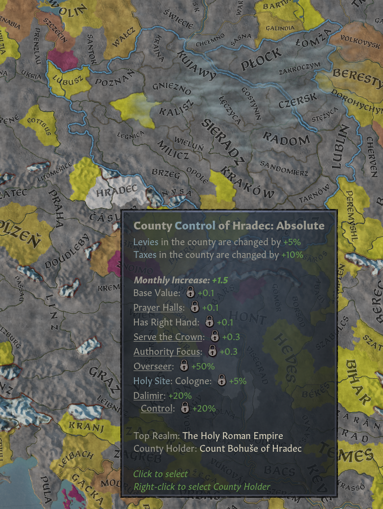
The Control map mode is very straightforward, showing you exactly what you’d expect. It spans from a dark purple (denoting very low control) to a light yellow (showing just a slight lack of control), and a bright white shows where there’s Absolute Control.
 [Image: Control Map mode Example]
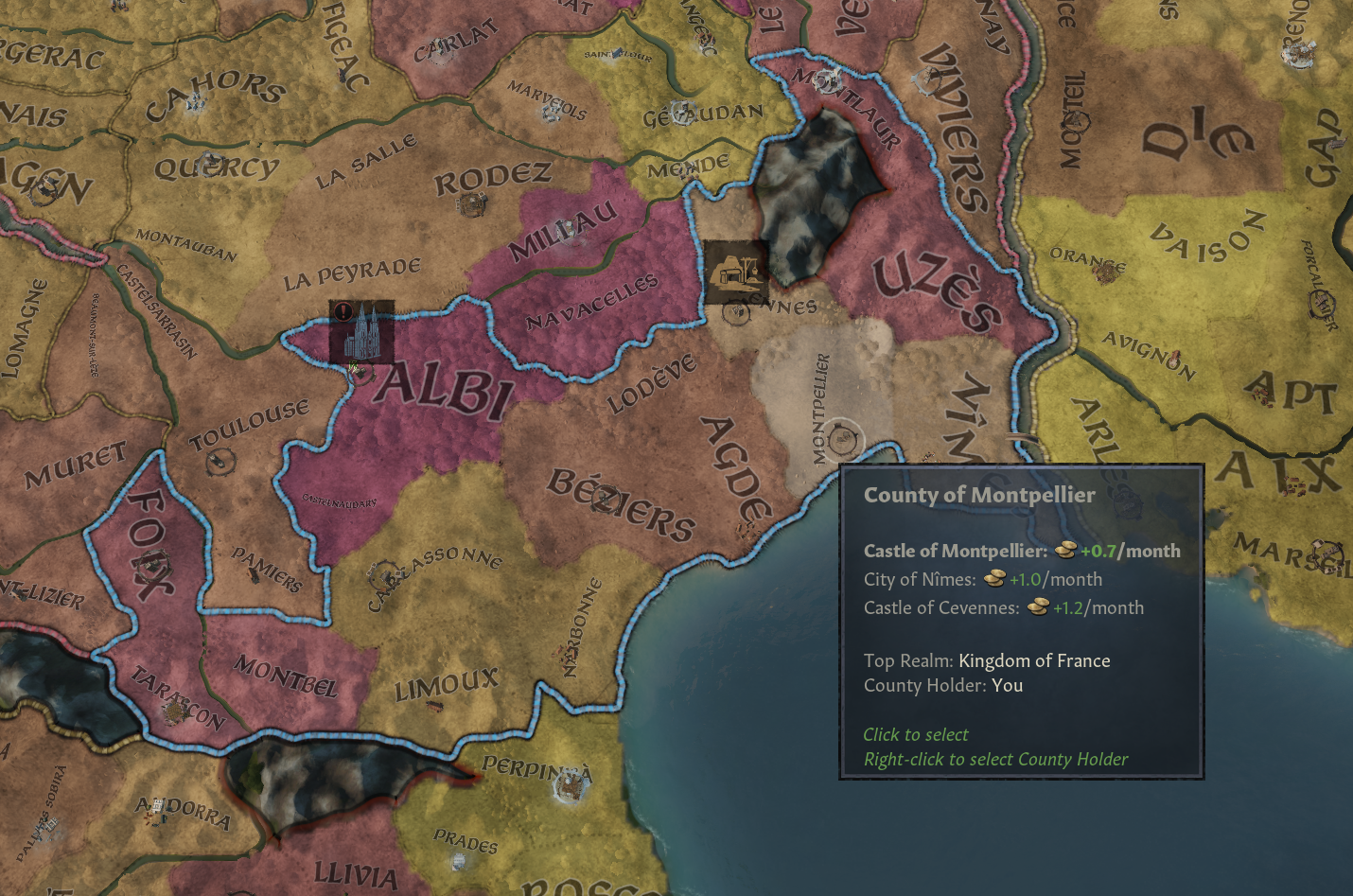
The Economy map mode is a little bit less straightforward - but we aspired to make it as useful as possible. The nebulous concept of ‘economy’ is a bit harder to represent, but we decided to include what most of us thought were key factors in making informed decisions.

[Image: Economy Map mode Example, Southern France]
Similar to the Development Map mode, the color spans from dark purple to bright yellow; bright yellow indicates an area is quite rich. The area colors are based on Counties, including income from Cities, Bishoprics, and so on - for an overall approximation of the County’s use to the player (of course, Counties with more Castles might be better in the eyes of some, but we had to make a call and thought that this was the most useful overall). This coloring is relative to the state of the world, meaning that the most brilliant yellow County is the richest one in the world at that moment. This map mode doesn’t care about the current Control Level of the County, which makes it useful for planning conquest targets.
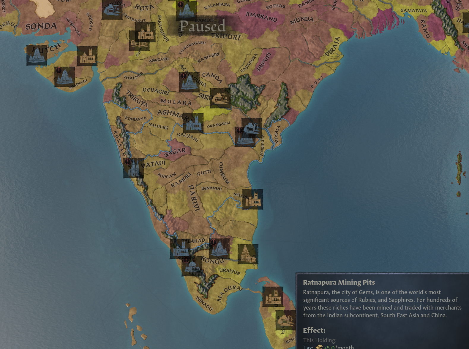
 [Image: Economy map mode, showing India]
Something else that you no-doubt notice is that Special Buildings are shown on this map mode! They’ve been hidden away for much too long, and we decided that this was an excellent time to reveal them… and maybe add a handful of new ones. Getting Special Buildings in your domain was always a fun goal for the player to achieve, and now it’s not only possible to see where they are - but also whether you can use them, if they are already built, what they provide, and so on!
As an added bonus, we’ve added an absolute ton of new mines strewn around the map, and we’ve also revised the system for founding Universities - now it’s no longer a decision, but rather the institutions are constructed as normal special buildings (and in many more places than before!), with the same rewards on offer.
This means that there are many, many more great capital locations strewn across the world, and it’s now easier than ever to find them!
---
That’s it for this time! But stay tuned… our spymaster sends word that what’s next for Crusader Kings III will soon be announced! Make sure to mark Monday next week, March 6th, in your calendars and visit
this link[pdxint.at]!


