Hello!
This Dev Diary is collectively written by members of the Art Team who work on these illustrations. We would like to share our process and some of the artistic choices that go into making these images.
🎁 If you would like to see more of our excellent 2D Artists' work, we are launching a
Displate contest starting today and running until the launch of Flavor Pack 2 on May 31.
This contest will provide the winners with either a Displate of their own or a discount code for a few more lucky winners. For details on the contest, see here. [link].
This fantastic team of artists will also be hosting a
Live Art Stream[www.twitch.tv] on
May 18 from 14:30 - 16:00 CEST on our Twitch channel!
- Petter: Lead 2D Artist
- Oscar: Illustrator
- Alessandro: Illustrator
- Ahmed: Illustrator
- Jon: Illustrator
- Nils: Lead Character Artist
► Read our
Dev Diary #97 - Event Illustration Showcase and Workflow[pdxint.at]https://store.steampowered.com/app/1303184/Crusader_Kings_III_Fate_of_Iberia/

Types of Event Illustrations Scene Illustrations These are the illustrations that show up as backdrops in CK3 events. They have a different style and context than those in CK2. As opposed to being the main storytelling device, their purpose is now to support our amazing new 3D characters and the story they are telling through their appearance and animations. The images are there to add context to the characters’ situation, but make no mistake: the characters are the star of the show.
As such, we make a number of artistic choices to support this goal:
- We avoid characters in the background and other elements one would expect to move.
- We do our best to design the composition in such a way that draws attention to the characters instead of the background.
Lastly, an additional tool provided by our 3D artists is the custom lighting setup that helps each character blend into the scene.
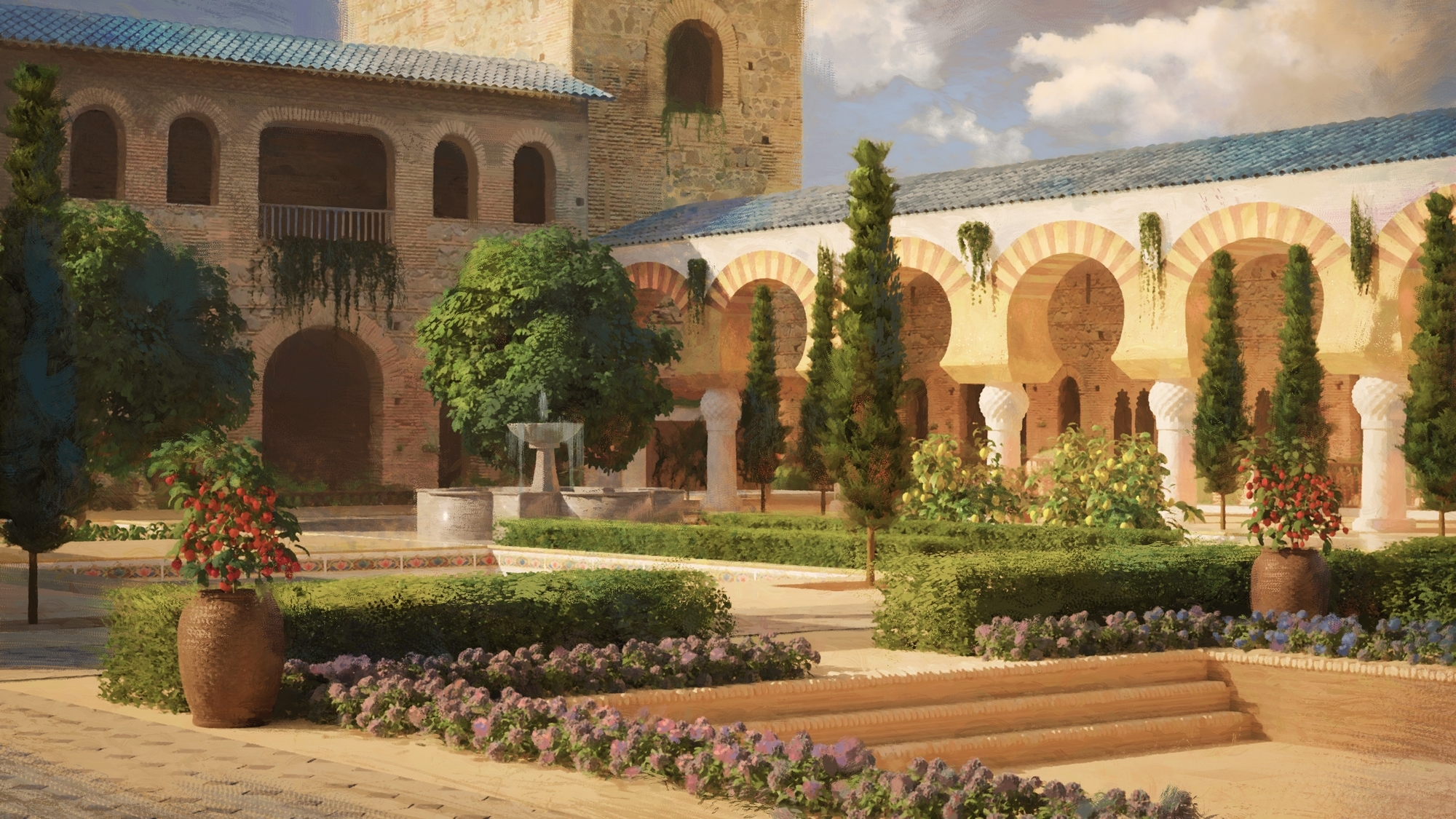
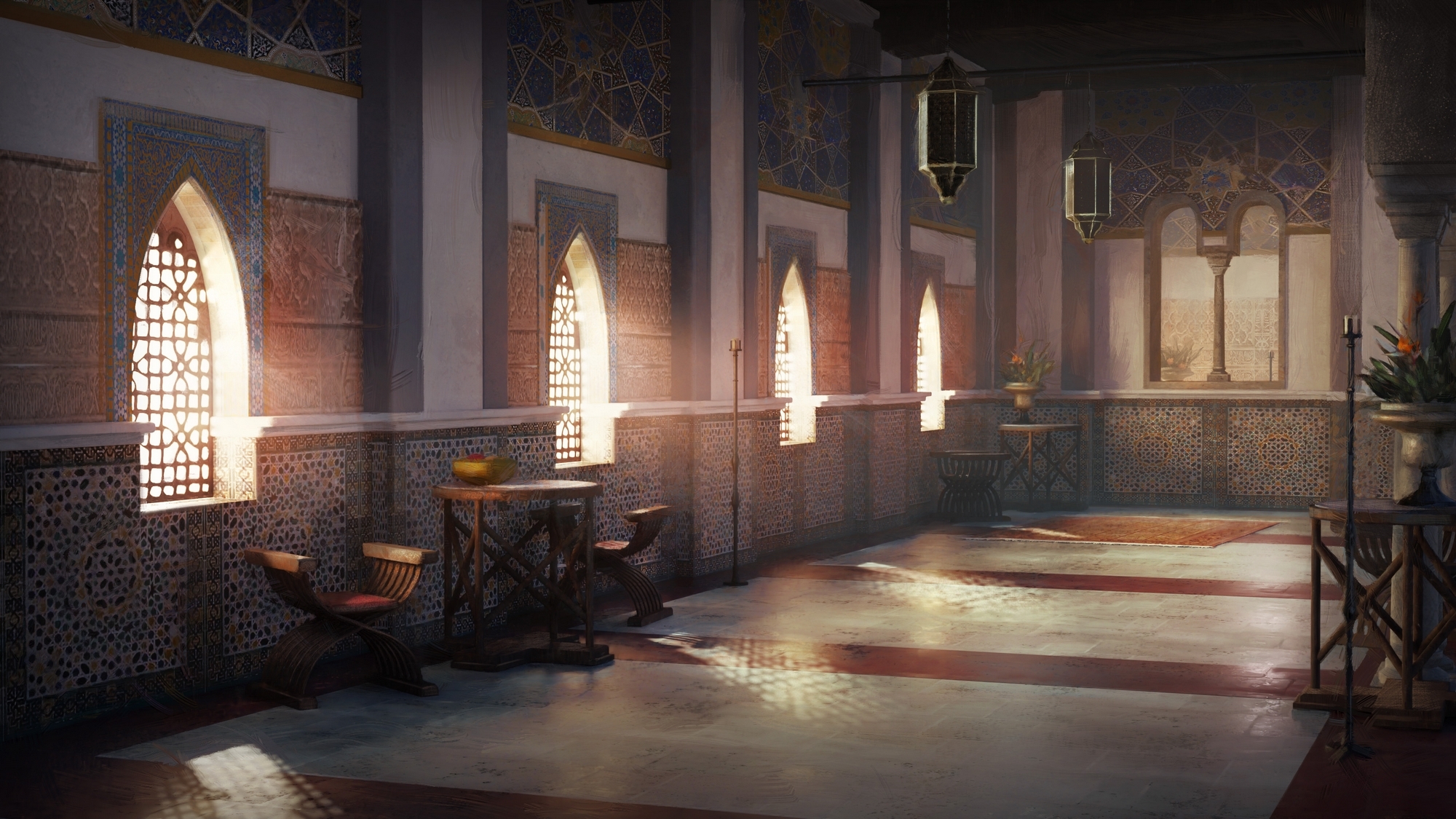
Here are some of the Scene Illustrations added with Fate of Iberia.
Click to enhance!
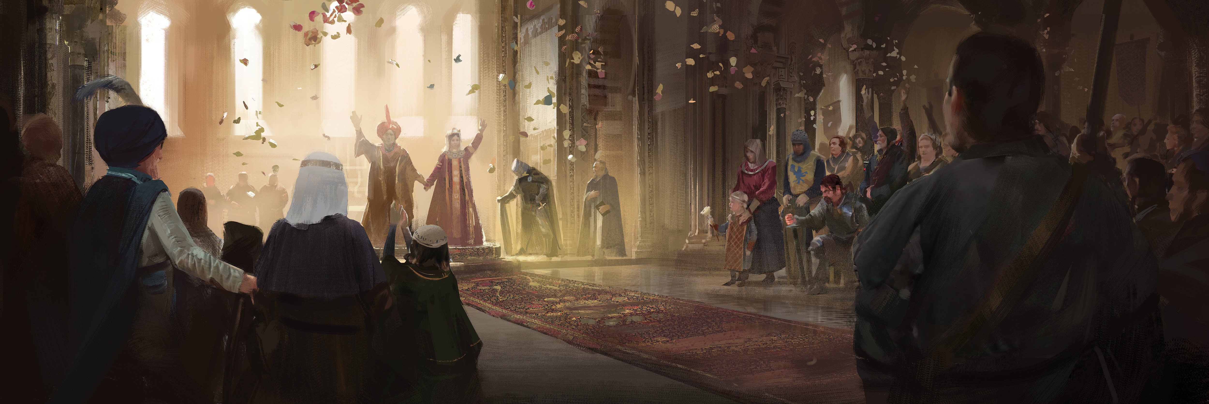
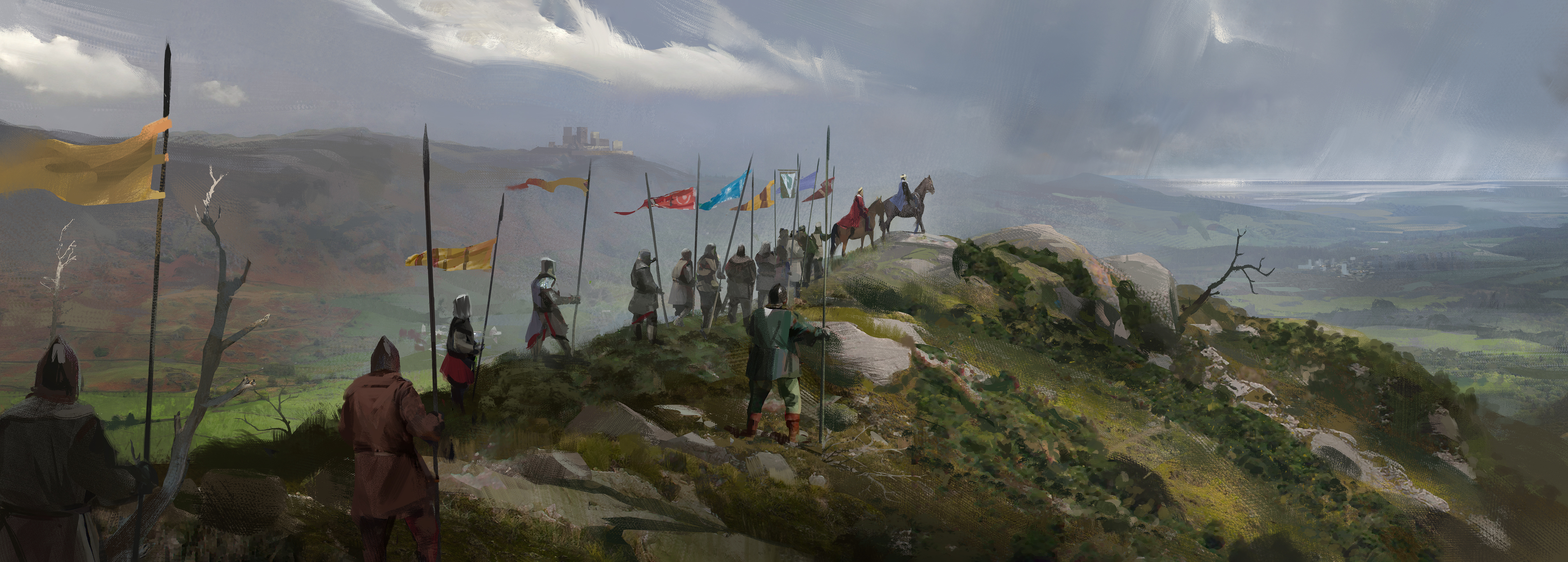
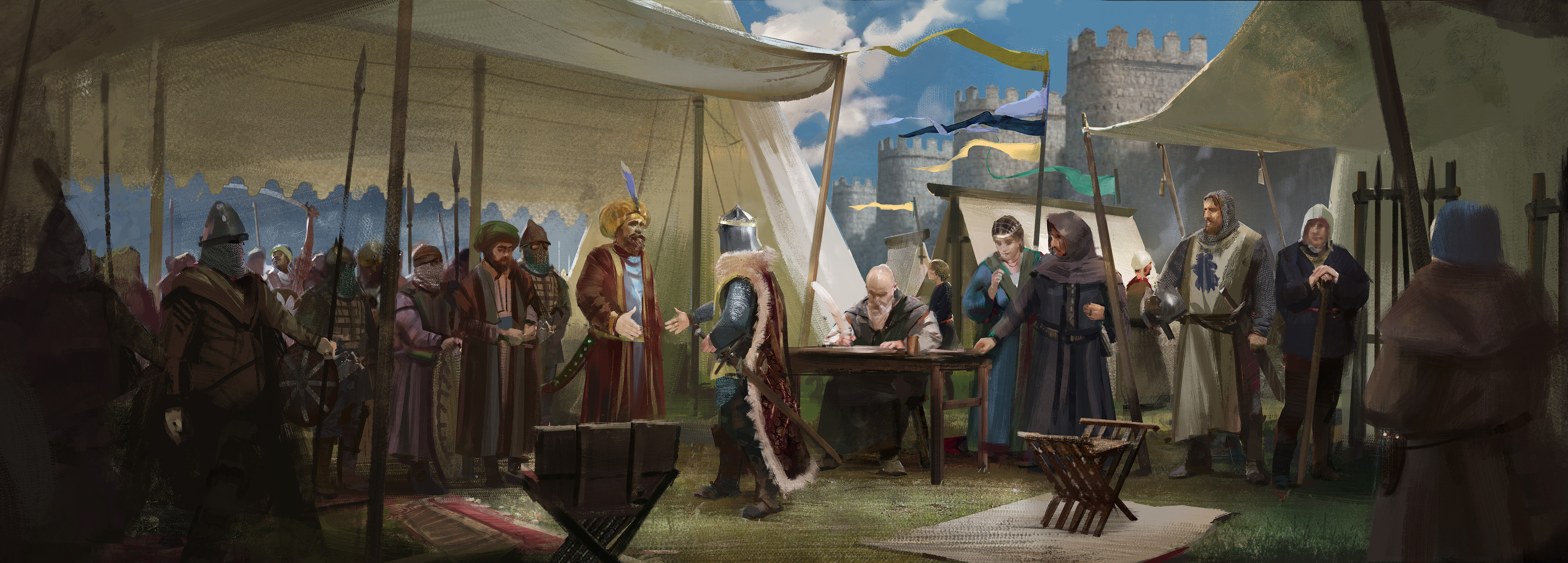
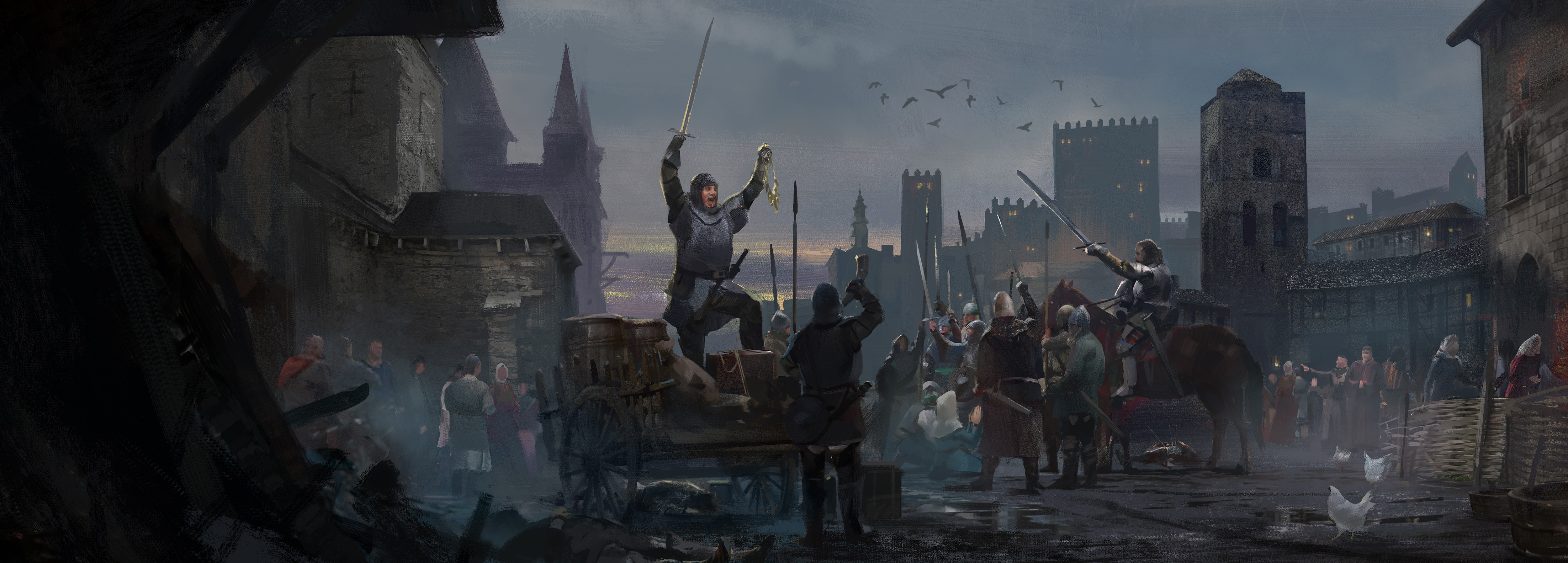
Story Illustrations The “Story Event” is a new, yet familiar, addition to Fate of Iberia. Not every type of Event we would like to create fits neatly into the previous format of “Character standing in a scene”. Some Events are more epic, involving a bigger cast of figures, or describe a more abstract idea not well captured by a single posed character. This type of illustration is a more epic version of the old CK2 event format we know and love.
These images are painted in a more expressionistic style and can contain a variety of characters and action. Here are some added in Fate of Iberia - expect to see more in the future!
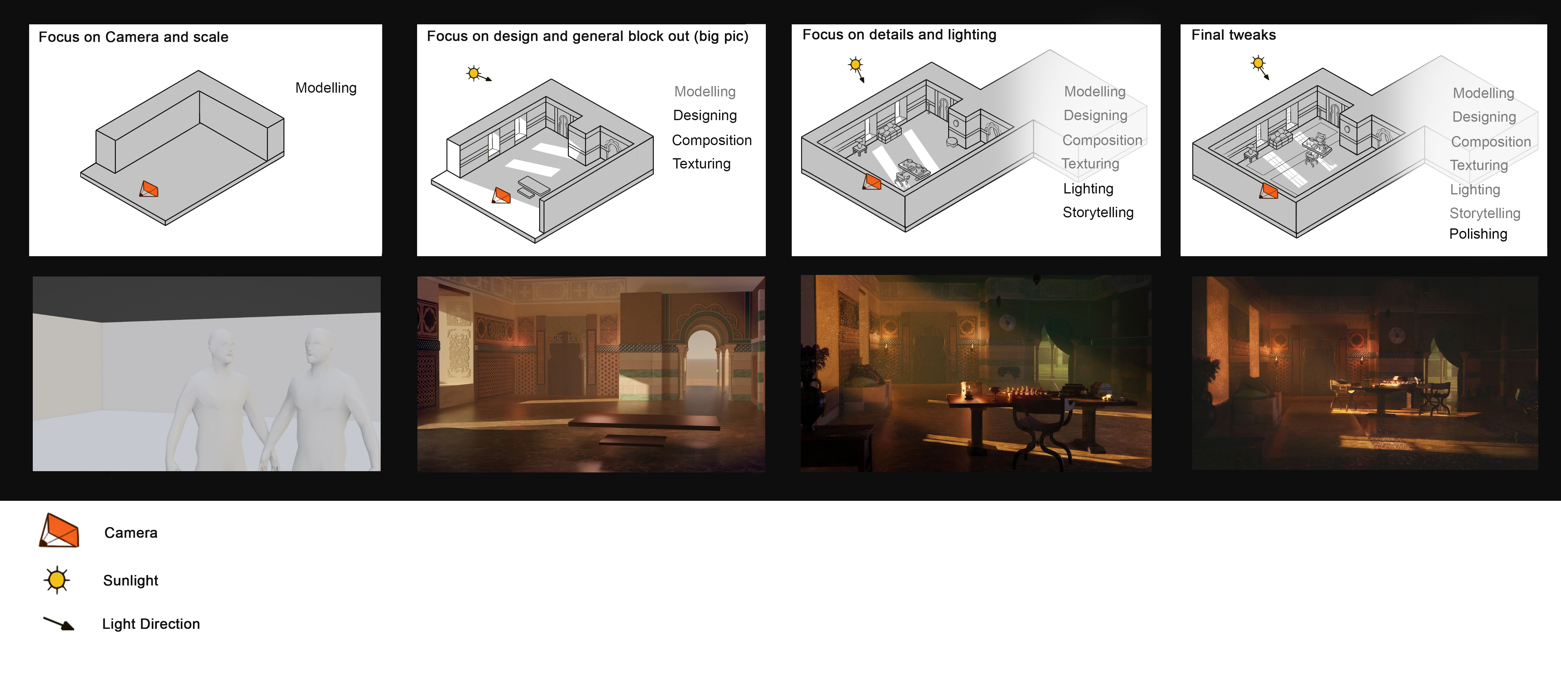
Process - Scene Event Illustration Step 1 - Concept and Brief The first step starts with Game Design. The Designers have some idea of which types of events they would like added to any expansion, and from this emerges a prioritized list of images. We typically want some images that can be used in many instances and some that are more unique and interesting.
The Designers will provide an initial set of references deemed suitable and historically accurate. The Artist will then supplement these with more artistic references, like inspiration for lighting, materials, and details. This is a collaborative process.
Step 2 - Modeling and Lighting

The base for these illustrations is always a 3D scene. This provides us with several benefits:
- Accurate scale and perspective become trivial.
- Iteration of lighting and camera angles happens much faster.
- We can reuse assets in multiple scenes, speeding up the process significantly.
It also helps us maintain a consistent style.
Step 3 - Polishing Our main priority is always framing the characters such that they are clearly legible.
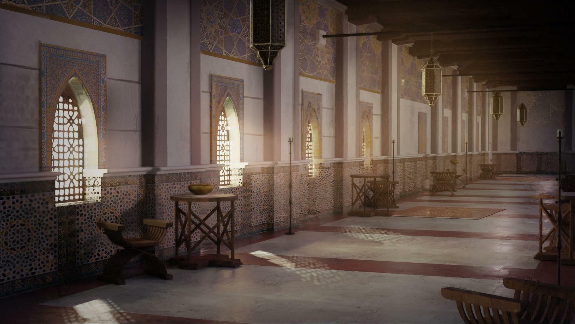
Here, for example, you can see how the same corridor could be longer.
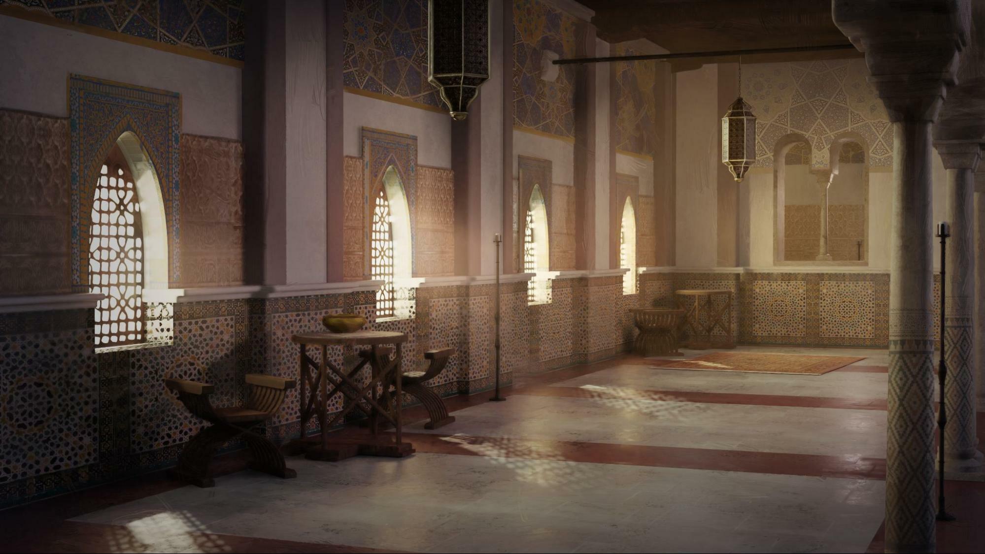
Or shorter.
The choice of using a shorter corridor here was twofold:
- The more intimate space is suitable for a broader range of events, rather than just those set in a massive palace.
- The corridor lines that go towards the vanishing point far away risk guiding the eye out of the scene. By making the line shorter, we allow the character to take more focus.
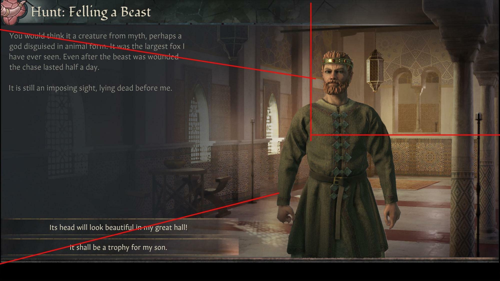

When we approach the final iteration, we keep doing tests to make sure we are respecting our goals. Here, for example, you can see elements that are too close to the character, which were then corrected in the final image. The vanishing point lines are placed in such a way as to not to excessively distract the player.
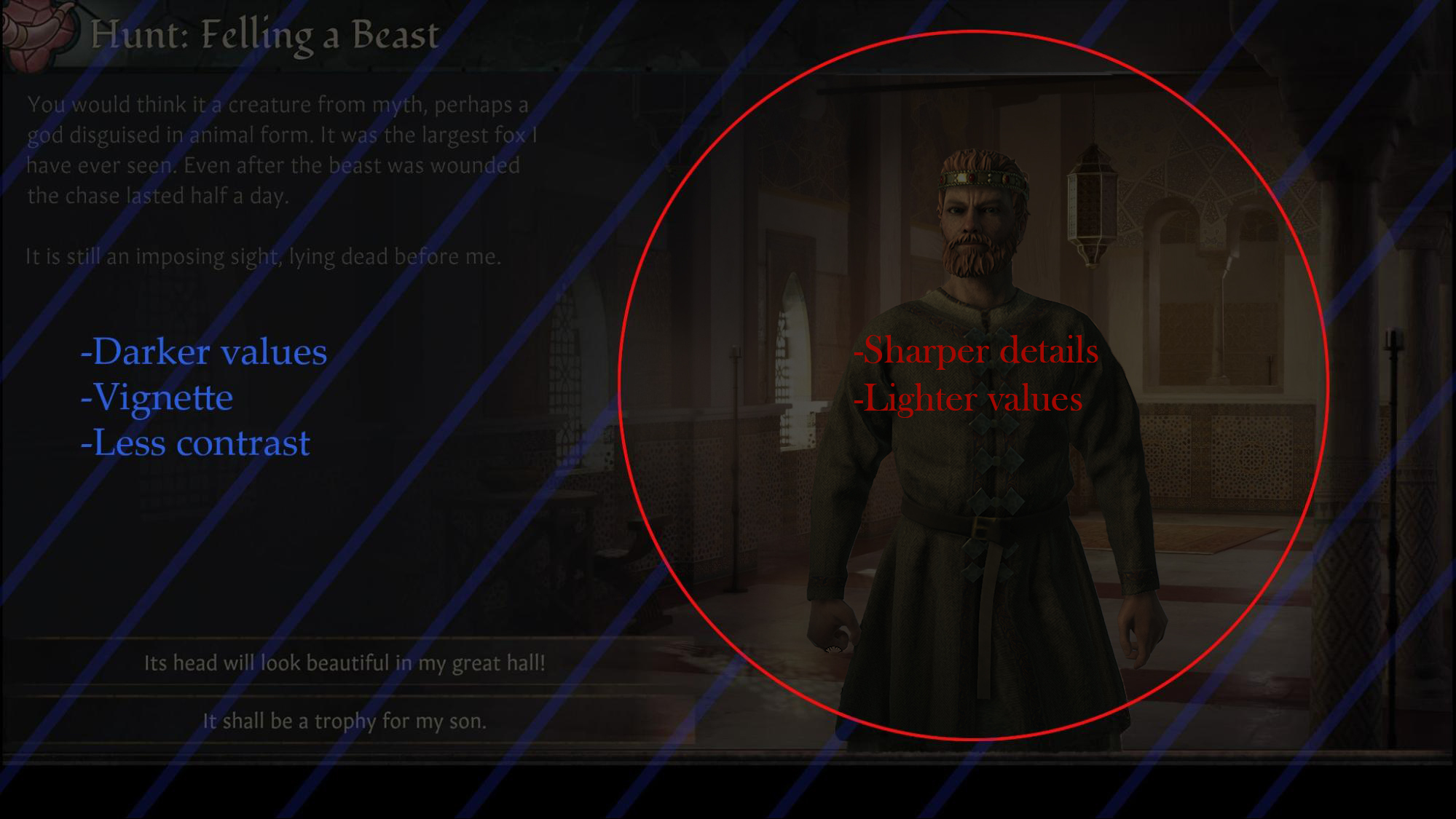
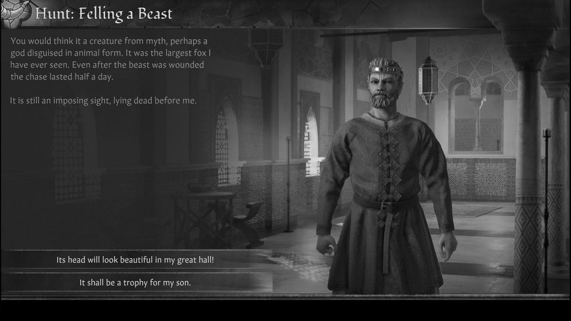
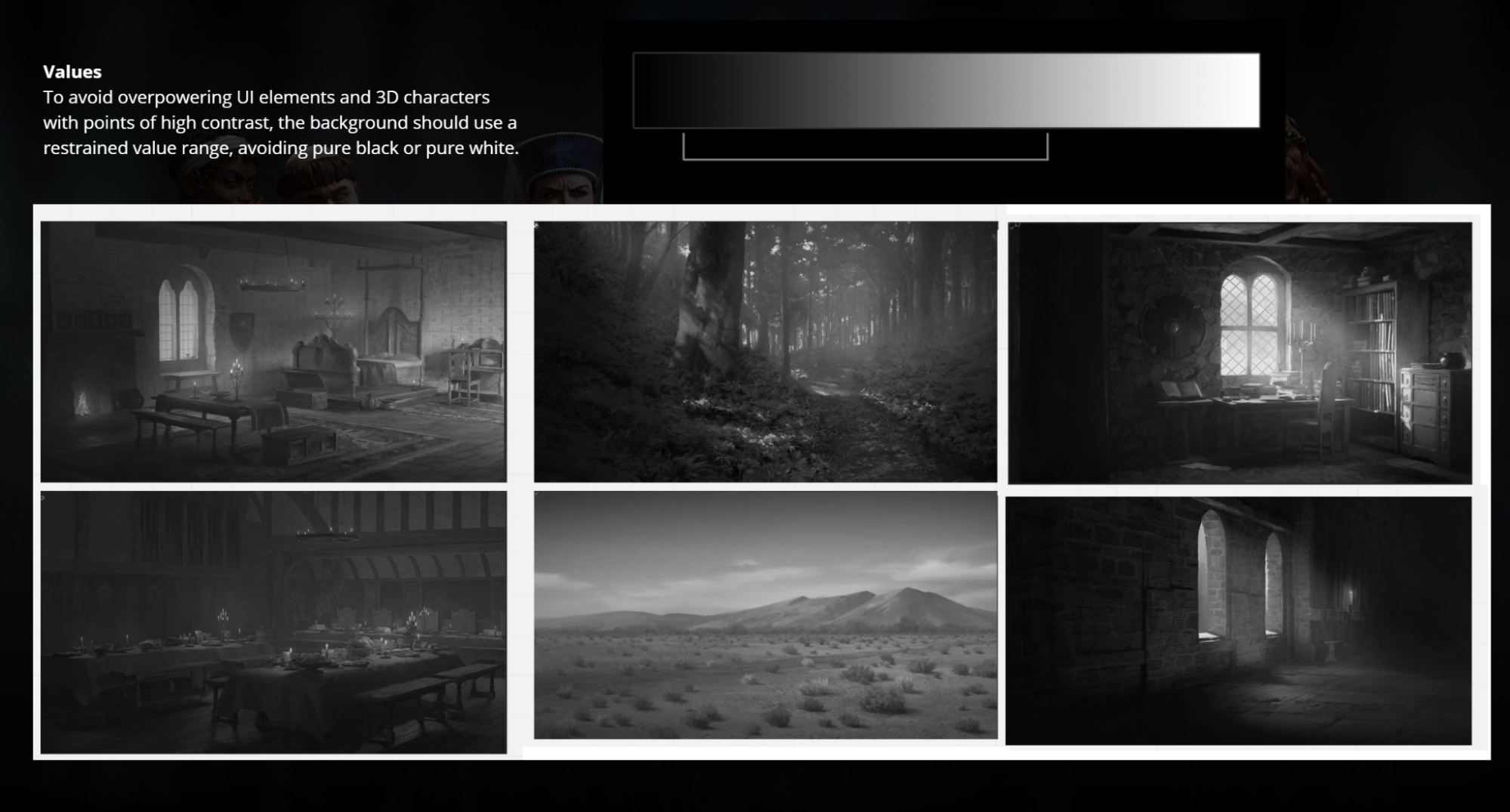
It is helpful to view the image in grayscale to get a clearer sense of how the light and dark values work.
If we do our jobs correctly, we end up with an image that is interesting, pretty to look at, and doesn’t overpower the character.
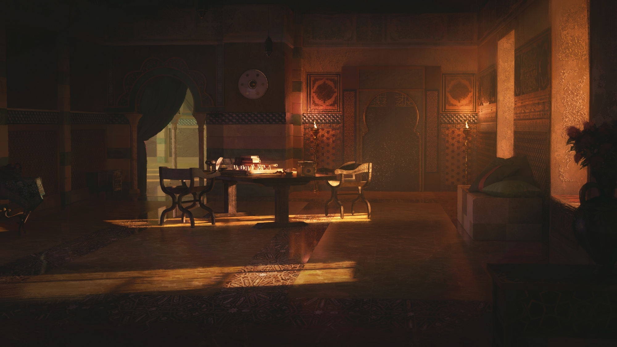
Example 1: MENA InteriorBy Ahmed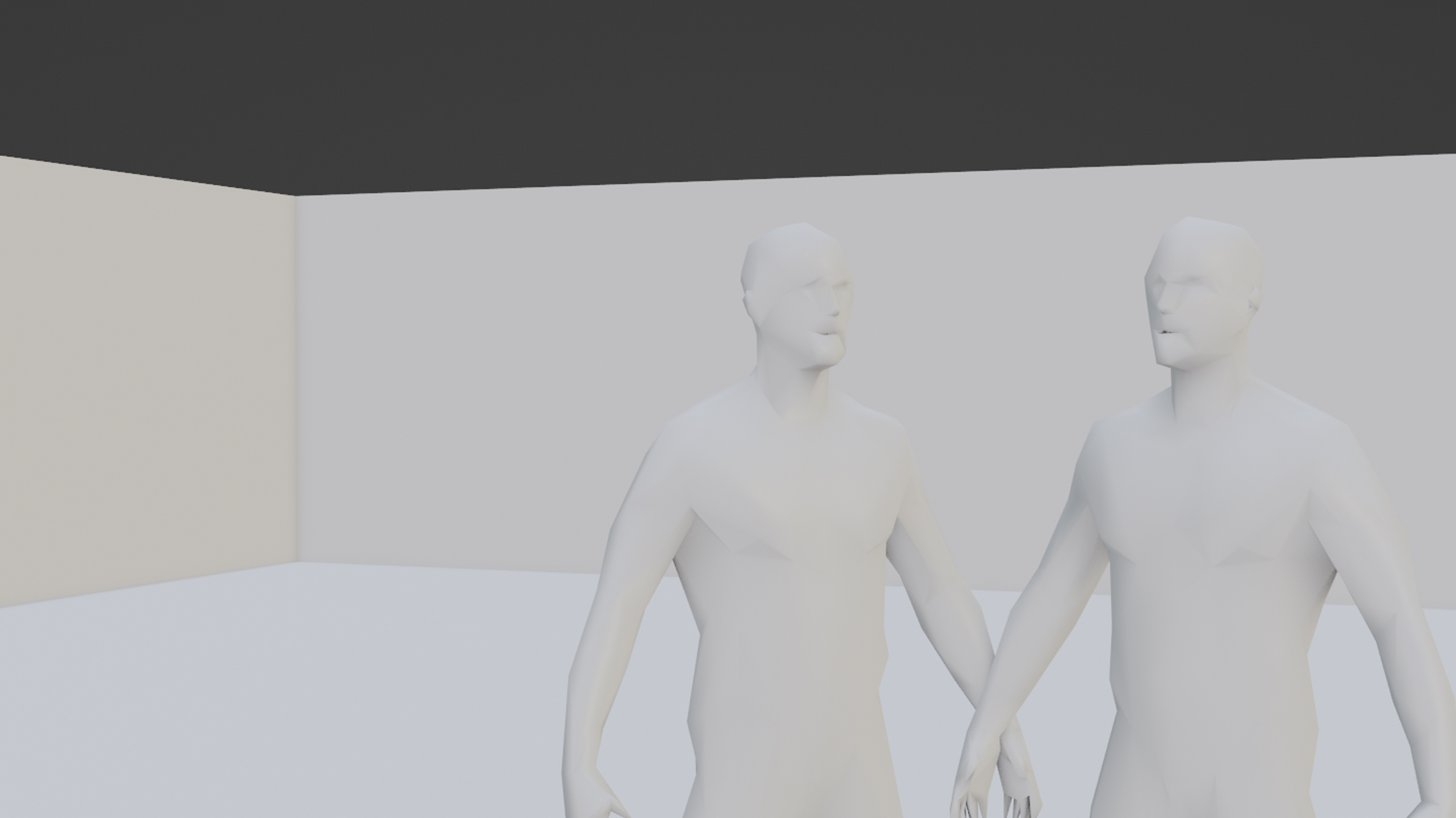
The modeling process starts with a template scene in Blender which includes a correct camera lens and human models for scale.
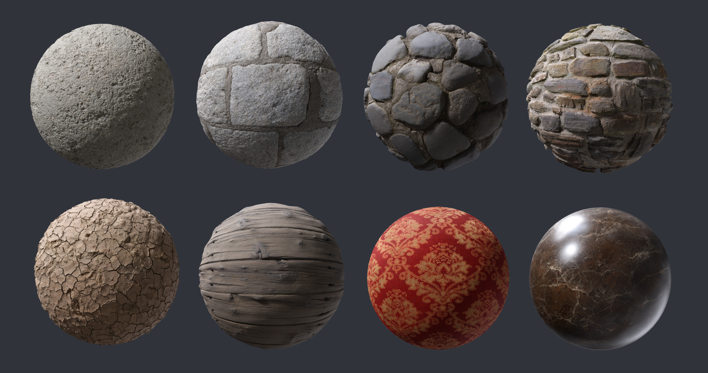
To speed up the process, materials are sourced from various free and commercial sources online. Common materials like Wood, Stone, Tiles, Fabrics and much more can be found in very high quality. The image shows various PBR Materials (source:
http://www.textures.com)
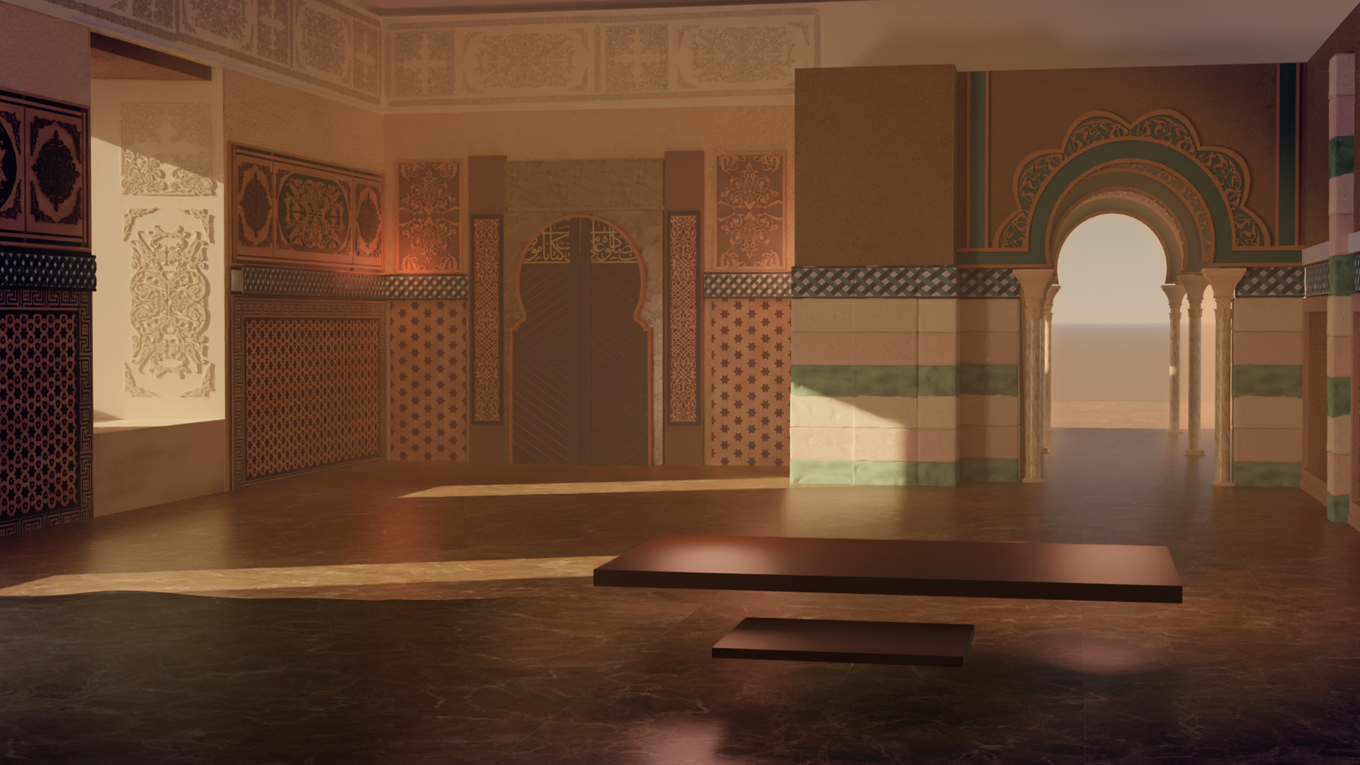
Blocking out the big details of the scene to get a feeling of the space.
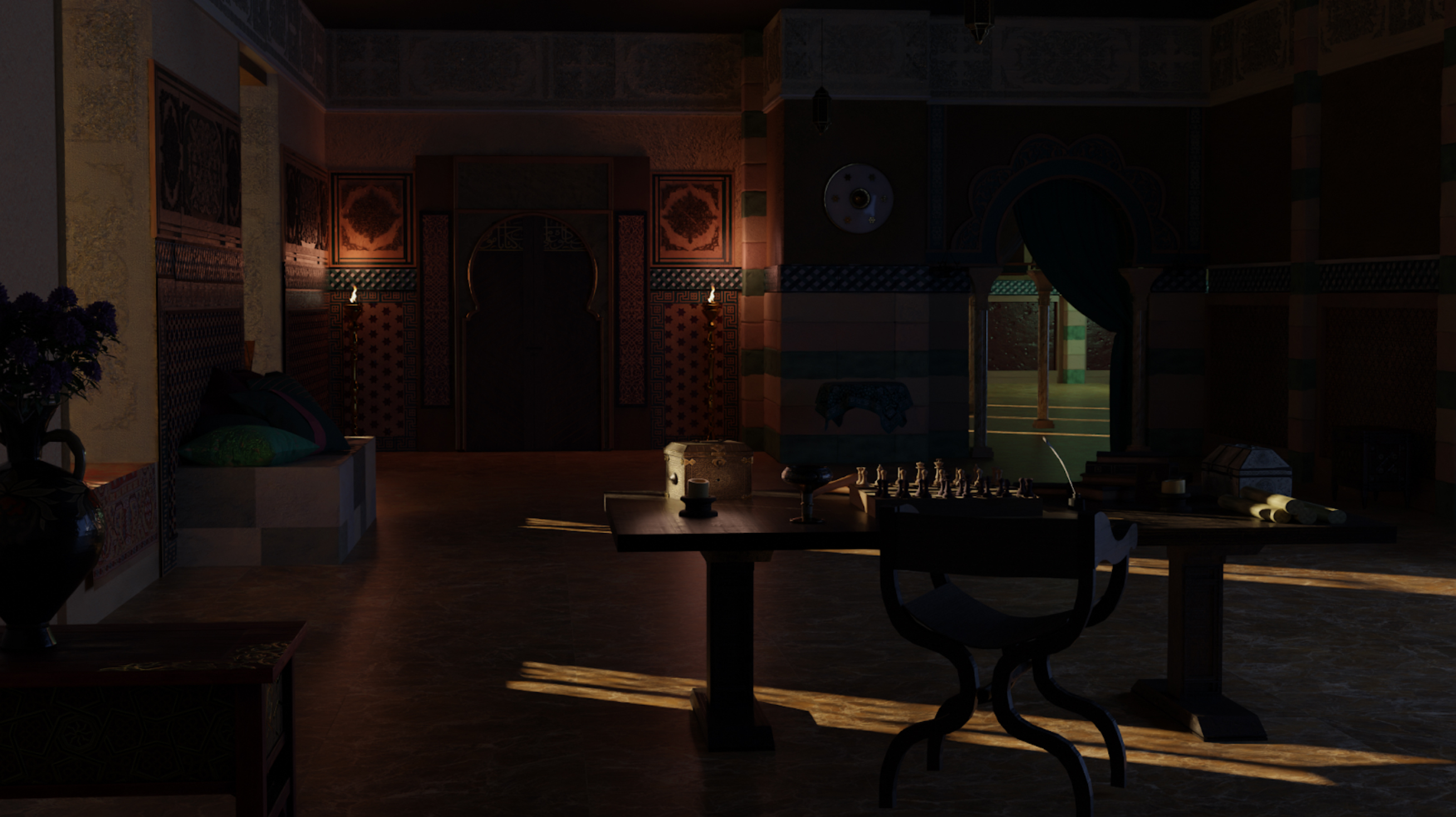
Walls were added behind the camera to block the sunlight and have the room closed from all directions, to make it darker. The focus was storytelling at this stage, and any added details should support this goal.
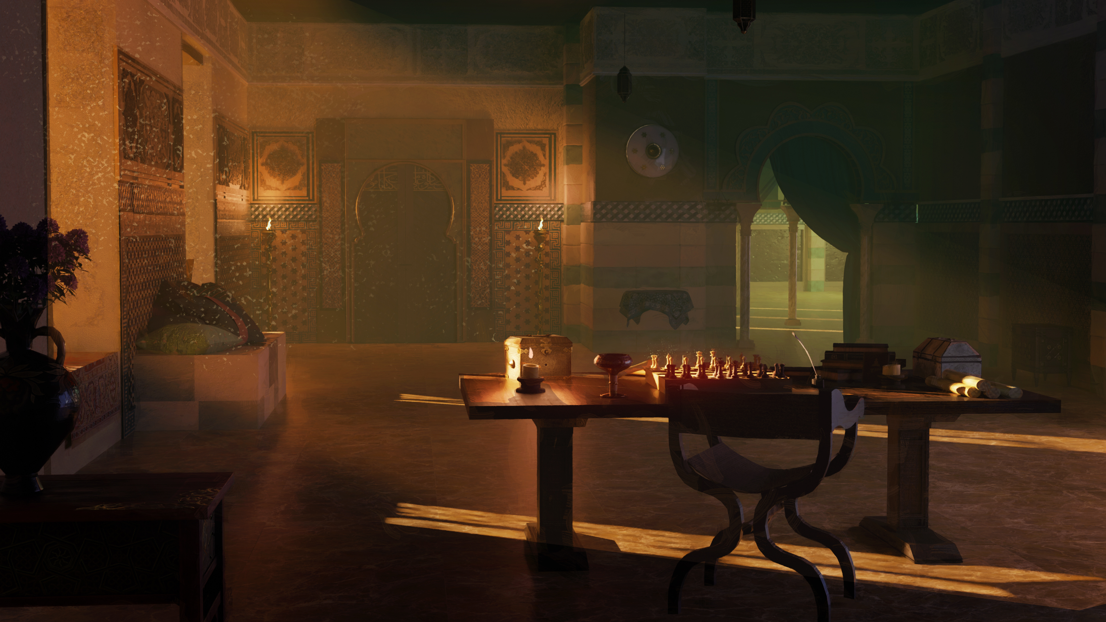
Some adjustments in Photoshop were made to get a feeling of the mood. *God rays” were added as well as some coloring tweaks:
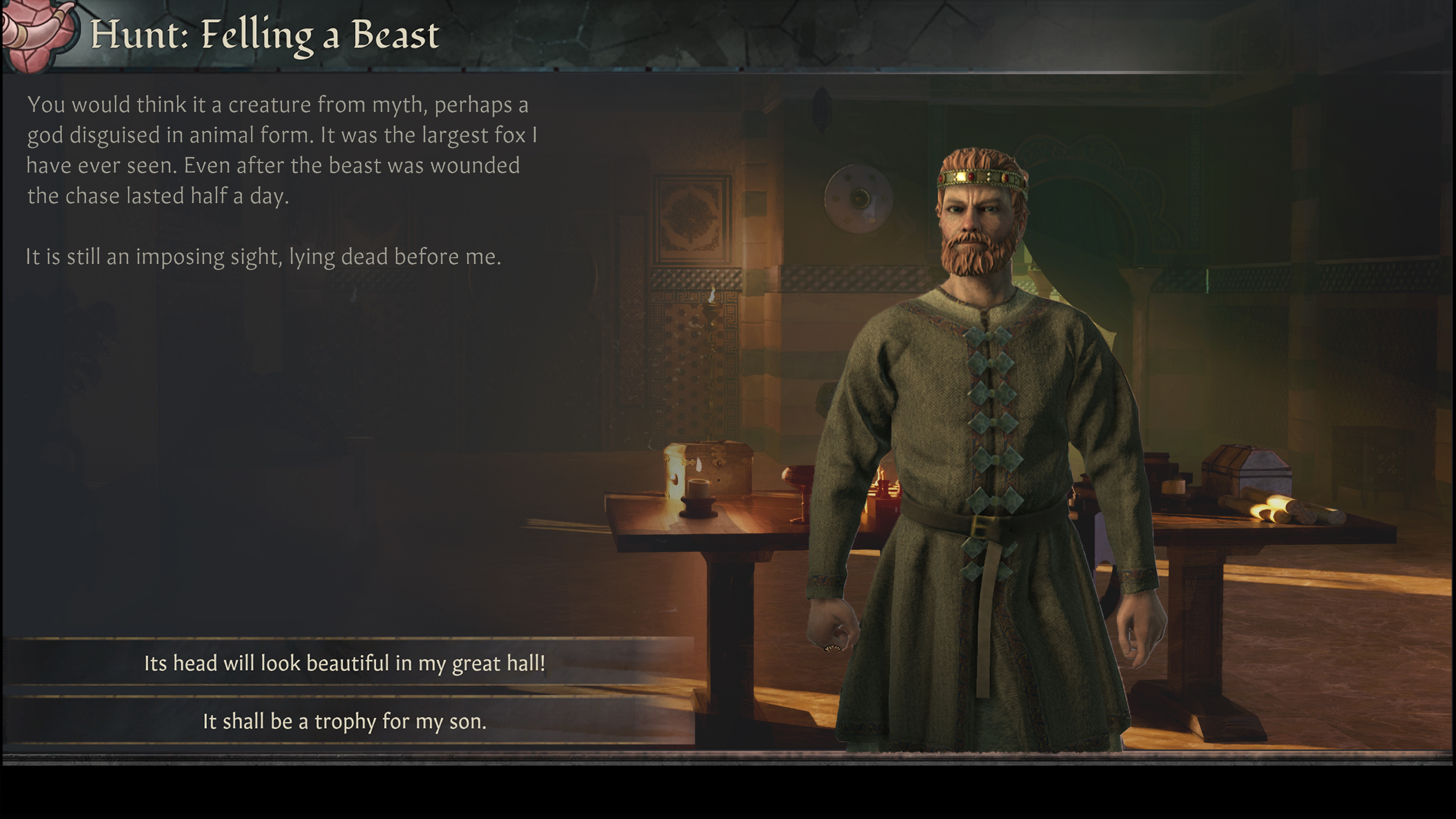
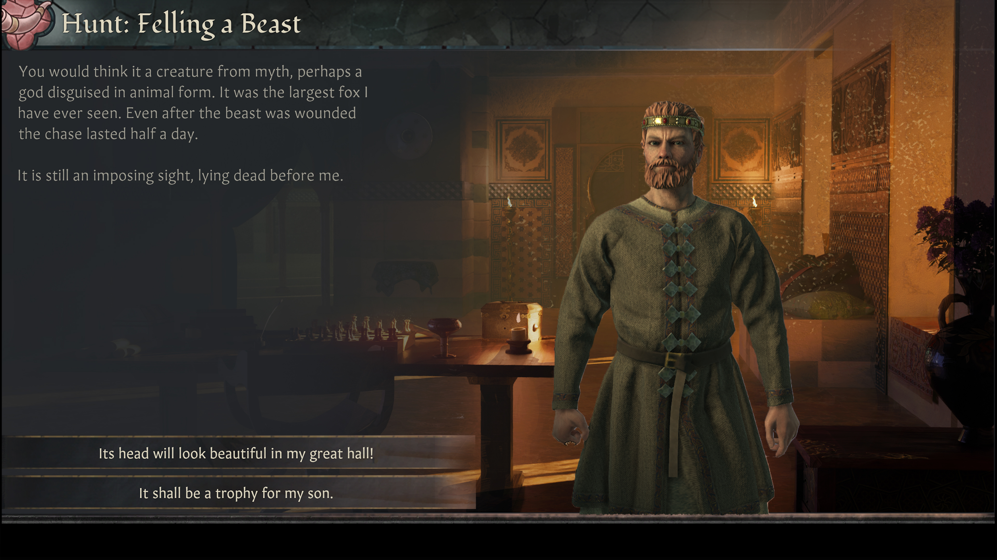
Placing a character and UI to see how it will appear in-game. The flipped scene looked better!
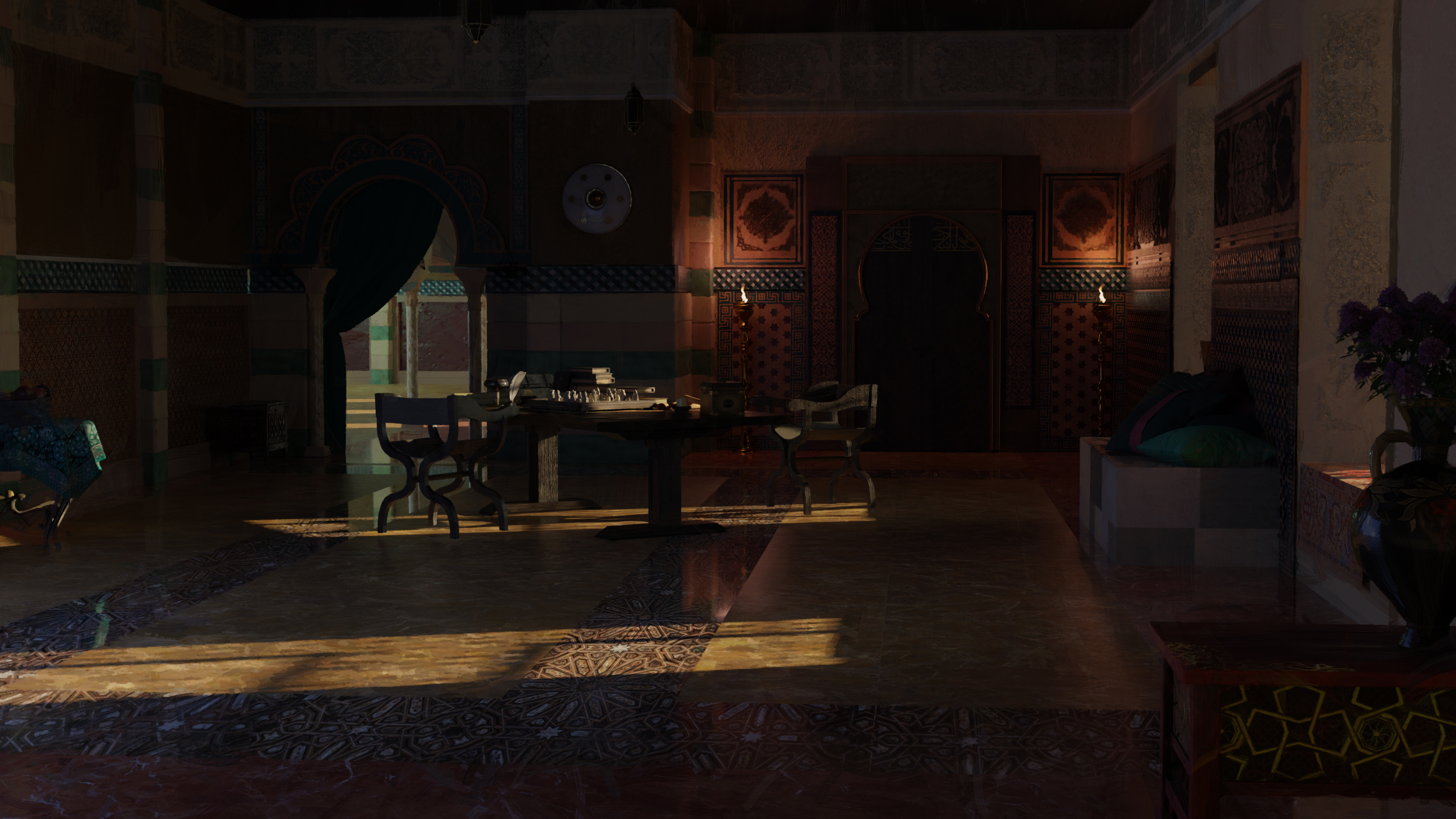
After some feedback, it turns out some changes to the composition were needed. Placing the table further back in the scene looked better for the overall composition and prevented the character from looking off-scale.
The simplest way to solve this was going back to Blender. The table is now placed further back in the scene.
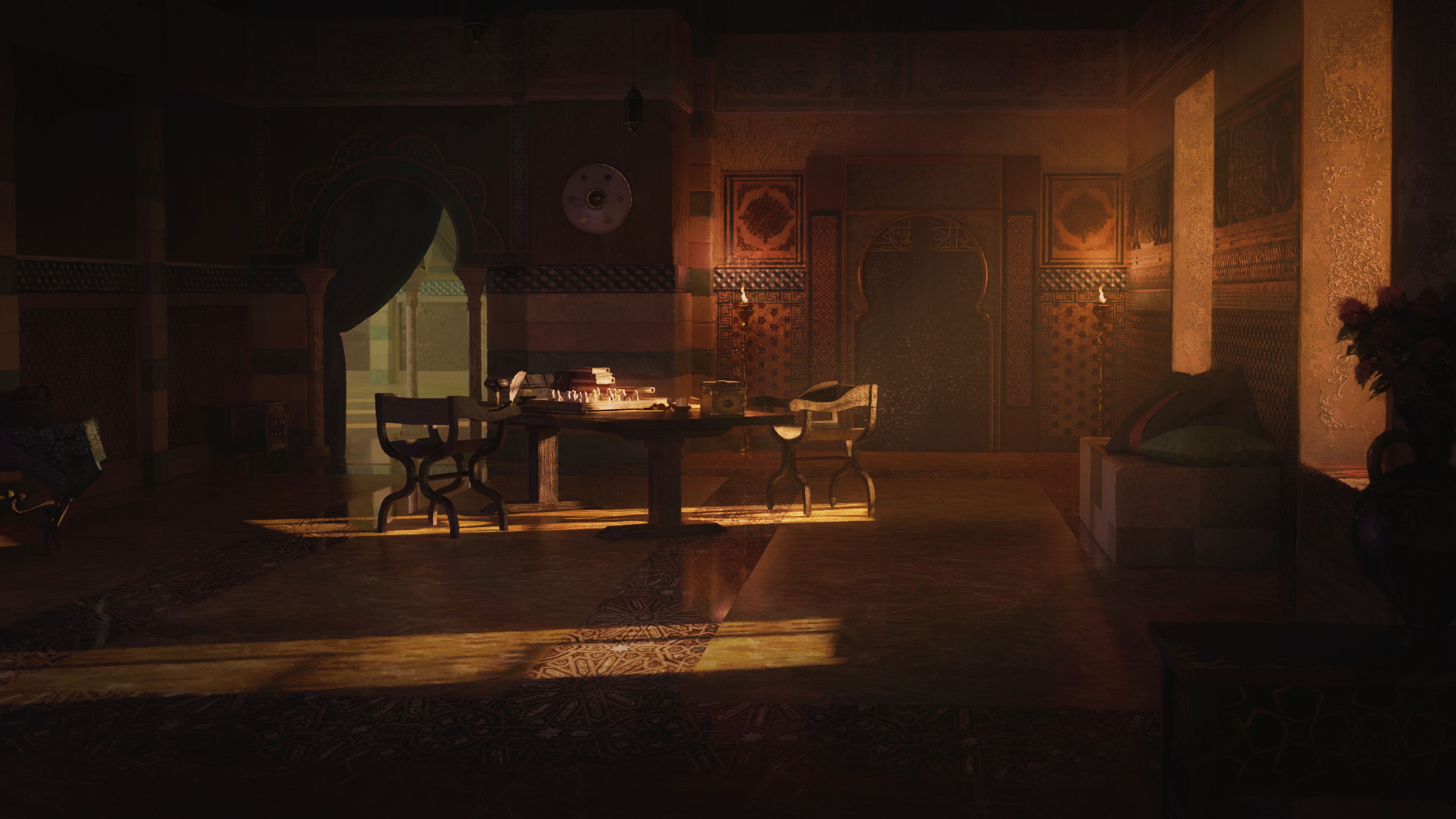
Back in Photoshop again, the color temperature was adjusted. Less greens and more reds.
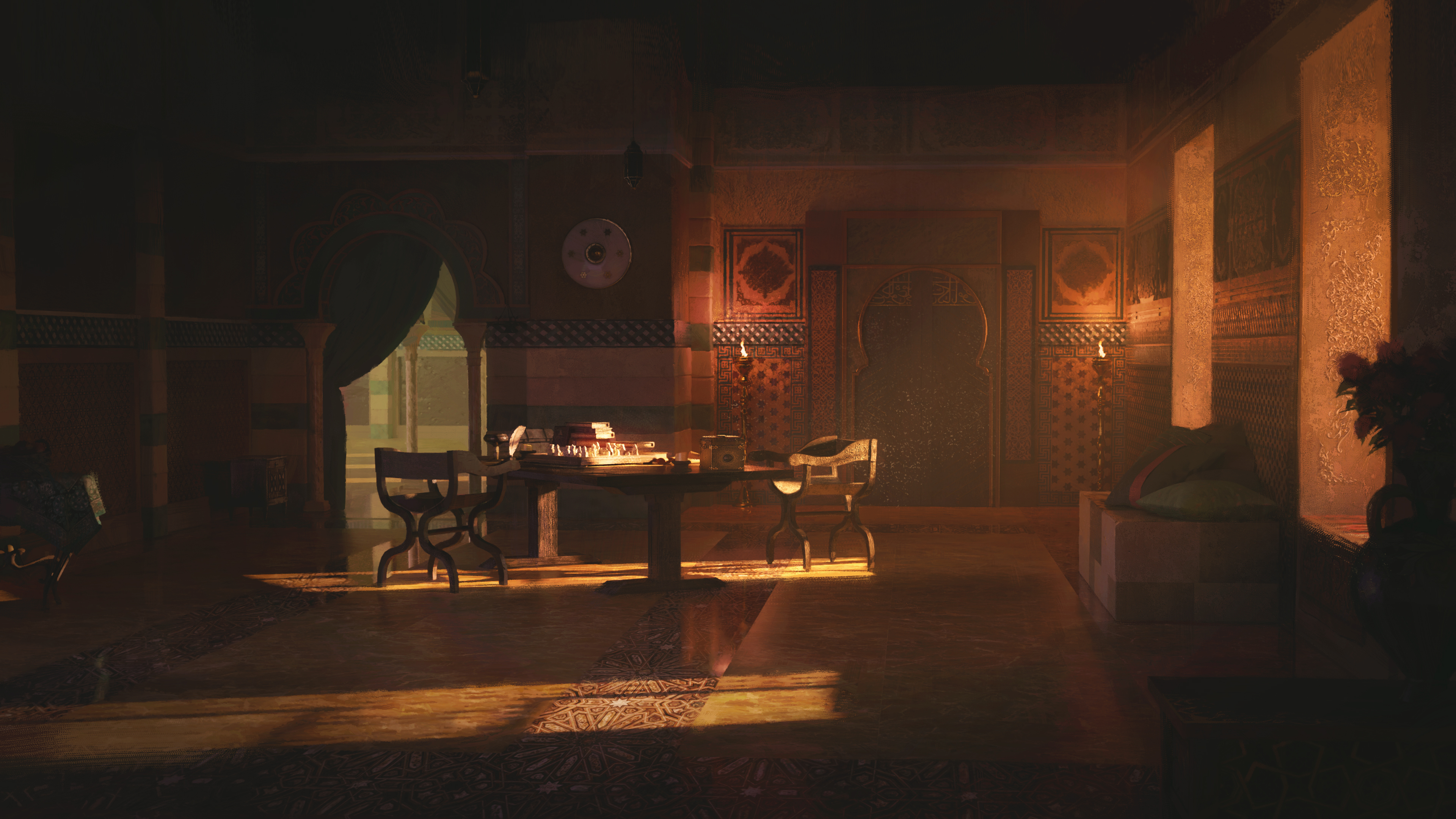
Fixing the lighting, making the lights pop more, adding color temperature to the lights.
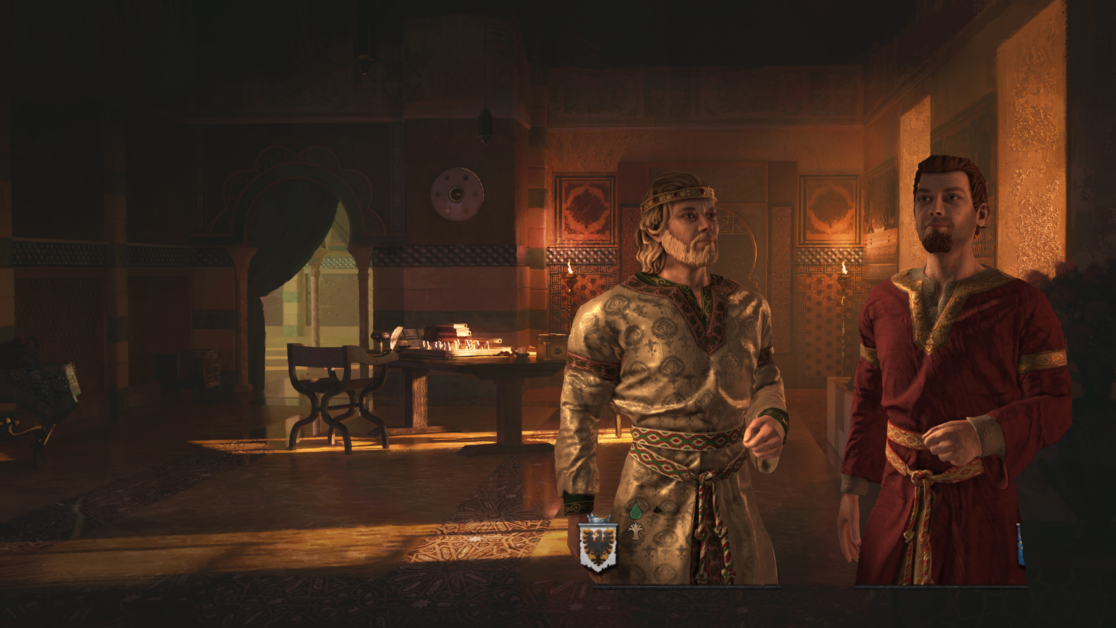
3D Characters with correct lighting done by our Character Artists.
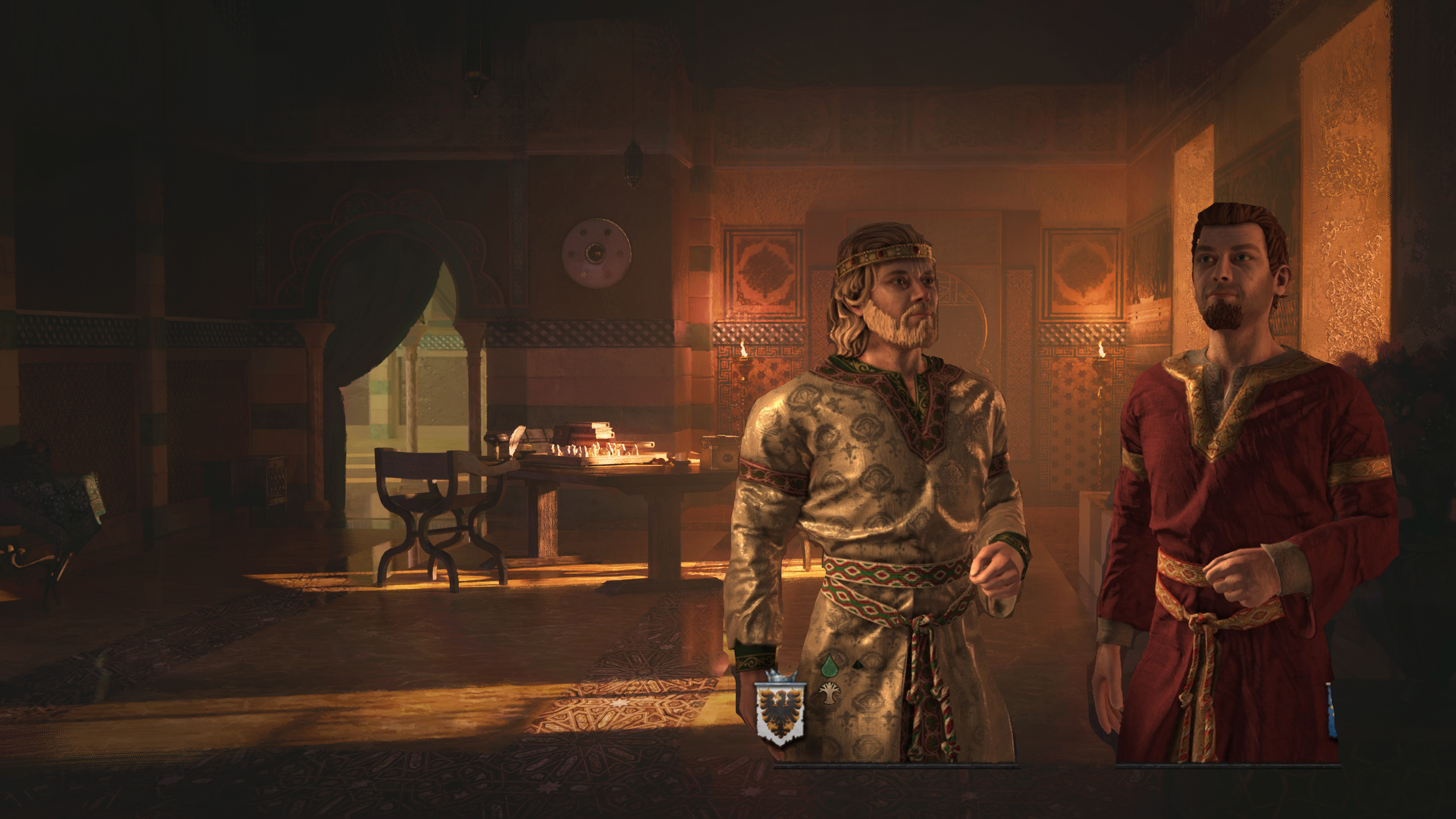
The Background behind the blonde bearded guy needed more separation. I went back to Photoshop and some fog was added.
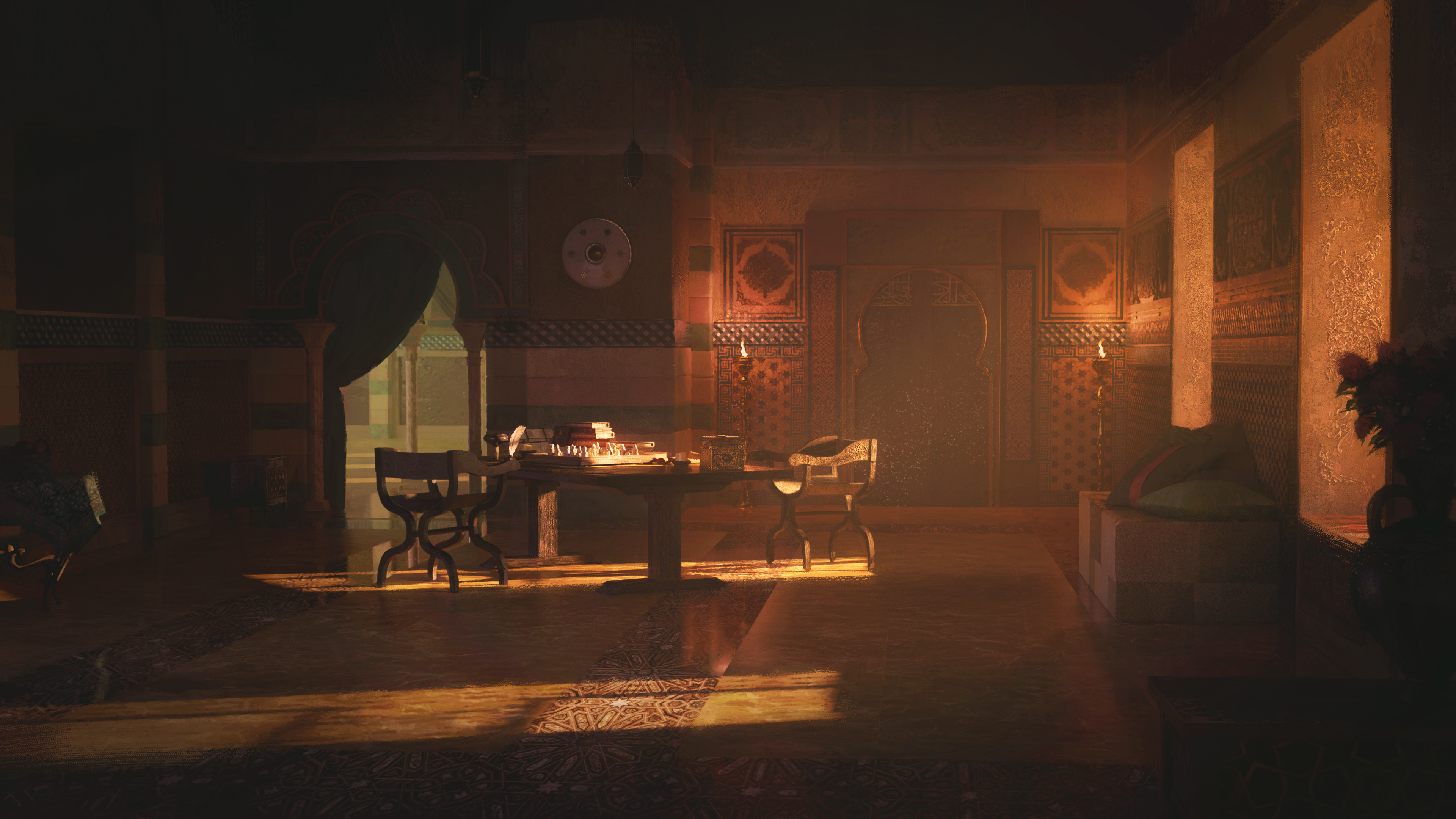
The result.
I hope you found this interesting and enjoyed the process as much as we enjoyed working on these images! As you can see the process can differ and each event image can present a distinct set of challenges, but with guidance and support from our art leads and colleagues we can reach those results.
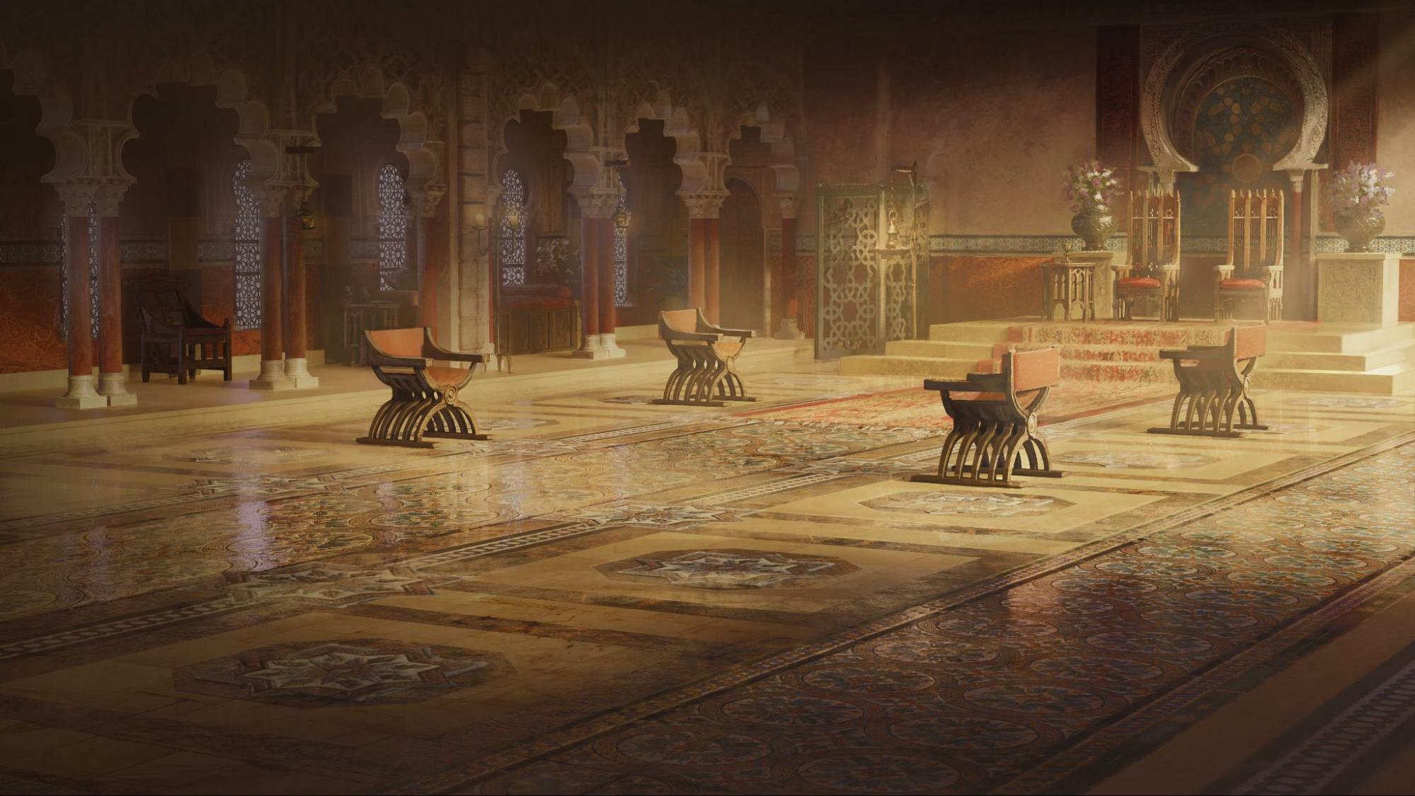
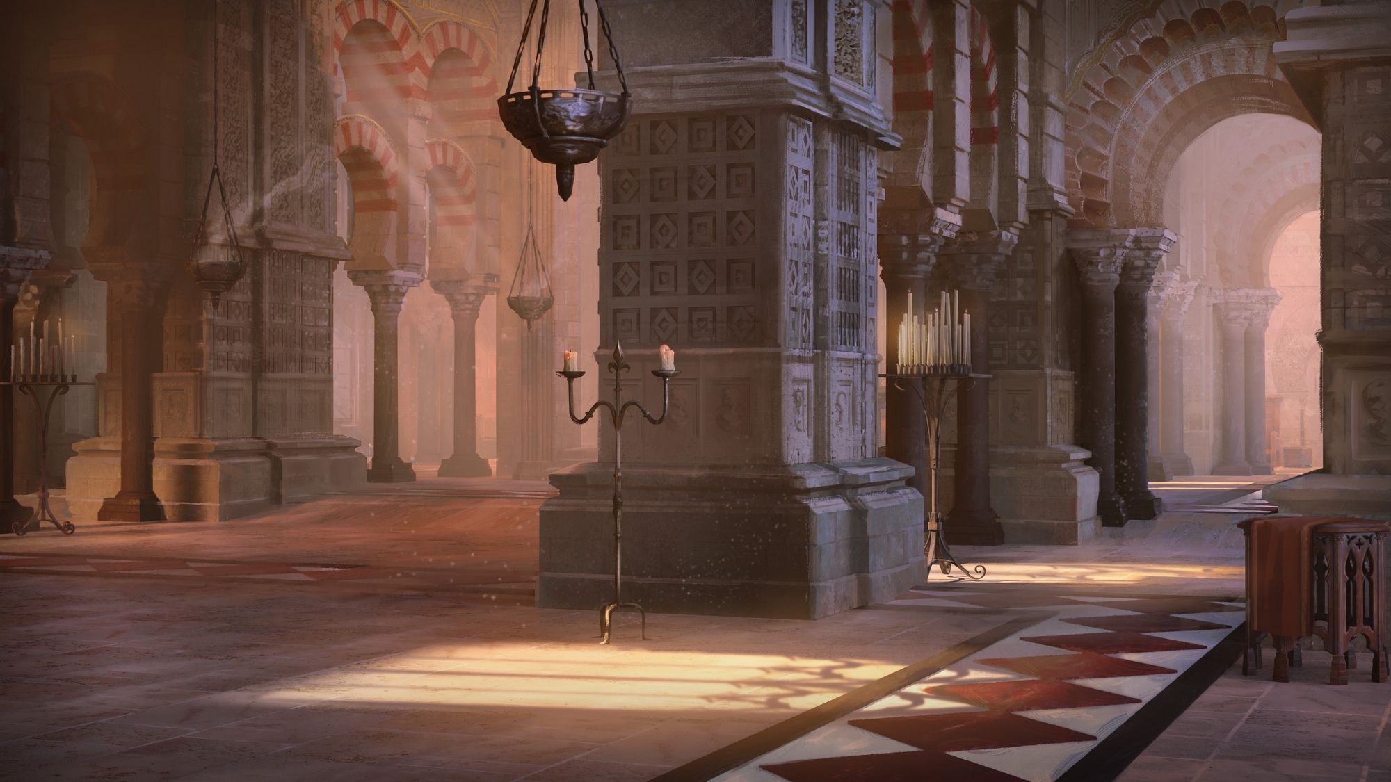
Example 2: Iberian Throne RoomBy AlessandroI was excited to be able to do the background of the main menu, partly because it presented a new challenge for me, partly because it was an eye-catching and immediately visible image.
First, we had some discussions about plausible historical references and moods for the scene, as well as the relation to previous works on the game.
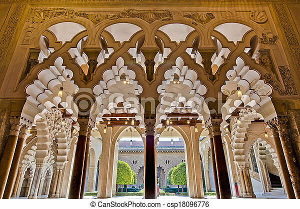
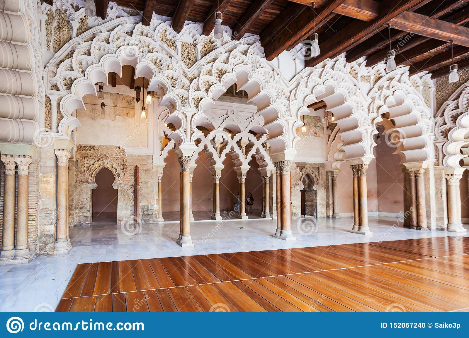
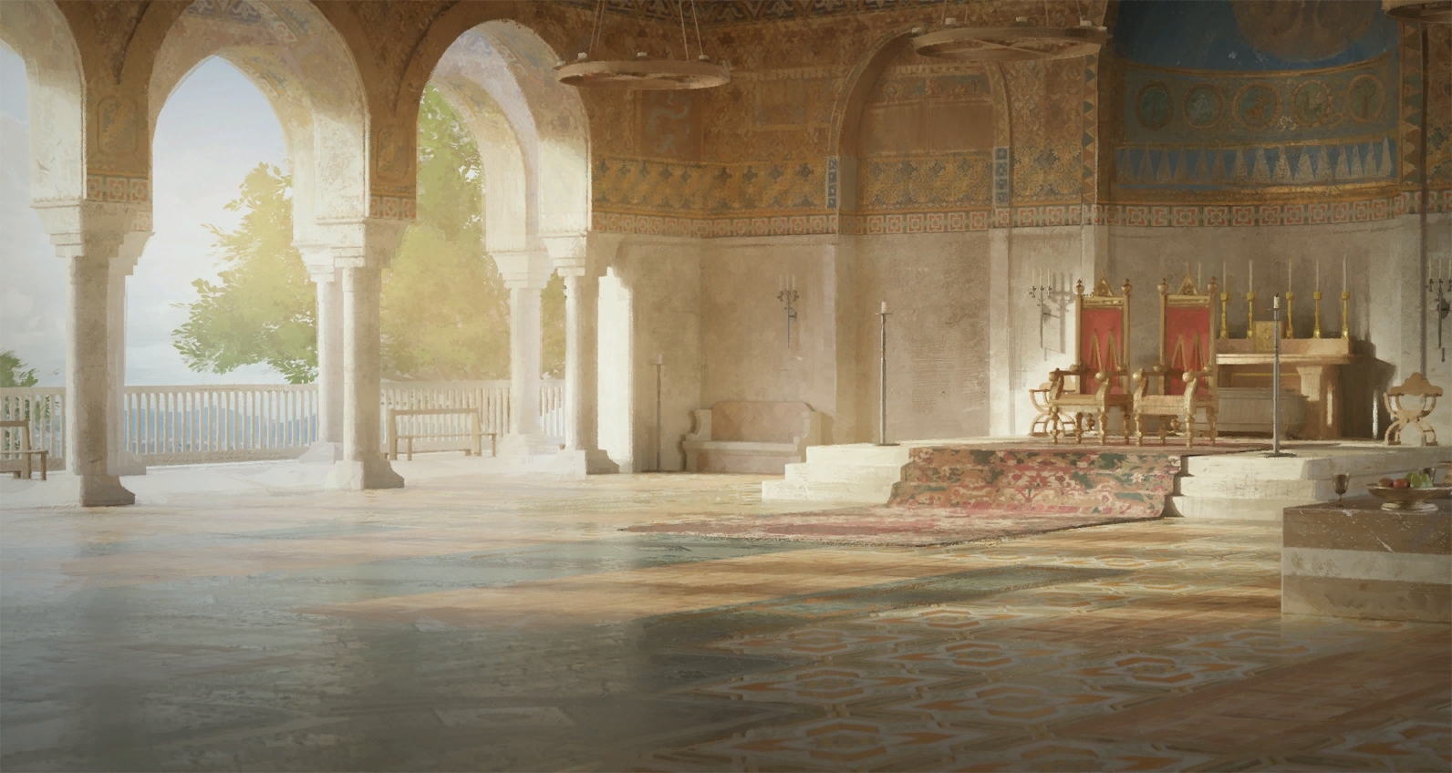
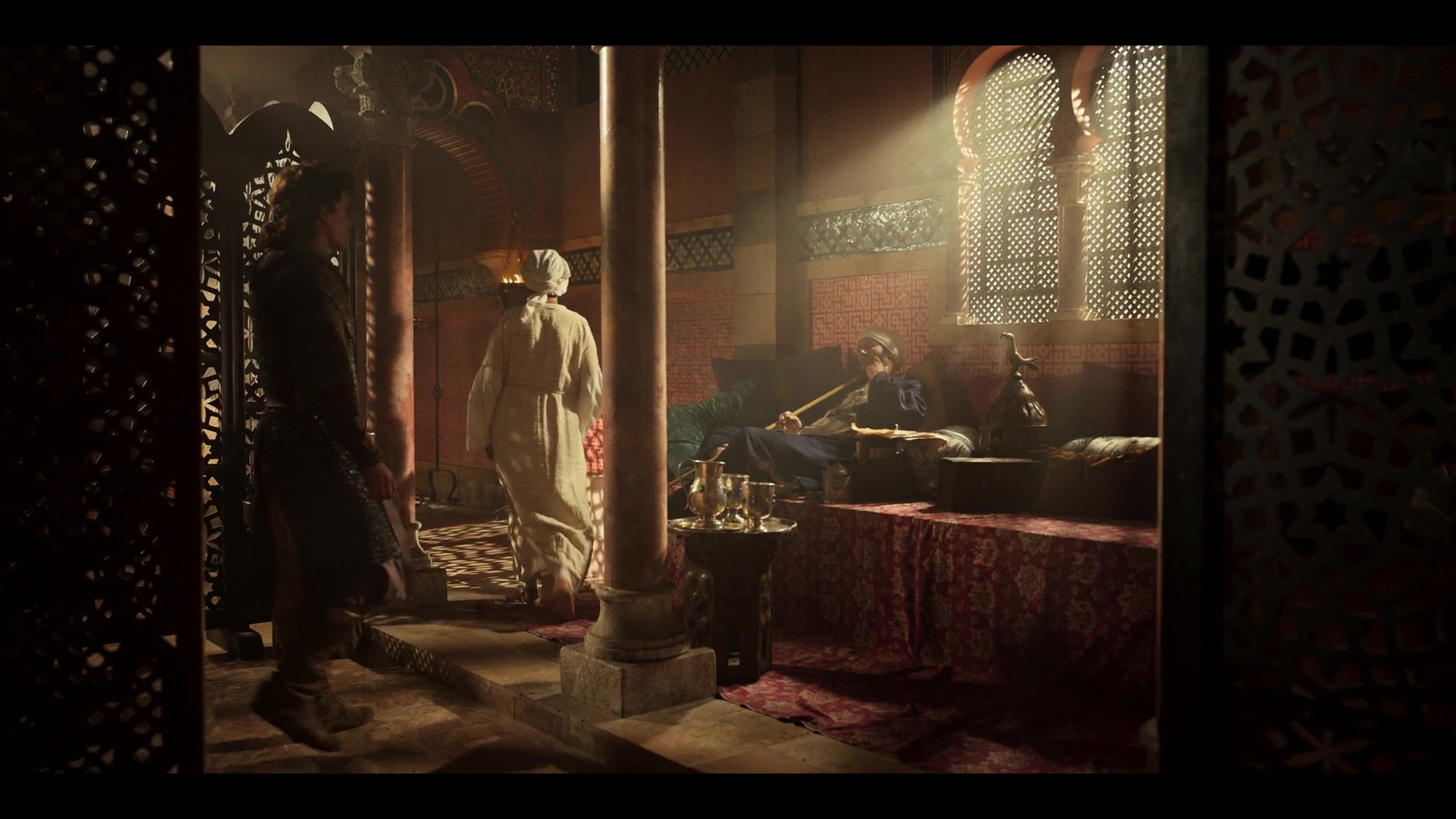
Because of the setting, the warm and welcoming atmosphere seemed appropriate, so I immediately started thinking about a yellow and red color scheme.
In the references, white is often used, and it was an interesting idea, but in order not to do something too like the standard Mediterranean Throne Room I opted for a real color. In my image there are still some white elements, but since I decided to use a very saturated sun, the result is still tending towards yellow.
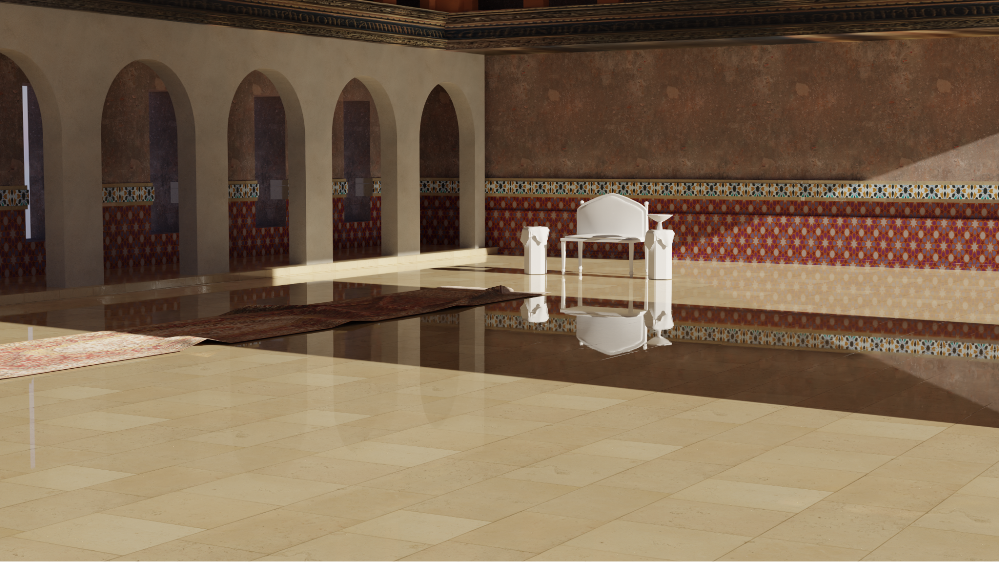
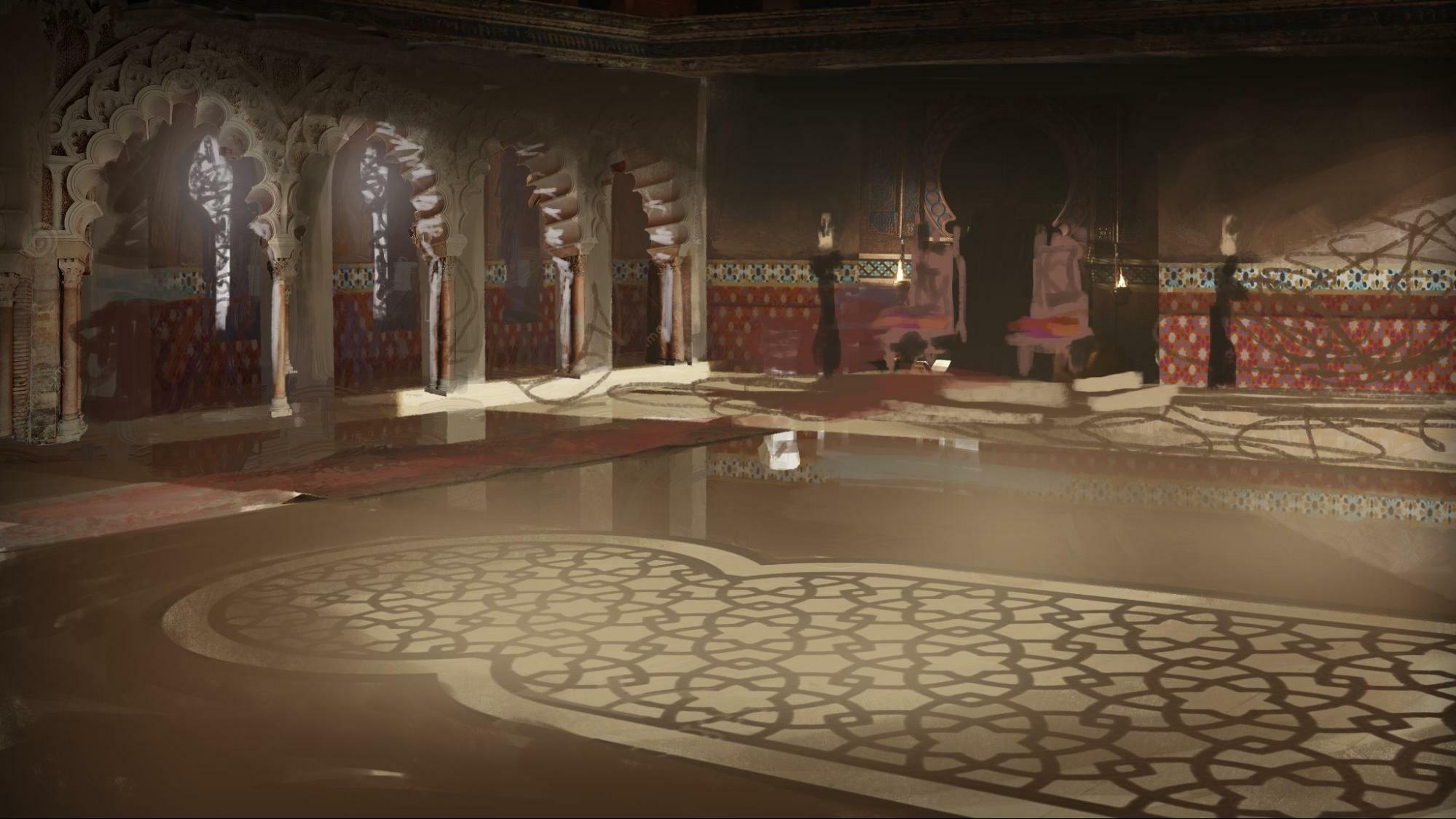
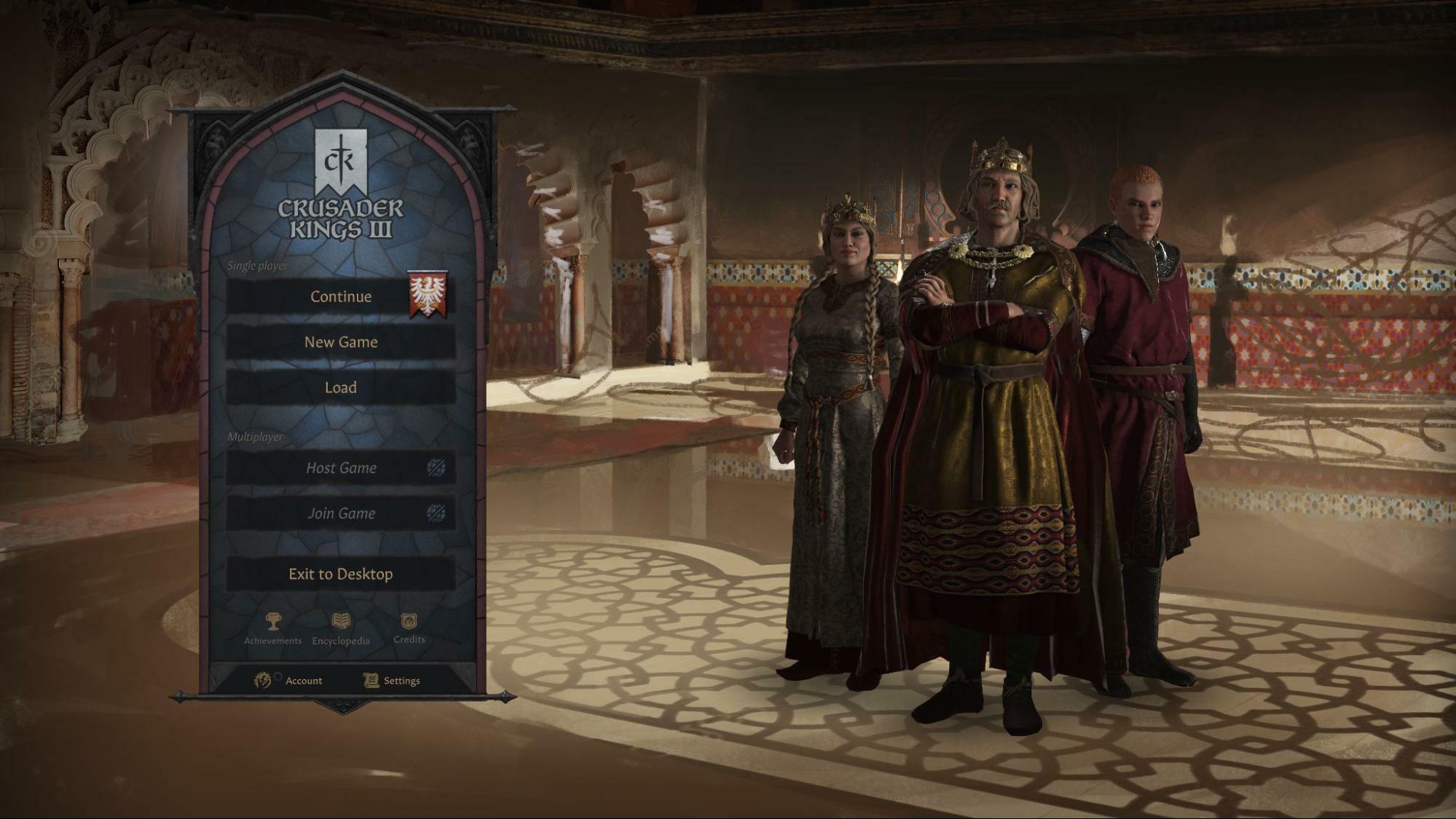
After the initial sketch stage, some technical problems became apparent. The throne itself, one of the focal points in the background, was completely covered by the characters. The second problem concerned the mood.
I wanted to create some interesting shadow patterns from the sun, but this would have created problems of credibility and shading with respect to the characters, so I had to opt for a different solution.
Often when I find myself in complex situations, I prefer to think about it in the final stages, it helps me not to get stuck on an illustration for too long, thinking about too many alternative solutions that in practice I do not yet know how to deal with, making myself waste time.
I started to define the details of the image, making it more saturated and darker, adding purple as a complementary color for the light seen from the windows, to create richer color variations.
I tried different approaches especially for the furniture elements and the floor. I liked the idea of creating a texture that combined large, open areas with more detailed areas - so I tested out a variety of materials.
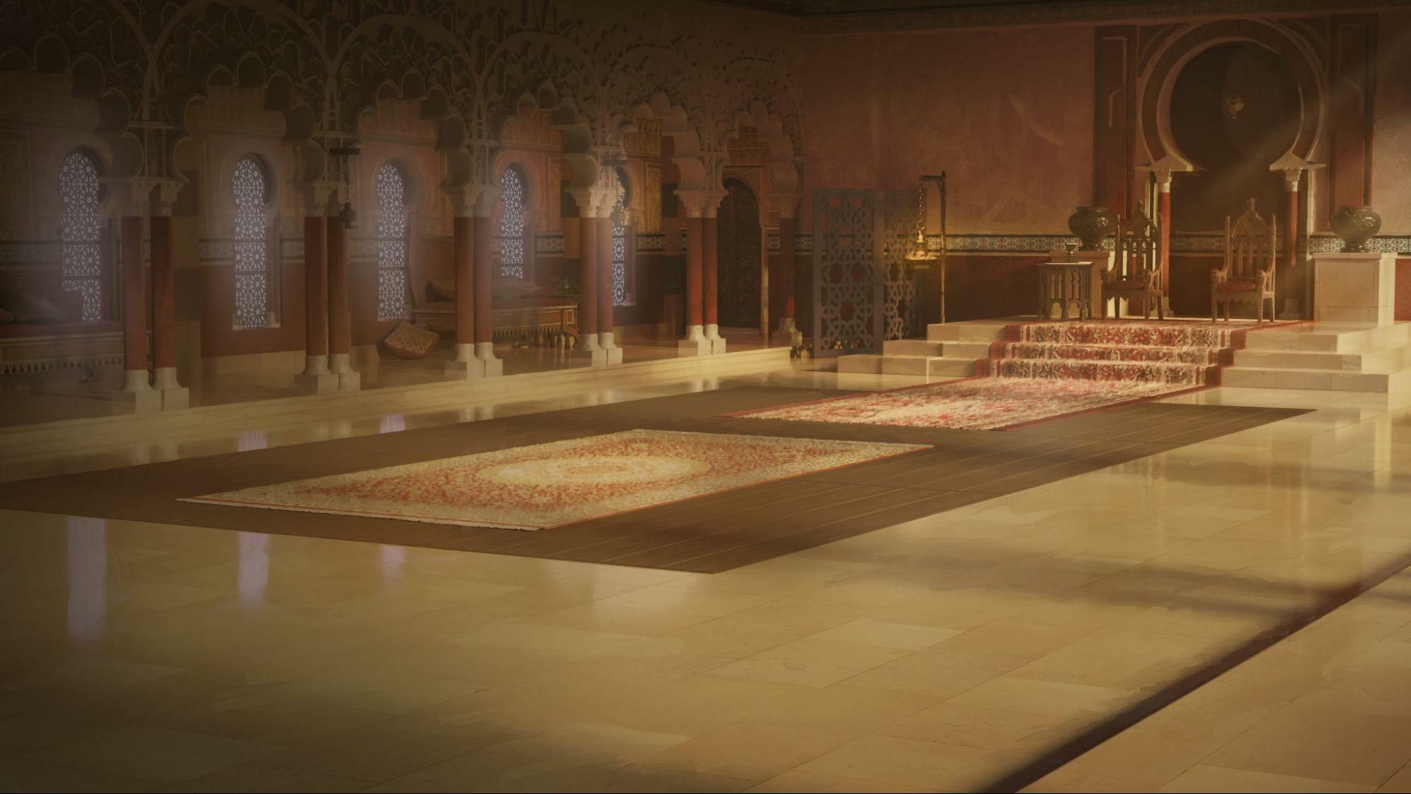
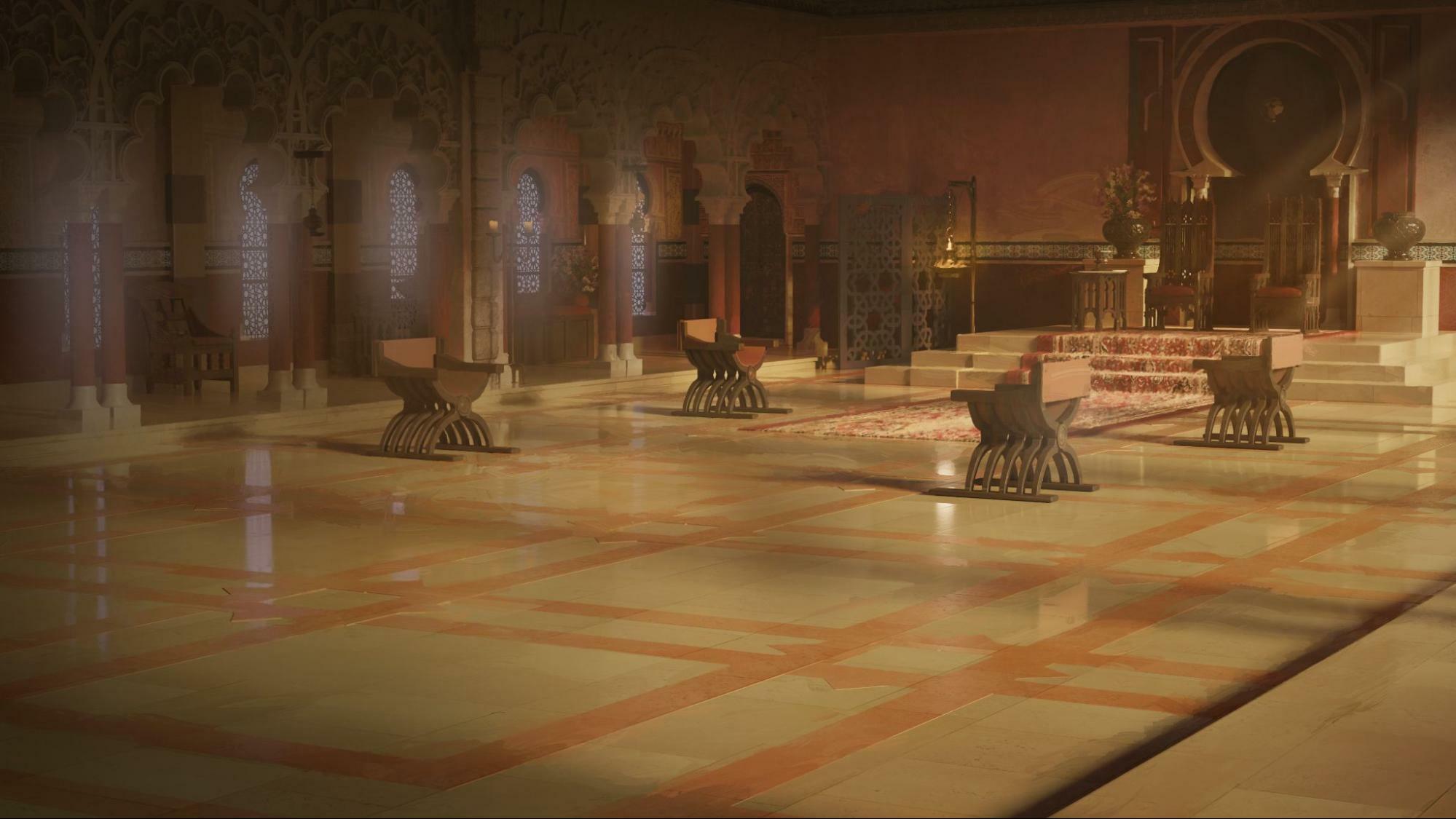
Speaking during the review meetings we decided to work the floor further, and I decided to add an additional color to create a darker but still rich texture, which I interrupted by larger elements, creating that type design that was in my plans from the beginning.
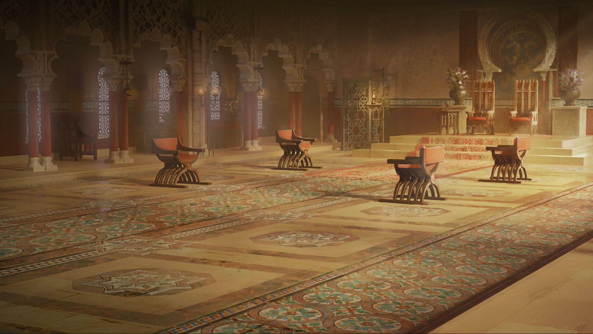
At this point I started to make the whole image more harmonious. Since it will show up in the Main Menu, it needs all the necessary care and detail. You can see that a whole series of patterns have been added to the walls, like plants and more.
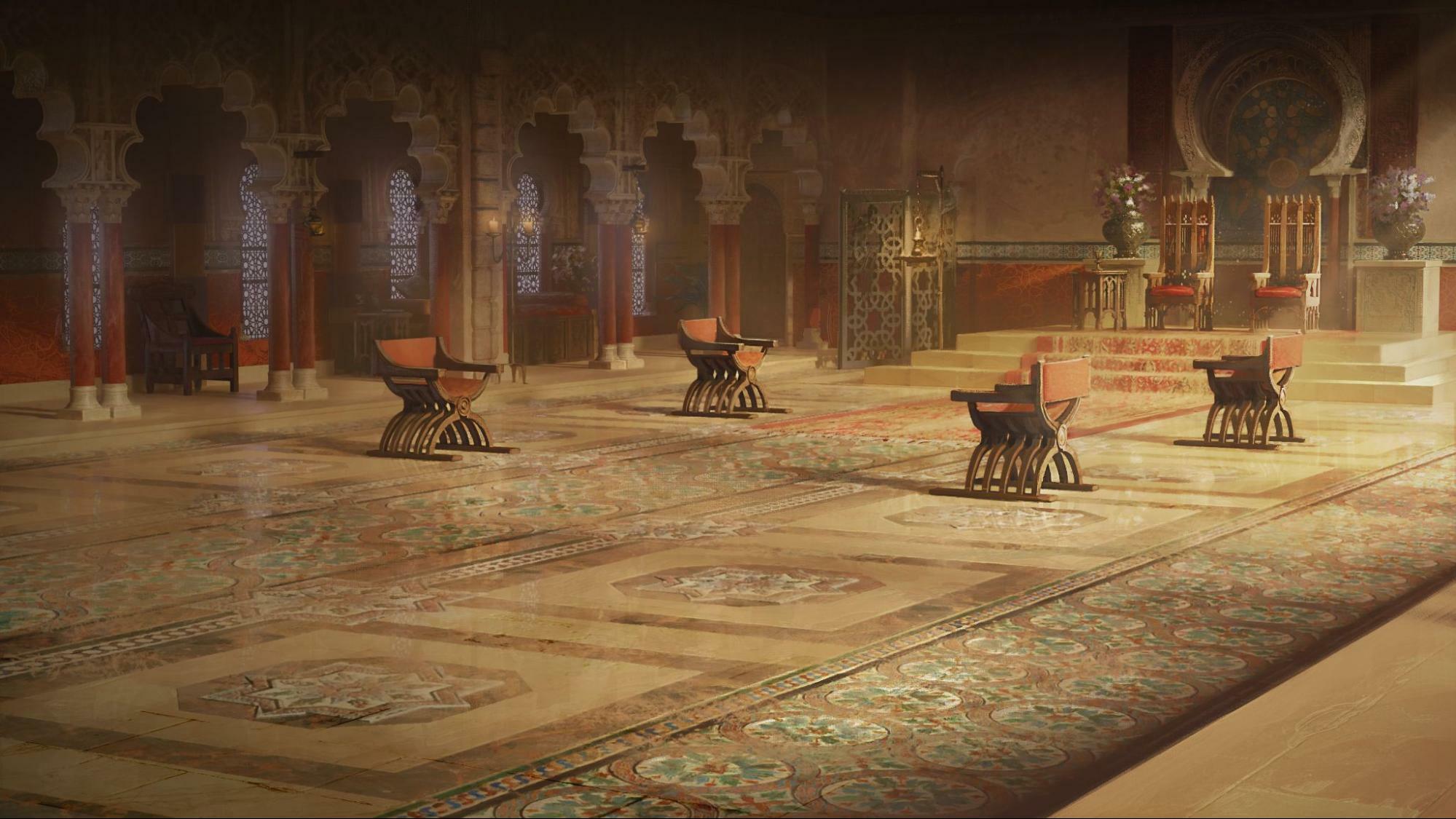
When we got to the end, we felt it lacked something, and there was still an issue with the strange shadow that had been looking for at the beginning.
The solution was to cut the shadow and make the floor pattern less invasive (but still visible), and in general made the whole image deeper, and with distinct levels of reading.
I hope you enjoy the result as much as I enjoyed making it.
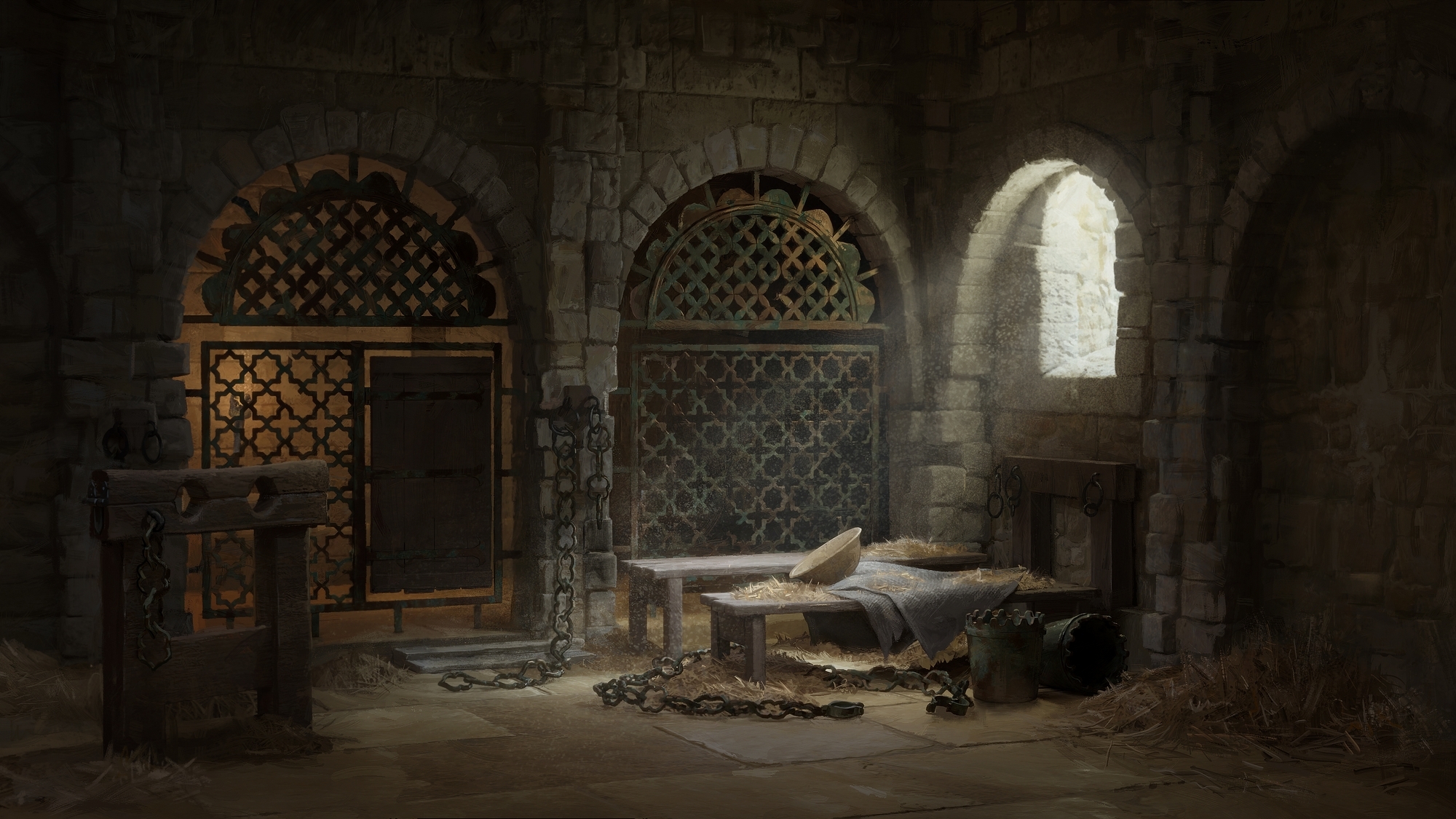
Example 3: MENA DungeonBy Jon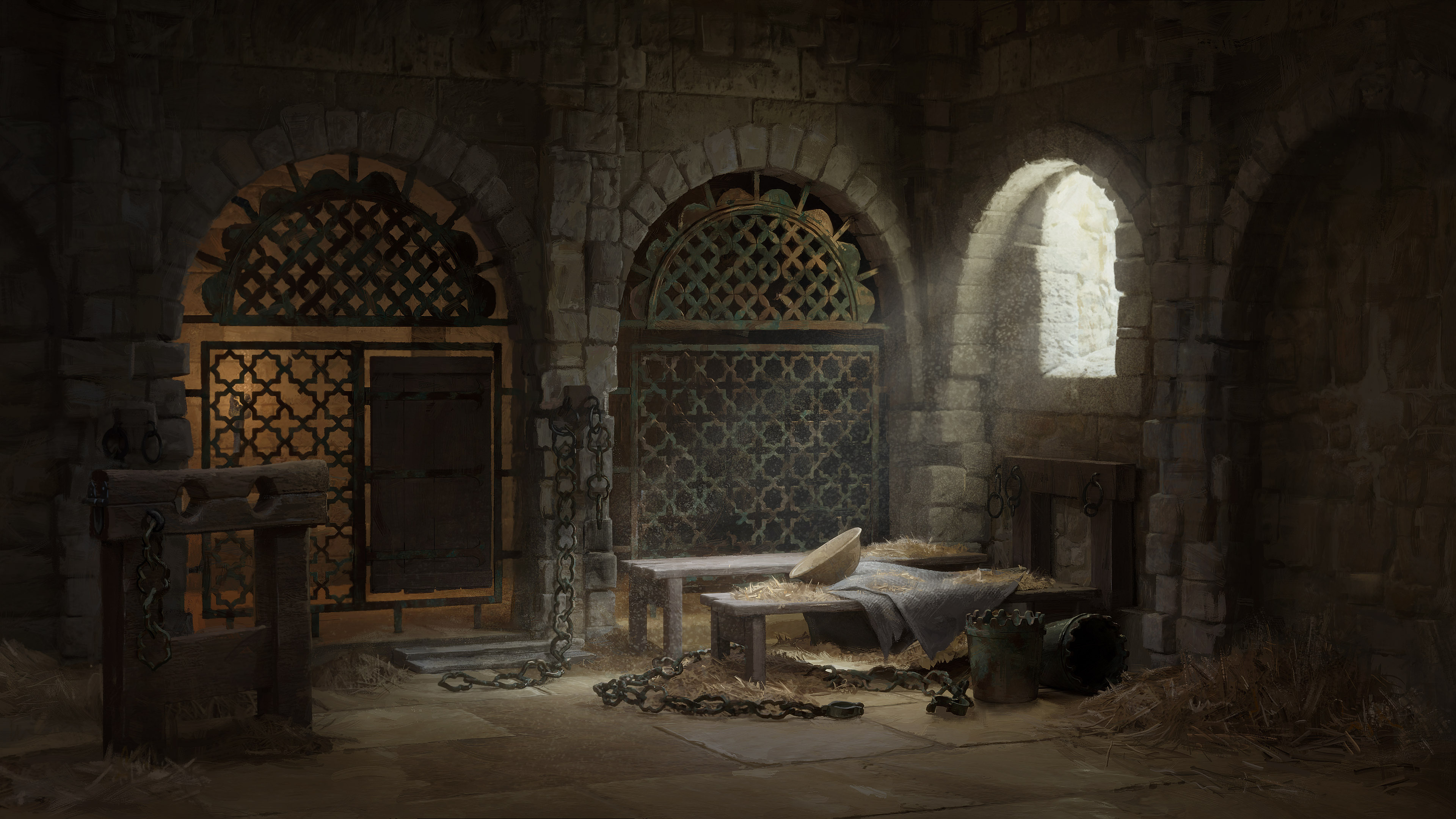
This was the first time I did an event scene illustration for CK3, which was exciting and maybe a little bit intimidating. I really like the art style used in these illustrations and I was looking forward to trying it out myself.
When I started working on this illustration, I had a few things in mind. Since it was going to be a dungeon, it would be sparsely decorated and only have the most basic, roughly cobbled together, furnishing. There was not much room for props, architecture or artworks that could connect this illustration with the area. In order to make this illustration stand out from the other dungeon scenes, I focused more on materials and mood.
Layout and Lighting Before I started to work on materials and other details, I needed to come up with a good layout for the image. I started by blocking out some basic objects - walls, arches, bars, doors - and tried various layouts and lighting for the scene.
Each layout was tested with characters and UI elements on top, to get an idea of how it would look in-game. It was important that the illustration didn't compete with the other elements by being too busy or by having too much contrast.
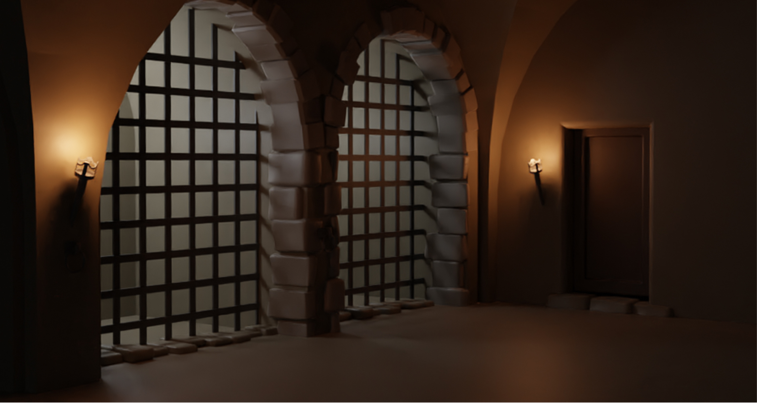
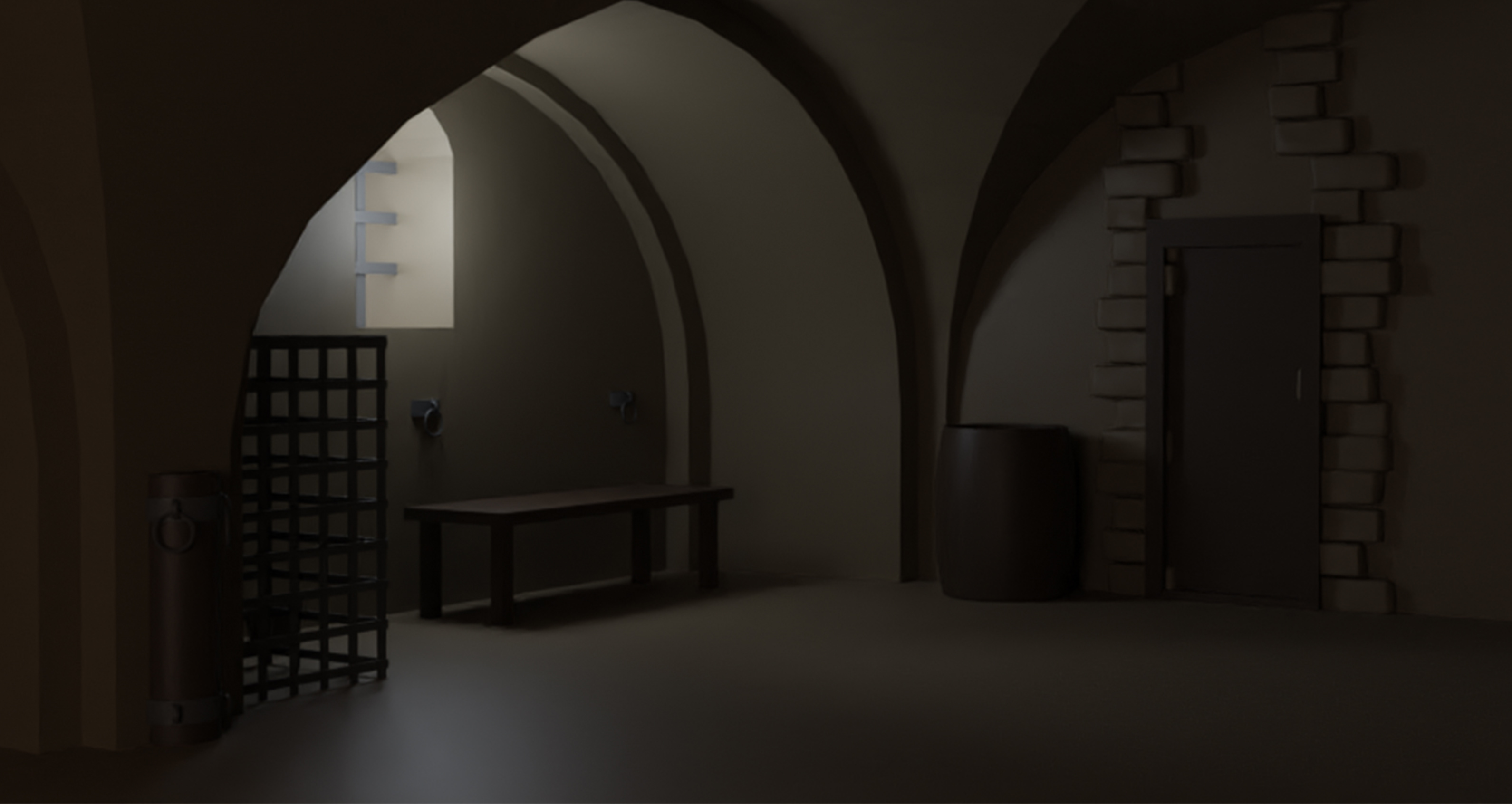
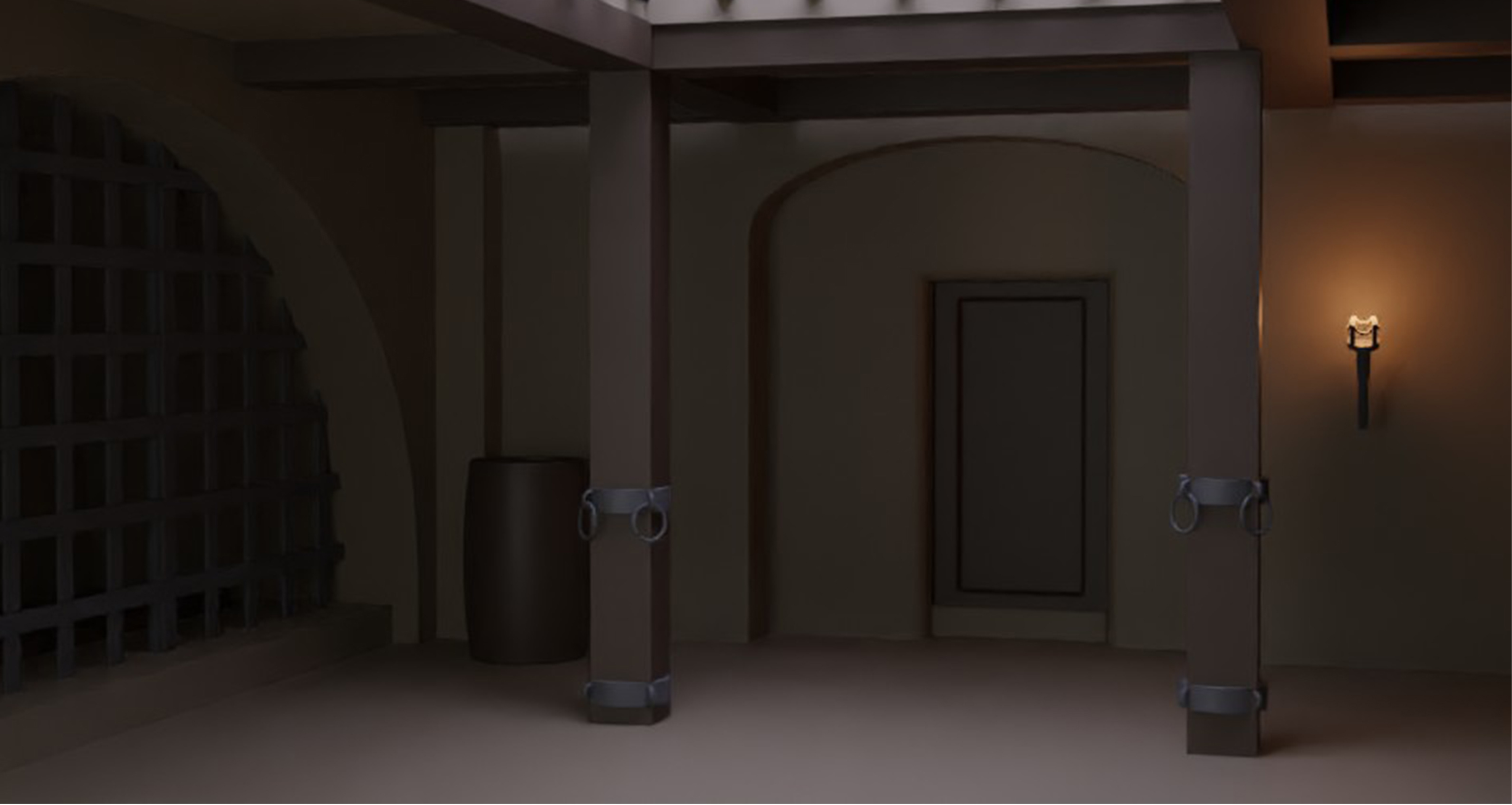
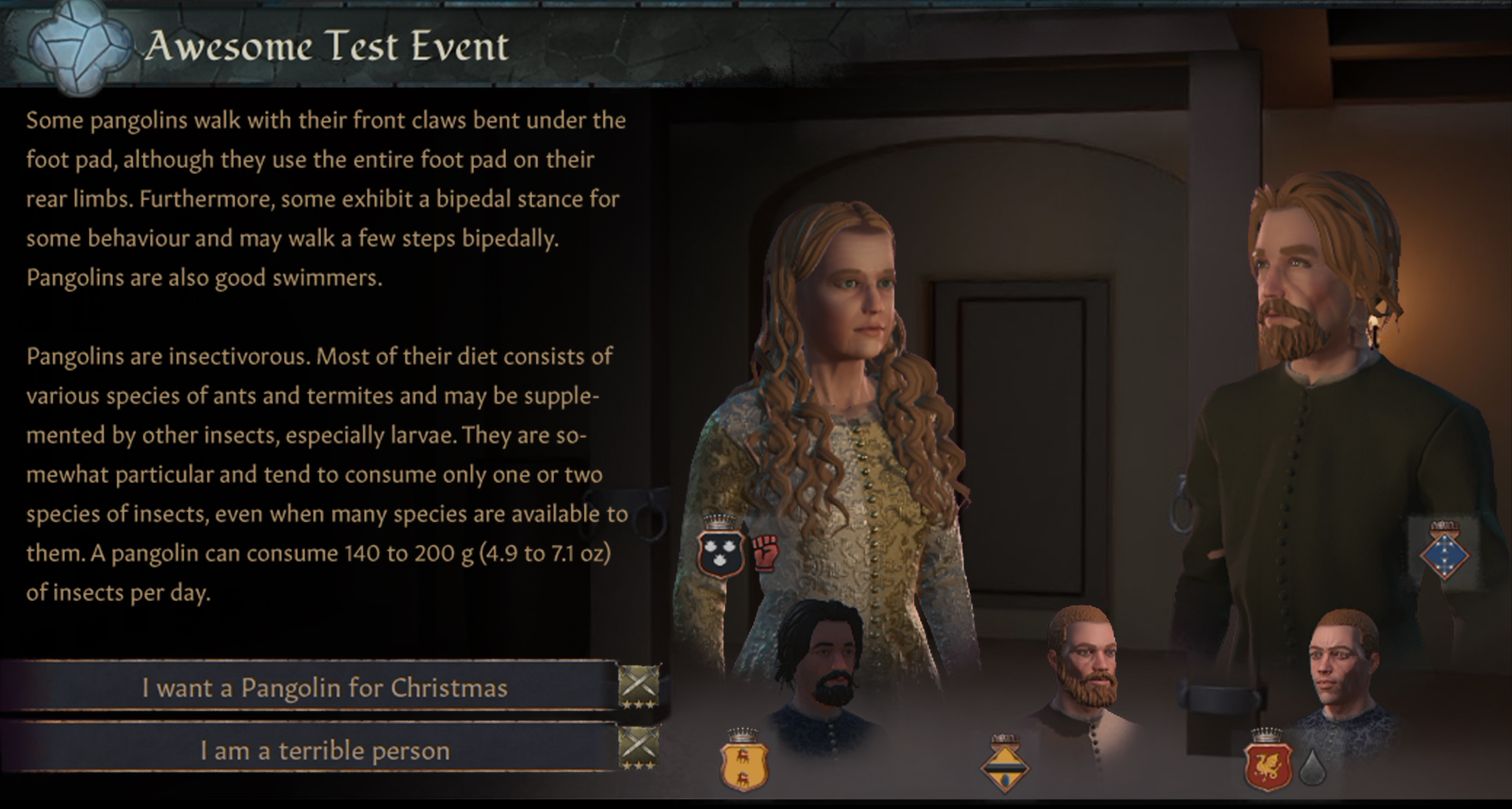
After going back and forth, I eventually settled on this design.
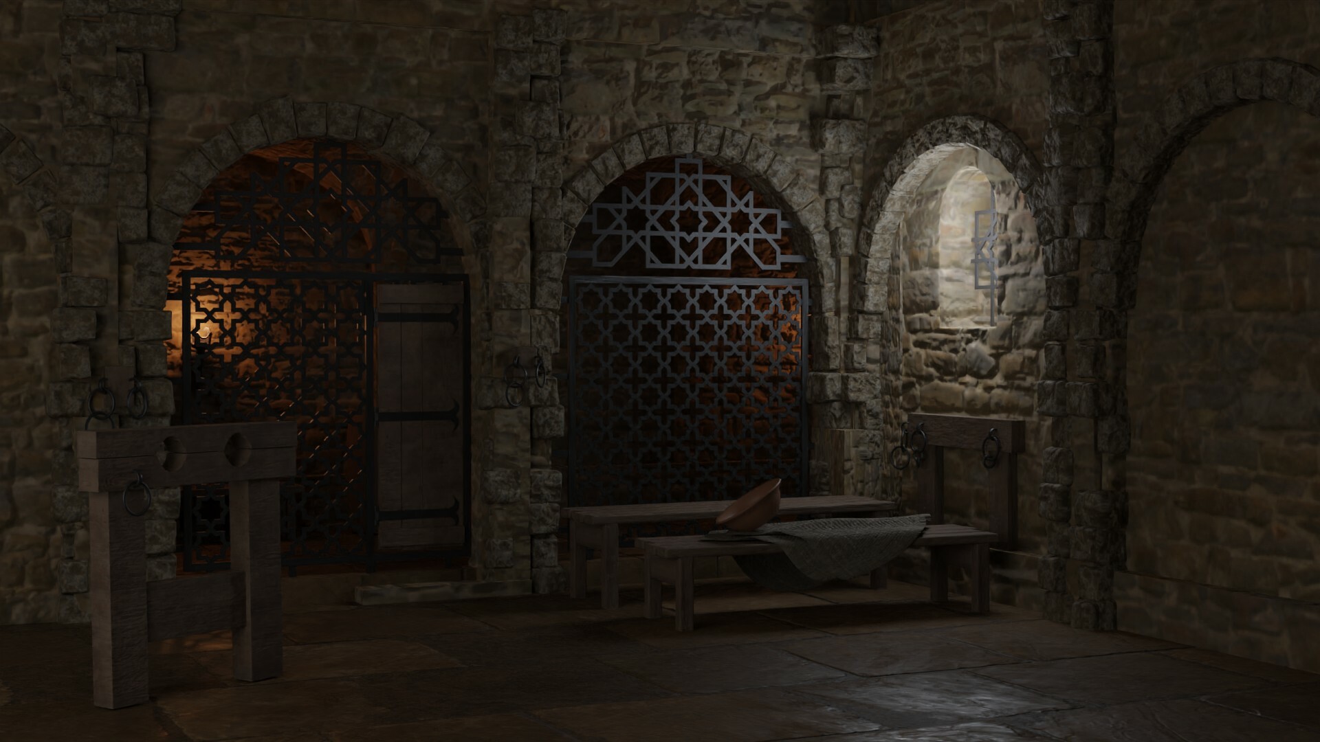
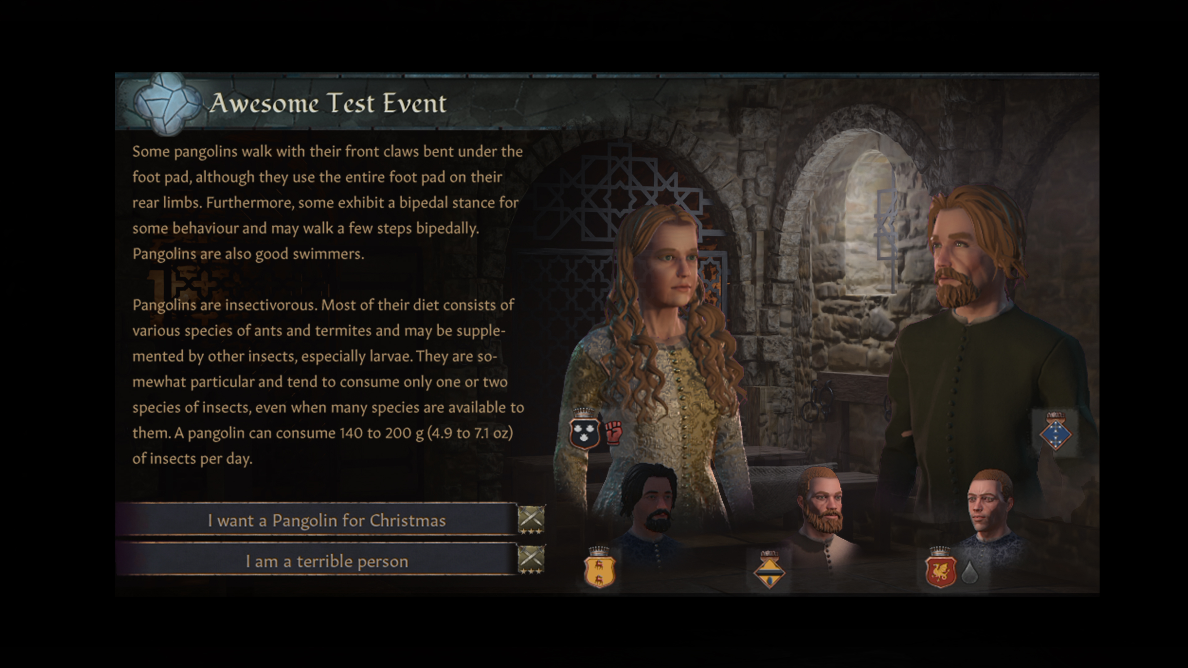
Materials and Mood When I had settled on a layout, I started to play around with the materials in the scene. I imagined this area being one of the older parts of the building, perhaps it was used for something more extravagant at one point, but now the walls are eroded, the stones have shifted, and the surfaces are worn. The only source of natural light would be a small window placed high on the wall.
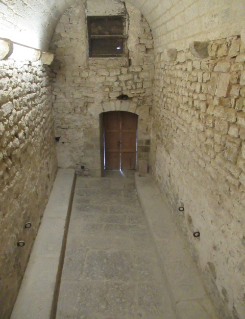
I gathered references of buildings in the area, looking for interesting textures and variations in the materials. I tried to achieve a combination of chiseled stone blocks in some areas, with rough, eroded walls and uneven patches of mortar in others.
Props and details Another area that I experimented with quite a bit was the metal bars separating the rooms. The first versions of these were based on Moorish patterns, but I wasn't happy with the way they came out. To improve them, I collaborated with our content designers, who helped me find references of other types of Moorish artworks to base the new designs on. In order to make these appear less fancy - this was a dungeon after all - I gave them an eroded material and banged them up a bit.
In addition to the material and design of the bars, I also put in some extra attention to the lighting to make the silhouettes more clear. The left panel would receive a fair deal of natural light from the window, making it stand out from the dark corridor behind it. The left panel would receive less light, so in order to make it more clear I placed an artificial light source behind it, perhaps a lantern burning next to a sleeping guard.
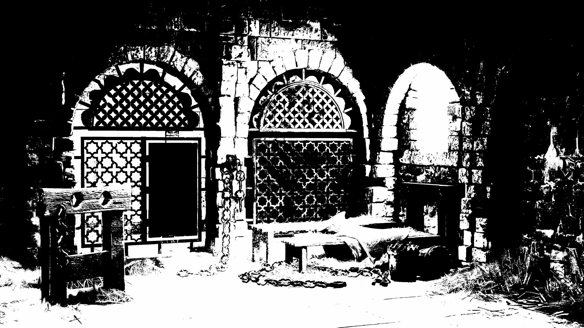
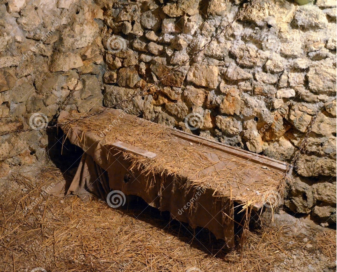
Lastly, I worked on the props for the scene. I wanted to keep them simple - the unfortunate residents would only have a couple of rough benches to sleep on, and would only have access to the most basic necessities.
Rendering Once I had everything I needed in my 3D scene it was time to render it. At this point I want all the major aspects of the illustration solved. Since I know that I am going to paint over it, it is not the end of the world if a texture looks wonky somewhere, but I want to avoid doing any major changes once I start to work in photoshop.
I did some test render where I tweaked the lighting and some details until I got a result that I was happy with. After that it was time to bring the illustration into photoshop. This is what the raw render looks like compared to the final image.
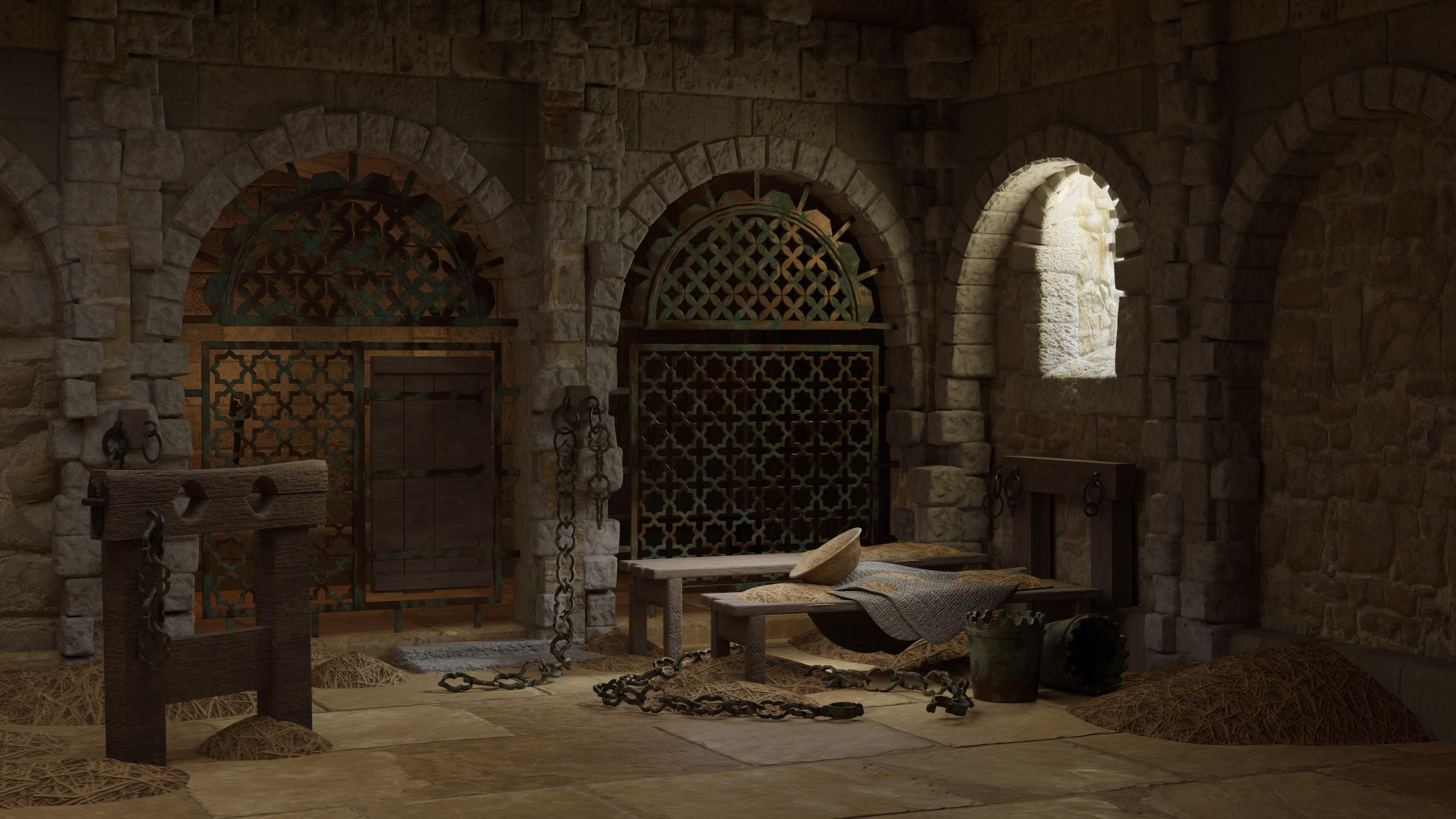
Painting When I started in Photoshop I focused on the major things first, such as darkening some areas, tweaking saturation and adding haze and other effects. Then I started to paint over the 3D image - simplifying some areas while adding additional detail to others. This is where I push the image and try to make it as nice as I can. While doing this I am also paying attention to the mockup, testing it regularly to make sure that the image works well in the game.
Finalizing Throughout this process I worked closely with my colleagues. The support and feedback that I get from my art team is incredibly valuable and appreciated, and I know for a fact that this image would come out way worse if I didn't have their input. I also get a lot of help from our designers, providing tons of cool ideas and references for what to put in the illustrations.
At this point I am mostly doing minor changes, looking for ways to improve the image and testing it in the game. Creating this illustration was incredibly fun and rewarding, and it´s since become one of my favorite things to do for our games.
 Process: Story Event IllustrationBy Oscar
 Sketch and brief Our Designers and Game Director had this idea for a scene showcasing the possibilities that the Struggle represents - a sense of standing at a crossroads overlooking the landscape and not knowing what the future holds.
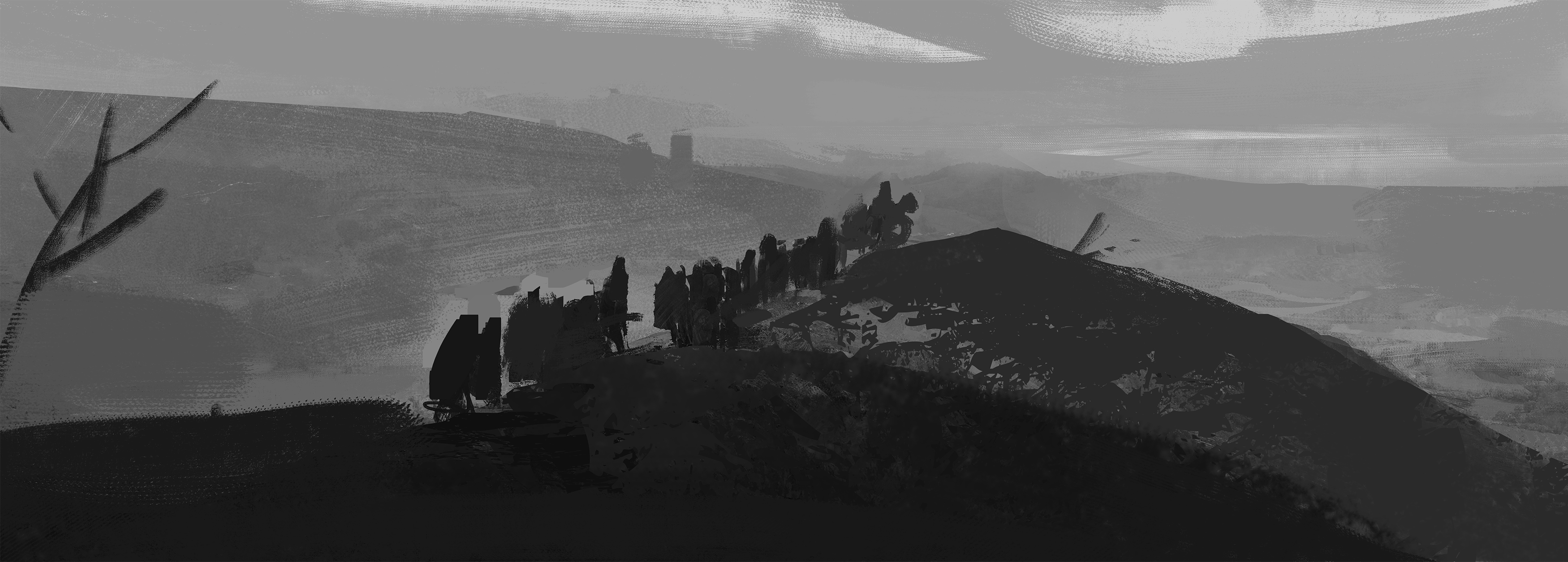
With this in mind, I started making some simple shapes in black and white to get a composition going. I wanted a strong triangular shape with some characters on it that would lead the eye toward the right side of the image and the horizon.
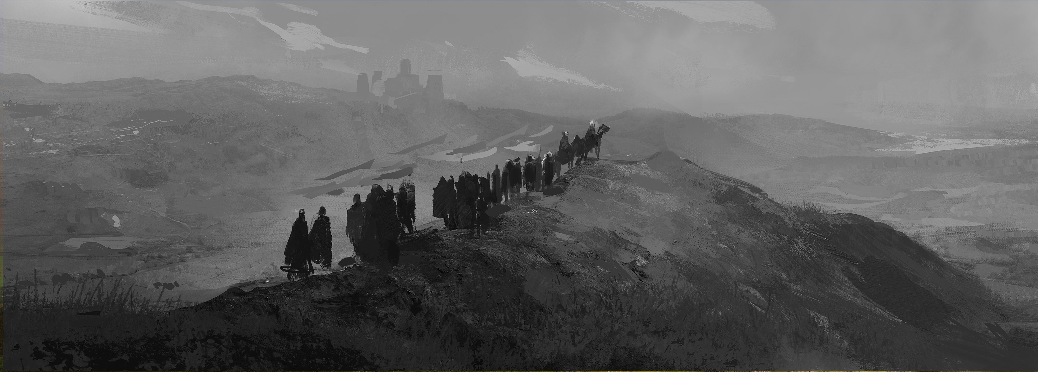
I kept refining and adding details and tried to add some more definition to the values. I looked closely at various reference images to get inspiration. I made the foreground elements darker so that you get a good separation between elements and a clear focal point.
Color
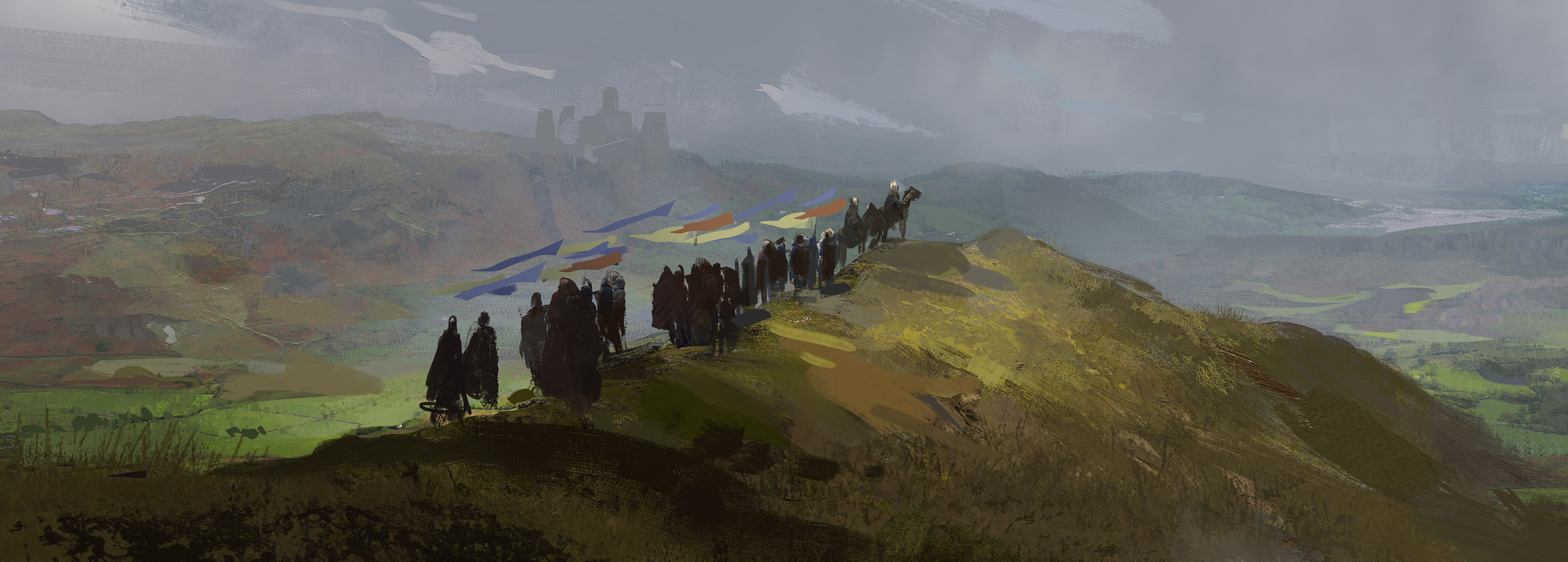
Time for color! I overlay some textures with color and use blend modes to establish a mood. I want it to feel a stormy with patches of light shining through the clouds to illuminate the landscapes and characters. This will allow me to model the lights to highlight the important elements to create focus. I also thought it would be a nice detail to give the characters colored flags, it would add a sense of wind and add some much-needed color variation to the scene.
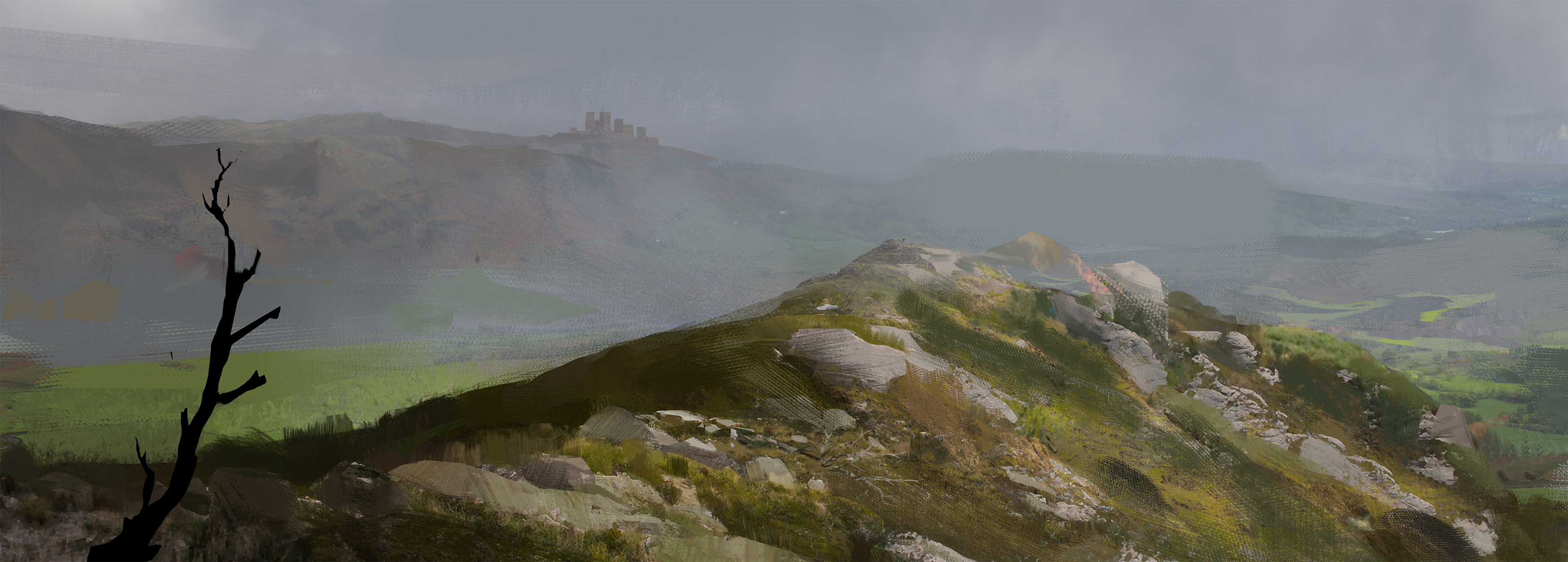
I remove the characters for now and start working on the environment, I add rocks and grass and block out the tree from the first sketch. I add some photos of foliage that I paint on top of to add some color and texture variation to the ground.
Refinement
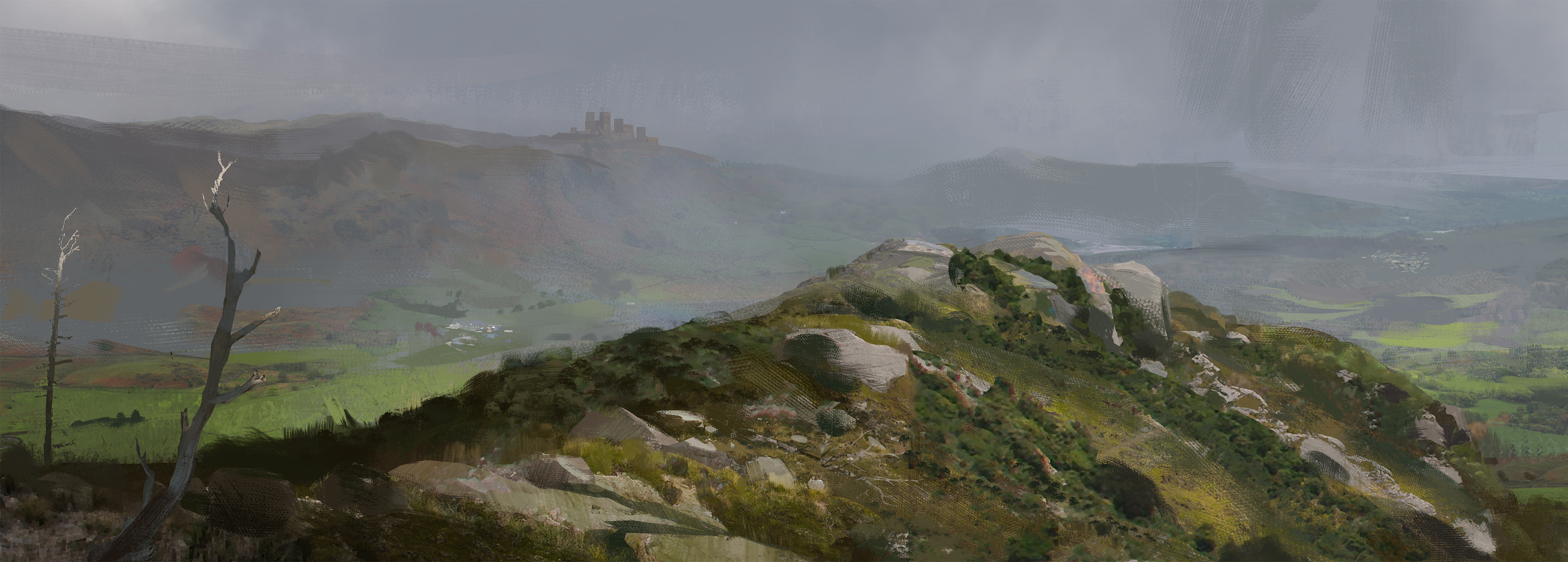
I add some more small bushes and work out textures for the ground. I also work a bit on the background so I keep all elements of the environment on the same level of finish. I add a second tree and refine them for some depth in the foreground, adding just a bit of light hitting the top of the trees is a nice way to further push the feeling of dappled light in the scene.
Finishing and characters
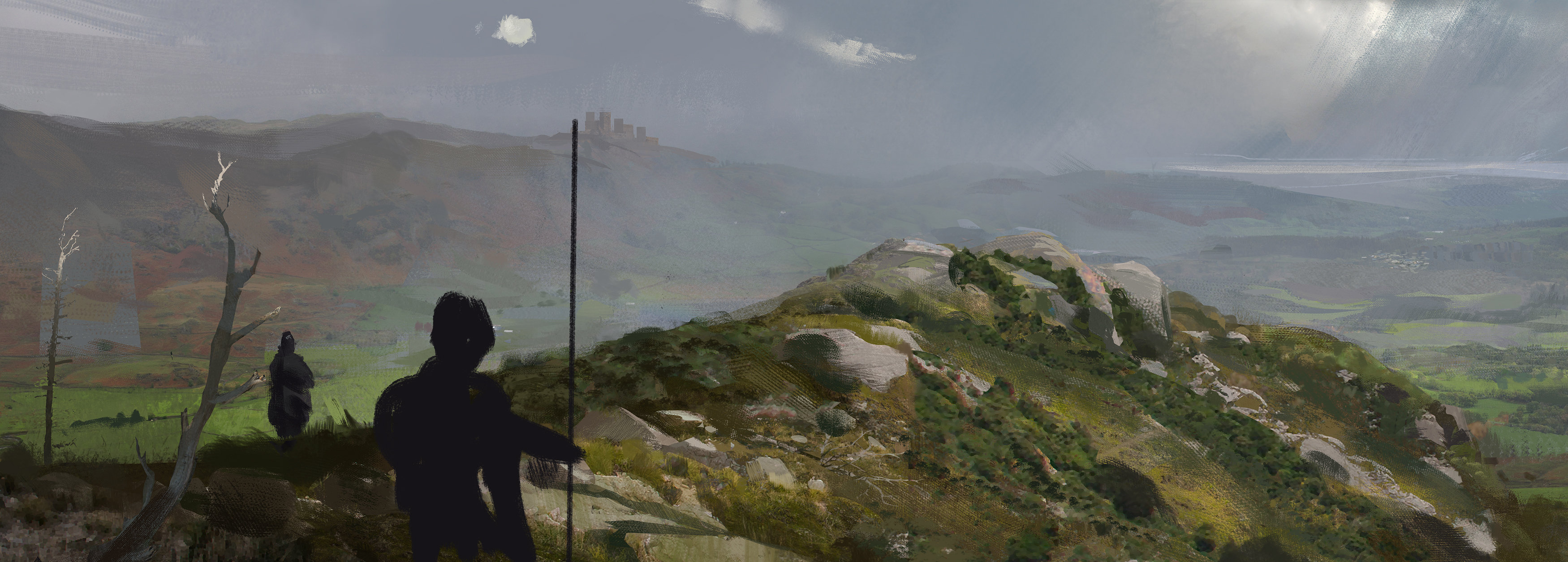
I add back characters and clouds and some brighter clouds on the horizon, to reflect stormy weather and I thought the scene needed some more variation in the sky.
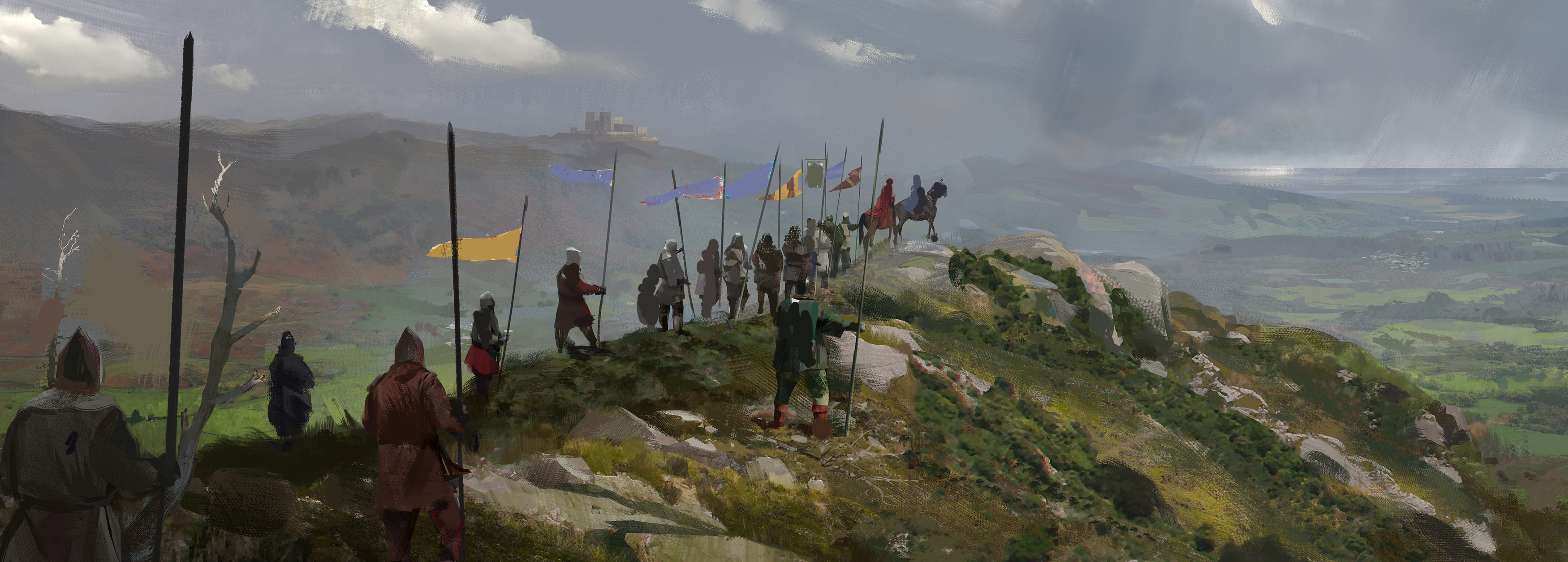
Now I’ve added back all the characters that were planned, I added back the colors of their banners and now it’s mostly a question of where all characters should be positioned to create a nice flow in the image. I’m pretty happy with how the clouds turned out and I think they convey a feeling of wind quite well.
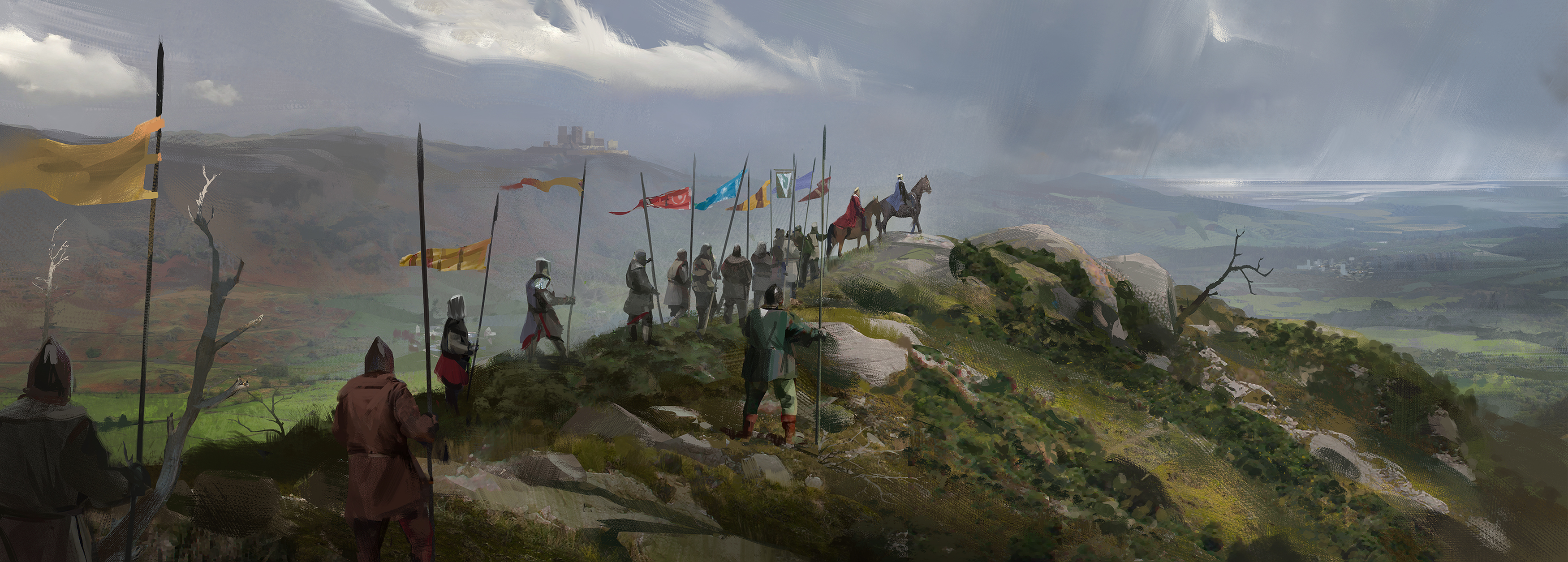
The finishing touches, mostly has to do with small fixes and changes to characters and clouds, I move some elements around and push values ever so slightly to make the image finished. I add some extra small details, like the small tree sticking out of the hill and do some light color adjustments and vignetting to make the composition just a little bit stronger.
I’m happy with how the picture turned out. Throughout the entire process the art team and our content designers have given me many references and plenty of excellent feedback to push the image further.
 [discord.gg]






 [discord.gg]