Hello Lumia Island survivors!
Today’s Dev Journal will cover changes to Saved Plans.
Saved Plans are one of Eternal Return’s most complicated systems, but also an integral part of the game that makes it stand apart from others. Many of Eternal Return’s core players find a ton of fun in
figuring out the perfect Saved Plan. As we plan to change a lot of elements in the game for official launch, we knew we had to do more research into not only how to change Saved Plans for the better, but also how to make sure our players continued to have fun with the research process.
However, for players brand new to the game, Saved Plans can be an overwhelmingly difficult system to understand. At the end of last year, we conducted a play test with about 50 new players. What we found was that many players were frustrated
because as soon as they finished the tutorials, they were thrown straight into their first match. Even before they played a single round, there was too much information was thrown at new players, making them confused.
Searching for the perfect Saved Plan and
creating a strategy is one of the most complicated parts of all our menus. From when we first launched with our first Alpha build, we added a ton of functions to the Saved Plans, and last summer, we made large-scale changes and reorganization. That reorganization added late-game items, Remote Drones, Augments, and other necessary features that expanded the scope of Saved Plans to encompass even more. (Before that, Augments weren’t even connected to the Saved Plans, and players had to use external websites to find the perfect Augment for the character they wanted to play.) However, this necessary increase in functions led to significant decrease in intuitive UI. Sure, we added a ton of new functions, but unless you used them repeatedly and became a master, you wouldn’t know which button to press or which function connected to what.
The goal for improving Saved Plans is to make accessibility between
game preparations and the strategy menu even better. We want to help brand new players understand how to prepare for the round ahead. Additionally, players who start getting into the game can go into the strategy menu and pre-plan the perfect strategy. The current Saved Plans don’t need new functions—rather, they need to be reorganized and refined so they aren’t as difficult to understand.
First, we’ll be deleting the map from the character selection screen. The screen is divided into three sections: Character selection - Character picture - Minimap. However, this divide makes it tough for new players to learn the menu. We wanted to
switch to a two section screen to make things much easier. With the new widened screen, players will be able to see more Test Subjects at one glance.
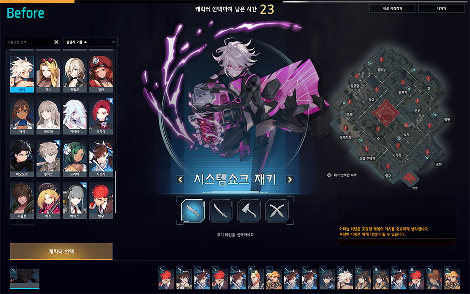
 With this change, the flow of selection will also become more convenient from left to right.
 Choose a character, choose their weapon, pick a skin, hit the “Character Select” button, then move onto the next page. It’s that easy! Previously, you would have to keep looking all over the page to select what you wanted, but this new selection will be much more streamlined.
After character selection comes Saved Plan selection. Previously, you chose one Saved Plan from a list of available plans made by other players. Because of this, the screen was littered with a ton of icons that were tough to read by the time the game started. Quite a few players also didn’t understand that this was a list they could choose from.
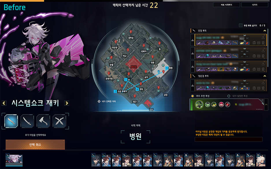

Changing this screen to a two section screen makes it much easier to read
while also greatly reducing the amount of information displayed. Masters of the game who are able to process a lot of information in a short time may prefer the old screen, but for beginners, it was too overwhelming. They won’t be able to process everything needed in the less than a minute prep time.
At first, we wanted to make and add another tutorial about game preparation to solve this problem. However, during our beginner’s focus test, we noticed that if there was too much explanation regarding game mechanics and functions, players often just skipped over it.
Overall, UX shouldn’t need an explanation—
we believe the best UX should be able to explain itself. The new screen will now clearly show that you need to choose your
Saved Plan, tactical skill, and Augment before you can start the game.
Additional information and functions will also be available. For example,
if you press the F button, you’ll be able to see the other characters picked for that round. You’ll also
be able to change your selected Saved Plans, tactical skills, or Augments by right-clicking.
This will make
the connection between each function even better. Now
if you change your Saved Plan, it will automatically change your tactical skill and Augment to the recommended ones from the Saved Plan. Before, if you wanted to change your Augment, there were a few steps involved, but now it will be easy to instantly change or modify an Augment based on what the Saved Plan recommends.

Previously, when you selected a Saved Plan from the list on the right, it would change the map next to it on the left. If you ask us, this broke the fundamental laws of universal UI design. Now
Saved Plan selection will follow the left to right principle, the menu will drop down below it, and the map will change on the right.Another enhancement we’re making is the
visibility of the chat box. There are plenty of times you need to chat with your team while you’re preparing for team modes like Squad and Cobalt Protocol. However, with the current layout, it’s hard to even tell when someone’s sent a message in the chat box. We’ll be moving the chat box to the bottom-left of the screen both in lobby and in-game so it’s much more visible and easy to use.
Like we mentioned earlier, our goal was to make game preparation much easier for beginning players just trying to understand the game. While the strategy menu isn’t for complete beginners, it does offer an intuitive way for players getting used to or enjoying the game
to find Saved Plans, modify them to their preferences, and slowly create something entirely unique to their play style!This is what the Saved Plans menu looks like at first glance.


The existing screen has
so many different functions cluttering the screen that it’s hard to even know where to focus. As you can see in the second screenshot, the Edit button is much more visible, and other actions, such as deleting a Saved Plan or checking IDs, can be found by clicking the three dots. While we kept the same functions as previous game preparation, we moved recommended Augments into Saved Plan editing as they didn’t exactly fit the context previously.
For the Saved Plan edit screen, the existing menu shows everything you might need which could get overwhelming. The new screen will divide each menu and the necessary information into different phases
so that there’s not too much information being thrown at you at the same time.

If you’ve become used to the old screen, you can always see the summary on the left side of the screen. However, there was admittedly too much information and it wasn’t organized very well, so players didn’t know what was clickable and what wasn’t. A lot of player feedback mentioned this as being too complicated and hard to understand.
On the new screen, the left side will feature clearly clickable buttons. We’ve also separated the Auto-create Saved Plan feature which was the most complex part of Saved Plans. This means you’ll only be able to use this function when you want to.

You can also see how convuluted the current UI is when you look at the Augment menu.
Augments will now be changed so players can quickly and clearly see Primary / Secondary and Core / Sub Augments. The Augments will now appear in a square at the top of the screen and be strung together in a line. This way, you will be able to tell the difference between the Augments as it wasn’t very clear before.


(Note: This image is only a preview and could change before official launch!)
Selecting Augments will now start from the top and go down, giving it a more natural left to right flow that is easy to follow.
First select Primary Augment,
then select Core Augment within those.

Next, choose the Secondary Augment

and select your Sub Augments!
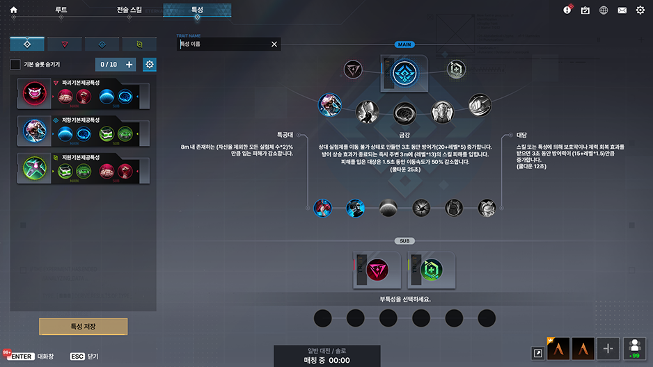
You'll be able to choose them in order, starting from the top.
The newly introduced tactical skills are configured to be even easier. All you have to do is select one to see its text and a video showcasing detailed effects.

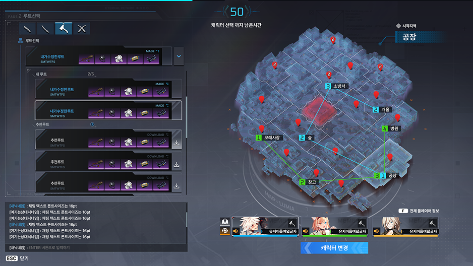
We’ve also improved the layout of the Search Saved Plans function. When you click on one of the vertical lists, the area on the right should change as well. However, in the current search UI, the top and right of the lists change at the same time.

We’ve adjusted these elements so that it flows more nicely.

Overall, our goal was to get rid of the awkwardness of the current Saved Plan system UX, adjust the amount of information players see on screen, and make the flow a lot better. With these changes, we can make Saved Plans—one of the most complex systems in all of Eternal Return—much more user-friendly and fun.
We understand that this change in UI flow may be strange for players already used to how Saved Plans work.
This is because even a good UI isn't as good as an already familiar UI. But, realistically speaking, the current Saved Plan system is a blockade for new players and something even users who play a lot struggle with. Thus, we decided it was something that needed to be changed.
We will cover more changes to the UI relating to Mastery and Crafting in future updates, so we hope you're looking forward to it!
The next Dev Journal will be our last look into Lumia Island's new map and will cover changes to Pond.
Thank you!
You can get WP from the Dev Journals on our {LINK REMOVED}web event page. Web Points(WP) are event points that can be obtained and used throughout the Season 9 web events