A New Fault Map
The design of a MOBA map is a very crucial element in determining the overarching gameplay of a MOBA. It is the foundation through which every other design choice sits upon and derives its context, and as such has to be done just right. Just like how boxers don’t fight in elevators and paintballers don’t play in mile-by-mile barren fields, MOBA players and MOBA mechanics need to have a map design that is complementary and conducive to the gameplay that is intended. This endeavour, to create an ideal MOBA map, is made even harder by our unique 3rd perspective, 3D genre and the challenges it brings. Not every aspect or element that goes into the development of a map can be explained here, and nor can I communicate or reveal every small detail, but I can hopefully convey a small sense of what goes into creating a new map.
These unique challenges are perhaps the best place to start when talking about map design. The most fundamental difference between a game like Fault and another MOBA such as DOTA 2 or League of Legends is scale. What scale am I referring to? The scale of the size of a character model versus their environment, versus their attack range, versus their movement speed, and so on. An isometric MOBA has a scale that is much more homogenous, meaning all of these distances and rates are much more similar than they are different. In a 3rd person, 3D MOBA like Fault, our scale is much more heterogeneous, meaning our heroes run much farther in a second than they are tall, their attack ranges are much larger than their movement speed, etc.

Due to these different fundamental design elements, our map’s design needs to have many different considerations in order to achieve a similar MOBA gameplay style when compared to the rest of the genre.
One of the biggest differences between these two comparisons is the difference in ratio between a character’s (ranged) attack range, movement speed (per second), and size. In League, this ratio looks something like 2/1.4/1 (range/move speed/size) for a typical humanoid, whereas in Fault the same ratio is something like 7.7/3.8/1, which is obviously a massive difference. This means that a character in Fault interacts with the geometric space around them on a very different scale than they do in other MOBAs.
Analyzing this to another level reveals that “combat space” is a much different thing in Fault. I define “combat space” as the typical area a ranged hero comprises when considering the length of their ranged basic attack. Using this definition, one can derive a metric that summarizes the total amount of “combat space” there is in a given space or map, and when one does this exercise for a gameplay space like, say, Summoner’s Rift, it is revealed that there are roughly 180 “combat spaces” for players to influence across the whole map in League of Legends. If one is to do the same exercise for our current map (using our metrics, of course), the result is 125 combat spaces, revealing that our current map is small relative to the available area for combat. This alone is simply one metric, and only shares with us one aspect of how our map compares with an example within the genre in a certain way. Regardless, it is evident that, assuming we want to design a map with as many geometric possibilities and options for players as possible, an effort to increase the size of our map would be beneficial.
Another emergent discovery from analyzing our different fundamental ratios has to deal with movement speed and how this interacts with combat spaces. Due to our movement speed being roughly 50% that of our ranged basic attack range instead of roughly 70% for that in League of Legends, we now also interact differently with our space than the rest of the genre. It takes us roughly 40% more time to move across a single combat space when compared with League of Legends, meaning travel times are affected more drastically the more space there is between two points (for those of you that are astute enough, you may just be able to draw a connection between the 40% number I stated before to a particular feature that graced a much-beloved game of old…). This now presents us with tough design choices: do we accept a map with genre-like combat spaces but much larger travel times; do we accept a map with much fewer combat spaces but “ideal” travel times, or; do we accept a map somewhere in the middle with moderate combat spaces and slightly increased travel times?
It turns out that another gameplay feature actually makes the decision for us, and that feature is structures. Structures are, of course, a central pillar to every MOBA and are in fact the main objective of a MOBA (one cannot win the game without destroying a particular PvE objective), and as such, are critical to get just right. There are three elements that present themselves when it comes to tower design and map design: attack range, model size, and traversal time. Model size is the easiest to tackle in that there is a sweet spot for compelling gameplay where the tower isn’t so large so as to make body blocking an enemy’s attacks impossible but also not so small so as to make hitting the tower impossible. Once this size is established through testing and gameplay feedback, one moves on and begins to analyze the time it takes to “engage” on a tower, meaning how long does it take to get from the edge of a tower’s attack range to the edge of your own ranged basic attack range from the tower’s hitbox. After, again, gameplay testing to get what feels right and from analyzing the rest of the genre, a particular overall footprint and internal dimensions of a tower are established that addresses all three gameplay elements behind towers in just the right way to match our unique perspective and fundamental design differences.
But, what does this have to do with how big our map is and our tough choices from before? Well, if you plug in these dimensions of a tower into our three scenarios from before, only one option in fact remains, assuming that we want to minimize how much “combat space” we lose. Only one option remains because not only does the map with the much larger travel times not work (for a number of reasons that we will eventually get to) but the map with the ideal travel times cannot actually fit our ideal towers within it’s middle lane! The middle lane ends up being too short to accommodate the towers, leaving their attack ranges to overlap disastrously and not provide enough space for combat and general movement overall. Once we factor in the size of our towers and give enough space in the middle lane to travel between the middle lane towers, we start to get a baseline metric for how long our middle lane can be, and from here, we can start determining the size of the rest of the map through analyzing geometry.
The geometry of a typical MOBA map holds one particular key feature that severely impacts the dynamics of gameplay, and that is it’s width. The width of the map, especially along the line of scrimmage or “river”, does a lot more than you might think, and is key to providing the combat spaces necessary while keeping the gameplay responsive yet tactical. Having width along the center of the map keeps lanes travelling in directions that are as much perpendicular to the middle lane as possible, while also opening up the jungles and spaces between the various tiers of towers.
Overlay of our current map with Summoner’s Rift to compare width
If one analyzes what features are in the spaces between Fault’s current T2 towers for example, one would only find a few limited and linear pathways that do little to add dynamic map traversal options and jungle objectives to the area. By designing with this more broadened fan shape instead of a narrow wedge, we can derive more useful space from the total area of the map, and it is from this geometry that we can scale up our map to be inline with and be proportional to our middle lane.
One unique and fundamental element in Fault that we have to design around, and significantly impacts the overall map design, is line-of-sight. This is of course due to the fact that players are over the shoulder of their character’s model and is a massive implication that we have to incorporate into the design of the map. Geometry can deal with limiting line of sight, especially given the possibility of using all three physical dimensions, without any visual effects or special systems required. So, in order to deal with line of sight in our lanes, our middle lane is forced to zig-zag across the map, while our other lanes can deal with line of sight through elevation and their natural curves. This zig-zagged middle lane means that the outside lane tier one and two towers have to respect this unique shape when it comes to their travel times from these mid lane towers, meaning that they too have to be closer or farther from the center of the map (horizontally). The resulting overall shape is not unfamiliar to MOBA players but is indeed different.
Another fundamental element in MOBAs that you may not think of as impacting map design is lane creeps and their spawn intervals. Every thirty seconds, lane creep spawns and marches down lanes, where they meet, battle, and either build up and push or die defending a push. This dynamic is critical to MOBA gameplay and players rely on this dynamic, meaning the map needs to be sensitive to how players interact with their lanes. If lanes are too far apart, players cannot effectively rotate between lanes without missing out or effectively managing their lanes, whereas if lanes are too close, there is no tactical decision making and utilization of creep management. Rotation times between lanes have to be just right. Therefore, our new map needs to attempt to provide more overall combat space and size while also accommodating a zig-zagged middle lane and properly controlled rotation times.
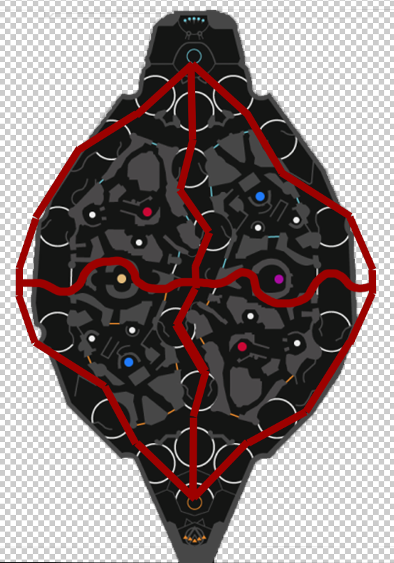
It is at this point where we now have an established skeleton of our map. We have a zig-zagged middle lane to break line of sight, a middle lane length has been primarily determined by our tower sizes and secondarily informed from our dimensions analysis, and a geometry and scale of the rest of the map that is based off this middle lane length, it’s unique shape and the fact that we have to accommodate rotation times and the lane creep spawn interval. We now have a map that is roughly 150 combat spaces instead of 125, a 20% increase in overall size, with much of that increase going into the jungles and bases (along with much smaller walls and dead space on the map). We now have a river that is roughly 14% longer. We now have rotation times that are 10-20% longer, depending of course on the towers, route, terrain, etc. We now have a decrease in the core to core travel time of ~9% and an increase in distance between inhibitors by ~25%. This hopefully gives you a sense of the difference between our current map and our new upcoming map.

A crude drawing of the new lanes and rivers marked out overtop our current map, with the maps scaled and aligned so that the cores are aligned.
Of course, nothing here is set in stone and is subject to change, but initial, preliminary reviews by internal testers on the map’s overall design have been promising. A reveal of the map in its preliminary state would not be appropriate at this time, so you will have to wait until it reaches a further state of development; perhaps a sneak peak into some internal testing can be shown in the future. There are lots of little details and features that have yet to be revealed and discussed, such as jump pads being retooled and repurposed, but those will come in a future blog. For now, I am very excited to get more development occurring on the map and to get it into people’s hands.
I hope everyone enjoyed a little under-the-hood look into the development of our new map.
Sylphin
Fault Game Designer

