Fortnite Creative is here to be a canvas for all of your imaginative ideas and give you the tools to craft an experience you can share with the world. We’ve put together a helpful guide on how to start off making high quality Islands and Hubs. If it’s original, innovative and most importantly fun, you could be featured in-game on the weekly Welcome Hub.
Submit your content to the official content submission page to have it officially reviewed by the Fortnite team. Before you submit your game or experience, make sure you review the guidelines for Featured Islands and The Hub below. We've added an FAQ section for submitting Hubs.
How do I get my Island featured?

We have a few base requirements you need to meet before submitting:
- Your island is a game.
- Creating a gameplay experience for players is core to the Fortnite Creative experience.
- We welcome a variety of game types. Your island can be a multiplayer, co-op, pvp, solo, puzzle, parkour experience or something totally new. Innovate!
- It has clear game rules.
- It is easy to understand.
- The map is aesthetically pleasing.
- Contains no inappropriate content.
- It is unique and your original work.
- Do not try to take credit for content that you link to that you didn’t create. Don’t impersonate other users, streamers, celebrities, government officials, Epic employees, or anyone else. And don’t take credit for another user’s creation. Pretending to be someone else in order to deceive or defraud others is not okay.
- Does not include any images, artwork, sculptures, structures, logos, words, phrases, and all other 3rd party content unless you have permissions from the rights holders to use it in your map.
- Read the full list of rules here.
Outside of these specific guidelines to follow when submitting, the best way to make sure you stick out among all the submissions is to really push the boundaries with how you set up your island. If you need a place to start, here’s a great onboarding guide that’ll help get you started on your creative journey.
Welcome Hub Design Guide
The best Welcome Hubs should empower players to identify content that they want to engage with and provide them with a path to easily navigate the game or island experience. To effectively connect players with content, a successful hub designer will continually iterate on discovery and theme. There are two main types of hub design: the Spoke model and the Cardinal model, you’ll see diagrams for both below and any specific call-outs.
Before getting started with the design guide, let’s review the two hub layout legends to see the major differences and requirements of each.
Spoke

Cardinal
Basic Creative Hub Requirements
Load a Featured Hub template to get started and make sure to follow the criteria outlined below...
- Hub must not exceed 40,000 Memory
- All social media or creator code callout text must be moved to one specific area outside of the initial spawn point, not directly in front of the player when they spawn.
- Your “Voice Chat” option must be changed from Team setting to All.
- Do not include devices which damage or eliminate players.
- Do not use excessive effects which may result in performance issues for the server.
- Moderating the use of particle effects, transparent layers, and physics balls will help limit issues.
- Avoid using groupings of lights in one spot
- Do not use excessive amounts of glass
- For example: Do not have glass overlaying more glass
- Reduce the amount of unique objects as much as possible, especially if only used a few times or within portal area pathways
- For example: Using 100 unique objects is worse than using 100 of the same objects (regarding memory usage and performance)
- Do not include game mechanics which obstruct or distract players from the portal area pathways.
- The center spawn arena must be flat, obstruction-free, and be a maximum of one tile high.
- Make sure you have included 4 player spawn points for the Epic Games Creative team to review the quality level of the hub. Note: We may request changes based on our review process.
- If you choose to include hidden easter eggs or interactions within your Hub, you must submit an additional video showing all hidden content
- You must have player flight turned on for QA testing. It will be removed by us if necessary.
- Do not place blocking volumes in the sky until after you’ve placed the above required 2-4 player spawns for reviews.
- Matchmaking portals must stay in designated areas and be placed by the creator.
- Do not alter default player movement speed.
If your Creative Island has met these requirements, let’s move to to how you can iterate on your hub’s discovery and theme!
New Creative Hub Layout Philosophy
Now that we’ve covered the specific required things you need for your hub to be considered for Epic featuring, let’s dig into how you can really make it pop and easy to navigate!
- Portal areas should be treated as the primary destination and not a secondary location.
- Hub layout should clearly convey how you want the player to interact and navigate.
- Utilize the 4 Portal area pathways.
- You can freely customize the areas located at the rear of the Hub.
- Signs/Iconography above the pathways should have no competing elements.
Design Guidelines
Moving on to aesthetics guidelines! all areas within the Hub should be cohesive with the theme of the world and contain a purposeful interaction with the player.
Choosing a Theme
- Pick a strong singular theme
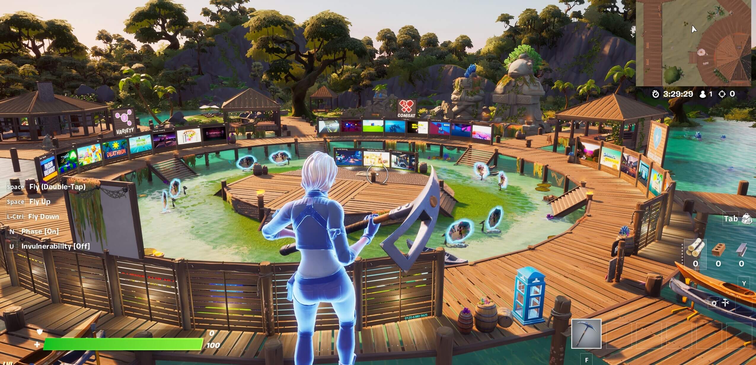
- Create visually interesting areas in the map with purpose for the player
- For Example: The best hubs have visually interesting areas that are laid out with the purpose of directing players to feature content.
- Ensure you properly research the theme you are attempting to replicate within your hub when executing on the overall visuals within the map
- Play around with adjusting settings, including:
- Time of Day
- Camera Filter
- Light Brightness
- Light Color
- Fog Thickness
- Fog Color
- Gravity
Navigation Tips
Your players should know where to go.
- Beginning at the player spawn, include straight and clearly defined pathways that allow players to easily navigate to portal areas.
- Portals must remain in the designated areas.
- Do not create distractions which direct players away from the main portal areas.
- Utilize design around the portal areas.
- The spawn area must be clear so players don’t spawn into objects.
- Paths to each portal area should be clear, unobstructed, and not include any distractions.
- Clear separation of navigation signage within the Hub
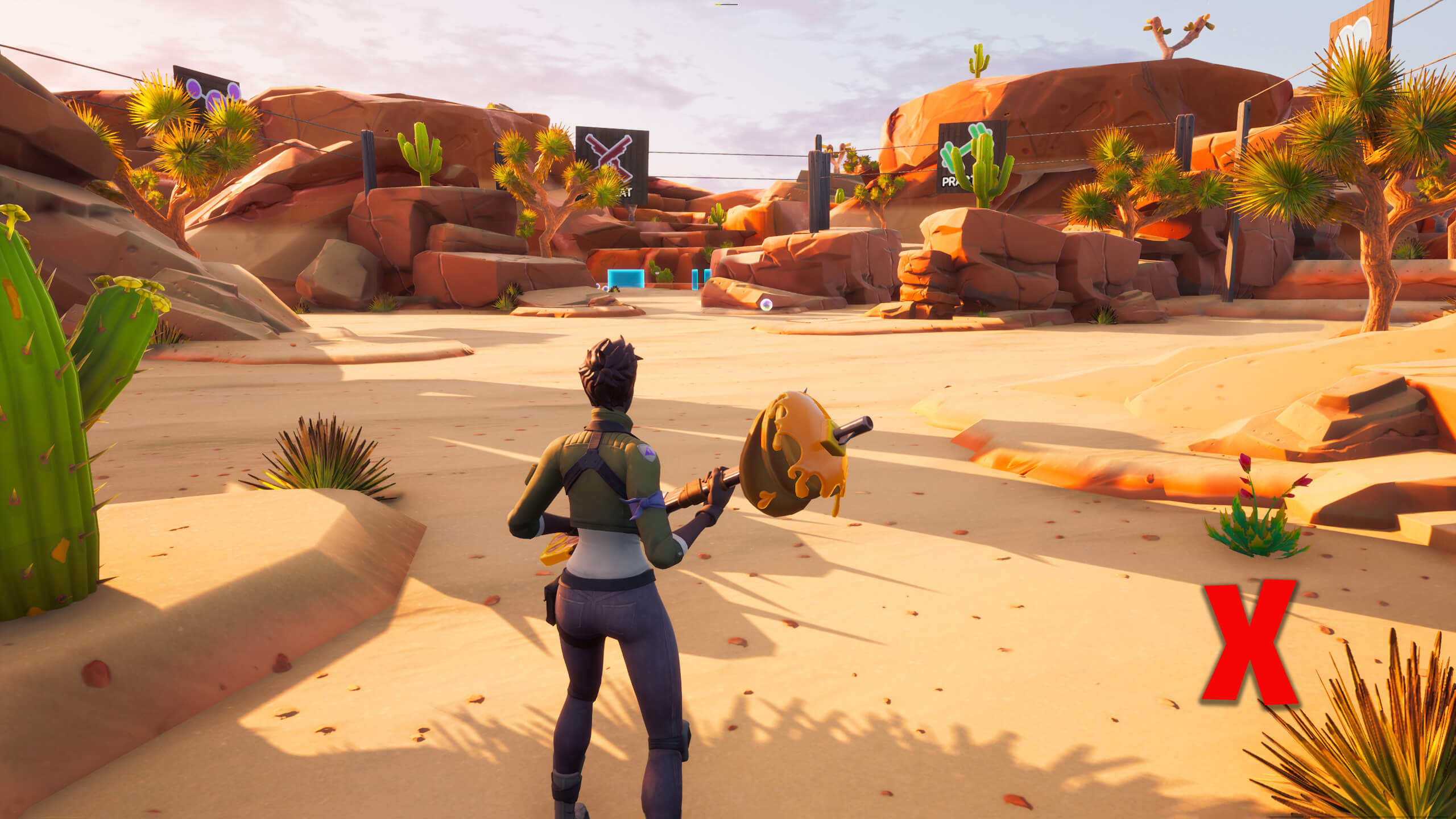
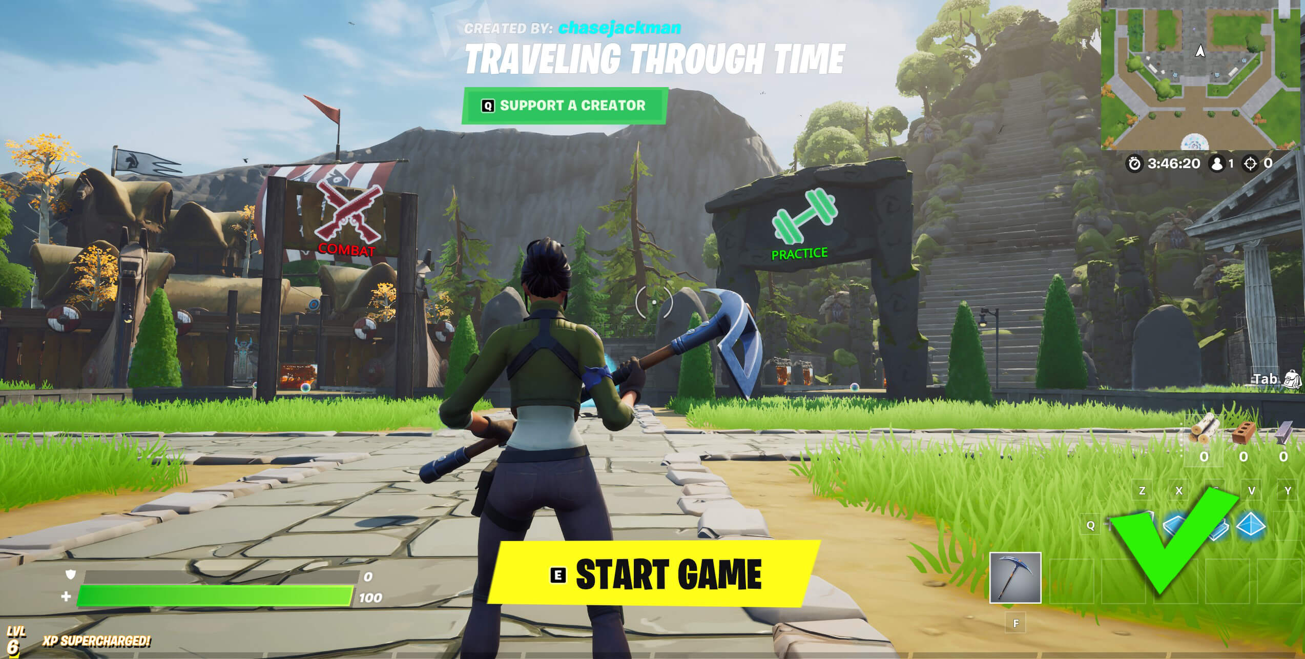
- Sign and icons within the portal areas should match the environment.
- Remove any line of sight (LOS) blockers to each area.
- Do not create pathways that players are unable to tell apart from the surrounding environment
- For Example: Grass pathways in a lush green environment
- Adjust your matchmaking portals to fit the design needs of that area, but they must remain the designated location.
- For Example: If you make a circular room for your portal area, you can adjust the portals to fit the curvature of the space you have chosen.
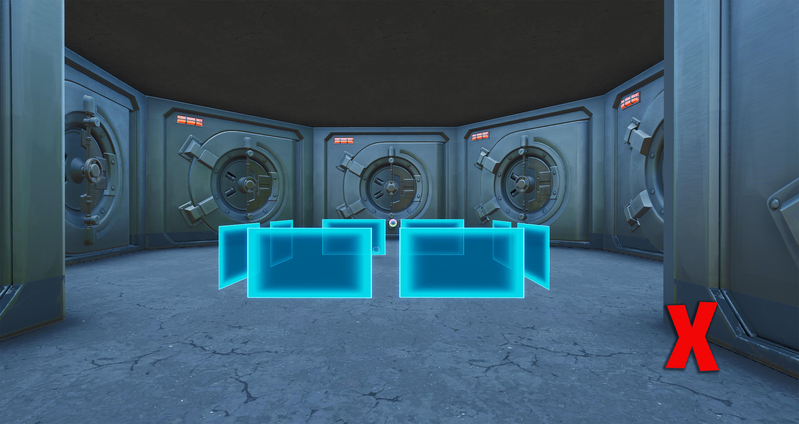

- Try to give each path and portal area it’s own characteristics and landmarks.
- For example: A tall or unique structure will help each area stand out from the others and allow for players to have a better sense of where they are on the map.


Environment Tips
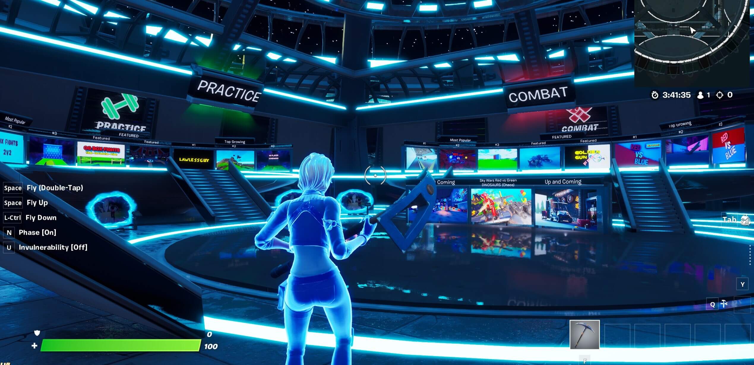
- Take time to fine tune the initial frame players will see when they spawn, because it’ll be the first thing - it is the most important element of the hub.
- Framed should include:
- Focal Point, a thing players can focus on
- Should include a clear separation of background and foreground
- Screenshot Example
- Clearly indicated gateway to the key portal areas
- For Example: Combat and Practice area signage
- NOTE: For Cardinal Hub layouts, you are encouraged to utilize placing portals below or above the players vertically in the space.
- Framed should include:
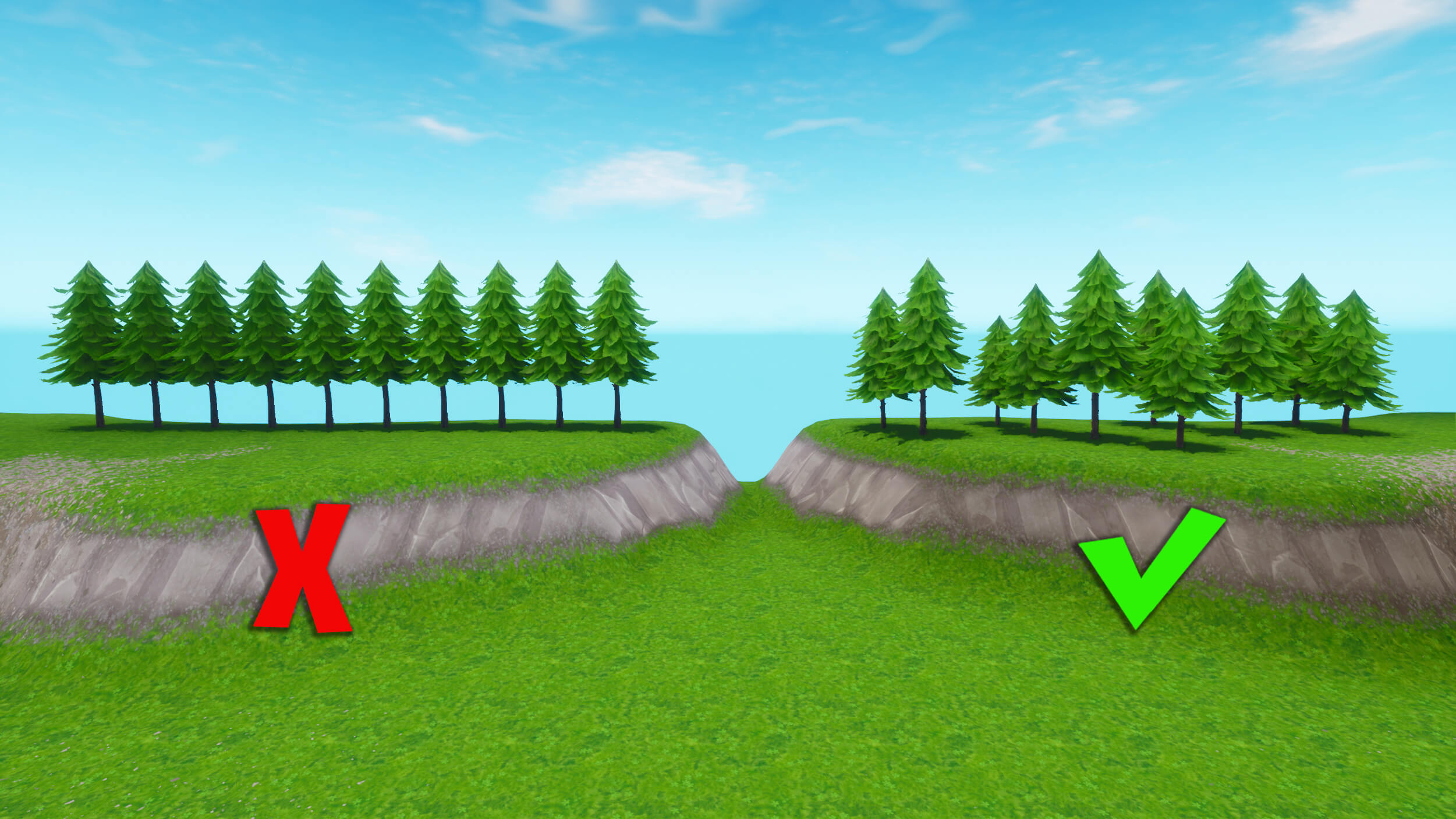
- Utilize a variety of objects within your hub
- Rotate and size objects differently that repeatedly show up within the hub
- For Example: Differing sizes of trees (need image)
- Rotate and size objects differently that repeatedly show up within the hub
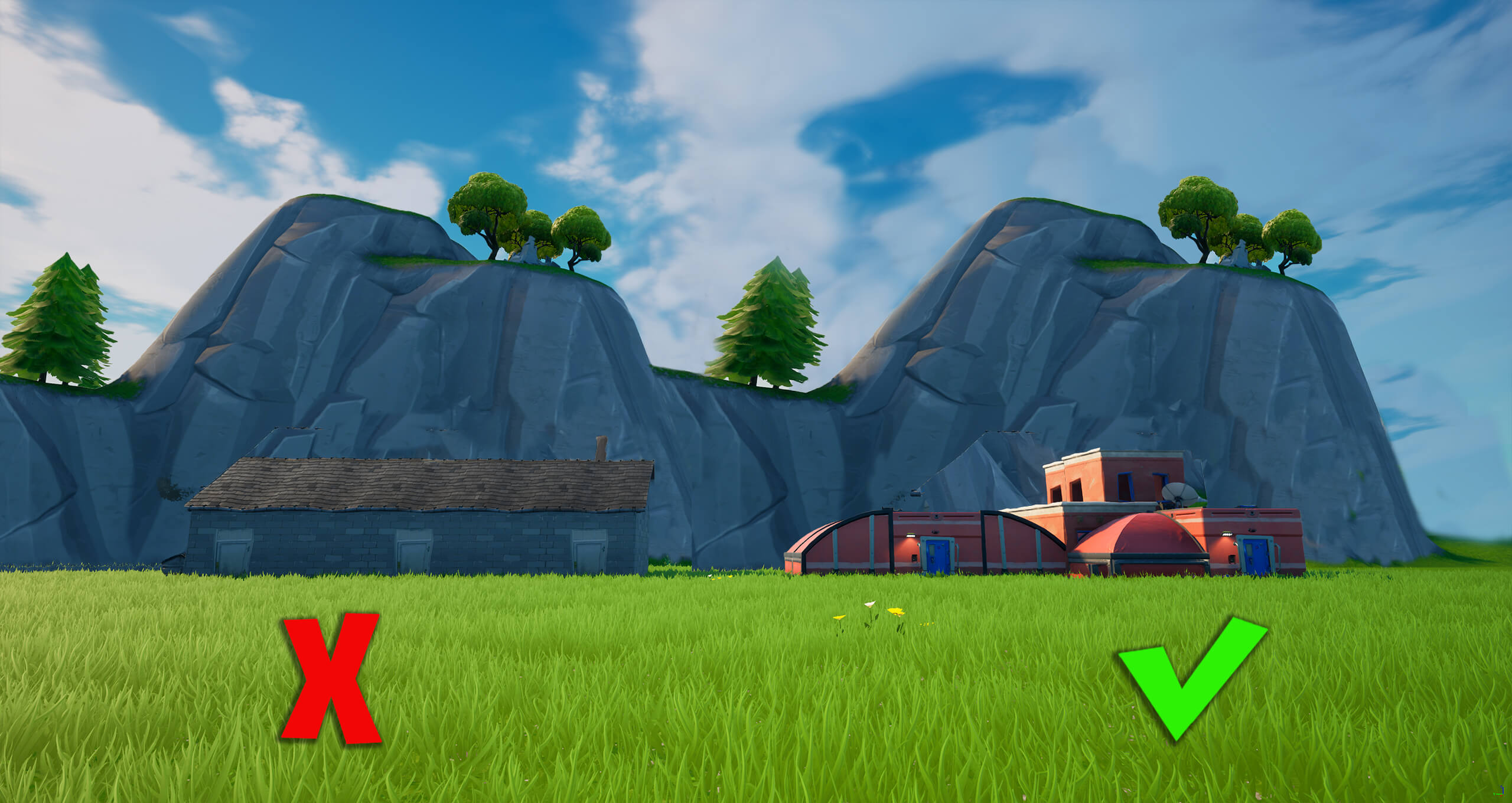
- Use asymmetry when creating a background landscape
- For Example: Each section of the background should have a distinct look, and not repeating patterns.

- Don't have the foreground blend with the background
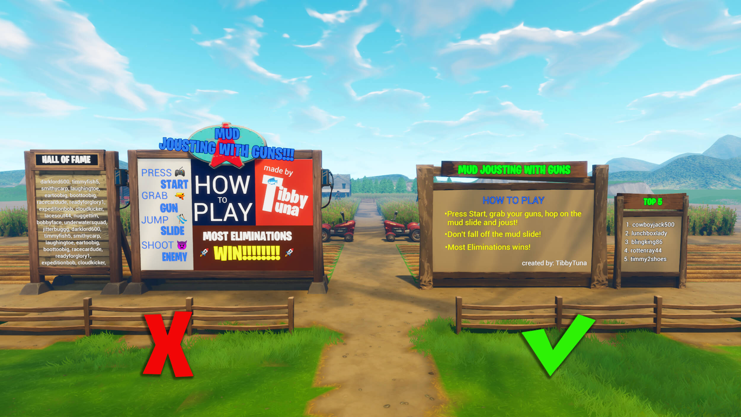
- All text should be thematically grounded to the experience.
- Embed text on objects, billboards, TVs, signposts, and other objects appropriately.
- If you choose to include text below the Portal area icons it must be in ALL CAPS.
- Text color must look natural in the environment.
- For example: If you put dark grey text on a giant rock, it may look like an engraving rather than a sign.
- The text should not feel spammy or like advertisements
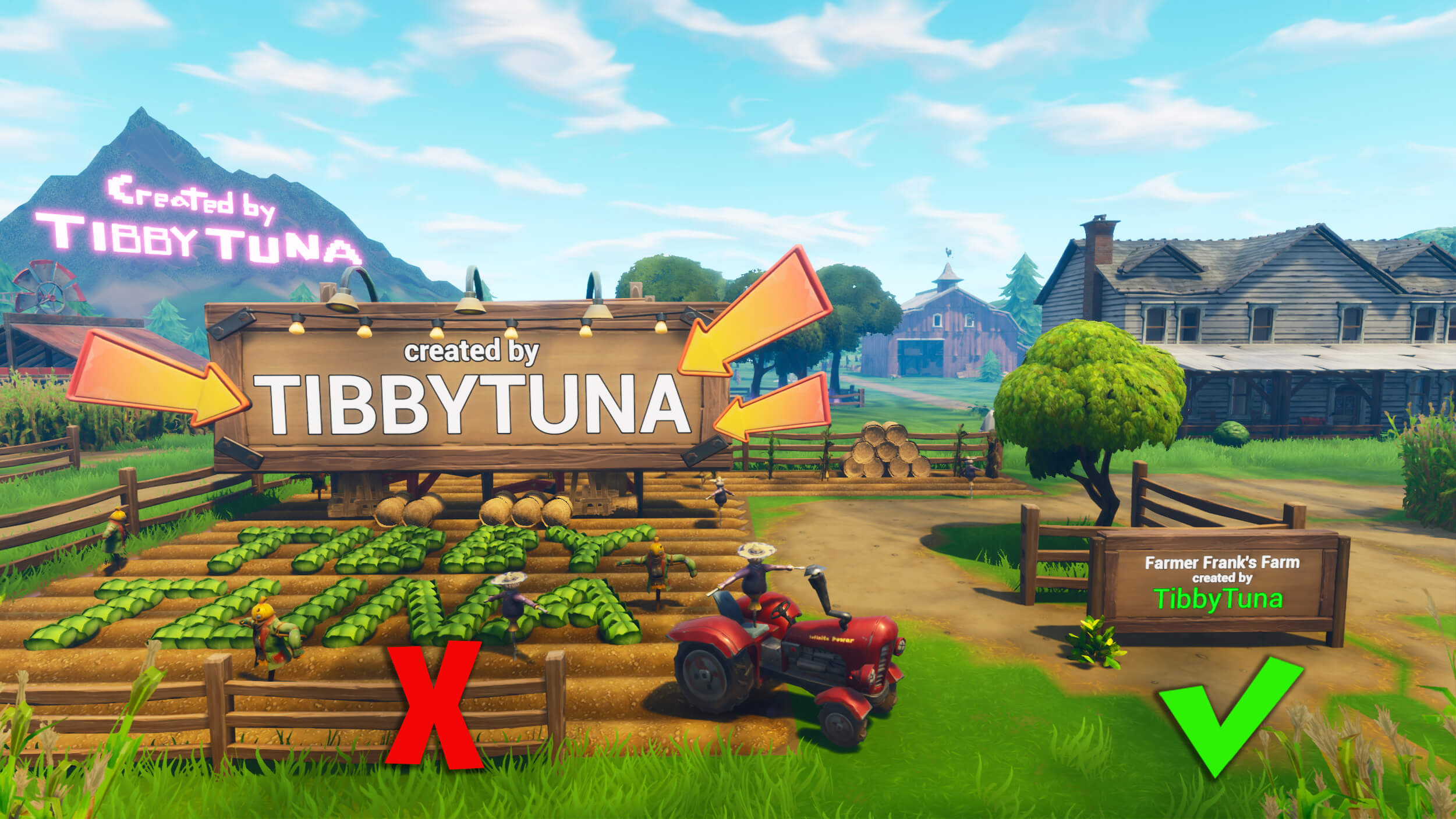
- Please sign your work and visually integrate it into the hub’s theme.
- Identify your social handles in a tasteful way.
Optimization
- Don’t overload the map with too many lights within close proximity to each other
Accessibility
- Be mindful of players with epilepsy. In general, stay away from flashing lights.
We can’t wait to see what you create! If you’re looking for inspiration, follow us on Twitter where we post info and images of new featured islands.
FAQ:
We made a handy calendar that is available in Fortnite Creative Discord where you all can track when we’re going to be requesting hub submissions for each season in the year.Q: How do I submit a Hub for approval?
A: Be sure to read our Fortnite Featured Hub design guidelines before sending in your submission. Submit your game in the Fortnite Creative Featured Content form by the submission deadline and use the dropdown “Hub”option.
Q: How long do I have to submit?
A: Once the announcement is made to the community, creators will have 6 weeks to submit Seasonal hubs and 4 weeks for Holiday hubs. After the submission window has passed we will close submissions for the event.
Q: What if my Hub is not a holiday or seasonal hub, can I still submit?
A: Creators will still be able to submit their hubs at any point no matter the callout, however even if we don't feature your hub during the period when you submit it, we may use it in the future when it aligns with the holiday/season. Note: If you have a hub that fits into one of the callouts It is better to wait for the call out that lines up thematically with your hub.
Q: How do you know if your hub was picked?
A: A few weeks after the call out ends, Epic staff will start reaching out to creators to make changes to their hubs. Once all changes are made and the team has tested your hub and received approval to move forward you will be given your feature date.
Q: What if we don’t live in the US and our holidays look different?
A: Great question, we understand our creative community reaches long and far which is why the submissions are not limited to one region. For example: if you live in Brazil and you celebrate winter holiday on the beach, please create a Hub to represent your experience and submit it. If it gets featured everyone will get a chance to experience a winter holiday in Brazil.
Q: Can I submit a hub anytime?
A: Yes we will still be featuring all regular hubs.
Q: What if I submit a hub for either seasonal or holiday but it is past the end date?
A: If you submit a hub past the call out timeframe it will be rejected. To limit confusion we ask that creators put in (type of call out) in the title.