For those on Mobile
Yes, you read that title correctly! We're happy to confirm that a Bank update is very real and is coming! And yes, it will include the long-awaited and requested feature, Bank Placeholders!
Please note: It goes without saying everything you read below is a work in progress and could be subject to change at any time.
Bank Placeholders
The Bank Rework was first announced way back at RuneFest 2016. Sadly, we probably got a bit ahead of ourselves and in the months that followed hit an assortment of technical hurdles that prevented us from ever launching it. We acknowledge that this has very likely gone some way to dampening your excitement and anticipation, and we're sorry. But we're quietly hopeful that the changes we've got planned will make up for the somewhat protracted wait!
Bank Placeholders is undoubtedly the most requested Bank update. Most people have a very strictly arranged bank or, at the very least, have tabs for certain gear. But when a player wants to take out their expensive PvM equipment, the bank collapses itself and moves everything around. This can be frustrating to anyone who has their items in specific places, or want to know where something is at any given time.
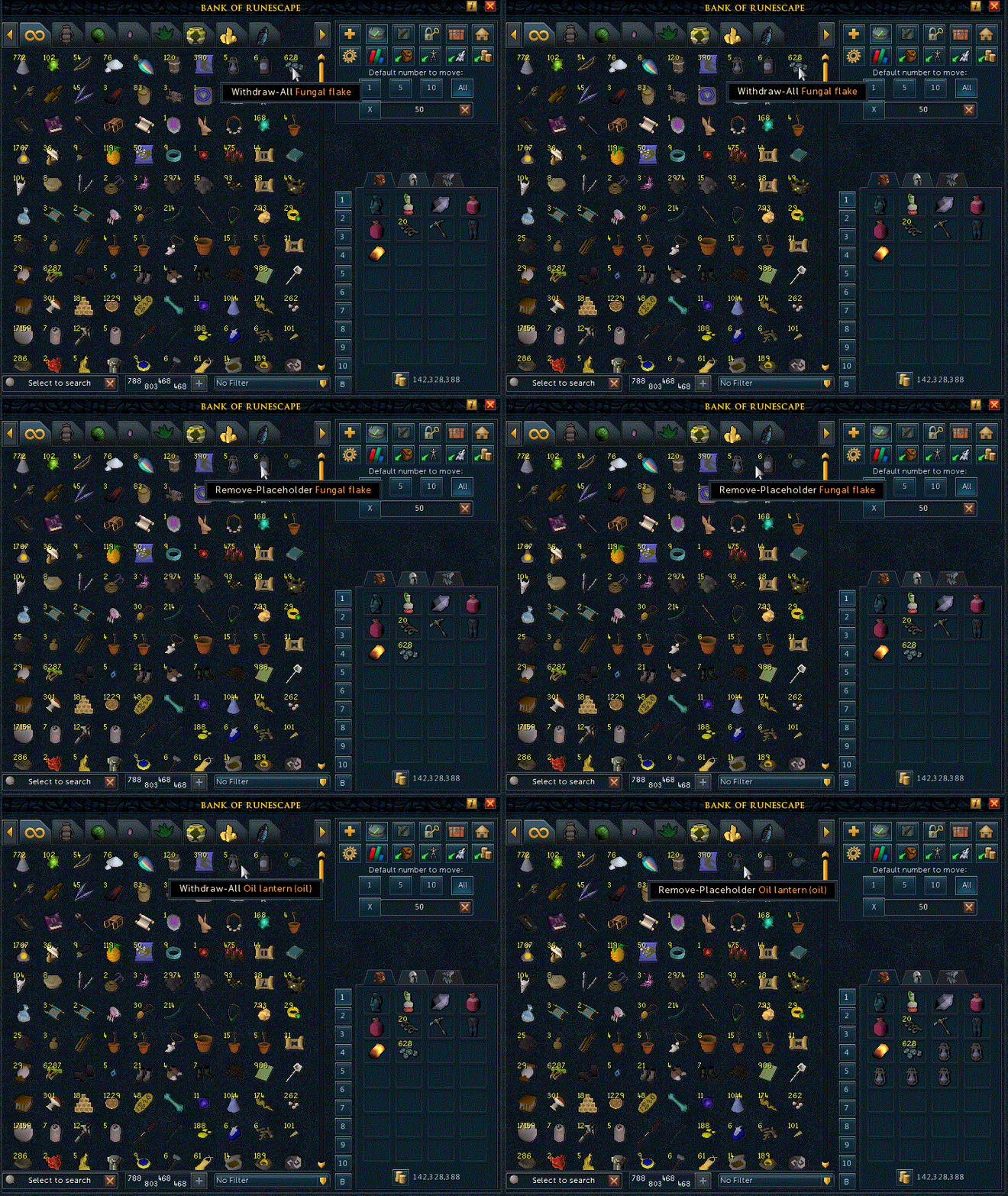
So how is this solved? The idea is simple: whenever the last item of a stack is withdrawn, the item itself stays in place at the same spot at 0 quantity, therefore putting a stop to unwanted shuffling. Any deposits of the item at a later date will replace the placeholder. This feature can be turned on or off.
The interface shown in this GIF is very much a work in progress and will be subject to change, and we're going to be making visual changes to make sure it works well across both Mobile & Desktop.
Bank Improvements
With this update we've also taken the opportunity to give the bank some 'under the hood' improvements. We'll go into detail on this a bit further in a future developer blog.
In the meantime, let's take a look at the new Bank interface!
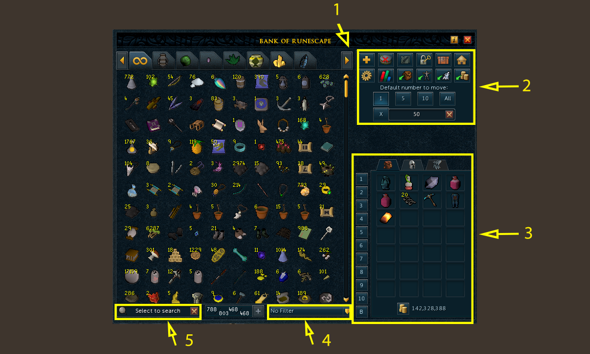
Picture of the new bank interface
1. A new tab scroll arrow
- We're now able to offer you 15 bank tabs (in the current game we give you nine tabs)!
2. Bank button additions
-
From top to bottom, left to right (new changes are bolded):
- The new tab button is now located here, freeing up a Bank tab slot. To use it, simply drag an item to this button to create a new tab.
- The placeholder button (ironically the art for this currently is a placeholder!). If this is ticked, any items withdrawn will leave a stack count of 0 behind to retain the position in your bank.
- The note withdrawal mode button has had a slight transparency tweak. When inactive it'll be faded so players will know they're currently withdrawing items without them being noted.
The bank pin button (no change).
Diango's holiday item and outfit retrieval (no change).
-
Player Owned House costume room (no change)
- The Bank Presets option. This used to be a bigger button on the main bank interface, but now resides behind the cog button icon.
- The worn equipment statistics window used to be hidden behind the 'worn icon' button. Now it can be opened by clicking the skills icon tab.
The backpack button deposits all of your backpack items (no change).
The worn items button deposits all of your worn items (no change).
The familiar button will deposit your beast of burden inventory into your bank (no change).
And finally, the money pouch button will deposit your money pouch into your bank (no change).
Plus, there's a new default number to move window. Similar to the Old School RuneScape's 'quantity' bank option, you can withdraw/deposit the listed quantities with a left click. However, if you need a custom value, you can set that via the 'x' option.
3. Integrating the backpack/worn/beast of burden/preset buttons into one area, in addition to adding your Coin Pouch amount into this window
Now instead of having to click on the worn icon to get to your worn equipment, you'll be able to click on the tab in the window. The beast of burden button is hidden to make clear to the player that they currently don't have a beast of burden active. Note: Withdrawing with the worn tab in focus will try and wear the item without needing to drag the item to the slot or right click!
4. A filter option
-
On clicking the dropdown, three options will appear that can apply the following filters:
- Show Junk - Shows all items that may be worth cleaning up (these are items that can be stored with Diango).
- Show member items - Show all items flagged as 'members only'.
- Show non-member items - Show all items flagged as 'free to play'.
Note: This makes future filters easier to add as well (though at this point we're not sure what future filters could even be added - let us know!)
5. Dynamic searching
Pressing the search button in the current Bank gives you a box prompt. If you're trying to type fast or are switching between items, there's a noticeable delay. This update will introduce a dynamic search box that instantly responds, offering a far smoother experience.
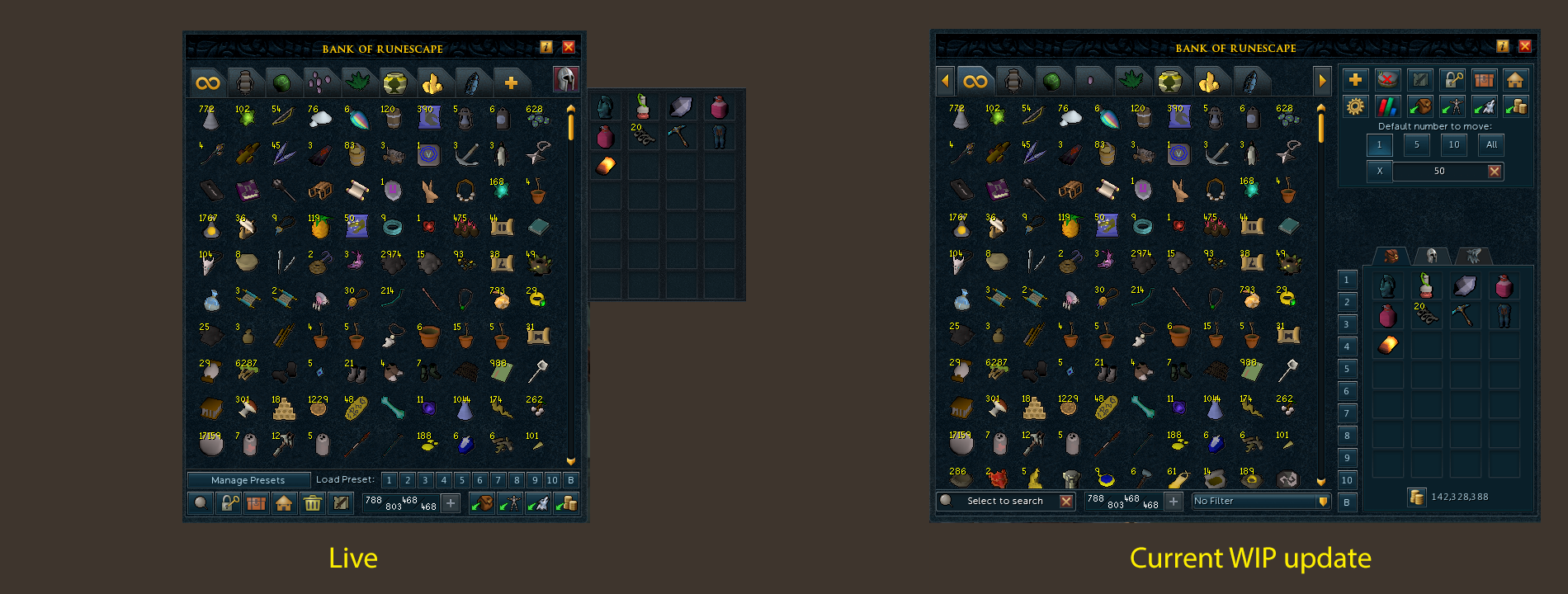
At a glance - Live vs WIP
So, how does all of this look once you put it in place?
Current bank in LIVE vs the WIP bank
Road to release
So, the big question - when is this all going live?
Fundamentally, we want to make sure we do this right, so we're going to be running a beta. This will be a great chance for you all to have a go for yourselves, and to let us know if we've forgotten anything. We're aiming for this to happen in July/August/September of 2019, so we won't have an idea about release dates until after that. In the meantime, keep your eyes open for a blog digging deeper into the code behind this project courtesy of Mod Hunter.
If you're keen to hear more, Mod Shauny and Mod Hunter will be showcasing everything in a livestream tomorrow during the data stream - 15:00 game time on [twitch.tv/RuneScape](twitch.tv/RuneScape)!

