It’s possible that the current appearance of Therium is just a placeholder, but if not, I think that there are a couple reasons why Therium should be a different colour.
In the resource UI, Therium just looks like a grey rock, or something greyed-out. Rather than looking like something, the icon looks more like it represents the absence of something, if that makes sense. I've watched hours' worth of footage from vods of the people who were permitted to stream the beta, and I'm still not used to it, which I think speaks to how unintuitive it looks as an icon to represent a valuable resource. You can see here
that the icon for Therium also doesn't really 'stand out' in the UI as much as the other important icons do, such as Luminite, supply, or research time.
Additionally, when workers are carrying Luminite, it’s very clear to see since it's bright yellow; but it’s really hard to tell when a worker is carrying Therium, because it’s just a grey lump that blends in with the worker model. See this example
, where the worker next to the Command Post is carrying Therium, but it's hard to tell.
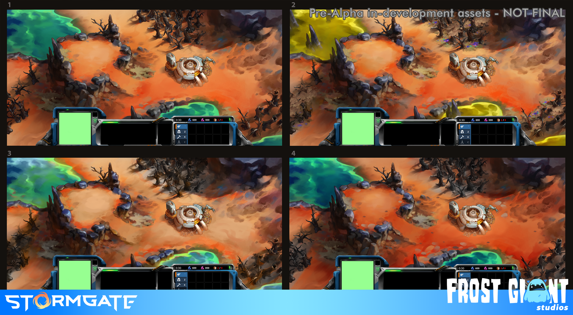
In this older concept art
, you can see they used a kind of vivid purple/pink for the tech resource. It’s a lot more striking, and looks like something valuable, rather than something that is easily mistaken for a regular rock. Not saying they have to go with that colour; but almost anything I think would be better than grey, both from an aesthetic standpoint, and a functional standpoint (in terms of making both the game and UI clearer).