Several members of our team - including Ross, our new Director of User Experience - have been working on some big improvements to our user interface! You may have seen some examples of these in the Patch Preview for Patch 0.8.2, and our previous post focusing on UI.
![]()

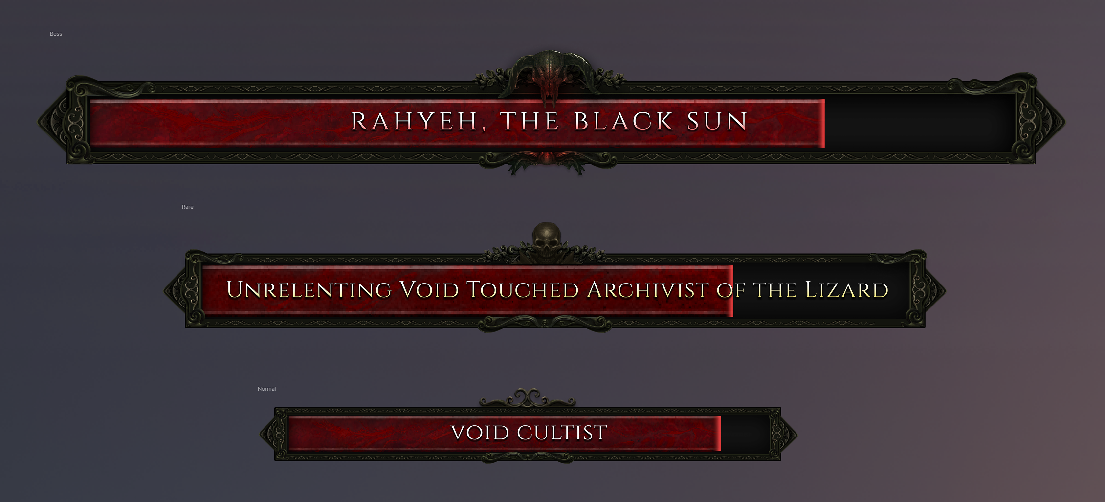
In order from top to bottom: Bosses, Rares, Enemies.
Please note that while some devices - such as the horned skull on the boss health bar - had not yet been centered correctly in the above image, this will be fixed in time for Patch 0.8.2.
![]()

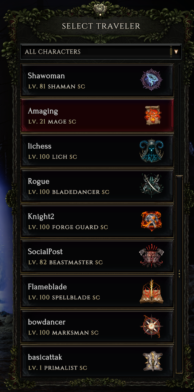
The character selection window is being updated, both to better match other UI windows, and also to resolve a few minor issues - no more seeing ‘Necromancer’ spill over to a second line!
![]()

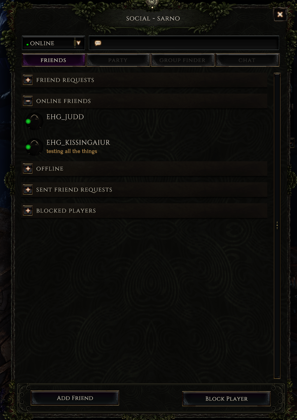
As shown on our social window, this update includes new designs for out buttons and tabs.
![]()

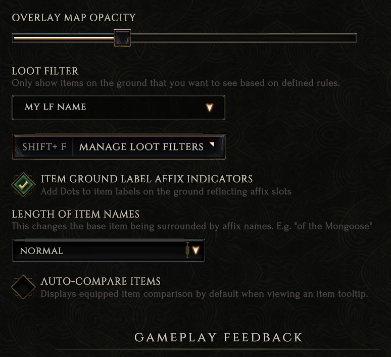
As seen in the above screenshot of our settings window, a number of other controls are also being visually updated. Patch 0.8.2 represents the largest ever change to Last Epoch’s UI.