Hello all, this is Hildor Anduv, the UX Designer on Stellaris. I’ve been with the team since December, and have really enjoyed working on such a great game. With my first Dev Diary I’m going to be sharing how I have been approaching UX Design on Stellaris.
Disclaimer: We're not quite ready to announce our plans just yet (we're saving that for the big stage, PDXCon), so this is going to be more process oriented without delving into specifics about any new feature. If that's not your thing, you can safely give it a miss, but if you're interested in the nuts and bolts of how games are designed and made, let us lift the curtain a bit.
Whiteboarding: The UX CornerWhiteboards are a great place for getting your ideas out quickly. When whiteboarding I try to get team members from multiple disciplines and rough out ideas, together. It’s a great way to discover gameplay and player needs, as well as find any potential development pitfalls early on.
We wanted to create a permanent space for this, and thus the UX Corner was born. Here we come together and iterate on ideas in real-time as a group. Having the permanent space has helped facilitate conversion and increased cross-discipline communication within the team,.
 Wireframing & Prototyping.
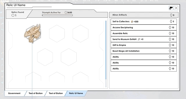
From the whiteboard sketches, I then move onto creating more detailed wireframes, the skeletal mockup of a UI design. Keeping your wireframes simple lets you iterate quickly, but more importantly allows you to nail down what content should be displayed, and how best to lay it out visually for the player.
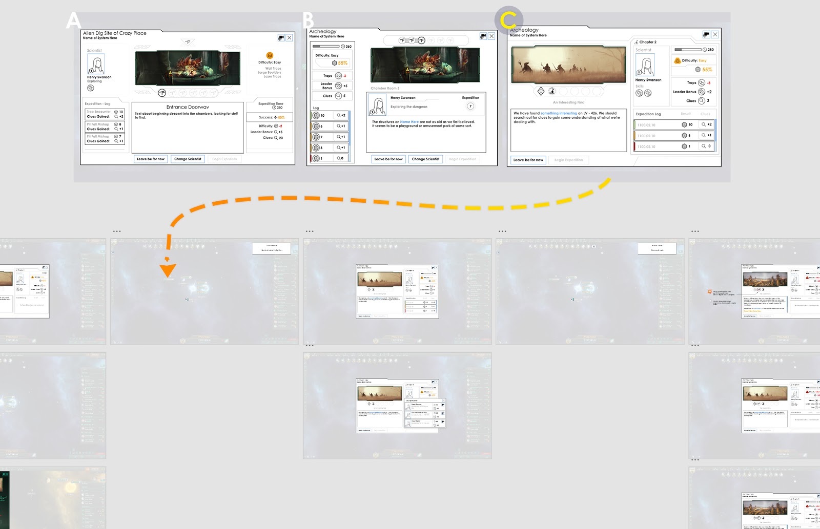
I typically try to nail down one key screen, and from there I build out a User flow of the entire experience.
When Designing the Archeology UI for Ancient Relics, I had some key pillars I wanted to nail.
- The stories are linked, and I can revisit past chapters for context. (Also experience the great artwork again!)
- When I come back here, I have a sense of the progress my scientist has made.
- The challenge of the site feels ‘game-y’.
Once I nailed an overall layout for the Archaeology UI, I then broke it out into a User Flow to capture the full breadth of a player’s journey while excavating a site.

With the User flow complete I then link it up and create an interactive Prototype. The prototype allows team members to experience what we are trying to create before we set out to develop it. It’s a great low cost way to identify issues in the flow, and fix them here before investing in development.

After we agree on the UX design, we then get to finally create it in game. As you can see below, the design mostly held through to release. The text window was increased to accommodate larger story text, and ‘difficulty’ was changed to ‘breakthrough chance’ to help better understand the ‘die roll mechanic’.
 User Testing
So, even though the design has now gone through many gates, we must test our designs with players and iterate based on player feedback. Luckily Paradox has a great User Research department, and so we were able to run playtests and get vital feedback which we could respond to before launch.
----------
Well, I hope this was an informative window into how UX Design is done here on Stellaris.
Also, I read the forums and look out for your feedback as well. You all have been very helpful, so thank you for that!
If you want to read the Dev Diary on our forums or share your feedback with us directly, go here:
http://pdxint.at/DD154_2


