We're excited to bring you a more graphical-oriented Mod Spotlight. This time, to illustrate some of the points, we're covering a small collection of Mods made by experienced modder, Plati. Enjoy!
----------
Hello dear community!
Plati with you today, going to take a moment of your time to talk about my ‘visual input’ in Europa Universalis IV modding ecosystem.
I’ll focus almost exclusively on a select few of my visual mods (part of
Plati’s Visuals workshop collection) with minor mentions of my input in Paradox Converter teams work. I'll delve into the technical aspect of visuals and explain the thought process of mine when making these visual alterations - might be helpful to my fellow modders.
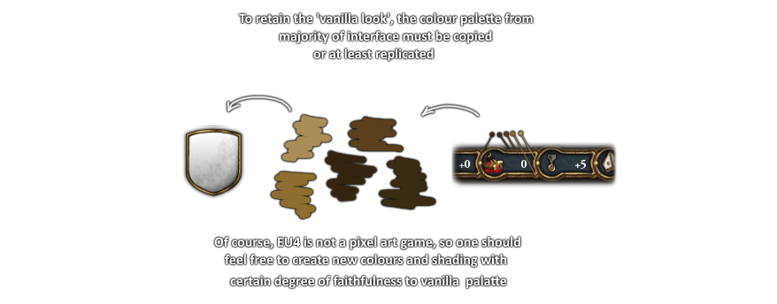
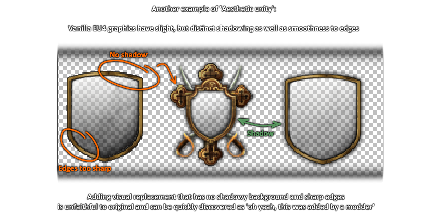
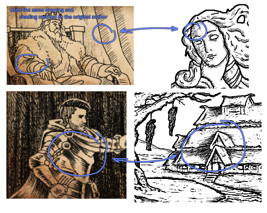
Before we move on to individual cases, let me name the main principle I am trying to follow in altering EU4’s look and visual feel: ‘Aesthetic Unity’ or ‘Visual Truthfulness’. In the simplest sense, if you alter or add graphics, it's best that your input fits into the game seamlessly, ergo you need to keep saturation, color palette, size and feel as close to the original visual direction as possible. I will demonstrate it as we go on.
Let’s start with the most recent one:
Plati’s Tech Pictures.
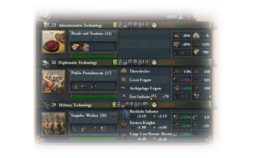
A player spends a sizable percentage of his playtime looking at the interface. Apart from the numbers and map borders the UI can often seem ‘too static’. This mod attempts not only to merely add something to stare at but also to set visual milestones for the player to actually see the history progress as his game progresses. 'Oh wow, so we are having muskets now? Sweet!’ ‘Oh wow, we learned to eat citrus to avoid scurvy? Sweet!’
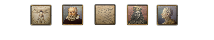
A technology icon in this sense represents scientific or cultural advancement. While it may be easy with inventions or tools, ‘social innovations’ tend to be problematic to portray:
1. Vitruvian man, often used as a symbol for Renaissance (thought). This one is a no-brainer.
2. Galileo Galilei, believed to be one of the ‘fathers of scientific method’. Historical date of the technology he represents takes place during his lifetime (Scientific Experimentation 1583).
3. While it may be seemingly more appropriate and recognizable to use the famous ‘We the People’, the technology this image represents (The Constitution) is set historically in 1687 - the same year the Declaration for Liberty of Conscience was adopted - the document you see in the picture.
4. Frontispiece of Leviathan (Thomas Hobbes). A no-brainer here. If you hear the word ‘Sovereignty’ anywhere, chances are you are gonna see this image attached. Though, instead of a black and white pencil sketch, I took the liberty to add color.
5. Montesquieu, considered to be one of the fathers of modern interpretation of separation of powers. While this idea is in no way exclusive to him, the historical date of technology he represents is set during his lifetime and academic work (Separation of Powers 1745).
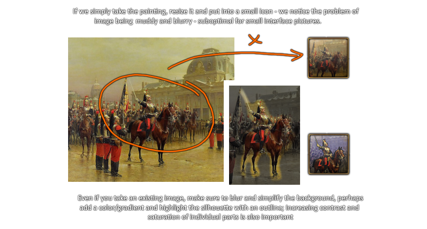
Now the pictures themselves include a mix of historical paintings, mash-up-photoshops and ai made images. Using an existing painting may be problematic:
Another tricky part was depicting advancement in Firearms: If you want to show a difference between a Matchlock musket and a Flintlock musket, you need to demonstrate the firing mechanism, zoomed in. There are plenty of images online available to take historical weaponry and depict them. However, simply pasting an image into a frame won't do:
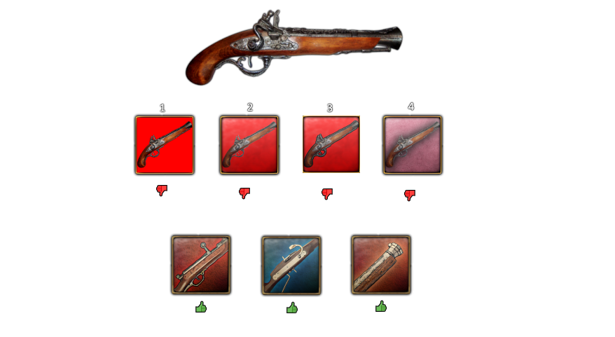
1. Saturated, bland red background and image of pistol just slapped on top. This is as low effort as possible.
2. An overlay added on top. Looks better, but still terrible.
3. A black outline was added around the pistol. It's good to distinguish something you want to highlight, but on its own - lackluster. Also, no shadow around the frame.
4. The color is less saturated to fit into the EU4 overall feel, but the pistol still looks bland and uninspiring. The blurry shadow makes the pistol harder to recognize. More edits are required.
As we often see in video games, small icons have focus on contrast, simpler backgrounds, gradients, outlines/shadows and other methods to highlight an object in a very small picture. Even if its something simple like a knife or healing potion, make it shine! Make it play!
A much smaller mod -
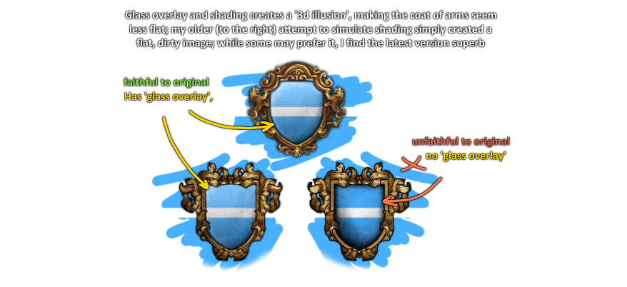
Plati’s Shield Frames - also was made with Aesthetic unity in mind:
Now, interface modding in EU4 is not merely spawning something pretty. There is some coding to do and values to be adjusted for your changes to take effect. For this reason, Mod-compatibility might be problematic, causing counter-intuitive errors and mish-mashes: if two mods alter the same .gfx file, for example, then either of them (or both) will be busted and dysfunctional. This is one of the reasons why mods are itchy and scratchy and you often need to create a separate 'compatibility mod'. I try to make mods as compatible and non-intrusive as possible, but one can go only so far.
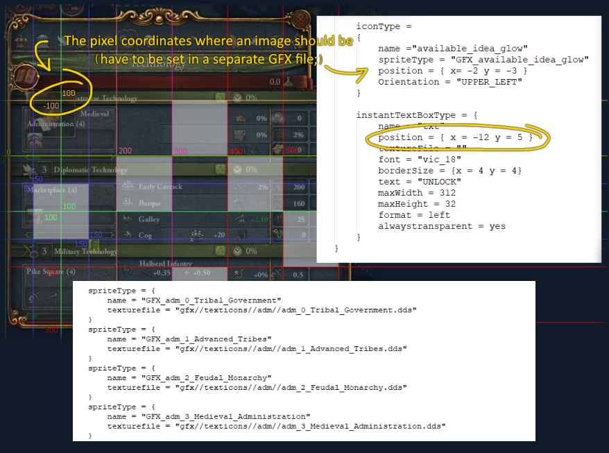
And newly added images must be 'defined' separately as well.
Needless to say, this is the least enjoyable part of the entire process. However, if you are not attentive and pedantic and misinput code, you may completely mess up the textures/ui:
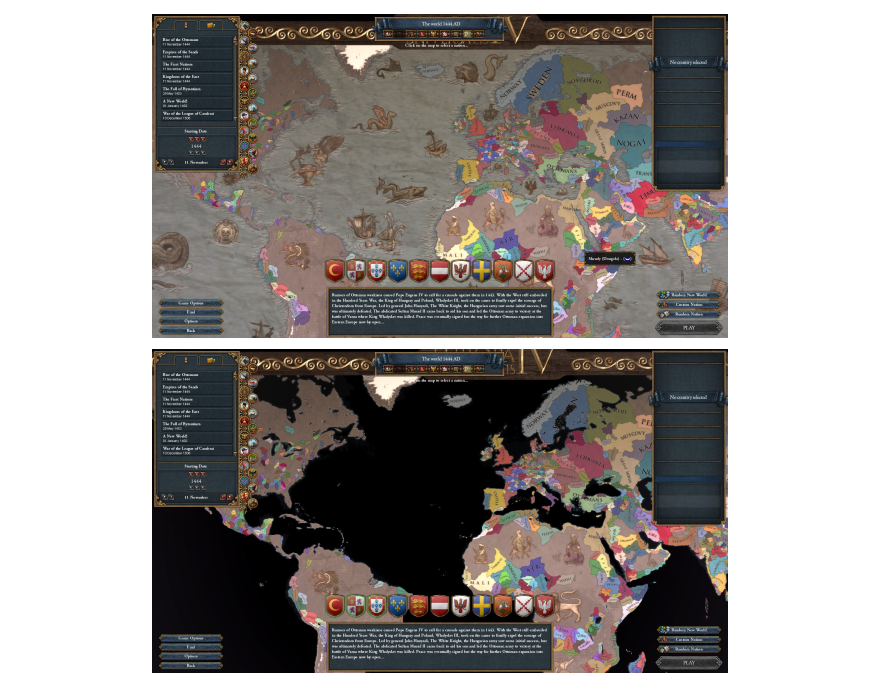
As we can see here (
Atlas Aesthetic mod), a minute thing like incorrectly defining map resolution may result in Water texture becoming completely invisible. I did not like the 5632x2048 resolution limit and wanted to enlarge the picture (otherwise the sea monsters get fuzzy on zoom-in). Trying to bypass this limit either crashed the game or made the map blank. Just to let you know there are engine/code limitations on what you can draw as well.
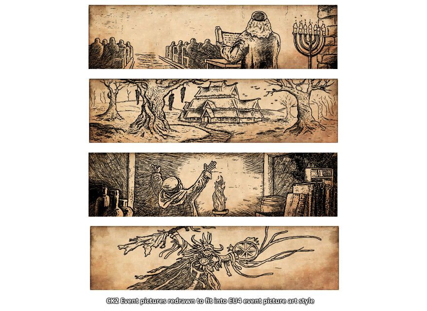
All in all, if one wants to edit game graphics without doing the complete overhaul, it's healthy to follow the principle of Aesthetic unity. Games have their feel, mood and tones meticulously set by developers. If someone drops an ENB, it may look cool at first glance, but may also erase artistic expression carefully installed by an artist. And EU4 is one of the brightest examples of stylish, yet functioning and unintrusive user interfaces I've seen. I try to compliment it whenever I make changes. In my input in CK3-EU4 converter mod, I added a number of flavor events and prepared event pictures for them. While I used a number of existing art as reference, instead of merely putting them through the 'Pencil Sketch' filter, I aimed to draw them in a manner they would be indistinguishable from vanilla event art.
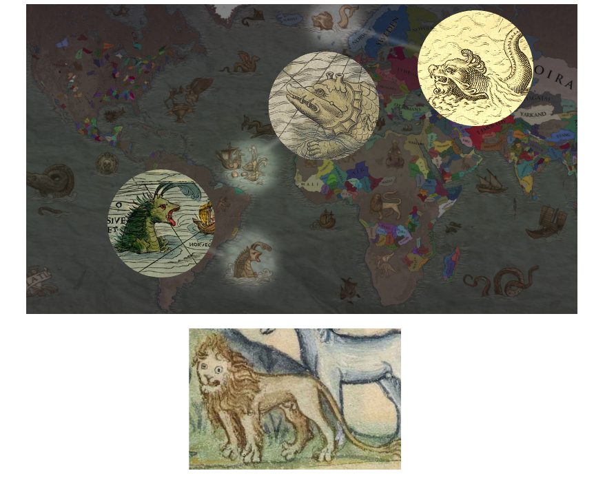
And this is where I conclude. I hope I did not bore you with technicalities - thought it would be exciting to bring you more of a 'behind the scenes' and 'inside authors mind' showcase. As a final goodbye, here’s pictures of some creatures that served as reference for Atlas Aesthetic:
----------
Community Ambassador Ryagi back, hope you enjoyed this spotlight as much as I did!
If you're like me and sometimes
scroll all the way to the bottom first before deciding if a post is worth reading in full, then hello! I fully endorse scrolling back up :p Personally I think Plati did an astounding job at both articulating and visually representing their points.
Here you can find a link to Plati's
visual workshop collection featuring their work shown here. If you have any suggestions for future coverage let us know. Perhaps we could even bring Plati back to have a look at their more gameplay-oriented mods!
In the meantime, we hope you enjoyed this spotlight. Hope to see you next time!