Huge UI Improvements Are Coming
You know there’s a lot happening when a social post needs a table of contents! In this post you can click on each of the non-GIF images to see larger versions of them.
| Table of Contents |
|---|
| 1. Action Bar Changes |
| 1.1. Style Update |
| 1.2. Updating the Ward Display |
| 1.3. New Controller Variant |
| 2. New World Map |
| 3. Removing the Quests Window |
| 4. New Class Passives Window |
| 5. Loot Label Optimization |
ACTION BAR CHANGES
STYLE UPDATE
We have been performing a UI pass to assess which parts of the user interface need to be updated stylistically or optimized for improved performance. We’re fond of the design of our action bar, but not how much space it takes up. As part of a future update, we’ll be adjusting it so you can better see enemies at the bottom of your screen.
Action Bar3227×531 1.01 MB

The latest version of Last Epoch’s action bar.
[ Top of Page ]
UPDATING THE WARD DISPLAY
While improving other aspects of the action bar, we’ll be refining how it displays Ward. We’re sticking with our established method of having a single bar represent your maximum health in Ward, and increasing the number of bars as your Ward skyrockets upwards.
How it looks when gaining & losing Ward.
[ Top of Page ]
NEW CONTROLLER VARIANT
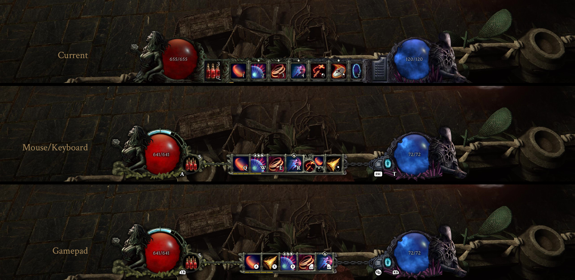
Users of controllers will be getting a more compact action bar designed specifically for use with them. We may make additional adjustments as we continue to improve controller support across future updates. Make sure to leave us your #feedback-and-suggestions!
Action Bar variants1920×935 2.16 MB

A paintover of three versions of our action bar.
[ Top of Page ]
NEW WORLD MAP
You may have noticed something on this page when we deployed our new website back in December! For several months we have been working on a very significantly higher quality world map to show off the world of Eterra in all its glory. The sheer scale of this artwork may not have been immediately apparent, so we’ve prepared a small teaser.
Here’s the small left-most island after you zoom in;
World Map - Island1331×1092 381 KB
[ Top of Page ]
Removing the Quests Window
Alongside the release of our new world map we will be removing the dedicated Quests window and moving its functionality to the Map window. This will be one of several changes intended to help people better understand which zones each quest takes place in.
[ Top of Page ]
NEW CLASS PASSIVES WINDOW
We are designing a new layout for use by our class passives to make better use of the space available. The new window should look better aesthetically and feel less cramped.
[ Top of Page ]
LOOT LABEL OPTIMIZATION
In Patch 0.8.2 we’ll be updating the organization of loot labels to be more efficient. We do not anticipate any perceivable changes to their behaviour. This change will be most pronounced when a large number of loot labels are present on the screen close together.
To offer an example, when there are 140 items on the ground close together the update will cause their loot labels to take approximately 85% less frame time, heavily improving their impact on framerate. In other words, this process will be approximately 5-6 times faster.
[ Top of Page ]
