about 4 years ago - Ubi-Milky - Direct link
Hey pjw_is_here,

Thank you for sharing this graphical bug with us. I have reported it to the team. If you find anymore whilst you are editing the maps, would you please post them in this thread?

Thank you for your help.
about 4 years ago - Ubi-Milky - Direct link
Hi RonQuiney,

Thanks for letting me know this. I have passed your images onto the team and I am collecting as many examples of visual bugs and glitches in the map creation / MediTracker tool. If you find anymore, please post them here. Thank you for your help.
about 4 years ago - Ubi-Raziel - Direct link
Originally Posted by pjw_is_here
Apologies @ Ubi-Milky, I saw this thread earlier (before posting mine), checked the first post, saw stuff about shader settings and UI and assumed this was not the right place. I should have checked more than just the first post. Thanks for the move.
No worries at all

Always post if you're unsure then we can advise accordingly.

Thanks!
about 4 years ago - Ubi-Milky - Direct link
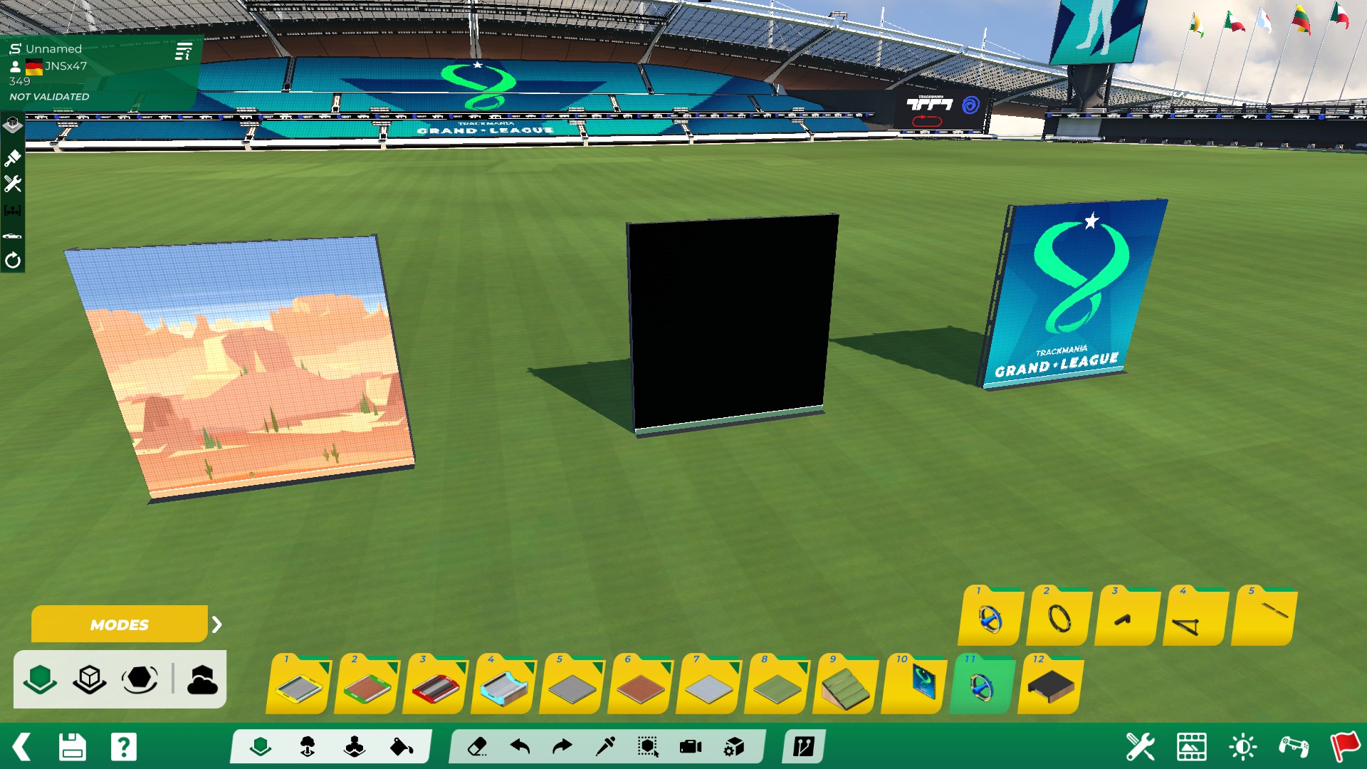
Hello JNSx47, thanks for uploading this image for us

Are you able to recreate this green border by placing other signs on the ground or does it only work with this particular sign?

Does this also work on any terrain you place a ground sign on or just grass terrain?

Please also make sure to post any further visual bugs you find in map editor in our thread here -
https://forums.ubisoft.com/showthrea...ghlight=visual
about 4 years ago - Ubi-TheBerry - Direct link
Originally Posted by JNSx47
happens with every type of sign, it just does that on the level of the stadium grass or below (in ghost and normal block mode, not in free block mode). It might have been done on purpose but I think it just looks ugly. It's kinda fine with colored signs (like the tmgl one) since the line is a bit transparent but with black signs (off) you get a green line which doesn't look good.

But I'd suggest in general to completely remove it. Like why should a screen have a transparent line just because it's placed on ground?

Hey there,

Thank you for providing an example, we've passed this onto the team for them to look into as well as the request for the lower part to be removed optionally