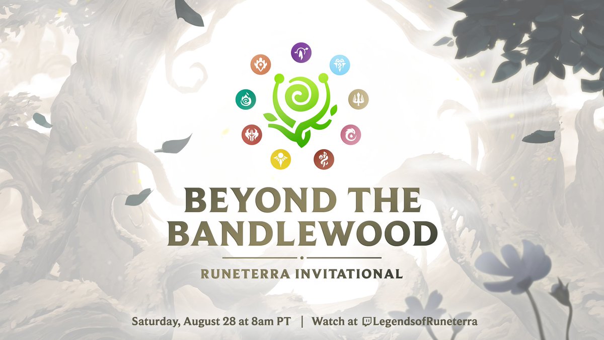
10 regions. 10 players. All battling it out in the Beyond the Bandlewood Runeterra Invitational. ⚔️ This Saturday, 8/28 at 8:00AM PDT on
Super cute!
The day has come!
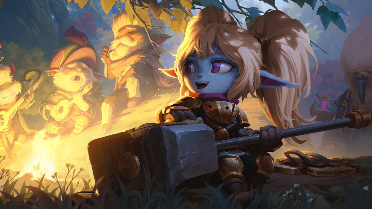
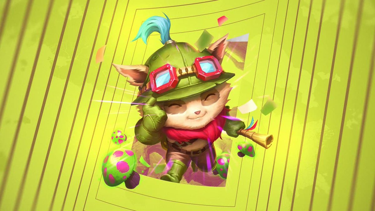
What’s that, Scouts? You’ve discovered hidden treasures in the Bandlewood? Well don’t just stand there, start digging! Hut-two!
@ZepRib 👍
@Aladiah_97 :D
@Imperius_Ira The Beyond the Bandlewood event begins on August 25 at 10AM PT, and runs until September 22 at 10AM PT. There may be a little variance, but expect it later today !
@HoSAf34 The update will hit later today when the event begins! Hope the recap will keep you busy just a little longer as it gets closer~
@Vexificationn It will be live later today! Hope the recap keeps you busy a little longer. 👍
Are you ready to explore what lies… Beyond the Bandlewood? The newest expansion goes live today!
Before you head out, take a moment to re-live the magical reveals for this season.
➡️
Which reveal was your favorite this time around?
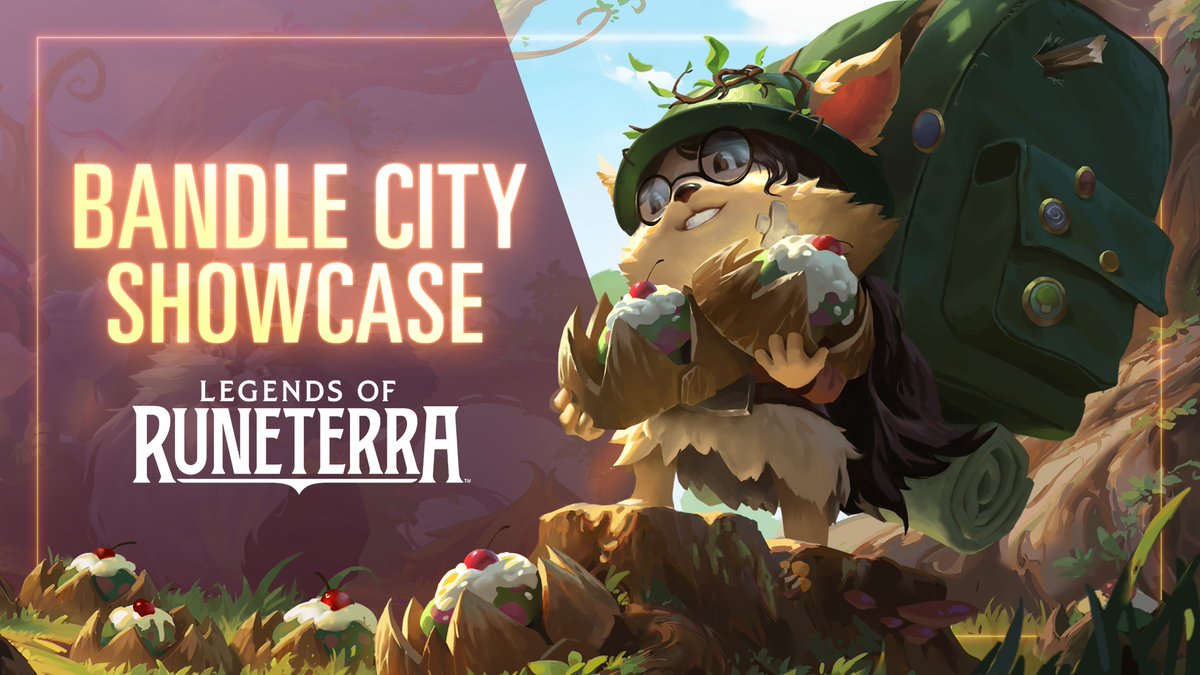
Wowza! Puffcap Pups, new emotes, and so much more - there’s a lot to discover in the Beyond the Bandlewood event. Learn about everything you can earn in the Event Pass here:
Wherever Yordle magic flows, impossibilities take root. The newest expansion, Beyond the Bandlewood, brings the final region to Legends of Runeterra. Play now!
@dragones_oscuro The climb starts right now! It ends 16/09/21 at 00:01 CEST - GLHF 👊
"Hut, two, three, four"- Today the climb begins for LoR Masters EU: Chronicles of Bandlewood! GLHF🃏
📅Climb dates: 25/08/21 - 16/09/21 at 00:01 CEST
📰Read all about it here:
Congratulations!
That's awesome! Congratulations!
@GiantSlayerLoR: With a final chance at Worlds qualification and a $20,000 prize pool on the line, last week's Top 32 was super intense!…
Apologies for any 404's on the article - the link is now working and the Patch Notes can be viewed.
Enter a portal to adventure, and journey to Bandle City in LoR's biggest expansion yet - Beyond the Bandlewood!
Full Patch 2.14.0 notes at: